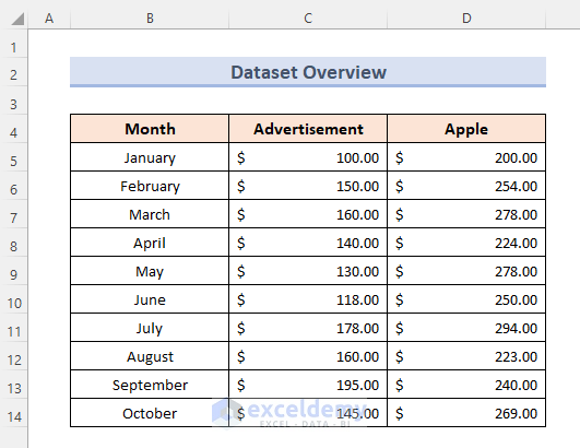
This is the sample dataset.
The independent variable should be in the left column and the dependent variable in the right column.
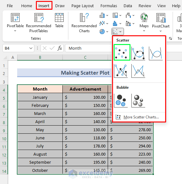
Steps:
- Choose three columns, including the column titles. Here, B4: D14.
- Click Charts in the Insert tab.
- Click Scatter and choose a template.
- Click the first thumbnail to add a simple scatter graph.
The scatter plot will be added to your worksheet:
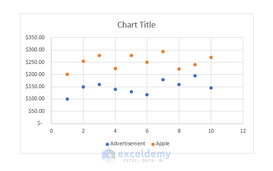
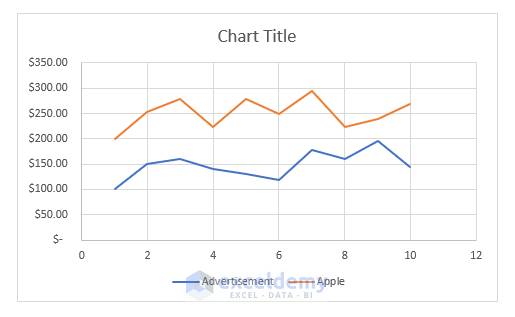
In the plot above, three columns are shown in two separate lines. The x-axis shows the number of months.
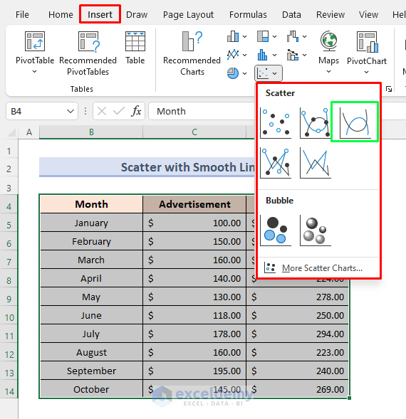
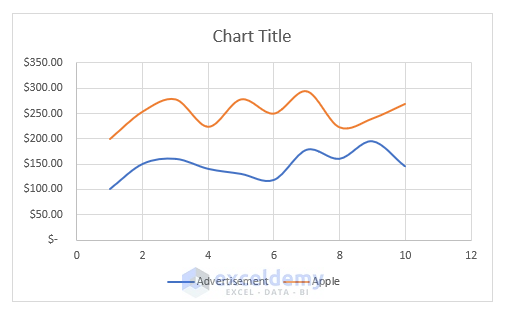
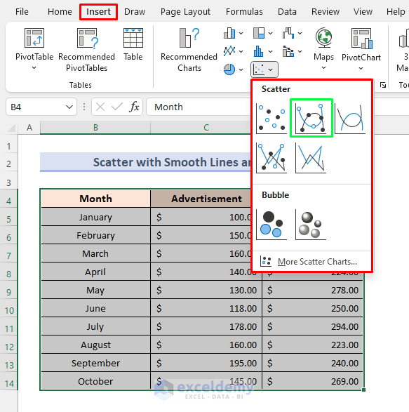
Scatter graph with Smooth Lines
Steps:
- Select all columns, including the column titles. Here, B4: D14.
- Go to the Insert tab, click Scatter and select the following:
This is the output.
Scatter Graph with Smooth Lines and Markers
Steps:
- Select the entire dataset with column headings.
- Go to the Insert tab and select Scatter.
- Choose Smooth Line with Markers.
This is the output.
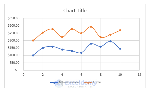
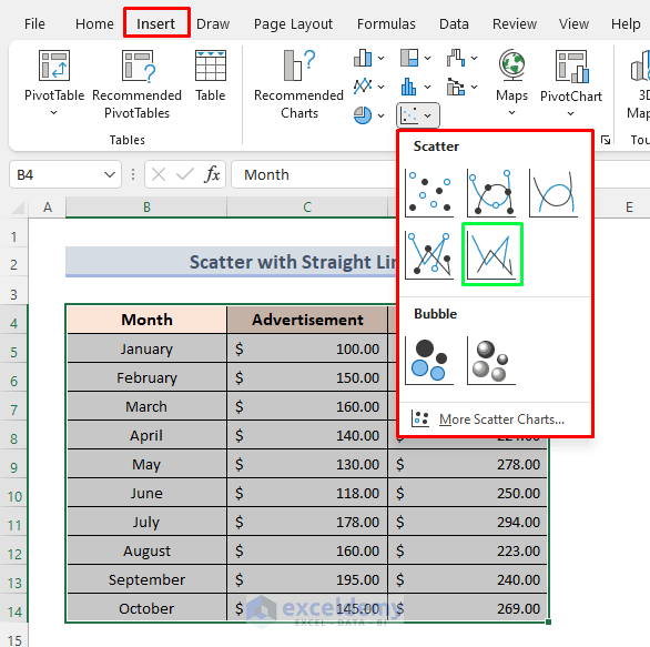
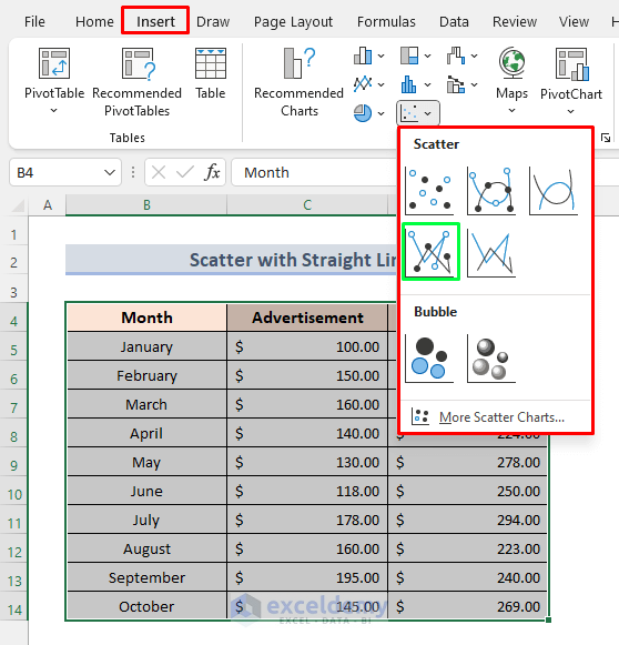
Scatter Graph with Straight Lines
Steps:
- Follow the steps described in Scatter graph with Smooth Lines.
- Select Scatter with Straight Lines.
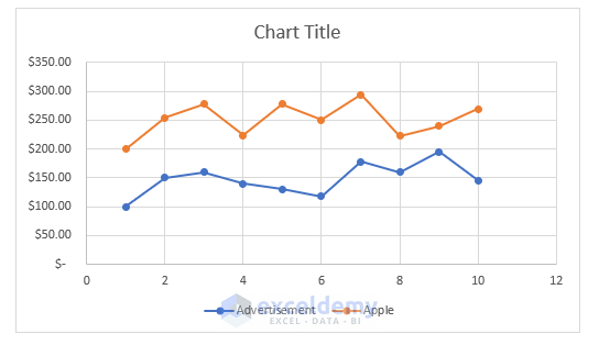
This is the output.
Scatter Graph with Straight Lines and Markers
This is the output.
Customizing an XY Scatter Plot in Excel
Adjust the Axis Scale
To reduce the distance between the initial data point and the vertical axis:
Steps:
- Right-click the axis you want to adjust. Select Format Axis.
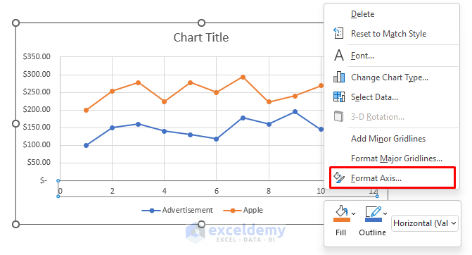
- In the Format Axis panel, set Minimum and Maximum (here, 10 and 5).
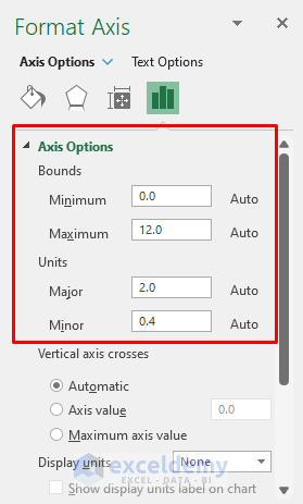
You can also change the spacing between grid lines by changing the Major (here, to 1) and Minor values.
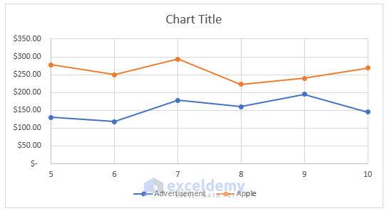
This is the output.
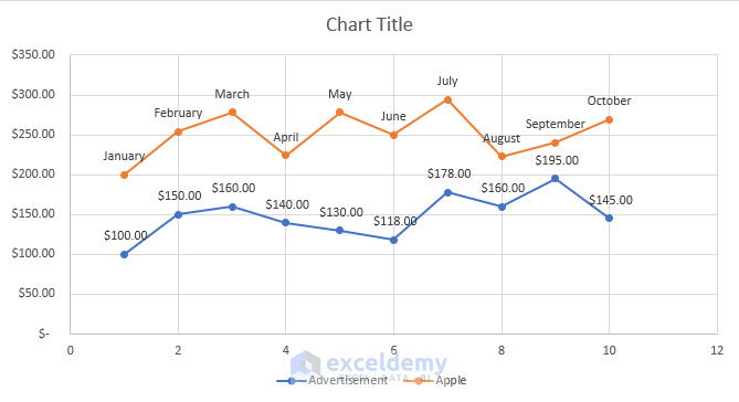
Add Labels to the Data Points
Steps:
- Select the plot and click the Chart Element button ( ‘+’ ).
- Check Data Labels and select the label placement.
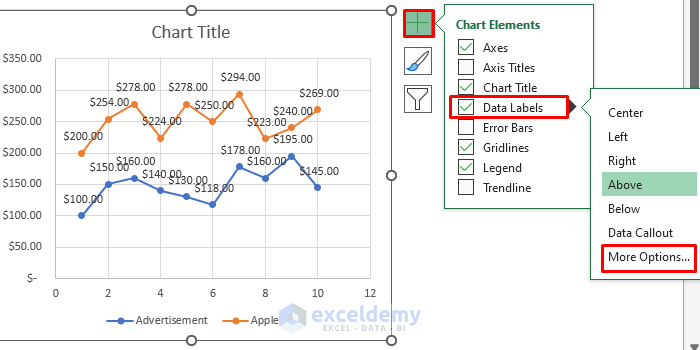
- In More, select Format Data Labels.
- Click Label Options. You can choose to show the Y-axis value and the label placement.
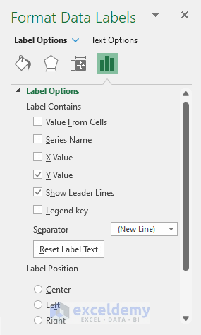
Enable the X Value and disable the Y Value for Apple.
Enable the Data Label for Advertisement.
This is the output.
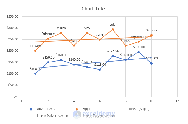
Insert a Trendline
This is the output.
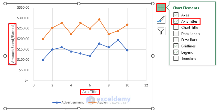
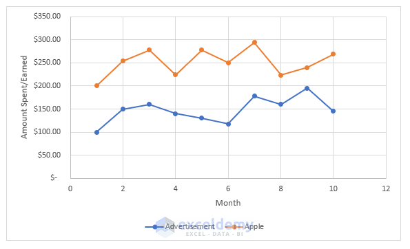
Add a Title to the Axes
Steps:
- Select the plot and click Chart Element ( ‘+’).
- Select Axis Titles.
- Edit the axis name.
- This is the output.
Things to Remember
- Labels of points that are close to each other may overlap: click the label that overlaps and use the four-sided arrow to move it.
- To modify properties, change each line separately.
Download Practice Workbook
Download the practice workbook here.
Make Scatter Plot in Excel: Knowledge Hub
- How to Make a Scatter Plot in Excel with Two Sets of Data
- How to Create a Scatter Plot in Excel with 2 Variables
- How to Create a Scatter Plot in Excel with 3 Variables
- How to Make a Scatter Plot in Excel with Multiple Data Sets
<< Go Back To Scatter Chart in Excel | Excel Charts | Learn Excel
Get FREE Advanced Excel Exercises with Solutions!
