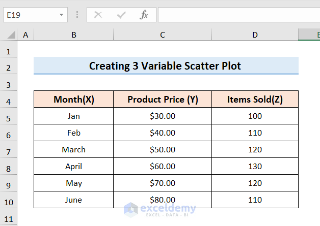
Step 1 – Arrange the Dataset for a Scatter Plot with 3 Variables
We have a dataset of sales with Month(X) in Column B, Product Price(Y) in Column C, and Items Sold(Z) in Column D.
Read More: How to Make a Scatter Plot in Excel with Multiple Data Sets
Step 2 – Generate Scatter Plot
Steps:
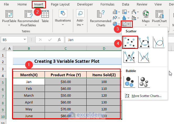
- Select Column B, Column C, and Column D.
- Click the Insert tab and go to the Insert Scatter option.
- Select the first Scatter chart.
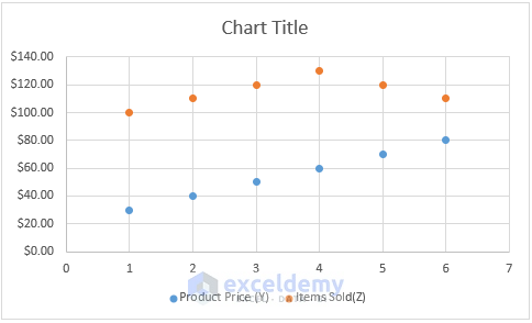
- Excel will insert a scatter chart.
Read More: How to Create a Scatter Plot in Excel with 2 Variables
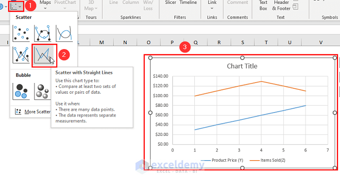
Step 3 – Apply Different Scatter Plot Types with 3 Variables
Steps:
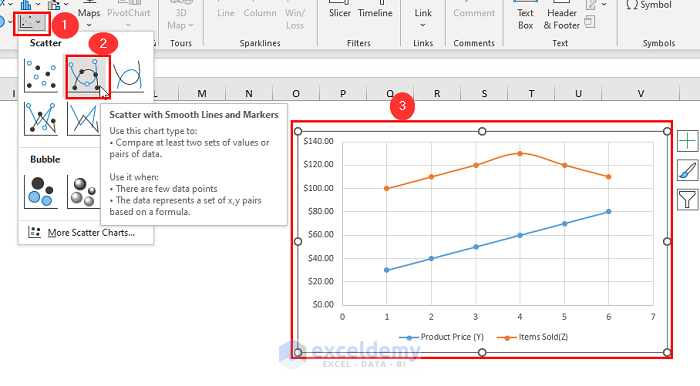
- Go to the Insert option and select the Scatter option similar to Step-02.
- Choose ‘Scatter with Smooth Lines and Makers’ to have the following result.
- If you select ‘Scatter with Straight Lines’, the following chart will come up.
Types of Scatter Graphs and Correlation
Positive Correlation: With the increase in the x variable, the y variable also increases.
Negative Correlation: With the increase in the x variable, the y variable decreases.
No Correlation: If there is no connection between the variables, then the points don’t seem to influence one another. These could be two completely independent variables.
Designing a XY Scatter Plot with 3 Variables in Excel
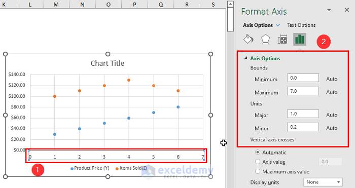
Method 1 – Adjusting the Axis Scale (Reducing White Space)
Steps:
- Right-click on the x-axis and go to Format Axis.
- Set the Minimum and Maximum Bounds as needed.
- You can change the spacing between the grid lines using the Major and Minor units.
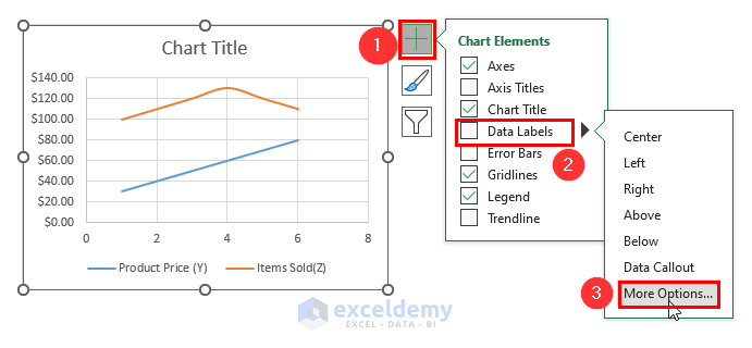
Method 2 – Attaching Labels to Scatter Plot Data Points
Steps:
- Select the whole chart and click on the Chart Elements option.
- Check the Data Labels box and then select More Options.
- Click on the Label Options, choose the Value From Cells option and then go to Data Label Range.
- In the Select Label Range box, choose the desired column.
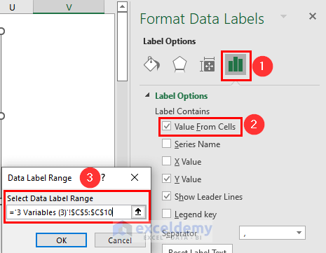
- After pressing OK, you will get a result similar to the below.

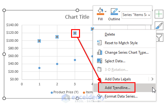
Method 3 – Adding a Trendline and an Equation
Steps:
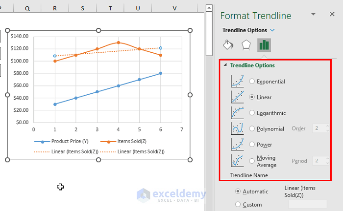
- Right-click on any data point and select Add Trendline.
- You’ll get a Display Equation on the Chart box on the Format Trendline which will come to the right side of your window just after you’ve added a trendline. The result will look similar to this:
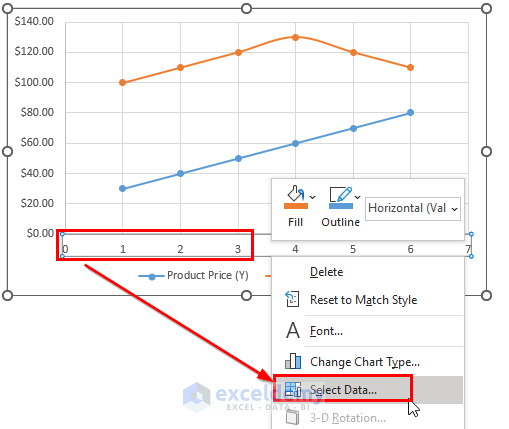
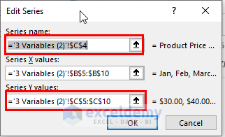
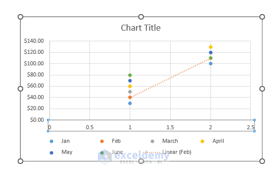
Method 4 – Switching the X and Y Axes in a Scatter Chart
Steps:
- Right-click on either the X or Y-axis and click on Select Data.
- In the Select Data Source dialog box, click Edit.
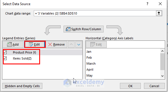
- Copy Series X values to the Series Y values box and vice versa. (You’ll need an intermediate point to save one result.)
- After clicking OK, your scatter plot will show this transformation:
Things to Remember
When two or more data points are very close to each other, their labels can overlap. To fix this, click on the labels and select only the overlapping data. Point your mouse cursor to the selected label and wait until the cursor changes to the four-sided arrow, then drag the label to the desired position.
Download thePractice Workbook
Related Articles
<< Go Back To Make Scatter Plot in Excel | Scatter Chart in Excel | Excel Charts | Learn Excel
Get FREE Advanced Excel Exercises with Solutions!
