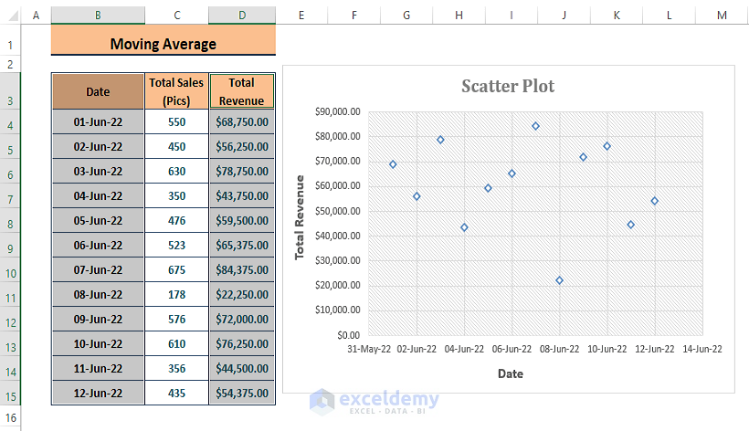
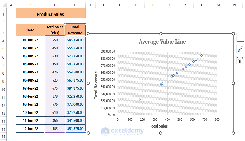
In a Scatter Plot where the data shows little correlation, adding an average line creates a useful yardstick. Suppose we have inserted a Scatter Plot of the highlighted data in an Excel Worksheet like in the image below.
Let’s add an average line to it, using 3 different methods.
Method 1 – Adding a Moving Average Line
We’ll use a Horizontal Line, as our desired data is on the Y-Axis.
Steps:
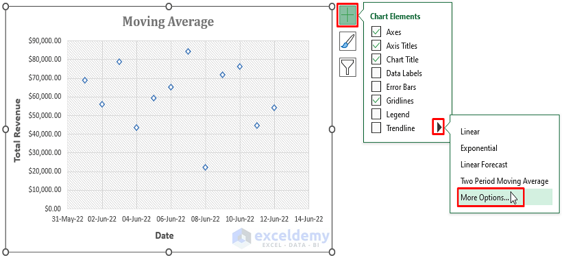
- Click inside the Chart area.
- From the side options that appear, click on the Plus Icon > Arrow Sign beside Trendline > More Options.
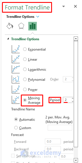
The Format Trendline side window appears.
- Select Moving Average as Trendline Options.
- Change the Period values to best fit your data. Here, as the dataset is comparatively small, a minimum period value of 2 is chosen.
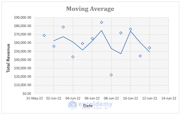
Excel inserts a Moving Average Line maintaining the average value of each two consecutive values serially.
Read More: How to Add Line to Scatter Plot in Excel
Method 2 – Using Error Bars
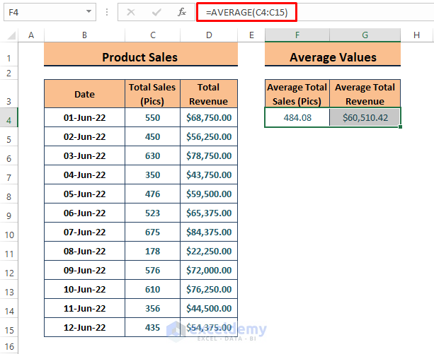
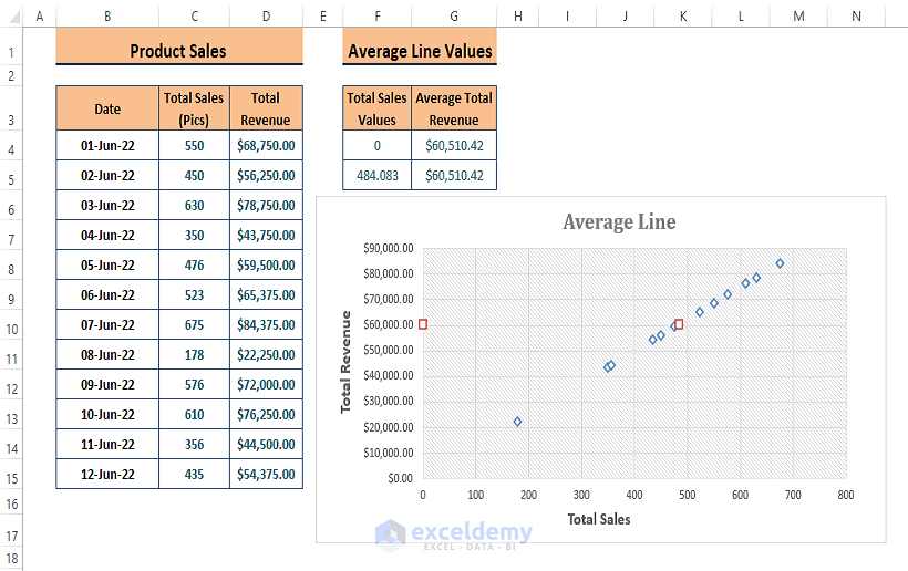
Suppose we change the source data to a comparatively correlated data type, such as Total Sales. We want to add a Horizontal Average Line to the Chart.
- Calculate the average of Total Sales and Total Revenue using the AVERAGE function.
Step 2:
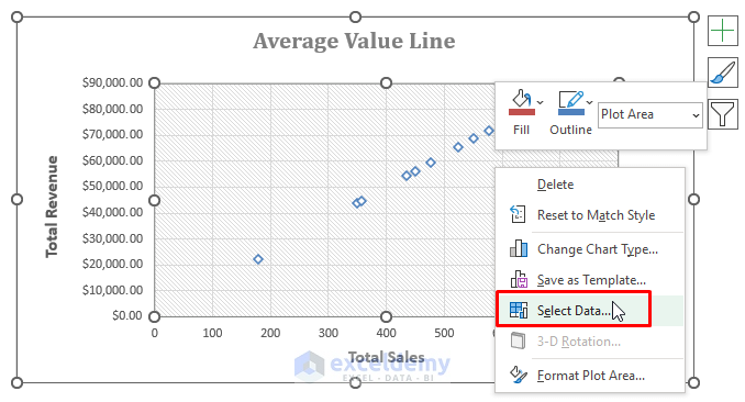
- Right-click within the plot area.
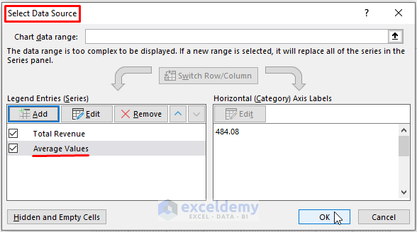
- From the Context Menu, click on Select Data.
Step 3:
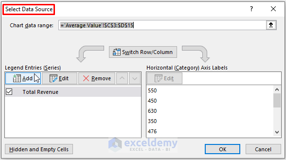
Excel opens up the Select Data Source window.
- Click on Add under Legend Entries.
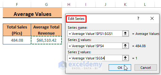
Step 4:
- In the Edit Series dialog box that opens, assign the respective values as shown in the screenshot below.
Step 5:
Excel adds a new Data Source named Average Values.
- Click on OK.
Step 6:
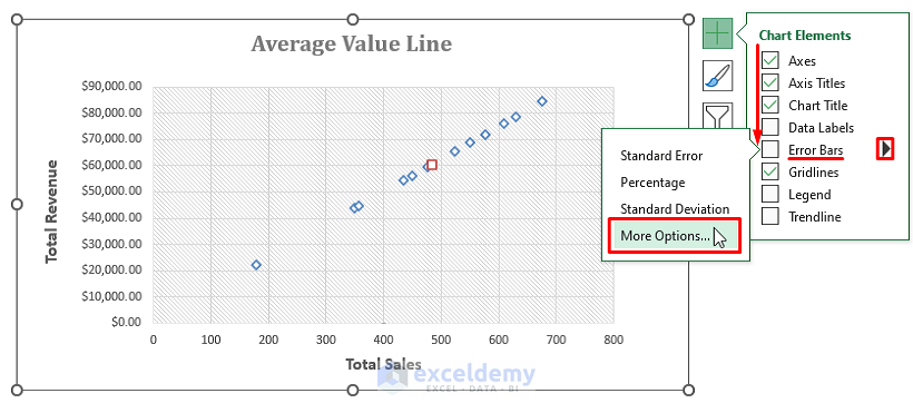
- Click within the Chart.
The side options appear.
- Click on the Plus Icon > Arrow beside the Error Bars > More Options.
Step 7:
Excel fetches the Add Error Bars.
- Click on Average Values, then OK.
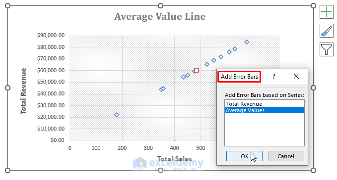
Step 8:
The Format Error Bars side window appears.
- Click Arrow beside Error Bar Options > Series “Average Values” X Error Bars (choose Series “Average Values” Y Error Bars if your desired values are on the X-Axis).
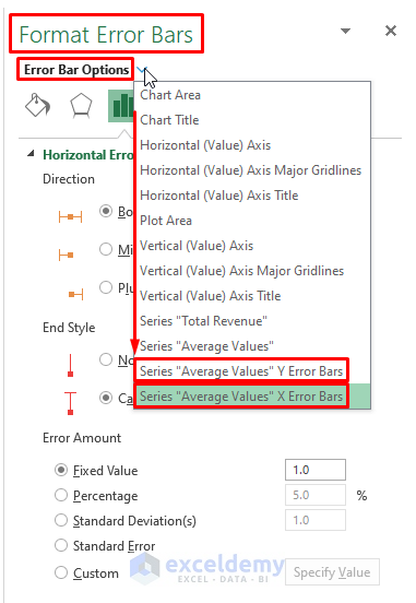
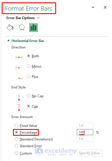
Step 9:
- In the Format Error Bars window, mark the Percentage under Error Amount.
- Enter 100 in the value box.
- Choose other options such as Direction, End Style, etc., as desired.
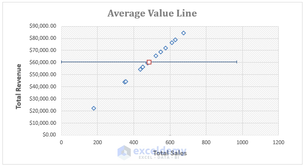
Excel inserts an Average Line as depicted below.
Read More: How to Add Data Labels to Scatter Plot in Excel
Method 3 – Using Two Points
We can insert a data source of two average points in the Chart and then connect them to make an average line. Finding the average points using the AVERAGE function is similar to the previous method. Just add an extra point by assigning the X-Axis values to 0 and the Y-Axis to the average.
Step 1:
- Repeat Steps 1 to 5 of Method 2 once.
The result is the two points needed to insert a line connecting them.
Step 2:
- Click on the Chart Plot area, and the side options appear.
- Click on the Plus Icon > Arrow beside the Trendline > More Options.
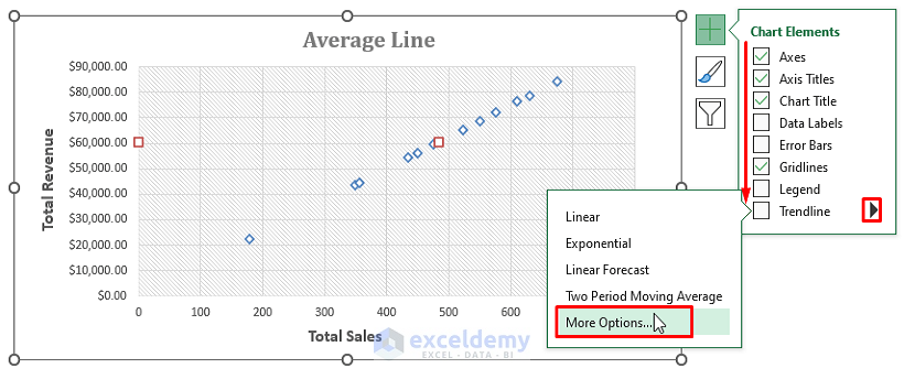
Step 3:
The Add Trendline window appears.
- In the window, click on Average Line Values > OK.
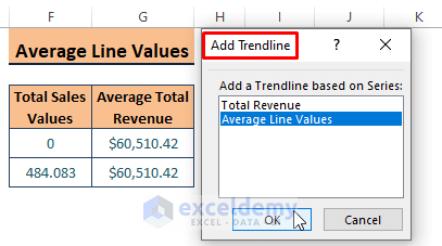
Step 4:
- The Format Trendline side window appears.
- In the window, mark Linear as Trendline Options.
For clarity purposes, the Linear Trendline option is selected from the Format Trendline side window; it can also be accessed from the Trendline options in the previous step.

Excel inserts an Average Line as shown in the below image.
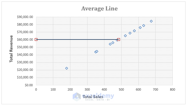
We can further extend the average line by inserting more points.
Download Excel Workbook
Related Articles
- How to Create Excel Scatter Plot Color by Group
- How to Flip Axis in Excel Scatter Plot
- How to Add Vertical Line to Scatter Plot in Excel
- How to Add Regression Line to Scatter Plot in Excel
<< Go Back To Edit Scatter Chart in Excel | Scatter Chart in Excel | Excel Charts | Learn Excel
Get FREE Advanced Excel Exercises with Solutions!
