Dataset Overview
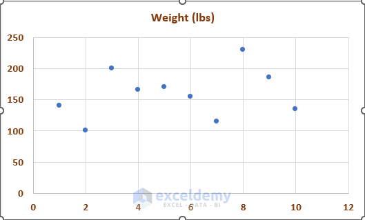
Suppose we have a Weight List of 10 individuals. We want to plot the Weight according to the Name of the individual in a Scatter Plot. Also, we want to add data labels to the chart to make it more understandable.

Method 1 – Using the Chart Elements Options
Create the Scatter Plot:
- First, select the cells in the B4:C14 range. These columns represent the Names and Weights (lbs) of the individuals.
- Go to the Insert tab and choose Insert Scatter (X, Y) or Bubble Chart > Scatter.

- The scatter plot will visualize our data table.
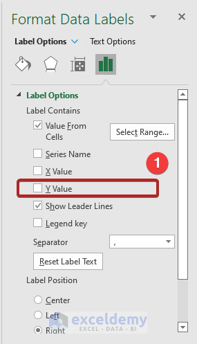
Add Data Labels:
- Switch to the Chart Design tab.
- Click Add Chart Element in the ribbon and select Data Labels from the drop-down list.
- Click More Data Label Options to open the Format Data Labels task pane.

- In the Label Options, check the box for Value From Cells.
- Select the cells in the B5:B14 range (containing individual names) as the data label range.
- Click OK.

- Uncheck the box for Y Value in the Label Options.
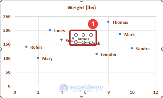
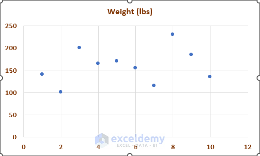
- Our Scatter Plot with data labels looks like the one below.

Fine-Tune Data Labels:
- To address partially unified labels, double-click the data label for James.
- In the Format Data Label task pane, set the Label Position to Above.
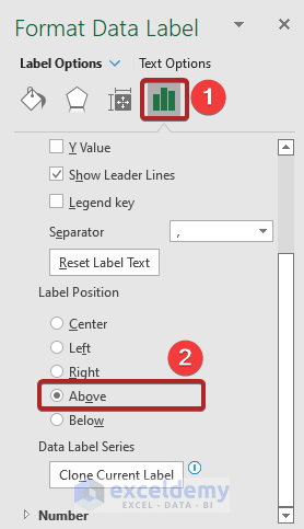
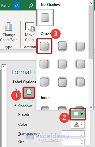
- For better visibility, select the James label again and go to Effects.

- Under the Shadow category, choose a shadow style.
Now your scatter plot with clear data labels is ready.

With the data range, our Scatter Plot with data labels looks like the one below.

Method 2 – Applying Excel VBA Code
Open the Visual Basic for Applications (VBA) Window:
- Right-click on the sheet name (VBA).
- Select View Code from the options.
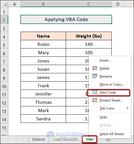
- The Microsoft Visual Basic for Applications window will open.
Insert a Code Module:
- Go to the Insert tab and select Module.
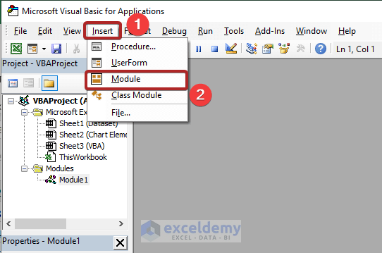
- This opens a code module where you can paste the following VBA code:
Sub AddDataLabels()
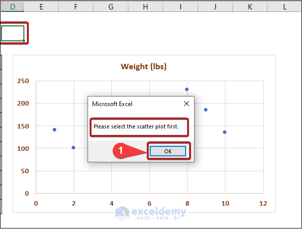
If Left(TypeName(Selection), 5) <> "Chart" Then
MsgBox "Please select the scatter plot first."
Exit Sub
End If
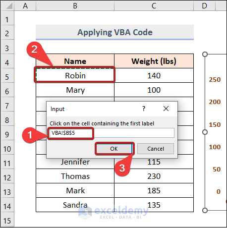
Set StartLabel = _
Application.InputBox("Click on the cell containing the first label", Type:=8)
Application.ScreenUpdating = False
For Each pt In ActiveChart.SeriesCollection(1).Points
pt.ApplyDataLabels xlDataLabelsShowValue
pt.DataLabel.Caption = StartLabel.Value
Set StartLabel = StartLabel.Offset(1)
Next
End Sub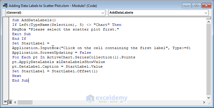
Explanation of VBA Code:
- The AddDataLabels macro checks if a scatter plot is selected. If not, it displays a message.
- An input box prompts you to select the cell containing the first label.
- The code applies data labels to each point in the scatter plot, using the values from the specified range.
- Save the workbook in Macro-Enabled format.

Run the Macro:
- Go to the Developer tab.
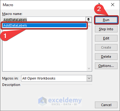
- Select Macros from the ribbon.
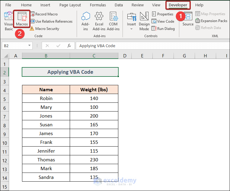
- Choose the AddDataLabels macro and click Run.
- If you encounter an error (e.g., Please select the scatter plot first), ensure you’ve selected the chart before running the macro.
- Specify cell B5 as the reference for the first label.
- Click OK.
Scatter Plot with Data Labels:
- Your scatter plot should now display data labels.

How to Remove Data Labels in Excel
In case you need to remove data labels:
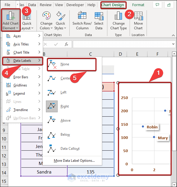
Method 1 – Using Add Chart Element
- Go to the Chart Elements sheet.
- Select the scatter plot.
- Navigate to the Chart Design tab.
- Choose Add Chart Element, select Data Labels and click on None.
Method 2 – Pressing the Delete Key
- Click once to select all data labels in a data series.
- Double-click to select a specific label.
- Press the DELETE key to remove data labels.
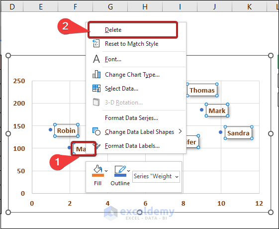
Method 3 – Using the Delete Option
- Go to the Chart Elements sheet.
- Right-click on any data label.
- Select Delete.
Read More: How to Add Line to Scatter Plot in Excel
Download Practice Workbook
You can download the practice workbook from here:
Related Articles
- How to Add Horizontal Line in Excel Scatter Plot
- How to Add Vertical Line to Scatter Plot in Excel
- How to Create Excel Scatter Plot Color by Group
- How to Flip Axis in Excel Scatter Plot
- How to Add Regression Line to Scatter Plot in Excel
- How to Add Average Line to Scatter Plot in Excel
<< Go Back To Edit Scatter Chart in Excel | Scatter Chart in Excel | Excel Charts | Learn Excel
Get FREE Advanced Excel Exercises with Solutions!
