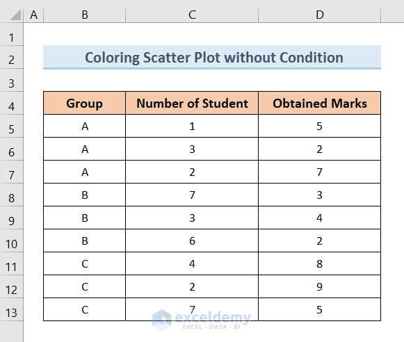
Method 1 – Create an Excel Scatter Plot Color by Group without Condition
We will create three groups (A, B, and C) using the Number of Students and their Obtained Marks and create an Excel scatter plot from them.
Steps:
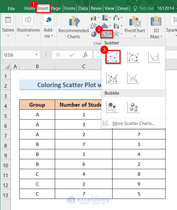
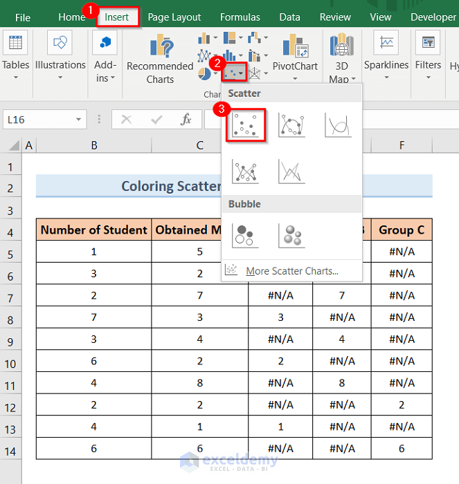
- Click on the Insert tab.
- Click on the Scatter Plot drop-down option.
- Choose the following Scatter plot option like the picture below.
- This will open an empty plot like the following picture.

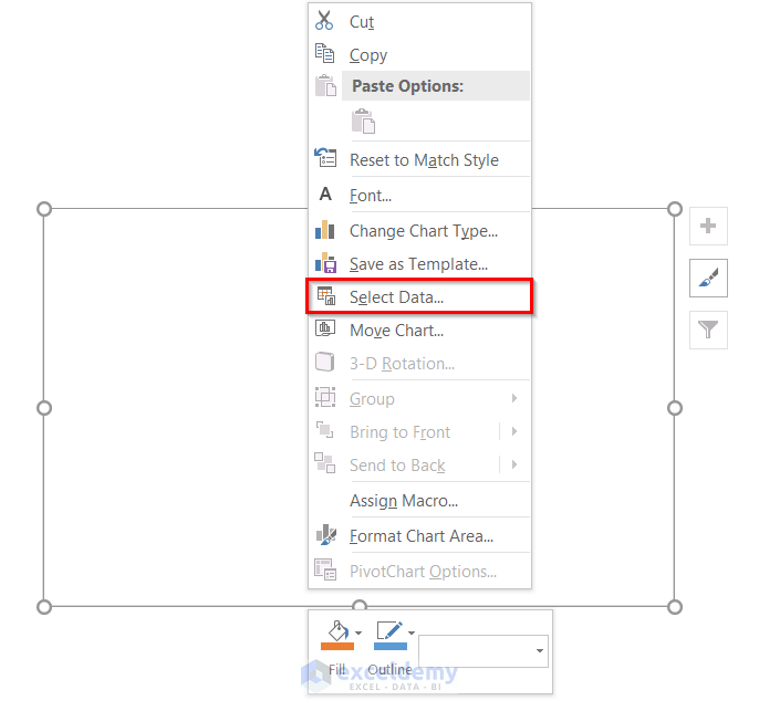
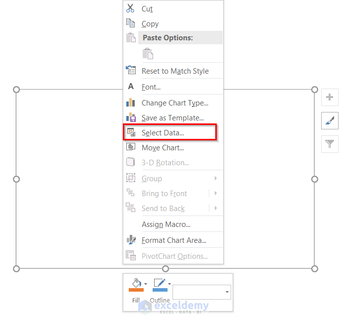
- Right-click on the empty plot.
- Click on the Select Data Source option from the pop-up window.
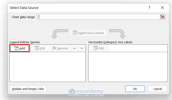
- The Select Data Source window will pop up.
- Click on the Add option like the picture below.
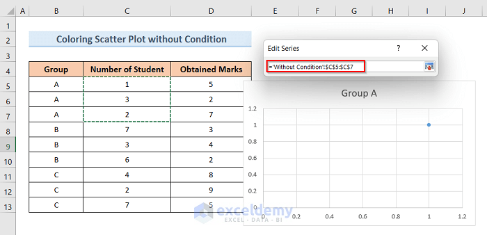
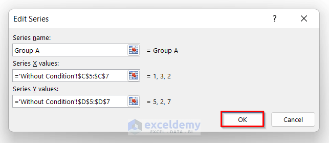
- Type the Series name as Group A.
- Click on the Select Range from the Series X values option.
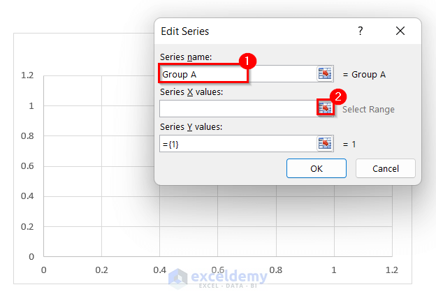
- Select the range of the number of student values from Group A and complete the range.
- Click on the Select Range in the Series Y values option like the picture below.
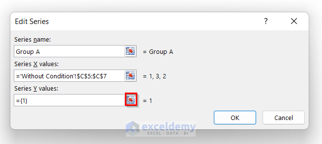
- Select the range of obtained marks from Group A and complete the range.
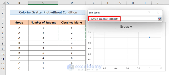
- After selecting the X and Y values, click OK.
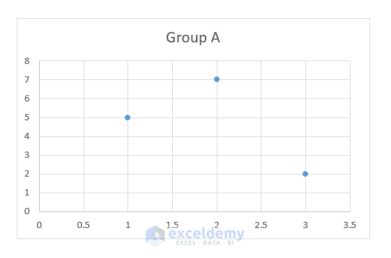
- This will create a plot of a particular color for Group A like below.
- Do the same for Group B and Group C values with their range of data.
- Click OK.
- This will create an Excel scatter plot with different colors for different groups like the picture below.
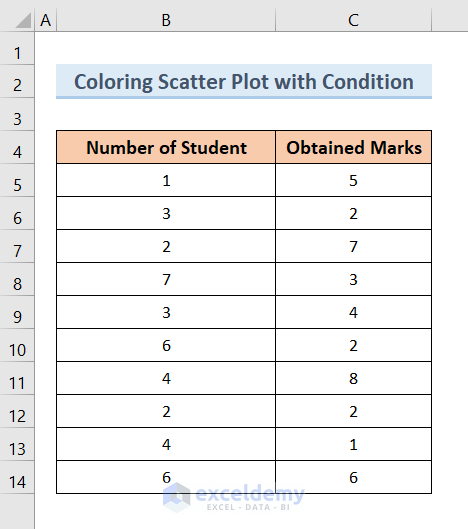
Method 2 – Apply a Condition to Make an Excel Scatter Plot Color by Group
We will need a dataset like the below image. The dataset contains the Number of Students and their Obtained Marks.
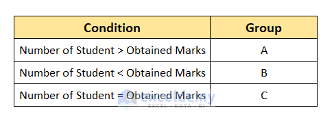
The Conditions we will use are given in the picture below.
Steps:
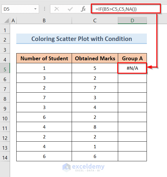
- Create a new column named Group A.
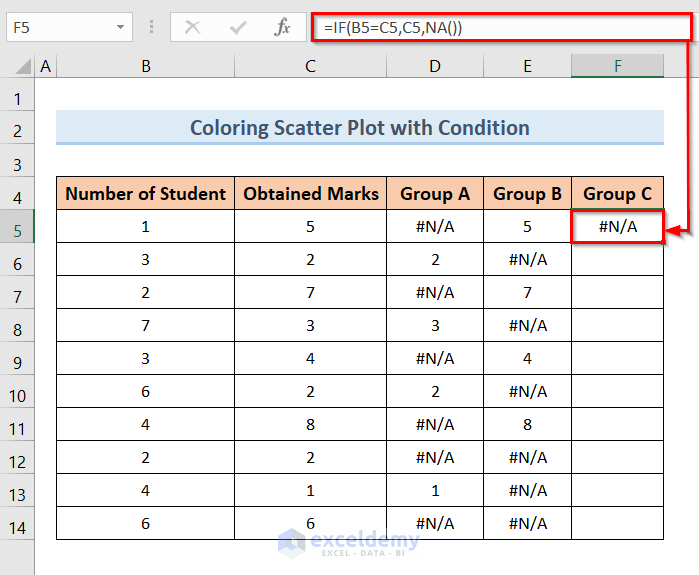
- Click on the D5 cell and insert this formula:
=IF(B5>C5,C5,NA())- Press Enter.
- Click on the D5 cell and drag the Fill Handle from cell D5 to D14.
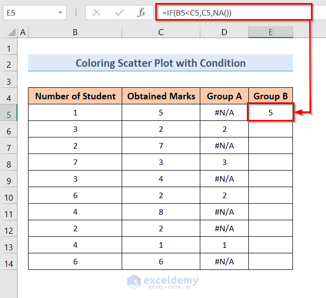
- Create a new column named Group B.
- Click on the E5 cell and insert the formula:
=IF(B5<C5,C5,NA())- Press Enter.
- Click on the E5 cell and drag the Fill Handle from cell E5 to E14 cell.
- Create a new column named Group C.
- Click on the F5 cell and insert the formula:
=IF(B5=C5,C5,NA())- Press Enter.
- Click on the F5 cell and drag the Fill Handle from F5 to F14 cell.
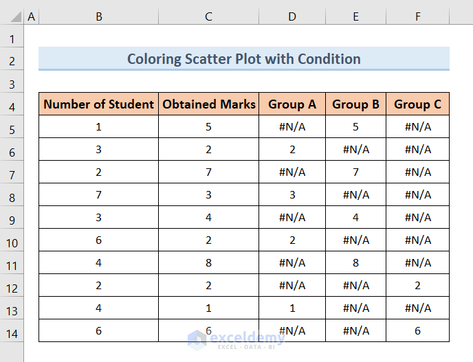
- The table is ready to be plotted in the scatter plot.
- Click on the Insert option.
- Click on the Scatter Plot downfall option.
- Choose the following Scatterplot option like the picture below.
- This will open an empty plot like the following picture.

- Right-click on the empty plot.
- Click on the Select Data Source option from the pop-up window.
- The Select Data Source window will pop up.
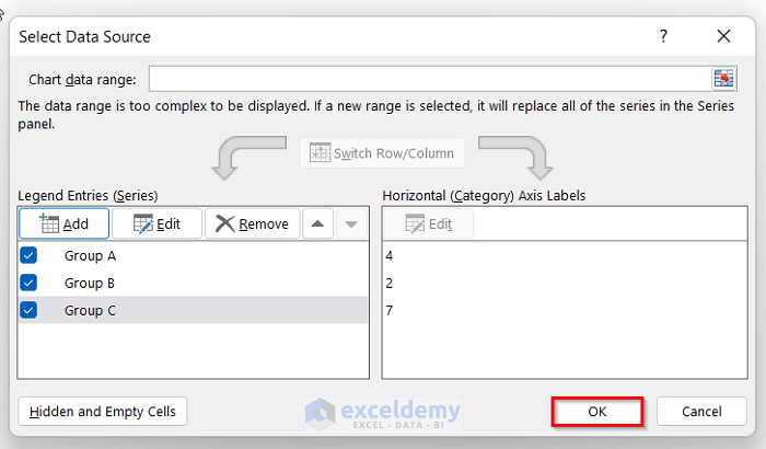
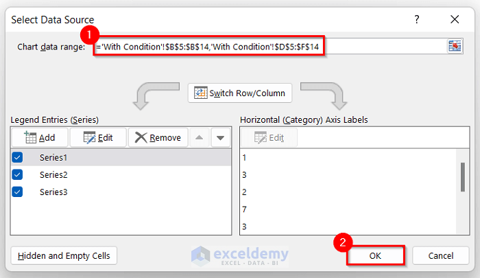
- Click on the Chart Data Range option and select $B$5:$B$14 and $D$5:$F$14 while pressing Ctrl.
- Click OK.
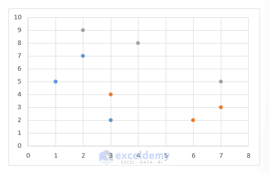
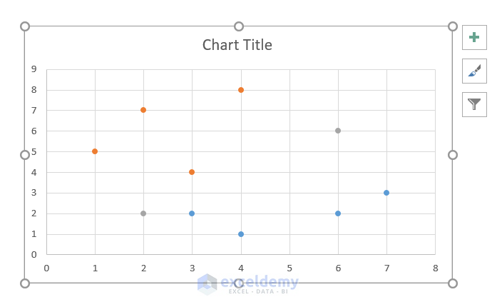
- This will create an Excel scatter plot for the three groups by individual colors like the picture below.
Method 3 – Group a Scatter Plot by Color Using VBA Code
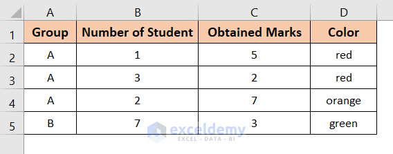
We have a dataset like the below image.
Steps:
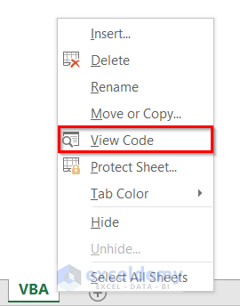
- Right-click on the worksheet name.
- Click on the View Code option like the picture.
- The Microsoft Visual Basic for Applications module will open.
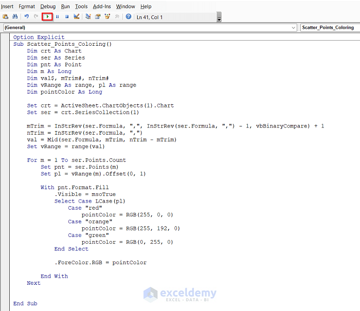
- Insert the following code:
Option Explicit
Sub Scatter_Points_Coloring()
Dim crt As Chart
Dim ser As Series
Dim pnt As Point
Dim m As Long
Dim val$, mTrim#, nTrim#
Dim vRange As range, pl As range
Dim pointColor As Long
Set crt = ActiveSheet.ChartObjects(1).Chart
Set ser = crt.SeriesCollection(1)
mTrim = InStrRev(ser.Formula, ",", InStrRev(ser.Formula, ",") - 1, vbBinaryCompare) + 1
nTrim = InStrRev(ser.Formula, ",")
val = Mid(ser.Formula, mTrim, nTrim - mTrim)
Set vRange = range(val)
For m = 1 To ser.Points.Count
Set pnt = ser.Points(m)
Set pl = vRange(m).Offset(0, 1)
With pnt.Format.Fill
.Visible = msoTrue
Select Case LCase(pl)
Case "red"
pointColor = RGB(255, 0, 0)
Case "orange"
pointColor = RGB(255, 192, 0)
Case "green"
pointColor = RGB(0, 255, 0)
End Select
.ForeColor.RGB = pointColor
End With
Next
End Sub- Run the code and close the window to see the results.
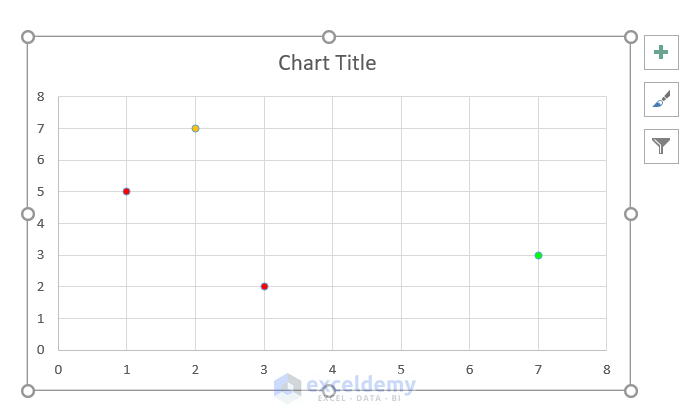
- This will create a formatted Excel scatter plot.
Download the Practice Workbook
Related Articles
- How to Add Horizontal Line in Excel Scatter Plot
- How to Add Vertical Line to Scatter Plot in Excel
- How to Add Regression Line to Scatter Plot in Excel
- How to Add Data Labels to Scatter Plot in Excel
- How to Flip Axis in Excel Scatter Plot
<< Go Back To Edit Scatter Chart in Excel | Scatter Chart in Excel | Excel Charts | Learn Excel
Get FREE Advanced Excel Exercises with Solutions!
