We will use this sample dataset to plot a Scatter Chart.
Step 1 – Insert Scatter Plot
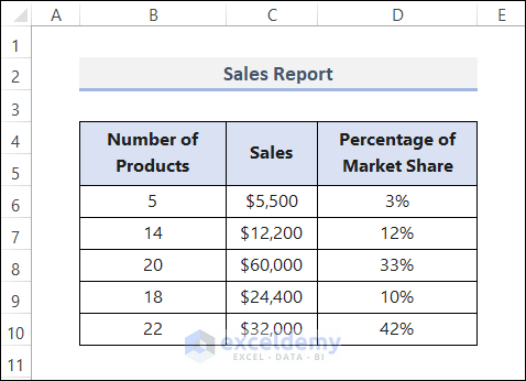
- Select cells in the B4:C10
- Go to the Insert
- Select Insert Scatter (X, Y) or Bubble Chart> Scatter Chart.
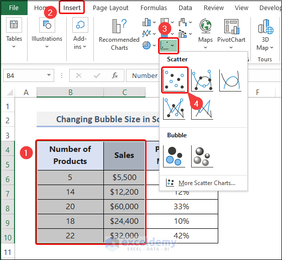
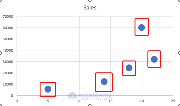
- It creates a Scatter Plot as shown.
Step 2 – Use Marker Options
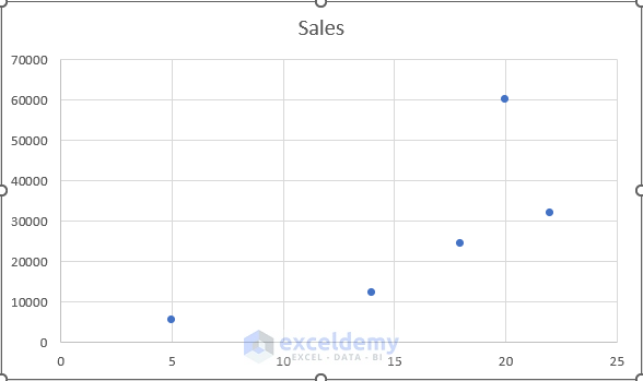
- Double-click on any marker.
- The Format Data Series task pane opens.
- Click on the Fill & Line icon.
- Select the Marker section.
- Expand the Marker Options menu.
- Choose Built-in from the options and set the Size to 15.
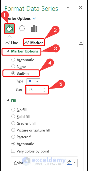
- Return to the chart. The size of the markers is changed.
Step 3 – Add Axis Titles
- Go to the Chart Design
- Select Add Chart Element from the ribbon.
- From the drop-down list, select Axis Titles> Primary Horizontal.
- Add the Primary Vertical title.
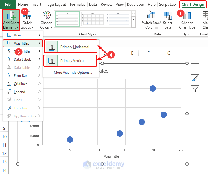
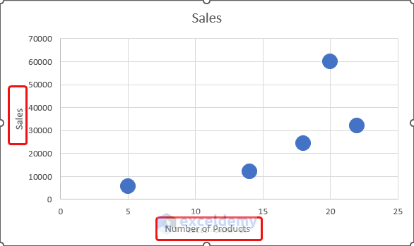
- Edit and give suitable Axis Titles relevant to the dataset.
Step 4 – Add Chart Title
- Add Chart Title to the chart.
- Go to the Chart Design
- Select Add Chart Element from the ribbon.
- From the drop-down list, select Chart Title> Above Chart.
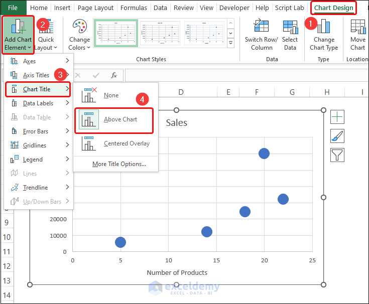
- Edit and give a suitable Chart Title relevant to the dataset.

Method 1 – Scaling Bubble Size to Change Bubble Size in Scatter Plot in Excel
Steps:
- Select cells in the B6:D10
- Go to the Insert
- Select Insert Scatter (X, Y) or Bubble Chart> Bubble.
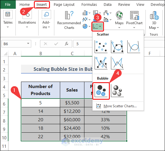
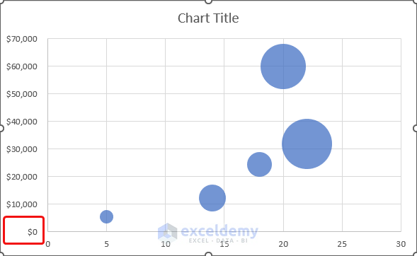
- This opens a Bubble Chart beside the dataset.
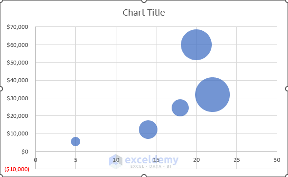
In the chart above, there is a negative value in the vertical axis that we don’t need. To remove it:
- Double-click on the vertical axis.
- The Format Axis task pane is visible now.
- Click on the Axis Options.
- Set 0 as the Minimum value in the Bound.
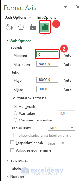
- The Bubble Chart now looks as shown.
The negative part is no longer visible.
- Double-click on any data point.
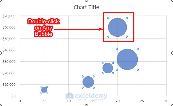
- This opens the Format Data Series task pane.
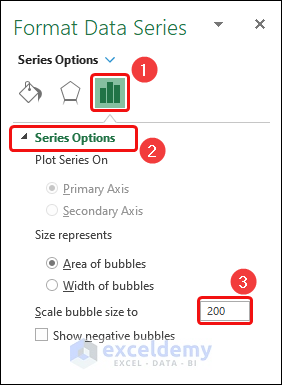
- Click on the Series Options
- Expand the Series Options
- Insert 200 in the box of Scale bubble size to.
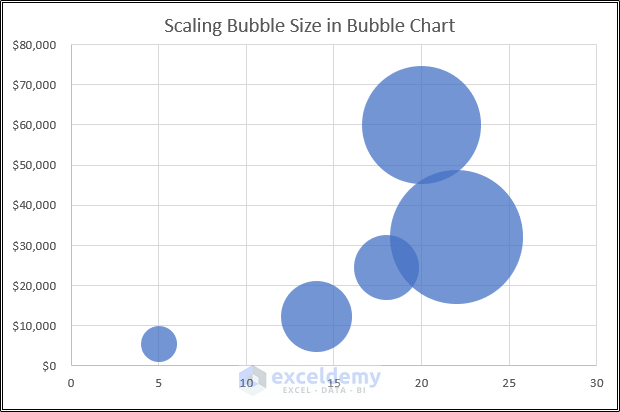
- The bubble of this chart is bigger.
Method 2 – Adding a New Series to Change Bubble Size in Scatter Plot in Excel
The example dataset below shows Region-wise Sales Report of two states: Texas and Florida. This report includes the Sales Quantity and Profit percentages for the corresponding Weeks.
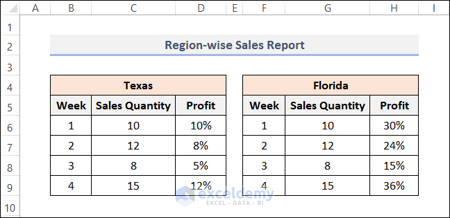
The Sales Quantity of each state the same. But the Profit in Florida is three times of Texas.
We will plot two different Bubble Charts from this dataset.
Steps:
- Insert the chart as shown in Method 1.
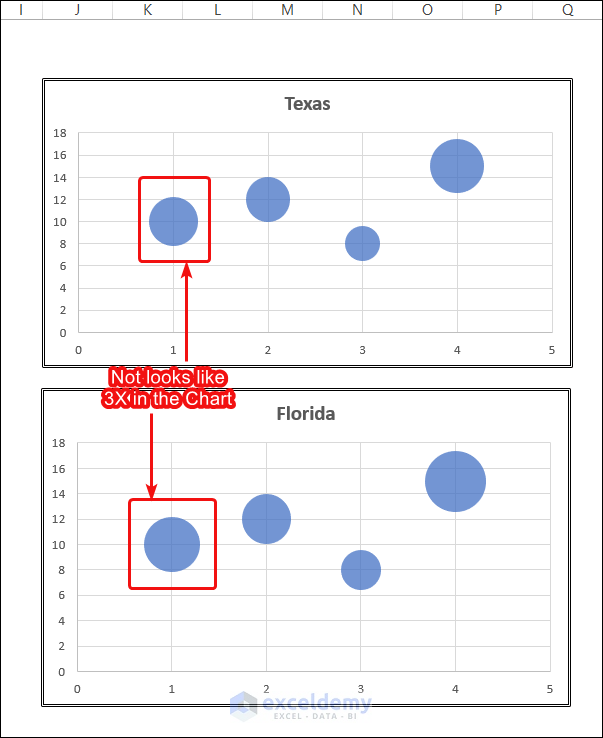
The above chart is not giving the right presentation of data.
- Add a new row of data in each table like the image below.
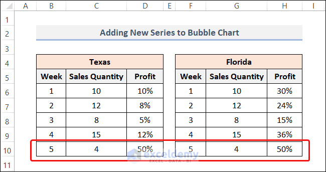
In row 10, we added the same values in each table.
- Right-click on the Bubble Chart.
- Select the Select Data.
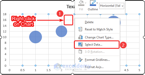
- It opens the Select Data Source dialog box.
- Click on the Add button in the Legend Entries (Series).
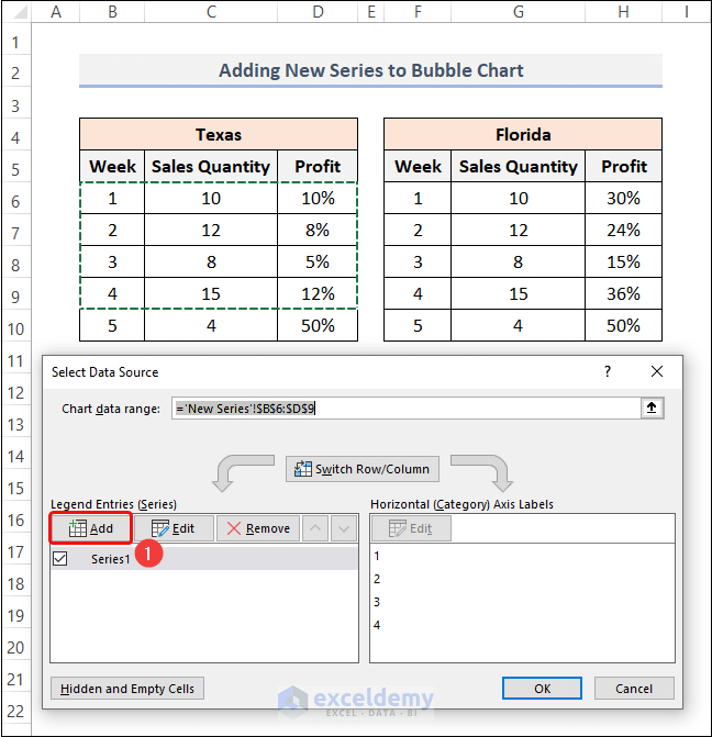
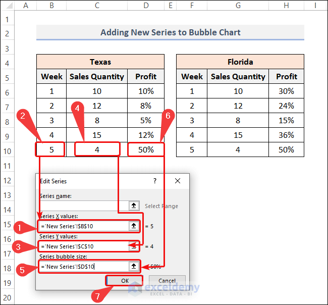
- The Edit Series dialog box opens.
- Select the relevant cells for the text boxes as shown in the image below.
- Click OK.
- A new series named Series 2 is added to the 1st Bubble Chart.
- Click OK.
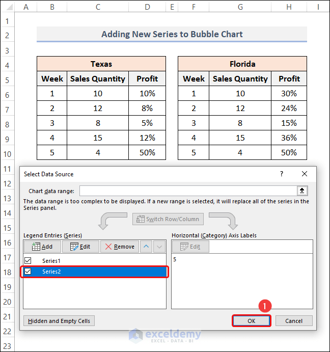
- Add a new series for the chart of Florida.
- The charts should look as shown in the below.
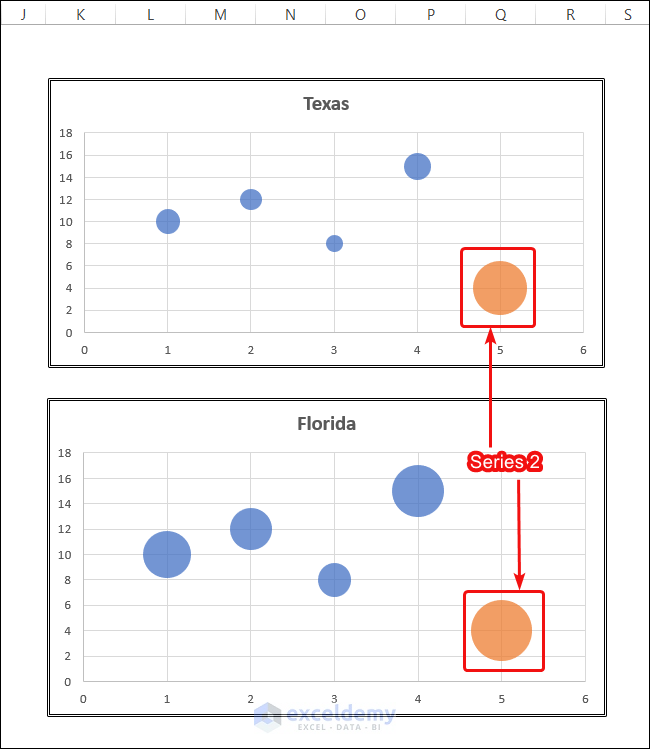
- Blue bubbles are for Series 1. They are of the main dataset. The proportion of the size of the bubble in these 2 charts is correct.
- Click on the orange bubble of chart 1.
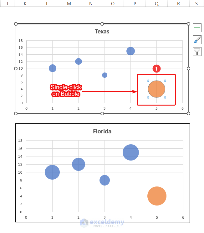
- The Format Data Series task pane now.
- Click on the Fill & Line.
- Choose No fill from the Fill.
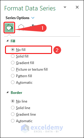
- Follow the same steps for the orange bubble of the 2nd chart.
- The charts look as shown in the image below.
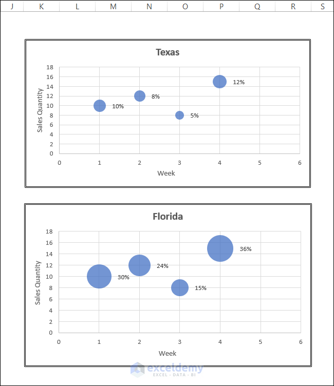
Tbe bubbles are perfectly proportional according to the two different graphs.
Download Practice Workbook
Related Article
<< Go Back To Edit Scatter Chart in Excel | Scatter Chart in Excel | Excel Charts | Learn Excel
Get FREE Advanced Excel Exercises with Solutions!
