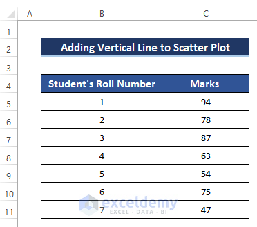
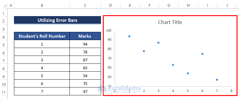
This is the sample dataset.
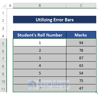
Method 1 – Using Error Bars to Add a Vertical Line to a Scatter Plot in Excel
Steps
- Select B5:C11.
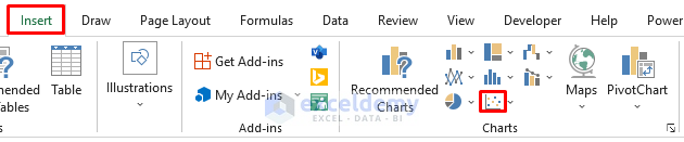
- Go to the Insert tab.
- In Charts, select Scatter Chart.
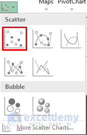
- Select the Scatter chart shown below:
The following chart is displayed:
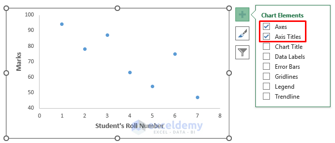
- To modify the chart, click the plus sign (Chart Elements).
- Add Axes and Axis Title to the chart:
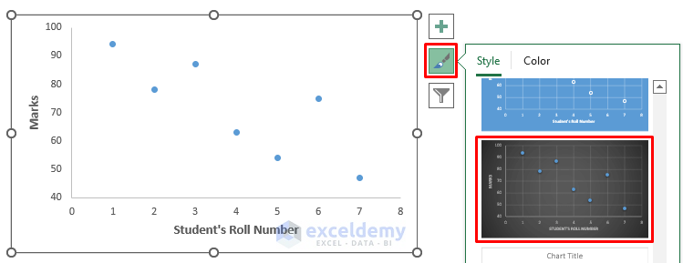
You can modify the Chart Style by clicking the Brush sign.
This is the output.

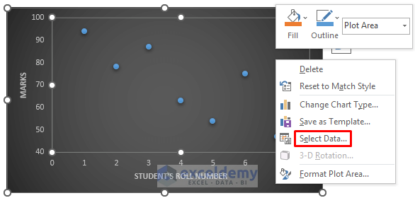
- Right-click the chart.
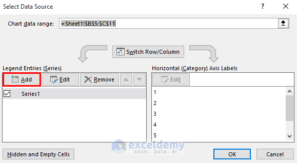
- Click Select Data.
- In the Select Source Data dialog box, in Legend Entries (Series), click Add.
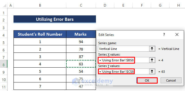
- In the Edit Series dialog box, set the Series name, Series X values, and Series Y values.
- Click OK.
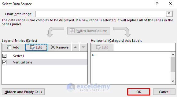
- In the Select Data Source dialog box, click OK.
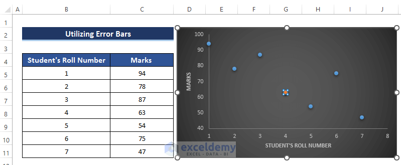
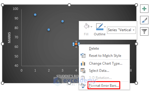
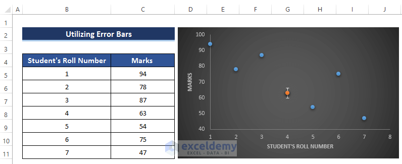
The point of the student whose roll number is 4 has a different color:

- Click that point.
- In Chart Design, select Chart Layouts.
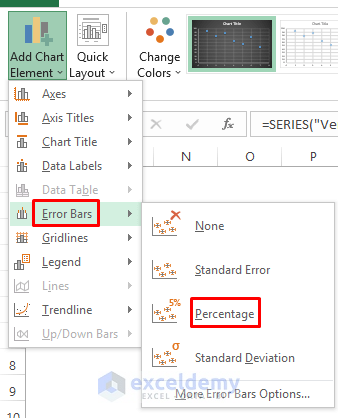
- Choose Add Chart Element .
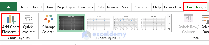
- Select Error Bars.
- Select Percentage.
Horizontal and vertical percentage lines will be created on the point.
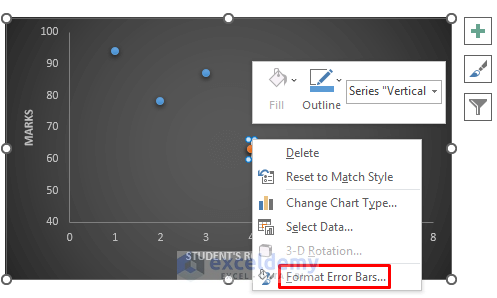
- Right-click the horizontal line.
- Select Format Error Bars.
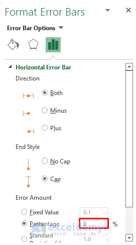
- In Error Amount, set the Percentage to 0.
The horizontal line is removed:
- Right-click the vertical line on the point.
- Select Format Error Bars.
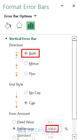
- In the Format Error Bars dialog box, in Vertical Error Bar, set the direction as Both (the error bar will show in both directions).
- In Error Amount, set the Percentage to 100.
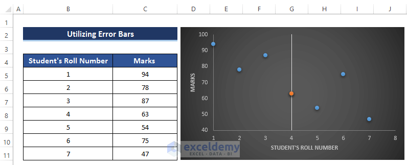
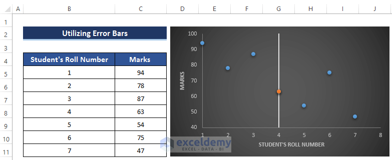
This is the output.
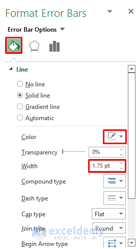
You can change the color and width of the vertical line in Format Error Bars:
- Go to Fill & Line.
- In Line, change the Color and Width.
This is the final output.
Read More: How to Add Line to Scatter Plot in Excel
Method 2 – Adding a Vertical Line to a Scatter Plot Using Excel Shapes
Steps
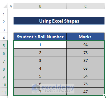
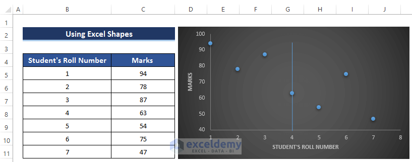
- Select B5:C11.
- Go to the Insert tab.
- In Charts, select Scatter Chart.
- Select the first Scatter chart.
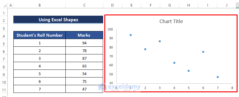
The following chart is displayed:
- To modify the chart, click the plus sign (Chart Elements).
- Add Axes and Axis Title.
You can modify the Chart Style clicking the Brush sign.
This is the output.
- Go to the Insert tab and select Illustrations.
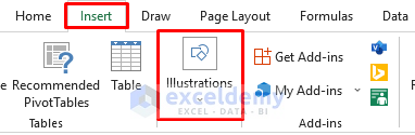
- Select Shapes.
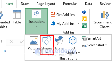
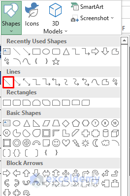
- Choose the first Line in Lines.
- The mouse cursor will change. Click a point to add the vertical line.
- To keep the line straight, press Shift.
The line will be displayed in the chart.
- Click the line.
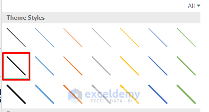
- In Shape Format, select Shape Styles.
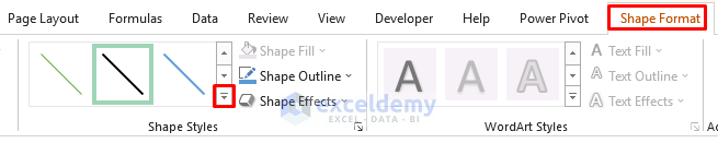
- In Theme Styles, select a theme.
The vertical line is displayed:

Read More: How to Create Excel Scatter Plot Color by Group
Download Practice Workbook
Download the practice workbook.
Related Articles
- How to Add Average Line to Scatter Plot in Excel
- How to Add Regression Line to Scatter Plot in Excel
- How to Add Data Labels to Scatter Plot in Excel
- How to Flip Axis in Excel Scatter Plot
<< Go Back To Edit Scatter Chart in Excel | Scatter Chart in Excel | Excel Charts | Learn Excel
Get FREE Advanced Excel Exercises with Solutions!
