Before making a chart with the variables from the spreadsheet, you may need to arrange them. This is comparable to the process of making a scatter plot. The independent variable is expected to be on the left and the dependent variable on the right. In this article, we will show two simple methods to flip the axis in an Excel scatter plot.
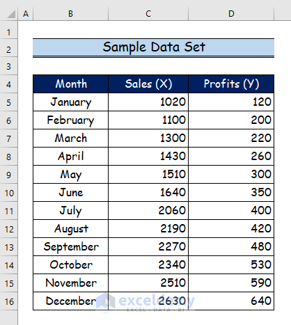
When you alter the axis selection, you have additional flexibility in changing the chart axis. Additionally, you can maintain the data on your sheet by doing it this way. Thus, these are two simple techniques for altering the axis in Excel charts. We arrange the data in the provided data set such that we can change the X and Y axis in Excel. Here, we’ll demonstrate how to use Editing Data Series and VBA code to flip the axis in an Excel scatter plot. Let’s suppose we have a sample date set.
1. Editing Data Series to Flip Axis in Excel Scatter Plot
Here, we’ll first make a scatter chart before flipping Excel’s X and Y axes. Two quantitative variables are related in a scatter graph. Then, you enter two sets of numerical data into two distinct columns. The stages after that are listed below.
Step 1:
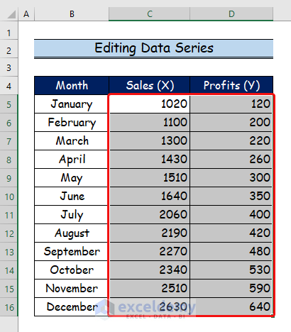
- Here, we’ll start by choosing the Sales and Profits columns.
Step 2:
- Firstly go to the Insert tab.
- Secondly, choose the Scatter Charts option.

Step 3:
- Now, select the desired option from the Scatter Charts.
- Then, we will select the first option, which we have marked with a red color rectangle.

Step 4:
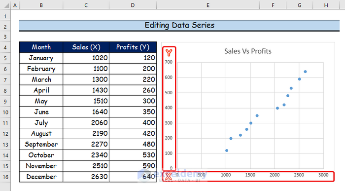
- Finally, the scatter graph will display the indicated result where the X and Y axis represents the Sales and Profits values respectively..
Step 5:
- Now, Right-click on the scatter graph to flip the axis.
- Then, choose the Select Data option by clicking on it.

Step 6:
- Now, click on the Edit option.
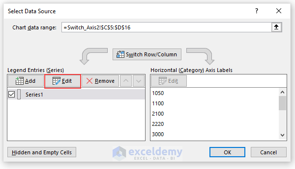
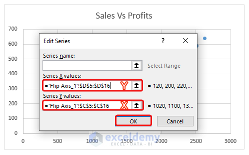
Step 7:
- In this step, put the X values in the Y Series and Y values in the X Series.
- Then, click OK.
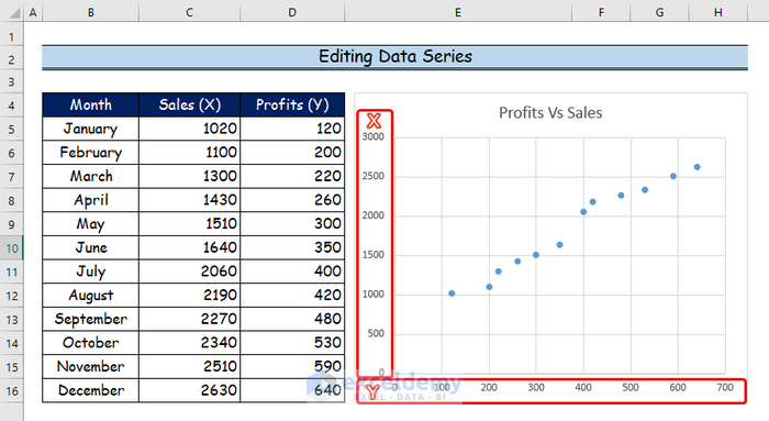
Step 8:
- Finally, the scatter graph will finally show the indicated outcome, with the X and Y axes denoting the respective Profits and Sales values.
- As a result, you will see here that the X and Y axes have been flipped.
2. Applying Excel VBA Code to Flip Axis in Scatter Plot
VBA is a programming language that may be used for various tasks, and different types of users can use it for those tasks. You can launch the VBA editor using the Alt + F11 keyboard shortcut. In the last section, we will generate a VBA code that makes it easy to flip the axis in an Excel scatter plot.
Step 1:
- Firstly, we will open the Developer tab.
- Then, we will select the Visual Basic command.

Step 2:
- Here, the Visual Basic window will open.
- After that, from the Insert option, we will choose the new Module to write a VBA code.

Step 3:
- Now, paste the following VBA code into the Module.
- Besides, to run the program, click the “Run” button or press F5.
Sub Flip_Axis()
'Declaring variables
Dim srs As Series
'Setting range in active sheet
Set Rng = ActiveSheet.Range("C5:D16")
'Using this statement to modify the chart
With ActiveSheet.ChartObjects.Add(Left:=Rng.Left, Width:=Rng.Width, Top:=Rng.Top, Height:=Rng.Height)
'Using the ScatterPlot chart
Chart.ChartType = xlXYScatterLines
'Selecting the range of data source
.Chart.SetSourceData Source:=Range("C5:C16,D5:D16")
Set srs = .Chart.SeriesCollection.NewSeries
'Specifying the series name
srs.Name = "Sales Vs Profits"
'Interchanging the X and Y axis value using range
srs.XValues = Range("D5:D16")
srs.Values = Range("C5:C16")
End With
End Sub 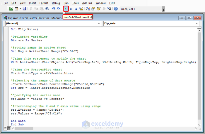
VBA Code Breakdown
- Firstly, we specify a name for the subject as Sub Flip_Axis().
- Secondly, we declare a variable as Dim srs As Series.
- Thirdly, we will set the range of our active sheet as Set Rng = ActiveSheet.Range(“C5:D16”).
- Now, we will modify our scatter graph using this statement as With ChartObjects.Add(Left:=Rng.Left, Width:=Rng.Width, Top:=Rng.Top, Height:=Rng.Height).
- And, we apply the scatter plot chart type as ChartType = xlXYScatterLines.
- Then, we choose the set data source using range as .Chart.SetSourceData Source:=Range(“C5:C16,D5:D16”).
- Besides, we specify the series name as Name = “Sales Vs Profits”.
- Finally, we will flip the X and Y axis using range as XValues = Range(“D5:D16”) and srs.Values = Range(“C5:C16”).
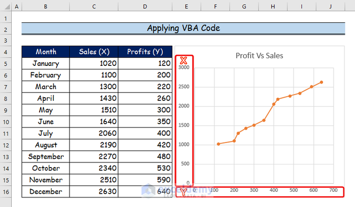
Step 4:
- The X and Y axes have been flipped below after the VBA code has been executed.
Download Practice Workbook
You may download the following Excel workbook for better understanding and practice it by yourself.
Conclusion
In this article, I’ve covered 2 handy methods to flip axis in Excel scatter plot. I sincerely hope you enjoyed and learned a lot from this article. Additionally, if you want to read more articles on Excel, you may visit our website, Exceldemy. If you have any questions, comments, or recommendations, kindly leave them in the comment section below.
Related Articles
- How to Add Horizontal Line in Excel Scatter Plot
- How to Add Vertical Line to Scatter Plot in Excel
- How to Add Average Line to Scatter Plot in Excel
- How to Add Regression Line to Scatter Plot in Excel
- How to Add Data Labels to Scatter Plot in Excel
- How to Create Excel Scatter Plot Color by Group
<< Go Back To Edit Scatter Chart in Excel | Scatter Chart in Excel | Excel Charts | Learn Excel
Get FREE Advanced Excel Exercises with Solutions!
