In this tutorial, I am going to share with you 3 practical examples of how to add lines to an Excel scatter plot. Lines may be needed to show a threshold or limit within your data, and are very useful in statistical analysis. Using lines properly can be very helpful in representing data.
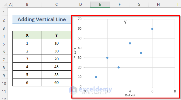
To begin with, generate a scatter plot with the data set provided below. Once you have your scatter plot ready, you’ll be ready to follow along.
Example 1 – Add a Vertical Line to the Scatter Plot
Let’s add a vertical line to the following data set, which has an X column and a Y column.
Steps:
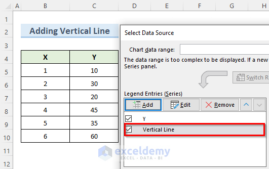
- Right-click on the scatter chart and click on Select Data.
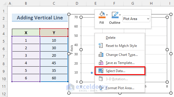
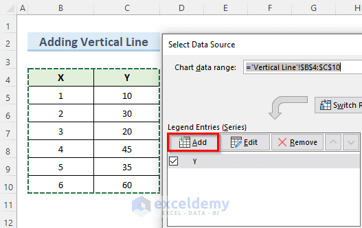
- In the Select Data Source window, click on Add.
- In the Edit Series window, set Vertical Line as the Series name.
- Select cell B8 as Series X values and cell C8 as Series Y values.
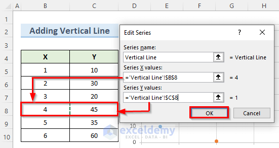
- Press OK and this will generate a new data point called Vertical Line.
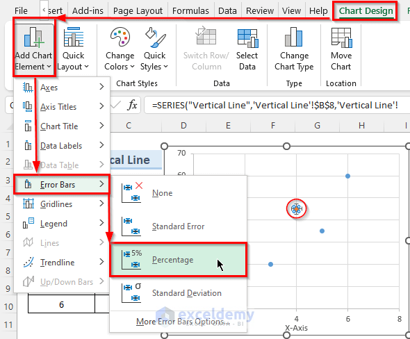
- Keeping the orange data point selected, go to Chart Design > Add Chart Element > Error Bars > Percentage.
A horizontal and a vertical line appear around the selected data point.
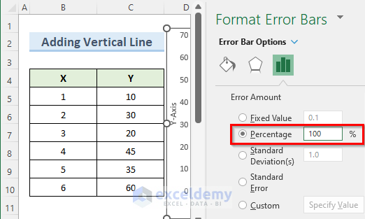
- Right-click on the horizontal line and select Format Error Bars.
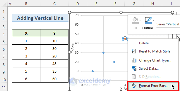
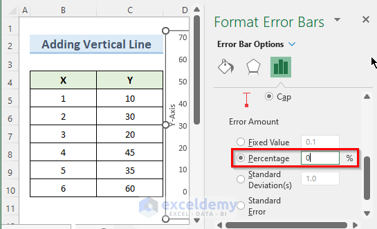
- In the new window on the right side, set the horizontal line Percentage value to 0.
- As before, right-click on the vertical line of the orange point.
- In the Format Error Bars window, set the direction to Minus.
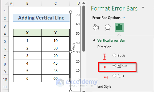
- In the Error Amount option, set the Percentage value to 100%.
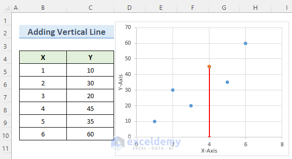
You now have a vertical line through your desired data point.
Example 2 – Add a Horizontal Line to the Scatter Plot
The first few steps of this method are exactly the same as the previous method. This time we will add a horizontal line to the scatter plot, again using the Error Bars option. We’ll also format the line to make it more visible.
Steps:
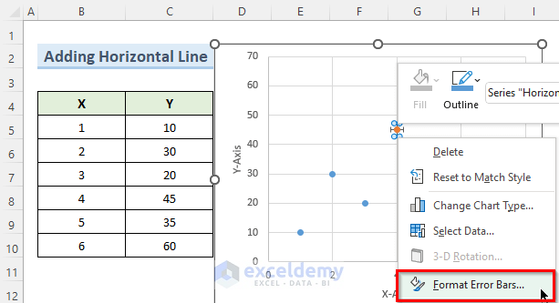
- Just as we did previously, right-click on the vertical line and select Format Error Bars.
- Again, set the Percentage value to 0 and press Enter.
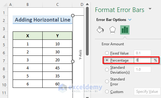
- Right-click on the horizontal line and go to Format Error Bars.
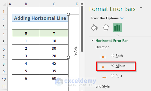
- Set the direction to Minus.
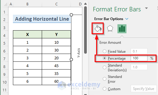
- Set the Percentage value to 100%.
- Go to the Fill and Line options.
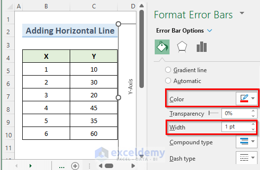
- Set the color to Red and the width to 1 pt.
You now have a formatted horizontal line.
Read More: How to Add Average Line to Scatter Plot in Excel
Example 3 – Adding a Slope Line to the Scatter Plot
In the previous two methods, we used only one point from our dataset to add a line to the scatter plot. Now, we are going to use two points to add a sloping line. The slope lines are very important for regression analysis.
Steps:
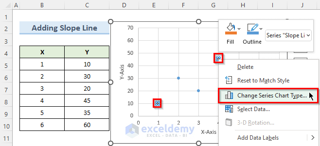
- Right-click on the scatter plot and choose Select Data.
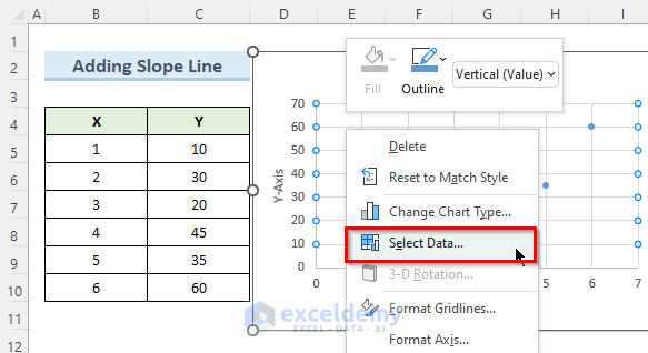
- In the new Select Data Source window, click on Add.
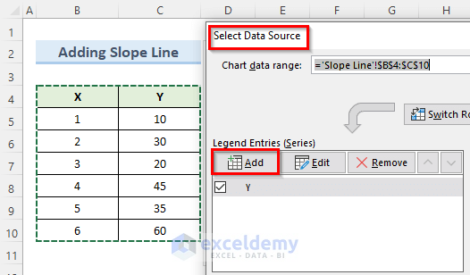
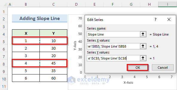
- In the Edit Series window, enter the series name Slope Line.
- For the series X values, hold Ctrl and select cells B5 and B8.
- For series Y values, hold Ctrl and select cells C5 and C8.
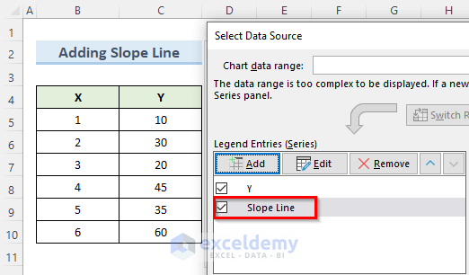
- Simply press OK.
Now we have a new data point named Slope Line.
- Select the two data points and right-click.
- Select Change Series Chart Type.
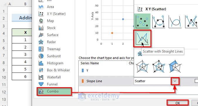
- In the new window that opens, go to the Combo option.
- Click the dropdown arrow beside the Slope Line option.
- From the dropdown options, select the icon with the name Scatter with Straight Lines.
- Press OK.
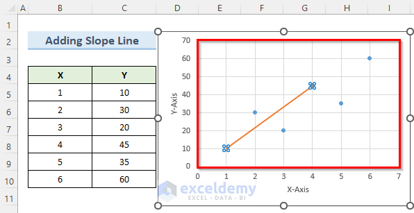
A slope line through the selected data points will be added.
Read More: How to Add Data Labels to Scatter Plots in Excel
Download Practice Workbook
Related Articles
<< Go Back To Edit Scatter Chart in Excel | Scatter Chart in Excel | Excel Charts | Learn Excel
Get FREE Advanced Excel Exercises with Solutions!
