If you are looking for how to add a regression line to scatter plot in Excel, then you are in the right place. In statistics, a regression line is a line that best describes the behavior of a set of data. In other words, it’s a line that best fits the trends of a given data. The purpose of this line is to describe the interrelation between a dependent variable and an independent variable. In this article, we’ll try to discuss how to add a regression line to a scatter plot in Excel.
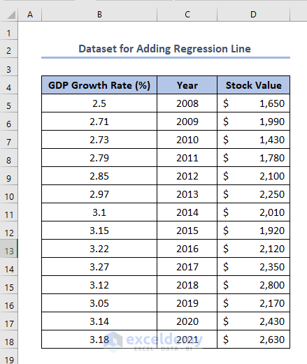
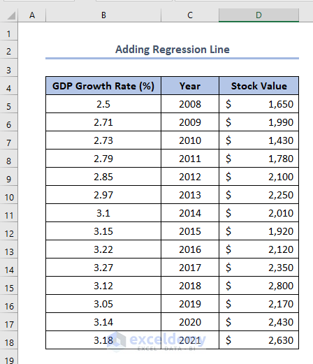
But eventually, here we’ll try to add a regression line to the scatter plot. Firstly, to do this, we have made a dataset named Dataset for Adding Regression Line. The dataset has GDP Growth Rate (%), Year, and Stock Value in USD In Columns B, C, and D respectively of one of the arbitrary regions of California state. The dataset is like this.
Step 1: Creating a Scatter Plot to Add a Regression Line in Excel
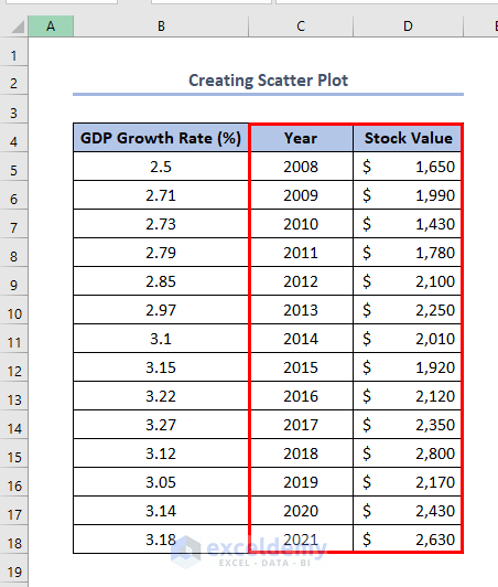
In a scatter plot we can add various types of lines like a vertical line, horizontal line, or line with a slopeHere, we’ll try to add a regression line relating Year with Stock Value. To do this our first step is to create a scatter plot according to the dataset. We’ll use Columns C and D to do this.
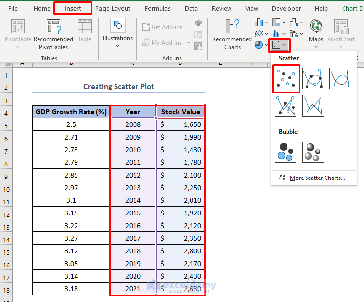
After selecting those columns, go to the Insert Tab > Scatter Dropdown > select the first option according to the picture below.
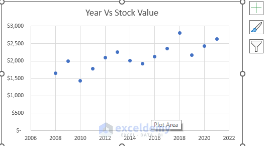
Then, we’ll have the scatter plot like this.
Read More: How to Add Line to Scatter Plot in Excel
Step 2: Adding a Regression Line
In this step, we’ll use the following dataset to add a regression line to the scatter plot.
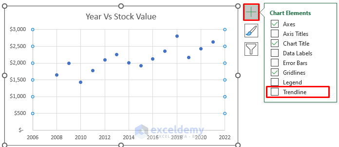
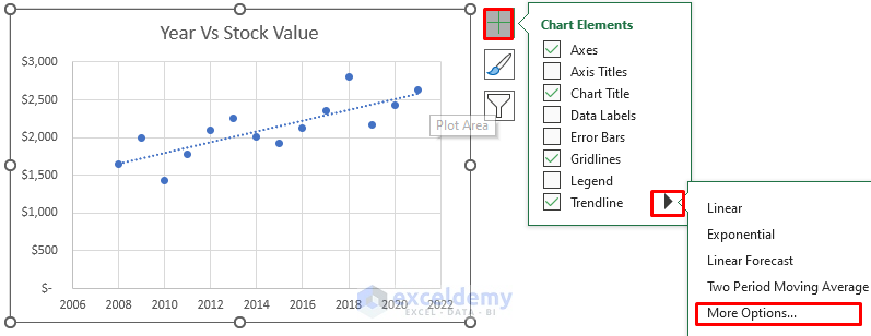
After finishing the first step, here, firstly, we’ll select the chart > click on the Chart Elements icon > select Trendline option and put tick mark.
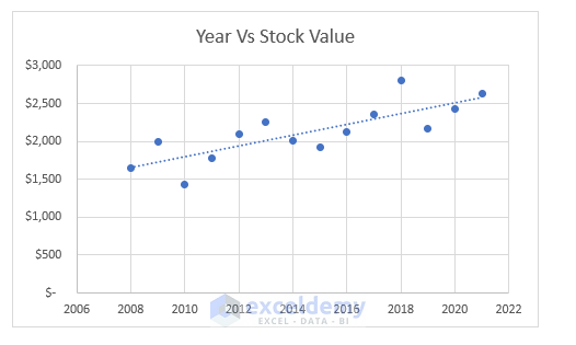
Secondly, we’ll have our regression line like this.
Step 3: Adding a Regression Line Equation and then Forecasting for Any Values
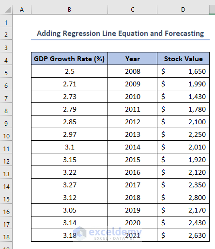
In this step, we’ll add a regression line equation and add a forecast in the scatter plot using the following dataset of Adding Regression Line Equation and Forecasting.
After finishing the second step, here, firstly, we’ll select the arrow mark in the Trendline option shown below.
Secondly, select More Options.
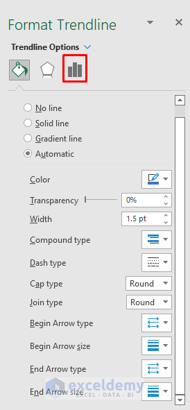
A Format Trendline window will appear like the picture below.
Thirdly, select the icon shown below.
As a result, the Trendline Options will be visible now.
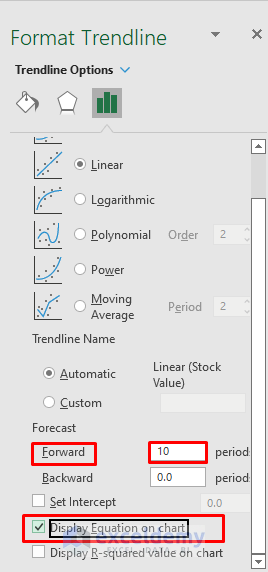
To add a regression line equation between those two variables, select and tick the Display Equation on Chart option like the picture below.
Suppose, we want to assume the stock amount of 10 years later i.e. we want to forecast.
To do this, put 10 in the Forward option of the Forecast bar.
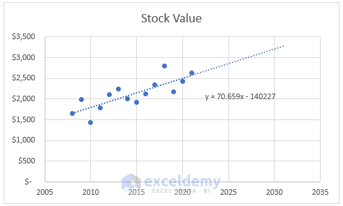
Finally, we’ll have an equation like this.
y = 70.659x - 140227This equation is in the form of.
y = mx + cWhere,
m = slope of the equation which is here 70.659
c = constant which is here -140227
We can find any Stock Amount which is y by putting only the Year which is x in this equation and also can forecast.
Additionally, we have got the extended line to forecast in the year 2031 i.e. 10 years later than the year 2021.
Let’s calculate it with the equation. Putting 2031 as x in the above equation we get.
y = 3,281.429
So, our forecasted stock value in the year 2031 will be 3,281.429 USD.
Things to Remember
- We can format our regression line according to the requirement with the help of iron bars placed upper-right side corner of the plot.
Download Practice Workbook
Conclusion
We can add any regression line to a scatter plot if we study this article properly. Please feel free to visit our official Excel learning platform Exceldemy for further queries.
Related Articles
- How to Add Average Line to Scatter Plot in Excel
- How to Add Data Labels to Scatter Plot in Excel
- How to Create Excel Scatter Plot Color by Group
- How to Flip Axis in Excel Scatter Plot
<< Go Back To Edit Scatter Chart in Excel | Scatter Chart in Excel | Excel Charts | Learn Excel
Get FREE Advanced Excel Exercises with Solutions!
