What is a Scatter Plot
The association between two variables is depicted on a two-dimensional chart known as a scatter plot, also known as an X-Y graph. Both the horizontal and vertical axes of a scatter graph are value axes used to plot numerical data. The dependent variable is typically on the y-axis, whereas the independent variable is typically on the x-axis. Values at the point where the x and y-axis meet are shown as single data points on the graph. A scatter plot’s primary use is to display the strength of the correlation between the two variables. The correlation is larger when the data points fall more closely together along a straight line.
How to Create a Scatter Plot in Excel with 2 Variables: 2 Easy Approaches
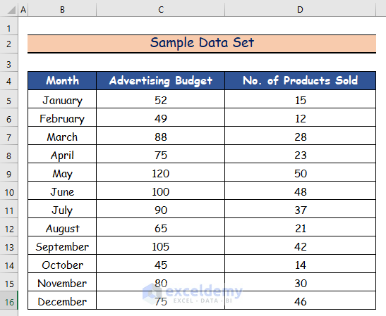
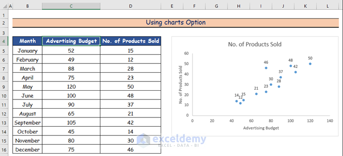
In this article, using the dataset below, we’ll arrange the data in order to visualize the link between the advertising expenditure for a certain month as an independent variable and the number of products sold as a dependent variable on a scatter plot in two ways: by using the Charts option, and by applying VBA Code.
Method 1 – Using Charts Option
Steps:
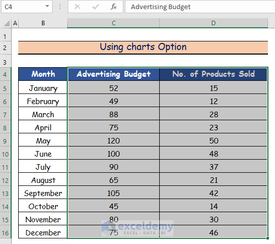
- Select the Advertising Budget and No. of Products Sold columns.
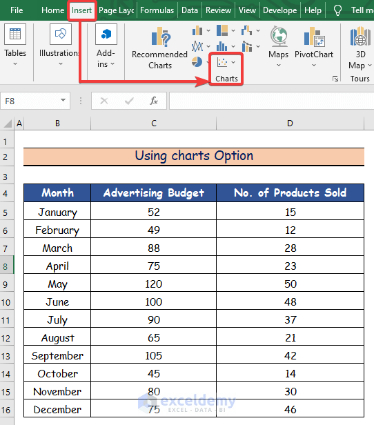
- Go to the Insert tab.
- Click on the Scatter chart icon.
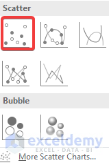
- Select the desired option from the Scatter charts. Here, we select the first option.
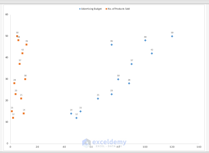
A Scatter chart is generated.
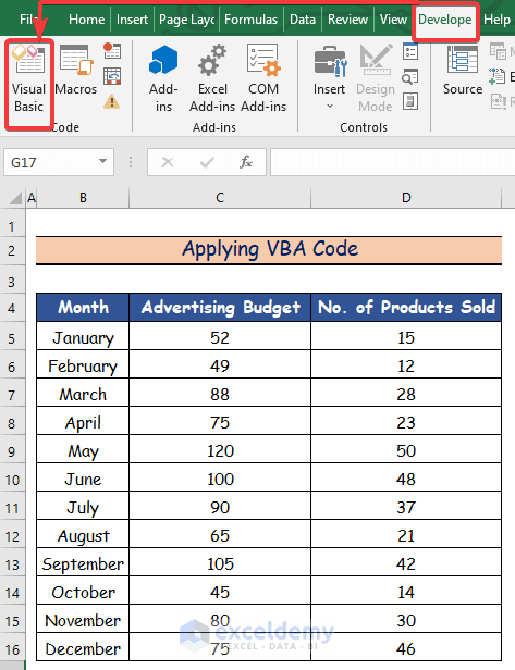
Method 2 – Applying VBA Code
Steps:
- Go to the Developer tab.
- Click on the Visual Basic option.
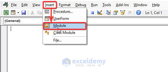
A Visual Basic window will open.
- Click on the Insert tab.
- Click on the Module option to create a new Module.
- Copy the following VBA Code and paste it in the new Module:
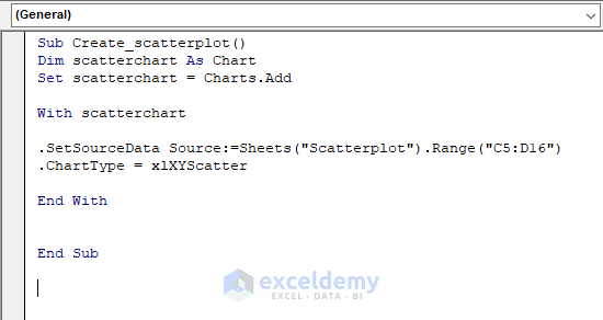
Sub Create_scatterplot()
Dim scatterchart As Chart
Set scatterchart = Charts.Add
With scatterchart
.SetSourceData Source:=Sheets("Scatterplot").Range("C5:D16")
.ChartType = xlXYScatter
End With
End Sub
The following Scatter chart is created.
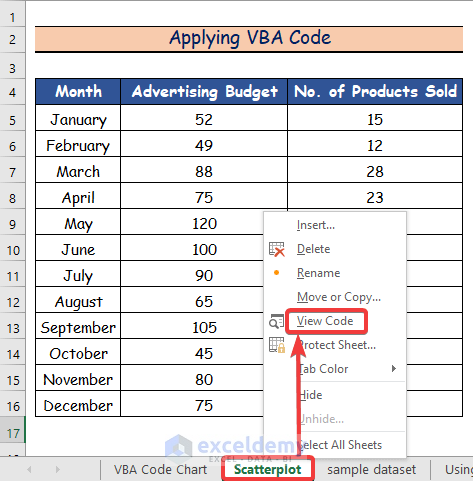
View the VBA code using the following method:
- Right-click on the Scatterplot sheet.
- Click on the View Code option.
Notes:
- When you open the Visual Basic window, you must create a new module to write your VBA code
Read More: How to Create a Scatter Plot in Excel with 3 Variables
Related Articles
- How to Make a Scatter Plot in Excel with Multiple Data Sets
- How to Change Bubble Size in Scatter Plot in Excel
<< Go Back To Make Scatter Plot in Excel | Scatter Chart in Excel | Excel Charts | Learn Excel
Get FREE Advanced Excel Exercises with Solutions!
