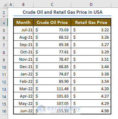
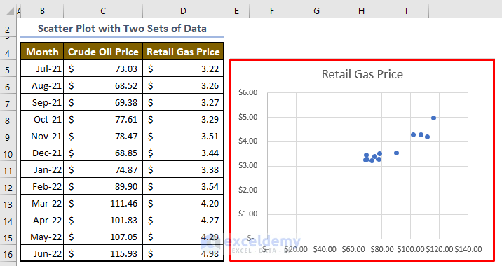
The sample dataset covers prices for crude oil and retail gas in the U.S.A. over a 12-month period.
Step 1 – Arrange Data Properly
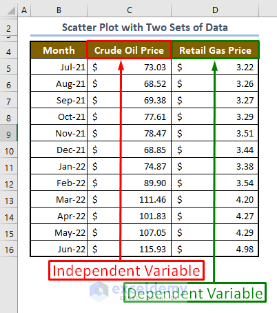
The first step is to organize your data. Remember that a scatter plot displays two interlinked numeric variables. So, you need to enter the two sets of numeric data in two separate columns. The variables are of two types. Put the independent variable in the left column and the dependent variable in the right column.
Step 2 – Select Data
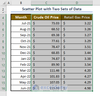
Select the two columns including their headers.
Step 3 – Create Scatter Plot
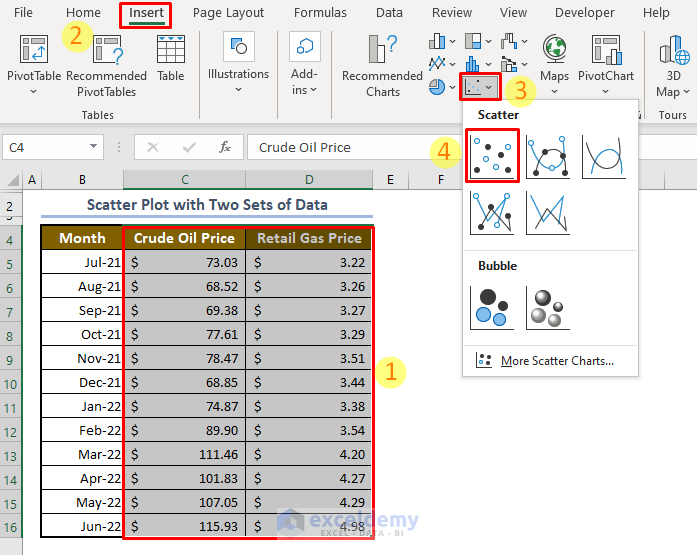
- Go to the Insert tab.
- From the Chats group, click on the Insert Scatter (X, Y) or Bubble Chart button.
- Select a suitable scatter plot template. We chose the first one.
- If you have fewer data points, you can choose other scatter plot types too.
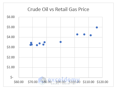
It will output the scatter plot with two sets of data.
Step 4 – Customize the Graph
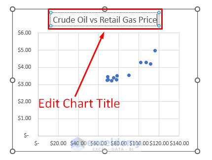
Edit Chart Title:
Double click on the chart title and add your desired title (e.g., Crude Oil vs Retail Gas Price).
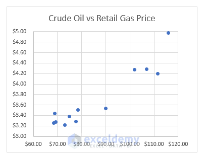
Format Vertical/Horizontal Axis:
To remove the white space around the data points, we can format the X and Y axis changing the starting point of the graph. In this graph, 68.52 is the first value along the X-axis. But the graph starts from zero point.
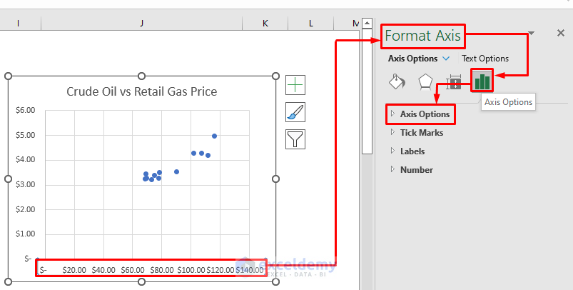
- Click on the chart area and go to the Format tab.
- Click on X-axis. A side window will appear on the right.
- From the Format Axis window, click on the Axis Options button and then click on the Axis Options drop-down menu.
- Input 60 in the Minimum box and 120 in the Maximum box located in the Bounds section. Press ENTER.
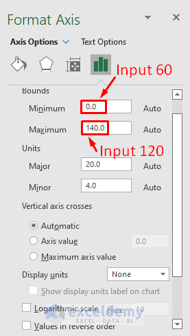
The graph will look like the image below.
Format the Y-axis following the same procedure.
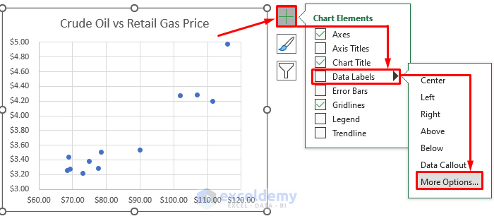
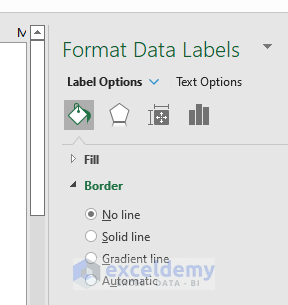
Add Data Labels:
- Click on the scatter plot and click on the Chart Elements button.
- Click on the Data Labels drop-down >> More Options.
The graph will look like this.
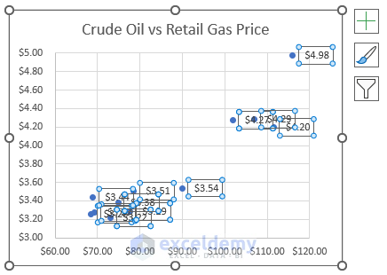
Note:
For scatter plots with just a few data points, adding data labels can be helpful. But if your graph has a lot of points, data labels can get crowded.
You can add more formatting with the options in the following window.
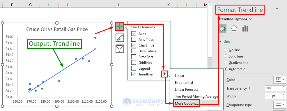
Add Trendline and Equation:
- Click on the chart area and then on the Chart Elements button.
- Check the Trendline box.
- From the Trendline drop-down, select More Options to add formatting to the trendline.
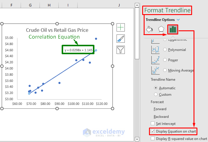
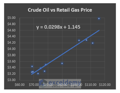
To add a Correlation Equation to the graph, go to the Format Trendline window as described above and check the Display Equation on the chart box from the Trendline Options section.
Select a Suitable Chart Style
- Click anywhere in the chart area.
- Go to the Chart Design tab.
- Go to the Chart Styles group.
- Select a suitable chart style from the available formats.
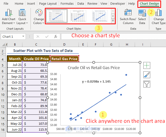
The scatter plot will look like the following image.
Download Sample Workbook
Related Articles
- How to Create a Scatter Plot in Excel with 3 Variables
- How to Make a Scatter Plot in Excel with Multiple Data Sets
<< Go Back To Make Scatter Plot in Excel | Scatter Chart in Excel | Excel Charts | Learn Excel
Get FREE Advanced Excel Exercises with Solutions!
