Method 1 – Using Multiple Data Sets from the Same Chart
Steps:
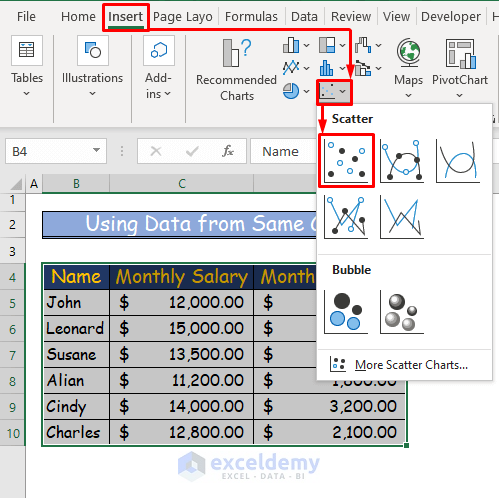
- Select the entire dataset.
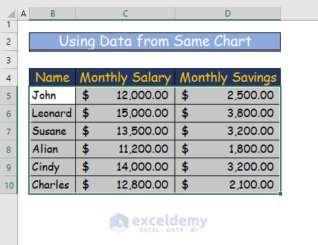
- Go to the Insert tab of the ribbon.
- From the tab, go to the Insert Scatter (X, Y) or Bubble Chart from the Charts.
- Choose the Scatter.
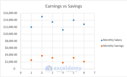
- A scatter chart will appear.
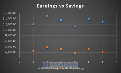
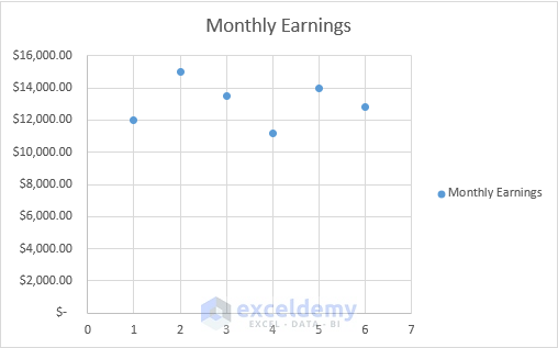
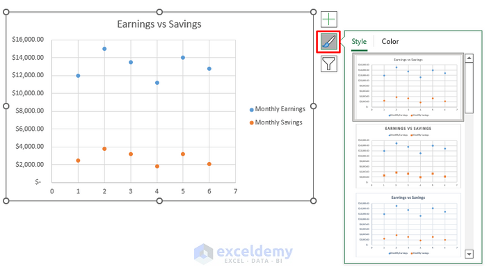
- Name the chart “Earnings vs Savings”.
- If you want to change the style of your plot, then select the “Style” icon – on the right side of your plot.
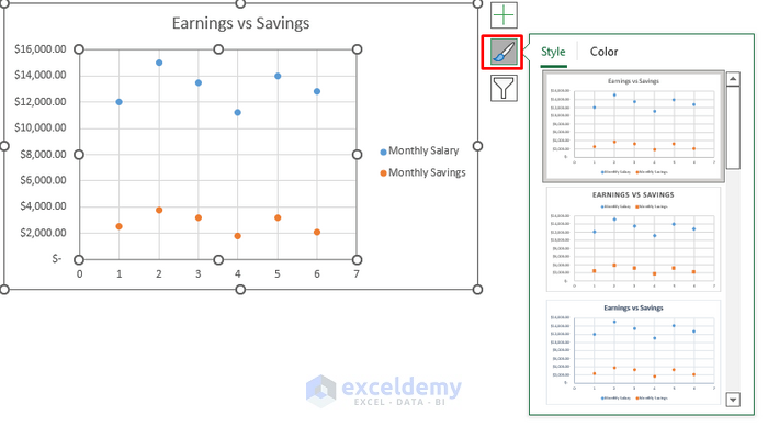
- Select the style.
Read More: How to Make a Scatter Plot in Excel with Two Sets of Data
Method 2 – Combining Multiple Data Sets from Different Charts
Steps:
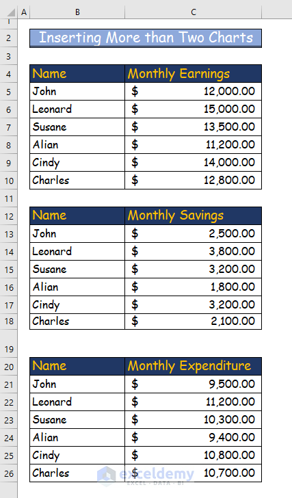
Let’s take the following data set to make the scatter plot. Here, more than one chart of data is presented.
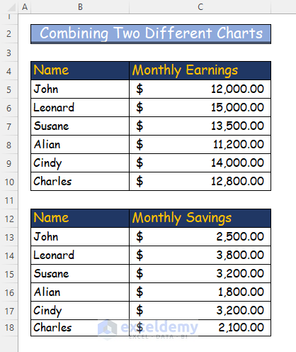
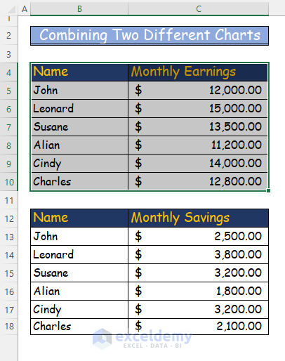
- Select the first data chart.
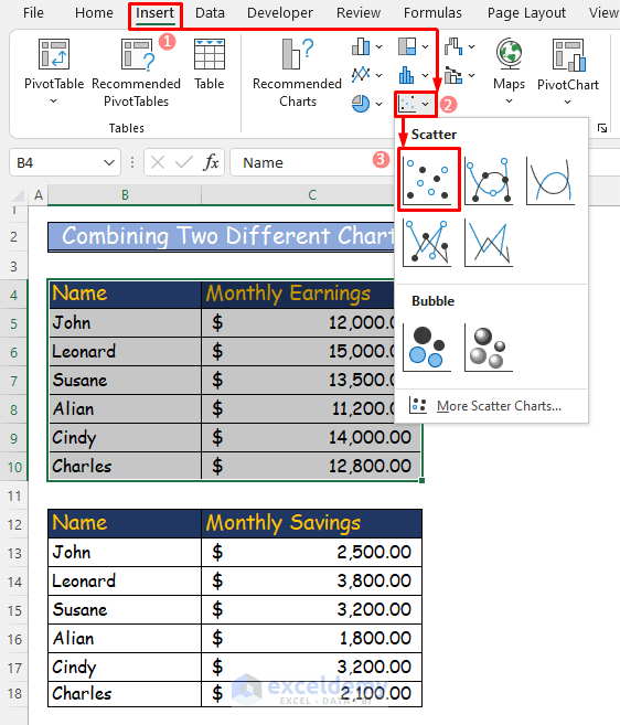
- go to the Insert tab of the ribbon.
- From that tab, go to the Insert Scatter (X, Y) or Bubble Chart in the Charts.
- Choose Scatter from the options.
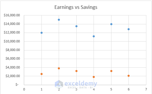
- After selecting Scatter, you will see a scatter plot with one variable, “Monthly Earnings”.
- Include the second data chart in the scatter plot.
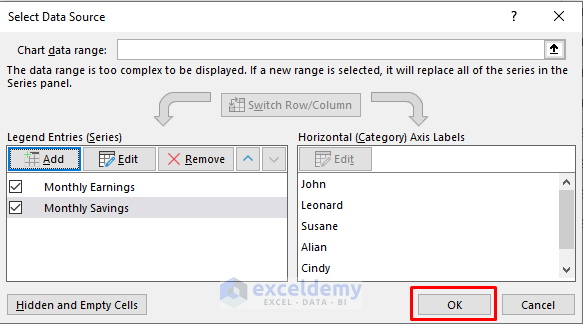
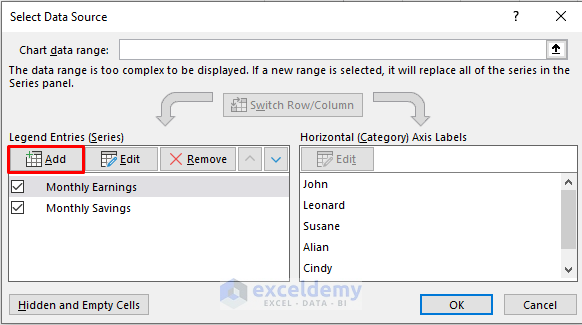
- Right–click on the plot and press Select Data.
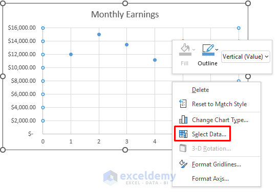
- A dialogue box named “Select Data Source” will appear.
- Click on Add.
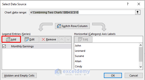
- A new dialogue box named “Edit Series” will appear.
- There are three blank spaces in that box.
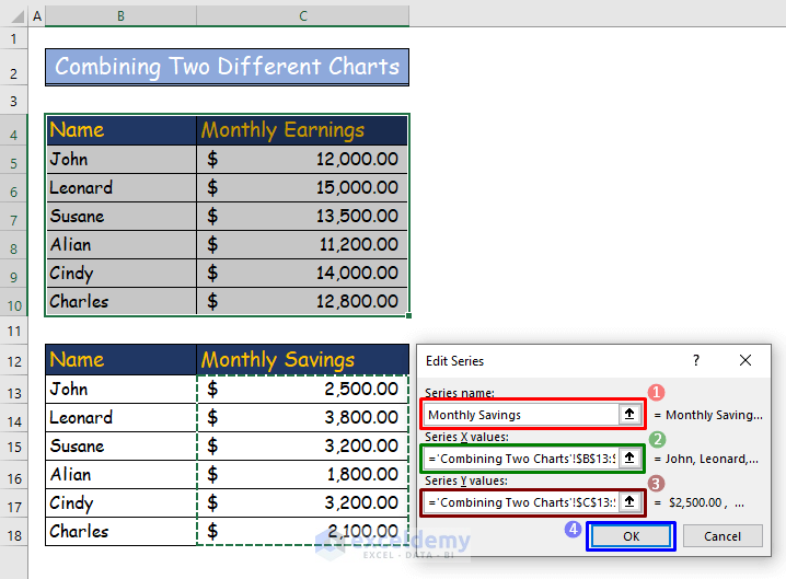
- In the “Series name” type box, enter “Monthly Savings”.
- Select cell range B13 to B18 of the second chart from the data table in the “Series X values” dropdown.
- In the “Series Y values” type box, select cell range C13 to C18.
- Press OK.
- The dialogue box from Step 5 will appear again.
- Press OK.
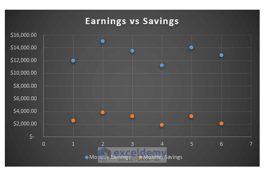
You can see a scatter plot with two variables.
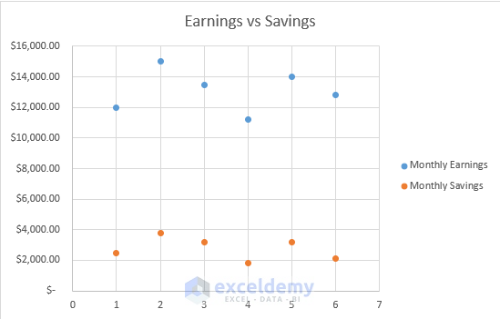
- Name the scatter plot “Earning vs. Savings.”
- From the Chart Elements option next to our scatter plot, click the Legend option.
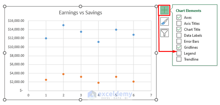
- You can see which color indicates which variable in the plot.
- If you want to change the style of your plot, select the “Style” icon on the right side of your plot.
- Select the style.
- Add an extra data table to the plot to add more charts. For example, we will add the data table for monthly expenditures here.
- Right-click on the chart with two variables from the previous method and select “Select Data”.
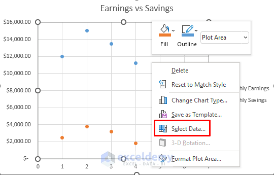
- A dialogue box will appear.
- Click on Add.
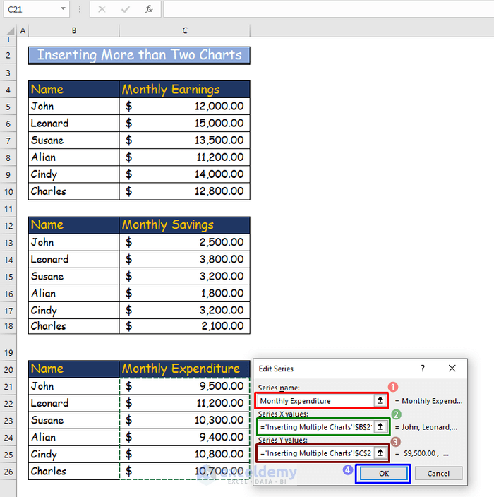
- In the Edit Series dialogue box, write “Monthly Expenditure” as the series name.
- Select the cell range from B21 to B26 as “Series X Value”.
- Name the cell range from C21 to C26, “Series Y Value”.
- Press OK.
- Press OK in the Select Data Source dialogue box.
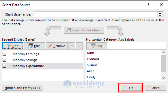
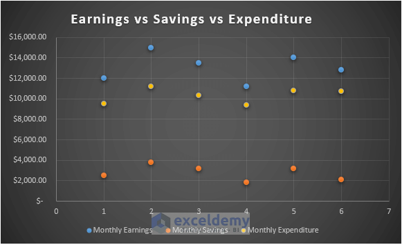
- The scatter plot, including three variables, will appear.
- Name the plot Earnings vs Savings vs Expenditure.
- Change the style of the plot if you want.
Download the Practice Workbook
You can download the free Excel workbook to practice.
<< Go Back To Make Scatter Plot in Excel | Scatter Chart in Excel | Excel Charts | Learn Excel
Get FREE Advanced Excel Exercises with Solutions!
