Scatter Plots
A Scatter Plot is a graph that represents the relationship between two variables. The independent variable is plotted on the horizontal (x) axis, whereas the dependent variable is plotted on the vertical (y) axis.
Scatter Plots are used in data analysis, as they show:
- the trend of the dataset.
- the maximum and the minimum values of the dataset.
- if the relationship between the variables is linear or non-linear.
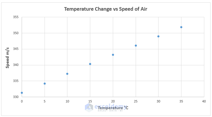
In the scatter plot above air Temperature and Speed have a linear relationship.
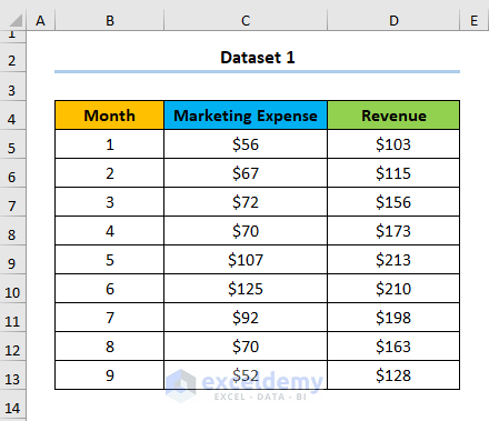
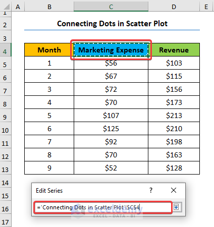
The sample dataset showcases Month, Marketing Expense, and Revenue in USD.
Step 1 – Add a Series to the Scatter Plot
- Select D4:D13 (the Revenue column).
- Hold CTRL and select B4:B13 (the Month column).
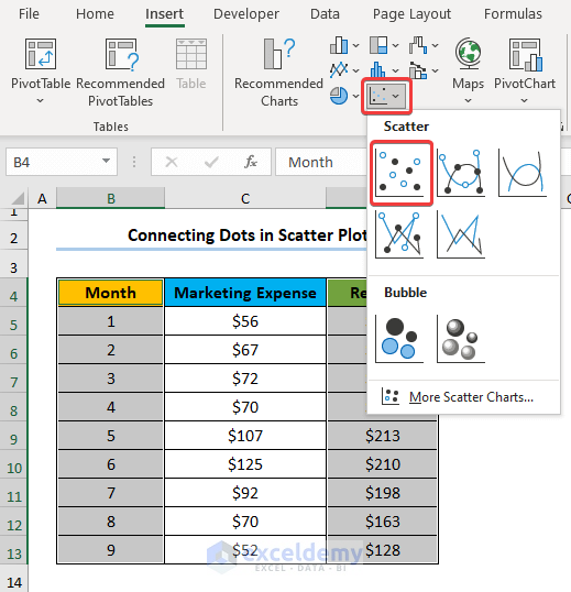
- Go to Insert > Insert Scatter (X,Y) or Bubble Chart.
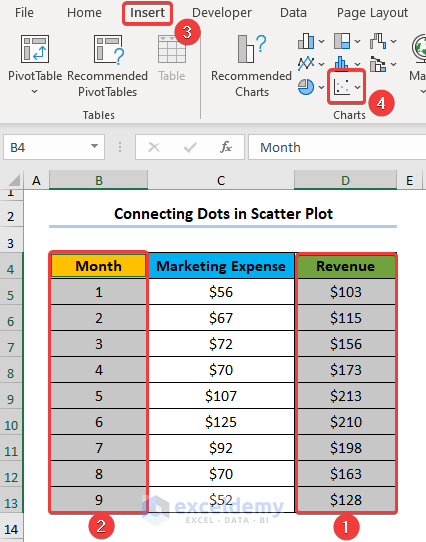
- Choose Scatter.
Step 2 – Add a Second Series in the Scatter Plot
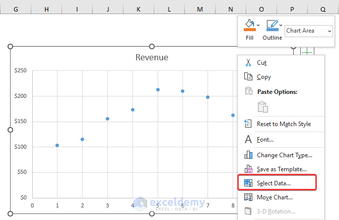
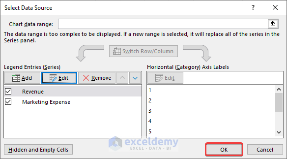
- Select the chart and right-click.
- Choose Select Data.
- Click Add.
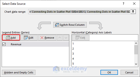
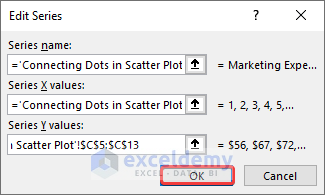
- In Edit Series, click Select Range.
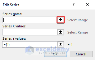
- Select C4 (Marketing Expense).
- Choose the values for the X and Y axes and click OK.
A second series is added to the Scatter Plot.
- Click OK.
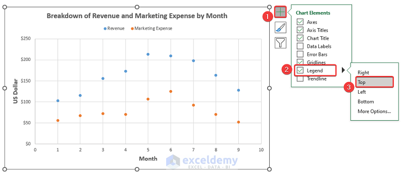
Step 3 – Add a Legend to the Scatter Plot
- Select the chart and go to Chart Elements > Legend.
- Select a location for the Legend. Here, Top.
Step 4 – Connect the Dots and Add Data Labels
- Select the chart and right-click.
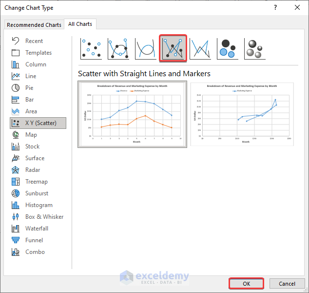
- Choose Change Chart Type.
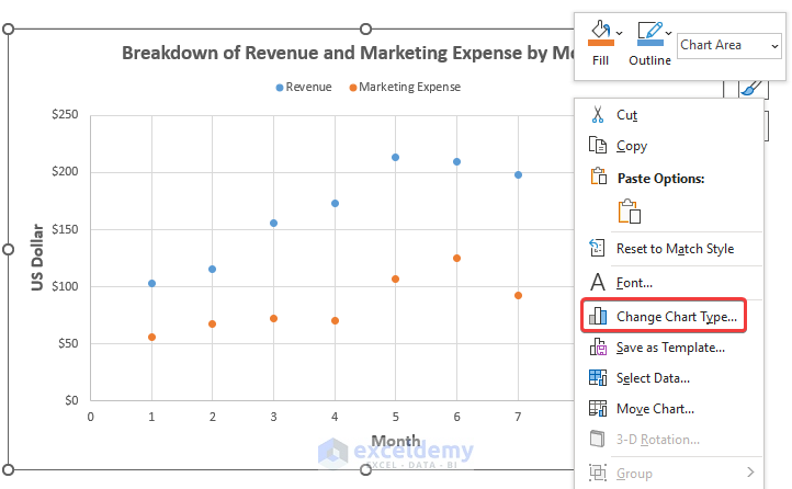
- Click Scatter with Straight Lines and Markers and click OK.
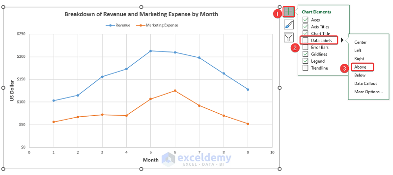
Step 5 – Add Data Labels
- Go to Chart Elements > Data Labels.
- Choose a position for the Data Labels. Here, Above.
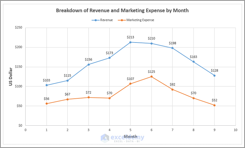
This is the output.
How to Add a Trendline to a Scatter Plot in Excel
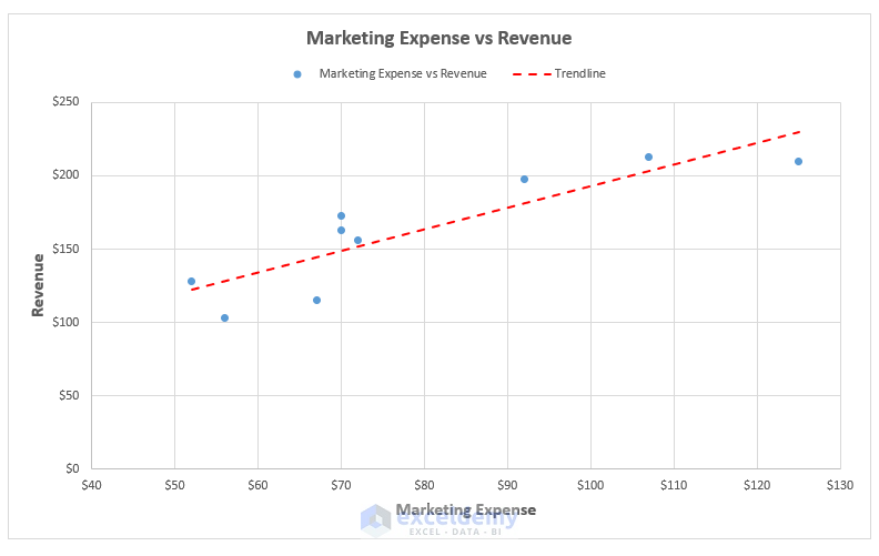
To see the relationship between Marketing Expenses and the Revenue:
Step 1 – Insert a Scatter Plot
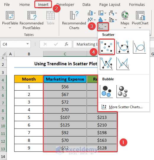
- Select C4:D13 (Marketing Expense and Revenue columns).
- Go to the Insert tab and select Insert Scatter (X,Y) or Bubble Chart.
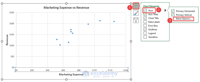
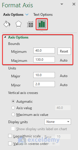
Step 2 – Format the Axes of the Scatter Plot
- Select the chart and go to Chart Elements > Axes > More Options.
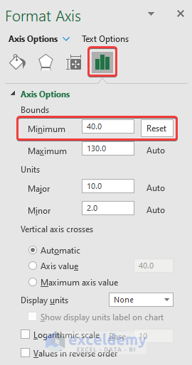
- Specify the Minimum value for the X-axis, here 40.
Step 3 – Add the Trendline to the Scatter Plot
- Go to Chart Elements > Trendline > More Options.
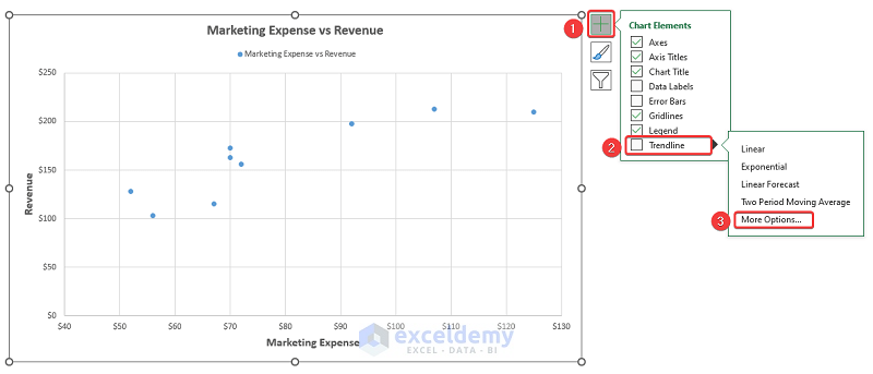
- Choose Linear trendline.
There are other types of trendlines.
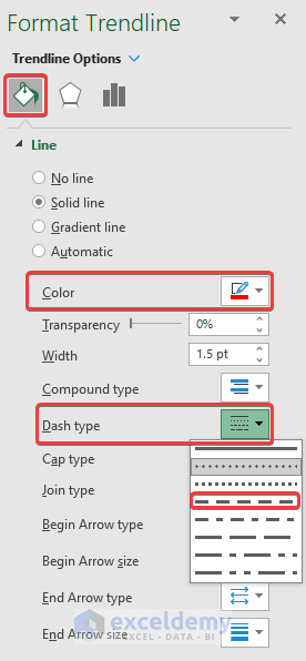
- Name the trendline.
- Change the Color and the Dash type in the trendline.
This is the output.
Download Practice Workbook
Download the practice workbook.
Related Articles
- How to Make a Categorical Scatter Plot in Excel
- How to Create Scatter Plot Matrix in Excel
- How to Create Multiple Regression Scatter Plots in Excel
- How to Create Dynamic Scatter Plot in Excel
- How to Combine Two Scatter Plots in Excel
- How to Create a 3D Scatter Plot in Excel
- How to Create Clustered Scatter Plot in Excel
<< Go Back To Scatter Chart in Excel | Excel Charts | Learn Excel
Get FREE Advanced Excel Exercises with Solutions!
