In Excel, the combination of scatter plots allows you to show and analyze two separate data sets that are connected to each other. A standard chart in Excel typically contains simply one X-axis and one Y-axis. A combination of scatter plots, on the other hand, allows you to have two Y-axes, allowing you to have two distinct sorts of sample points in the same plots. In this tutorial, we will explain to you how to combine two scatter plots in Excel to get better and comparable visualization.
How to Combine Two Scatter Plots in Excel: Step by Step Analysis
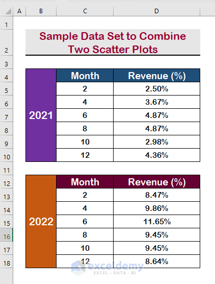
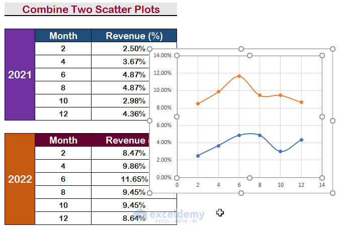
The fundamental strategy of combining two scatter plots will be discussed in the section below. To complete the task, we will use Excel’s built-in features. Later on, we’ll go through ways to make scatter plots seem more visually appealing when displaying data. A sample data set is represented in the image below to accomplish the task.
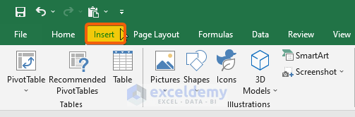
Step 1: Use the Charts Ribbon to Select Scatter Option
- Firstly, from the Ribbon, click on Insert.
- Secondly, click on the Charts Ribbon.
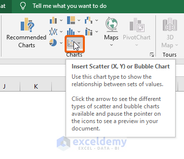
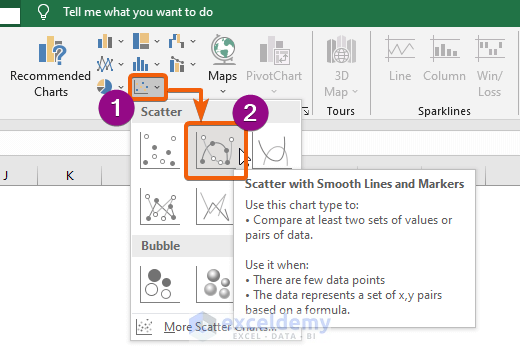
- Select the Scatter option and choose any layout you prefer to display.
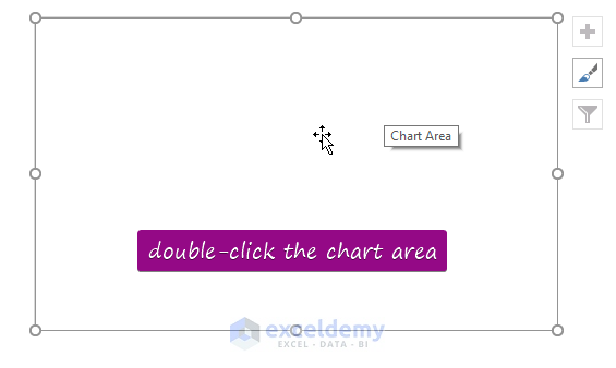
- Double-click the Chart Area to display the Chart Tools.
Step 2: Select Data to Create the First Scatter Plot
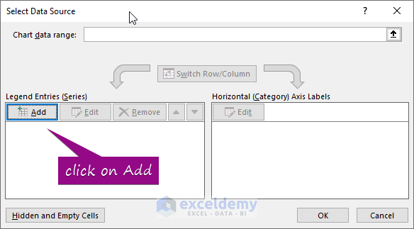
- Then, click on the Select Data.

- Click on the Add from the Select Data Source Box.
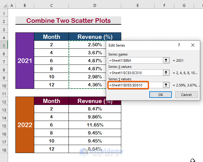
- Take the cursor to the Series name box.
- Select the merged cell ‘2021’ to enter it as the Series name.
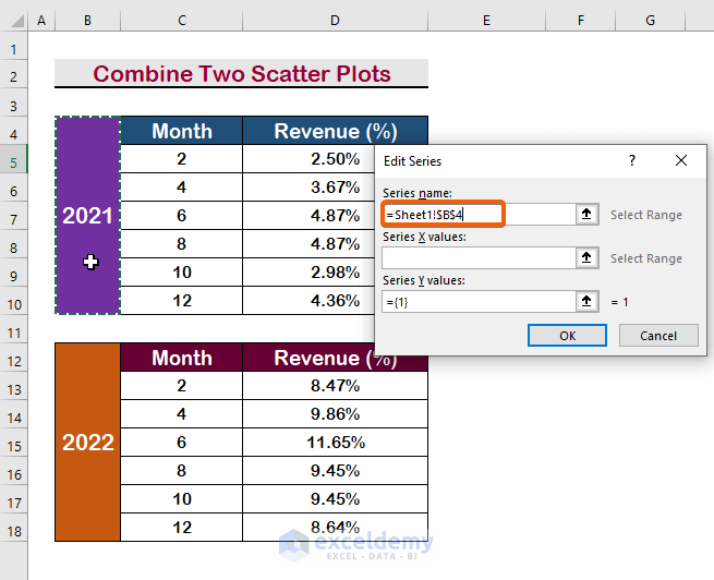
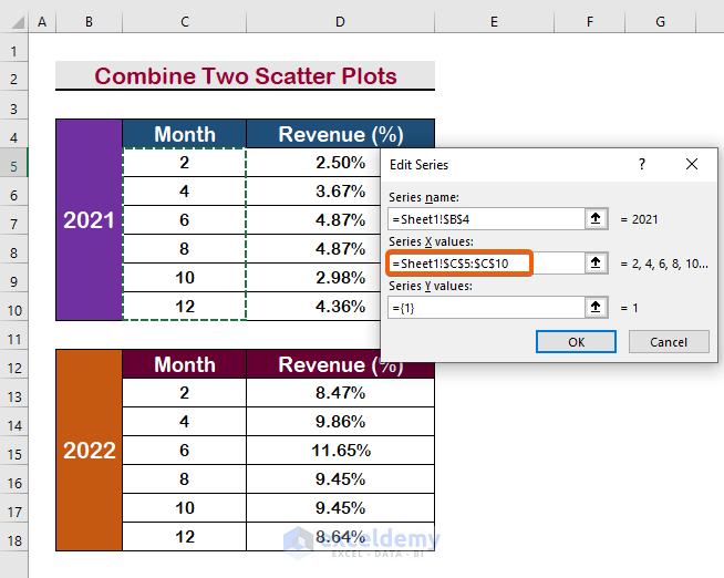
- Take the cursor to the Series X values.
- Select the range C5:C10 as the X values.
- After that, take the cursor to the Series Y value.
- Select the range D5:D10 as the Y values.
- Press Enter.
Step 3: Add Another Series to Combine Two Scatter Plots
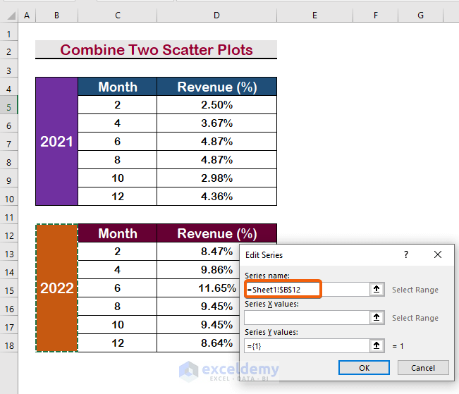
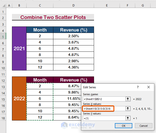
- Click on the Add again, and select the cell for the new Series name.
- Like previously, select the range C13:C18 as the X values.
- To select the Y values, select the range D13:D18.
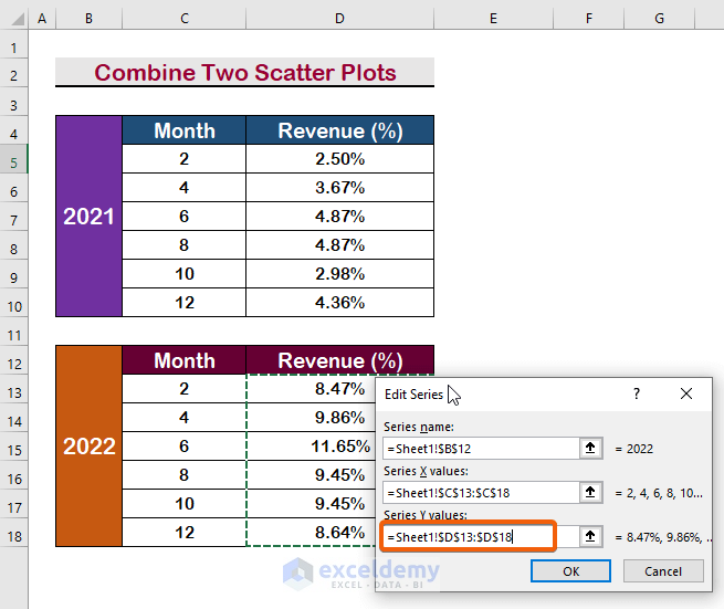
- Therefore, the two series names of scatter plots will appear as the image shown below.
- Press Enter to continue.

- As a result, you will get the two scatter plots combined in a single frame.
Read More: How to Add Multiple Series Labels in Scatter Plot in Excel
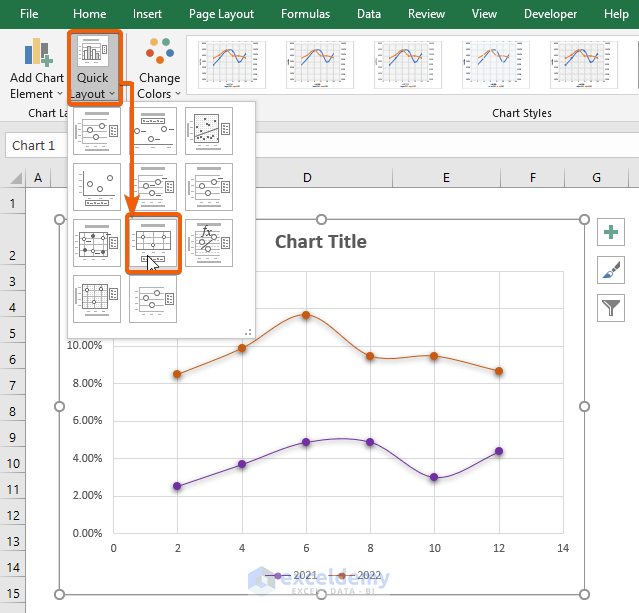
Step 4: Change the Layout of Two Combined Scatter Plots
- To get better visualization, you can choose any layout.
- Go to the Quick Layout option, and choose a Layout. In our example, we have chosen Layout 8.
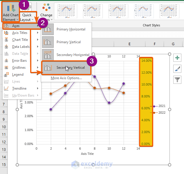
Step 5: Add Secondary Horizontal/Vertical Axis to Combined Scatter Plots
- To add an extra horizontal axis for the second scatter plot, click on the Add Chart Element.
- Then, select the Axis.
- Finally, select the Secondary Horizontal.
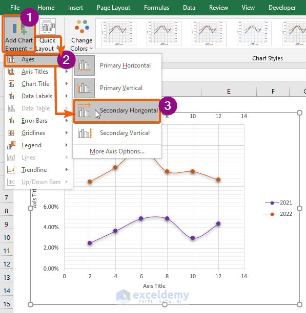
- Therefore, a Secondary Horizontal Axis will be added to the graph.
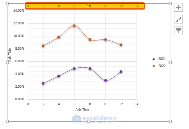
- Similar to adding the Horizontal Axis, you can add a Vertical Axis Simply select the Secondary Vertical option from the Axis option.
- As a result, you will get an extra Vertical Axis to the right side of the chart.
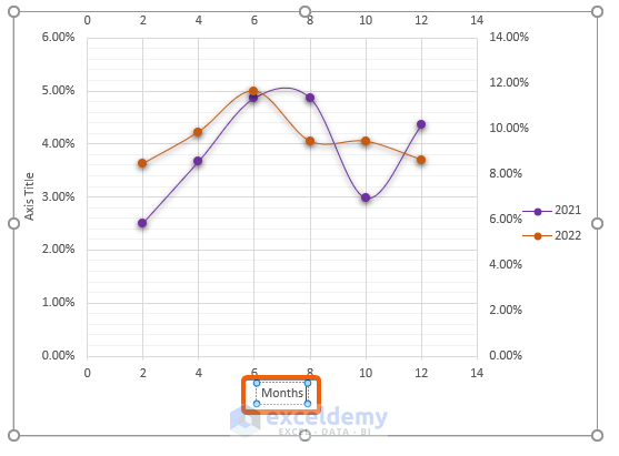
- To change the Horizontal Axis title, double-click the box.
- Type the name you prefer (e.g., Months).
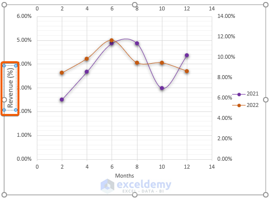
- To change the Vertical Axis title, double-click the box.
- Write the name you want to show (e.g., Revenue (%)).
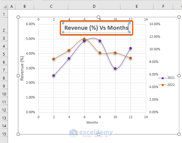
Step 6: Insert Chart Title to Combined Scatter Plots
- To add or change the Chart Title, click on the Add Chart Element.
- Select the Chart Title.
- Finally, select an option for where you want to display the Chart Title (e.g., Above Chart).
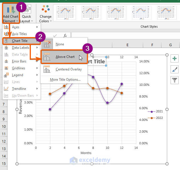
- After double-clicking, type the Chart Title in the box (e.g., Revenue (%) Vs Months).
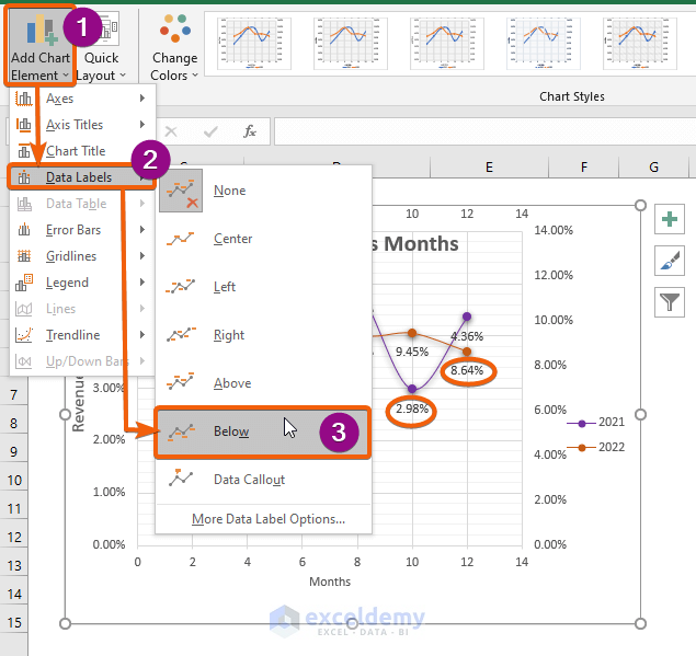
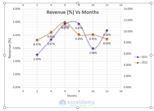
Step 7: Display the Data Labels to the Combined Scatter Plots in Excel
- To display the value, click on the Data Labels.
- Select how you want to display the Labels (e.g., Below).
- Finally, you will get the combination of the two Scatter Plots with a great display of visualization.
Download Practice Workbook
Download this practice workbook to exercise while you are reading this article.
Conclusion
Finally, I hope you now have a better understanding of how to combine two scatter plots in Excel. You should employ all of these strategies while teaching and practicing with your data. Examine the practice book and apply what you’ve learned. We are motivated to continue delivering programs like this because of your valued support.
If you have any questions, please do not hesitate to get in contact with us. Please share your thoughts in the comments section below.
Stay with us and continue to learn.
Similar Readings
- How to Make a Categorical Scatter Plot in Excel
- How to Create Scatter Plot Matrix in Excel
- How to Create Multiple Regression Scatter Plots in Excel
- How to Connect Dots in Scatter Plots in Excel
- How to Create Dynamic Scatter Plot in Excel
- How to Create a 3D Scatter Plot in Excel
- How to Create Heat Map Scatter Plot in Excel
- How to Create Clustered Scatter Plot in Excel
<< Go Back To Scatter Chart in Excel | Excel Charts | Learn Excel
Get FREE Advanced Excel Exercises with Solutions!

Did this and my x-axis changes to 1900, every time. Not sure why
Hello,
Thank you for reaching out and sharing your experience. It seems like there might be an issue with the X-axis formatting.
To address the x-axis displaying as 1900, try the following steps:
Format X-Axis: After combining the scatter plots, right-click on the x-axis and select Format Axis. Check the settings to ensure the date format is correctly applied to your month values.
Date Formatting: Make sure that the Month values on the x-axis are recognized as dates. You may need to format the cells containing the monthly data as dates if they are not already.
Data Source: Double-check the data source for your scatter plot. Confirm that the Month values are correctly assigned to the x-axis.
X-Axis Labels: Ensure that the x-axis labels correspond to the Month values. Adjust the labels if necessary.
If you face the issues again, please provide more details about your data and the steps you followed, and I will do my best to help you.
Please let us know if your problem is solved or not.
Regards,
Bishawajit Chakraborty
ExcelDemy