Scatter Plot Matrix is very handy to compare the bivariate relations of multiple variables. In this article, I will demonstrate how to create a Scatter Plot Matrix in Excel with very simple steps.
What is Scatter Plot Matrix?
Suppose you have a dataset of multiple variables. If you want to compare the relationship of each 2 variables of the dataset, you need to create a Matrix where every possible combination of bivariate variables is present. Now, in Excel, you can just create a Scatter Chart of each set of bivariate variables. Then arrange the scattered chart in a Matrix form. Therefore, you got your Scatter Plot Matrix. It is very functional in Statistical analysis.
How to Create Scatter Plot Matrix in Excel: with Easy Steps
It is straightforward to plot Scatter Plot Matrix in Excel. I will Insert the Scatter Chart into my dataset to create a Scatter Plot in Excel. Later the chart will be resized and readjusted so that I can use it to create the Matrix. So, let’s go through the process quickly.
Step-01: Create a Dataset
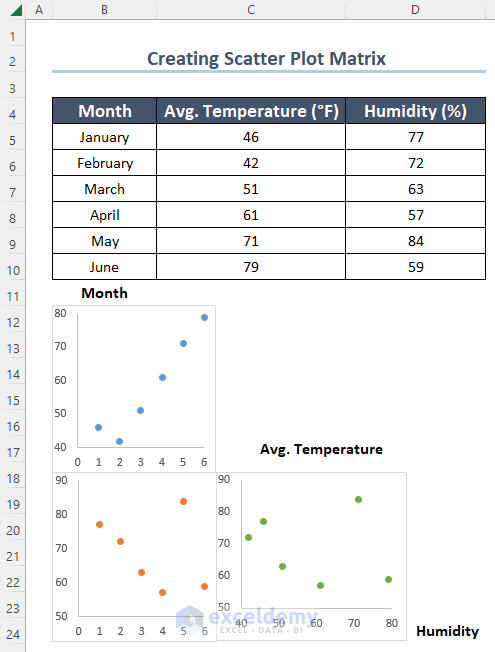
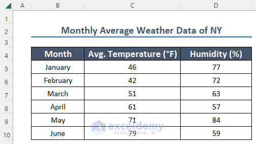
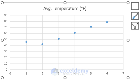
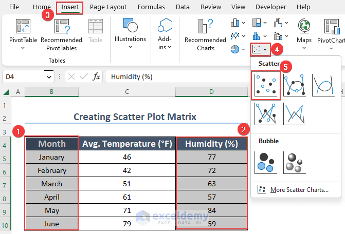
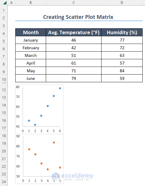
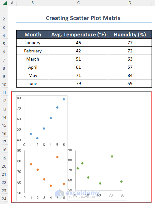
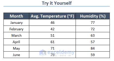
In the first place, you need a dataset with multiple variables. I have a dataset here representing the Monthly Average Weather Data of New York City. Moreover, the dataset has 3 variables. Those are Month, Avg. Temperature, and Humidity.
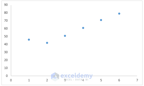
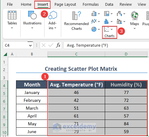
Step-02: Insert Scatter Chart
This step will introduce a Scatter Chart with a selected array.
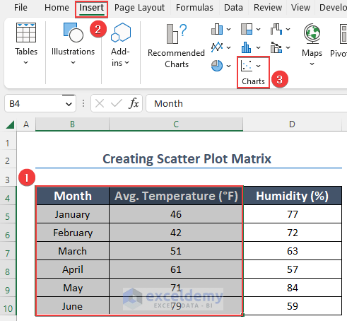
- First, select the columns Month and Temperature.
- Next, click on Insert.
- Then, choose the Charts option.
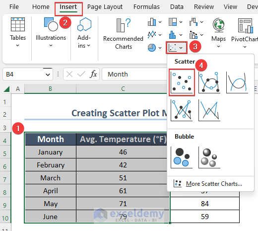
- Afterward, from Charts select the Scatter one.
- Finally, click on the 1st type from Scatter Charts option.
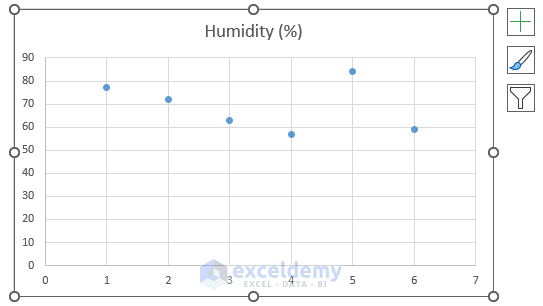
- Accordingly, you will get the Scatter Chart with selected columns.
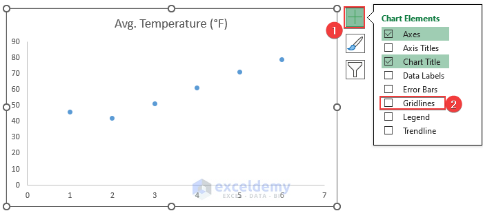
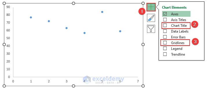
Step-03: Remove Chart Title and Gridlines
To make the chart clean and prominent, I will remove the Gridlines and Chart Title.
- Initially, click on the + sign at the top right corner of the Scatter Chart.
- Notice that there is a tick beside the Gridlines option.
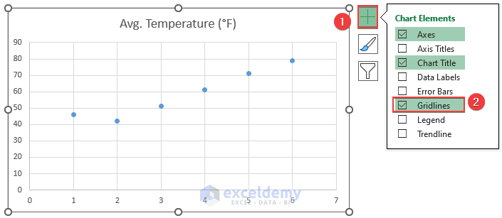
- Now, uncheck Gridlines.
- As a result, you can see that Gridlines from the chart have vanished.
- Besides, I will delete the Chart Title as I will add Labels after completing the Matrix.
- Again, click the + sign at the top right corner of the Scatter Chart.
- Chart Elements will appear.
- At this point, uncheck the Chart Title.
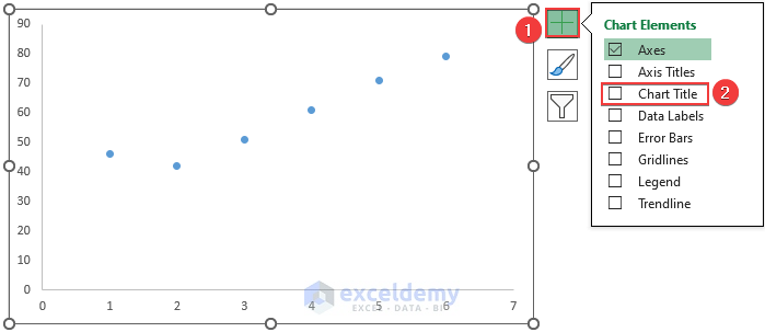
- Consequently, the Chart Title has disappeared.
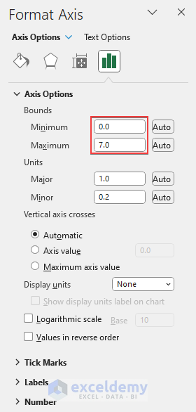
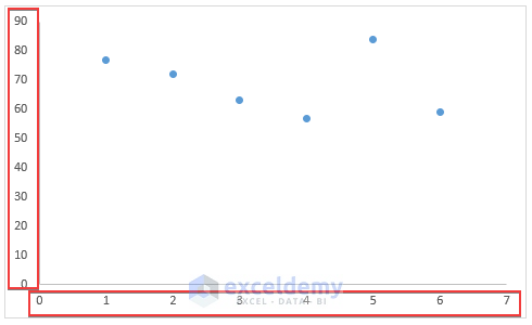
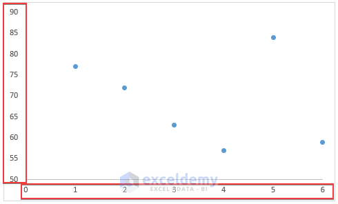
Step-04: Change Minimum Axis Bound
In this step I will readjust the Bound Maximum and Minimum value in Format Axis Pane.
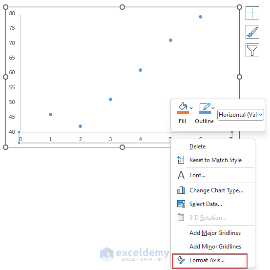
- In the first place, select the Vertical Axis of the Chart which is also marked in the snapshot.
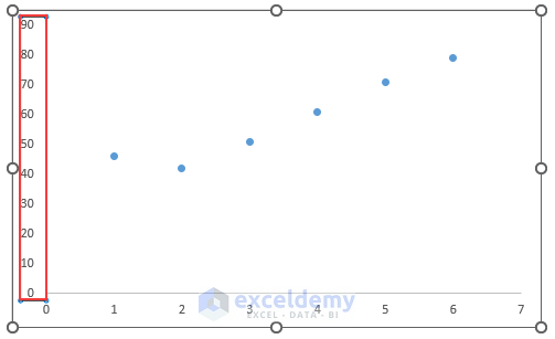
- Later, right-click on the selected Vertical Axis.
- From the options, hit the Format Axis option.
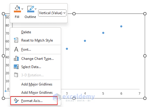
- Thus, Format Axis Pane has opened.
- Here, Bounds Minimum is set as 0, and the Maximum is set as 90.0.
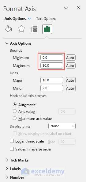
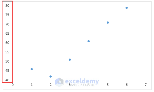
- Since in my dataset, the range of values for Temperature is 40-80, I will reset the Minimum value as 40.0 and the Maximum value as 80.0.
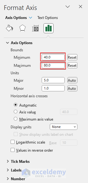
- Finally, hit Enter and eventually the Maximum and Minimum value of the Axis is changed, and this step makes the chart more relevant.
- Similarly, change the Bounds value for the Horizontal Axis.
- To start, click on the Horizontal Axis marked in the picture.
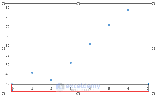
- Secondly, right-click on the Horizontal Axis.
- Accordingly, choose the Format Axis option.
- Now, the Format Axis Pane is visible.
- You must Reset the Minimum and Maximum values according to your dataset value.
- As my dataset has only 6 Months, I will Reset the Maximum value to 0.
- Please follow your dataset to find the Maximum and Minimum values and Reset accordingly.
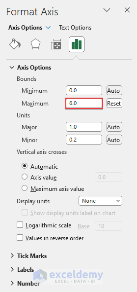
- In conclusion, both of your Axis Bounds are adjusted after following the steps.
Read More: How to Create a 3D Scatter Plot in Excel
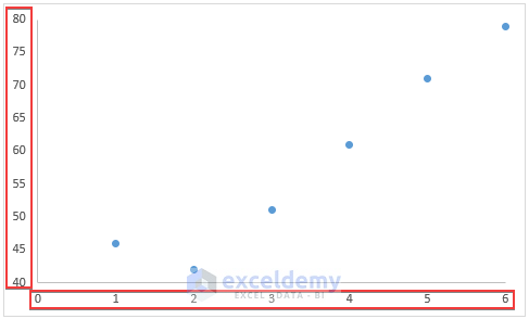
Step-05: Resize the Chart
This particular step is to make the overall outlook easy to read for the readers.
- Resize the Scatter Chart and place this below the dataset.
- As this will be a Scatter Plot Matrix, make the chart smaller so that other bivariate relations can be placed under this. Follow the picture for a better understanding.
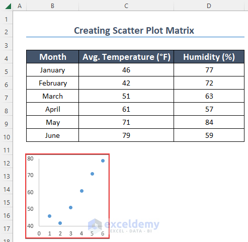
Step-06: Complete the Scatter Matrix
The dataset has 3 variables. This means another 2 combinations of variable sets are possible. So, let’s complete the Scatter Plot Matrix.
- Initially, select the Month and Humidity columns.
- Then, click on Insert, and after that hit on the Charts option.
- Choose the first option under Scatter type.
- As a result, you will get a Scatter Chart representing the relationship between Month and Humidity.
- Furthermore, remove the Chart Title and Gridlines following Step-03.
- Like the previous chart, adjust the Bounds Maximum and Minimum values of the Chart.
- For this, follow Step-04.
- Hence, I have Reset the range for Vertical Axis to 50-90. Because in the Humidity column, the values are in this range.
- Similarly, for Horizontal Axis I have Reset the range to 0-6.
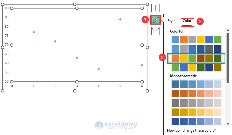
- At this point, you can change the Color of the Scatter Chart to differentiate among the relations.
- In the first place, click on the Brush icon just below the + sign.
- Then, select Color.
- Finally, choose any color except the previous chart’s color.
- Moreover, resize the chart and place this below the first chart to create the Matrix.
- Lastly, select the Temperature and Humidity Column.
- Insert Scatter Chart by just repeating the same actions.
- In addition, resize the Chart and complete the Scatter Plot Matrix.
Step-07: Introduce Label to the Scatter Plots
You must Label the chart so that readers can analyze the Matrix to understand the relationships. In this step, I will Label the Charts.
- Add the Labels according to your dataset.
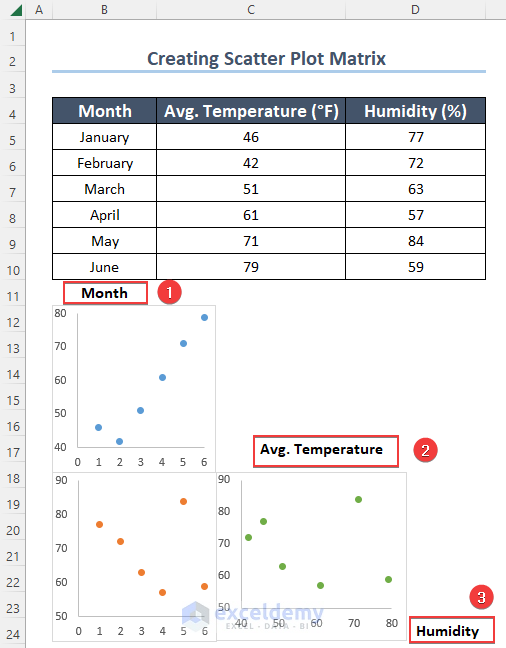
- After adding Labels the Scatter Plot Matrix is ready now.
- The top left corner indicates the relationship between Month and Temperature.
- Next, the bottom left represents the data points of Month and Humidity.
- In conclusion, the bottom right corner expresses the connection of Temperature and Humidity.
Things to Remember
- Be careful while Labeling the Scatter Plot Matrix. One wrong Label can mislead the readers in the whole chart.
- Try to keep the outlook simple and clean as there may be many variable pairs in one Matrix.
Practice Section
Here, we have provided a practice sheet for you to practice.
Download Practice Workbook
You may download the following Excel workbook for better understanding and practice it by yourself.
Conclusion
In this article, I have shown the steps of creating a Scatter Chart and making this into a Matrix. There may be more variables in your dataset. In that case, prepare the combinations and then arrange the charts accordingly. I hope this article gave you a clear idea about how to create a Scatter Plot Matrix in Excel. If you have any questions regarding this, please comment down.
Related Articles
- How to Make a Categorical Scatter Plot in Excel
- How to Create Multiple Regression Scatter Plots in Excel
- How to Connect Dots in Scatter Plots in Excel
- How to Create Dynamic Scatter Plot in Excel
- How to Combine Two Scatter Plots in Excel
- How to Create Heat Map Scatter Plot in Excel
- How to Create Clustered Scatter Plot in Excel
<< Go Back To Scatter Chart in Excel | Excel Charts | Learn Excel
Get FREE Advanced Excel Exercises with Solutions!
