Method 1 – Employing Pivot Table to Create Dynamic Scatter Plot
Step 1: Creation of Table from Dataset
Convert the dataset into a Table.
- Select any cell from the dataset.
- We selected cell E14 randomly.
- Select Table from the Insert tab.
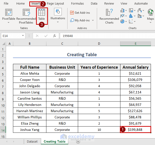
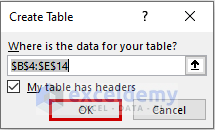
- A dialog box of Create Table will appear.
- Click OK.
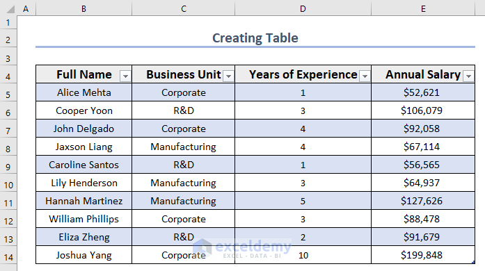
- The table is now created.
Step 2: Inserting Pivot Table to Create Dynamic Scatter Plot
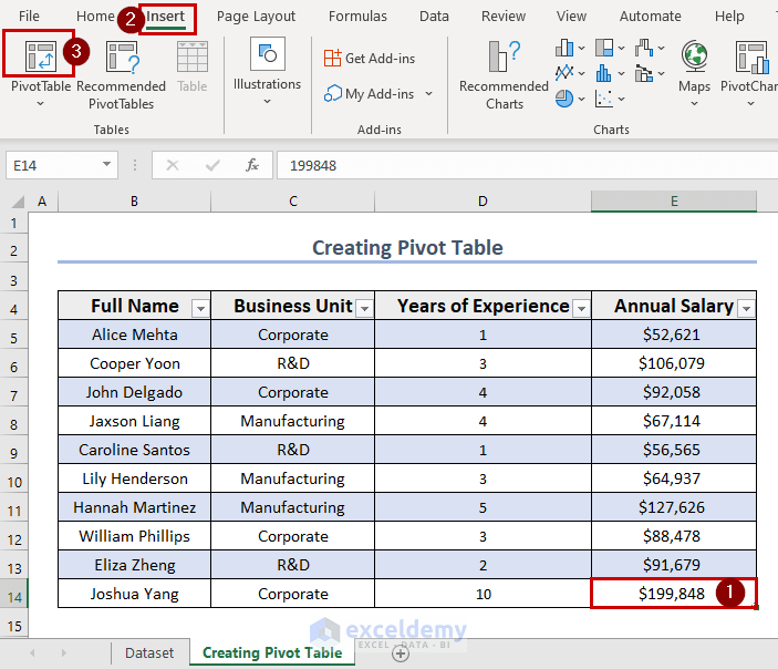
Create a Pivot Table from the table.
- Select any cell from the dataset. We selected cell E14 randomly.
- Select Pivot Table from the Insert.
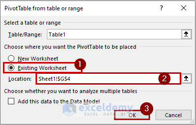
- A Pivot Table from the table or range dialog box will appear.
- Select Existing Worksheet.
- Set the location to any blank cell. We selected cell G4.
- Click OK.
- A side window of Pivot Table Fields appeared to fill up the necessary information about the Pivot Table.
- Drag the fields from the top section to the areas at the bottom section as follows.
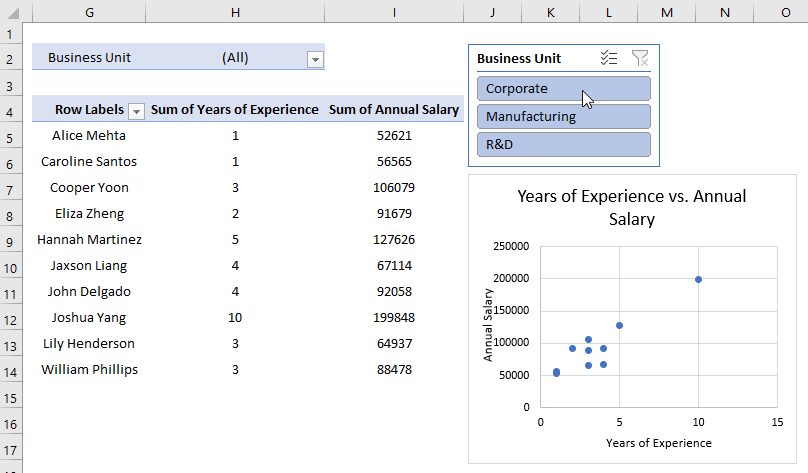
- Drag Full Name in the Rows area, Business Unit in the Filters area, and both Years of Experience and Annual Salary to the Values area.
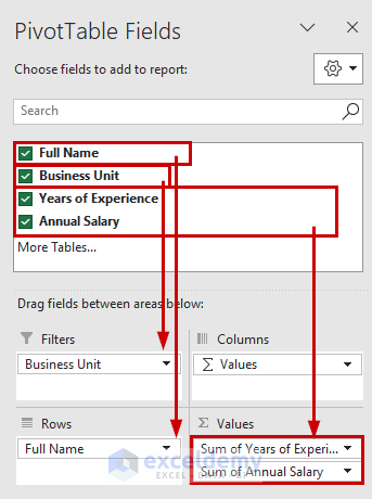
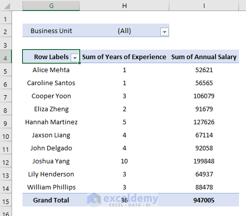
- The Pivot Table is created.
Step 3: Creating Dynamic Scatter Plot
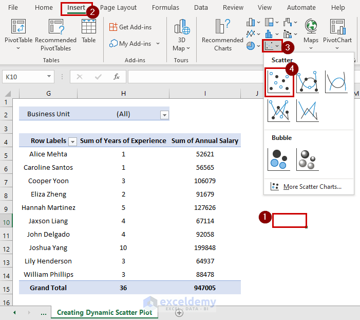
- Randomly select a cell.
- We selected cell K10.
- Go to the Insert tab >> select the Insert Scatter or Bubble Chart group.
- Select Scatter Chart.
- A blank Scatter chart or plot space will appear.
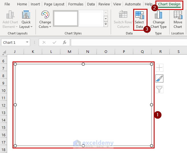
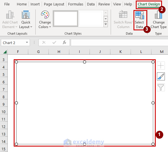
- Click on the plot box >> Go to the Chart Design tab.
- From the Data group >> Choose Select Data.
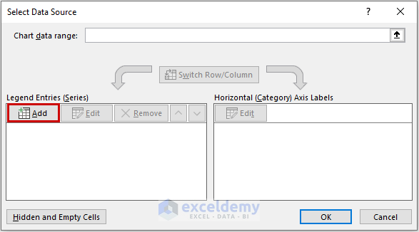
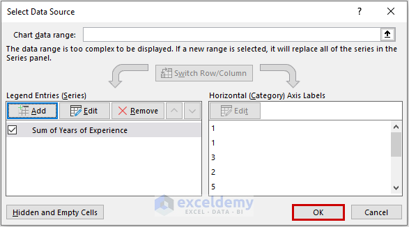
- A Select Data Source dialog box will appear.
- To fill out the Select Data Source dialog box, click Add.
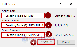
- An Edit Series dialog box will appear.
- Under the Series name option, select cell H4.
- Select values from the Sum of Years of Experience inside the Series X values.
- Select values from the Sum of Annual Salary inside the Series Y values.
- Click OK.
- Click OK in the Select Data Source dialog box.
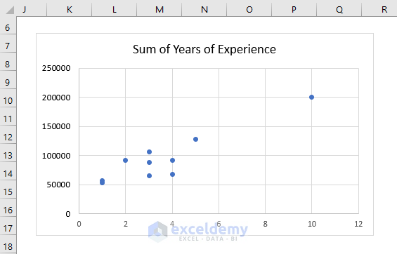
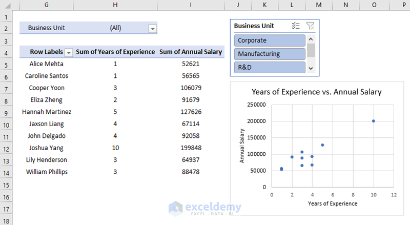
- The blank scatter plot is visible with dots, which is the data we inserted.
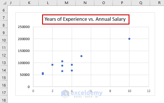
- Edit the title by clicking on it and typing Years of Experience vs. Annual Salary.
- The Dynamic Scatter Plot is created.
Step 4: Employing a Filter and Clearing off Grand Totals, Subtotals
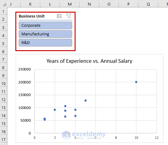
- Right-click on the Business Unit from the side window of Pivot Table Fields.
- Select Add as Slicer.
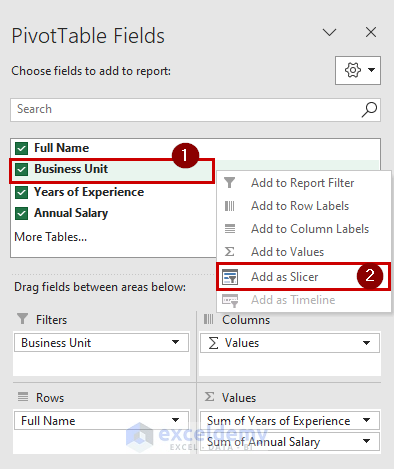
- A Business Unit slicer will appear.
You may need to clear off the grand totals and subtotals from your dynamic scatter plot if you do not want them in your dynamic scatter plot. To do so, follow the below steps.
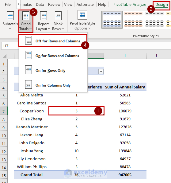
- Select any of the cells from the Pivot Table.
- We selected cell H7.
- Go to the Design tab >> from the Layout group >> select Grand Total.
- Select Off for Rows and Columns.
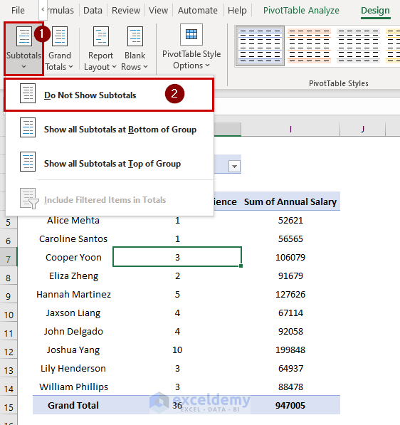
- Go to the Subtotals >> Select Do Not Show Subtotals.
- See the Dynamic Scatter Plot.
- The following GIF shows how the dynamic scatter plot works with Business Unit filtering.
Method 2 – Using Table to Create Dynamic Scatter Plot
Steps:
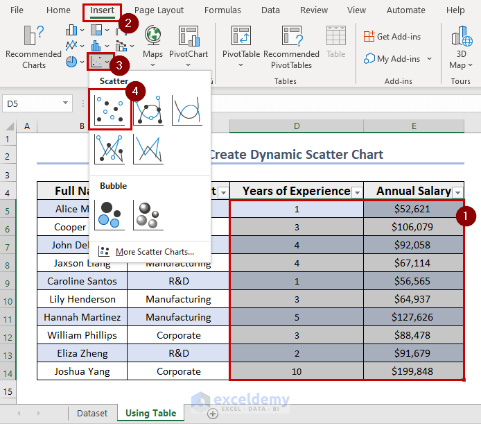
- Create a table from the sample dataset or press CTRL+T after selecting a random cell from the table.
- Select cells D5:E14 from the columns Years of Experience and Annual Salary.
- Go to the Insert tab >> Select the Insert Scatter or Bubble Chart group >> Choose the Scatter graph.
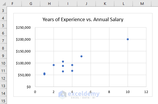
- The dynamic scatter plot will appear.
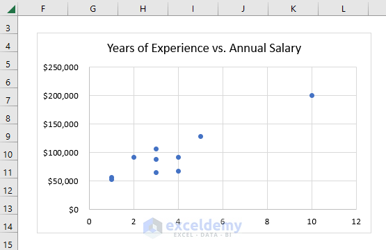
- Edit the title of the dynamic scatter plot to Years of Experience vs. Annual Salary.
Method 3 – Implementing Named Range to Create Dynamic Scatter Plot
Steps:
- Provide a name for the range.
- Go to the Formulas tab >> Click Define Name.
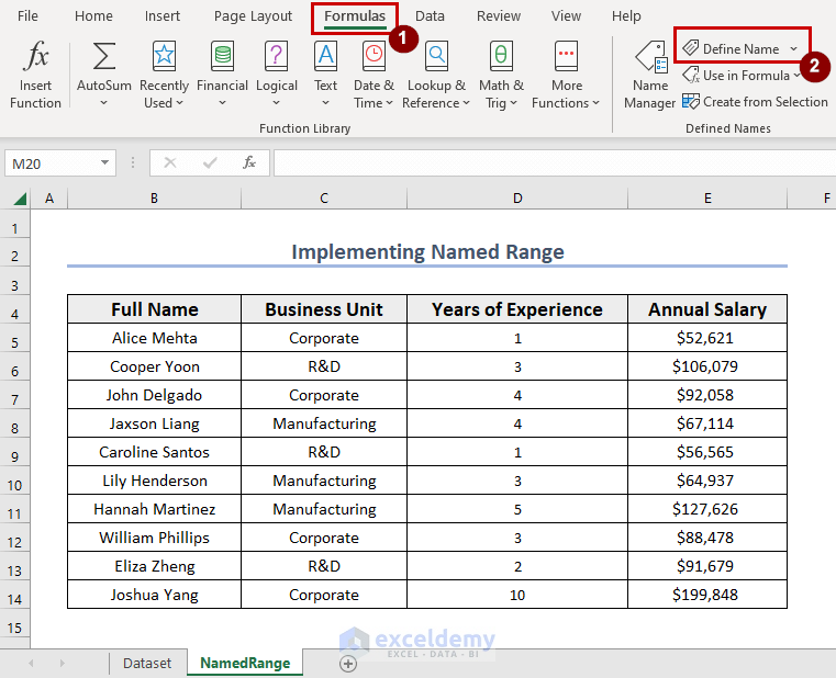
- The New Name dialog box will pop up.
- Fill out the Name with the preferred range name.
- Select the worksheet from Scope.
- Type the following formula in Refers to box to set the range:
=OFFSET(NamedRange!$D$5,0,0,COUNTA(NamedRange!$D:$D)-1,1)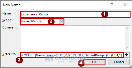
Formula Breakdown
- COUNTA(NamedRange!$D:$D)-1 → The COUNTA function will count all the data from column D. This will only count non-empty cells, and -1 is to indicate we have column headers in our dataset.
- Output → 10.
- OFFSET(NamedRange!$D$5,0,0,COUNTA(NamedRange!$D:$D)-1,1) → becomes
- OFFSET(NamedRange!$D$5,0,0,10,1) → The OFFSET function will extract all the data from the Years of Experience column starting from cell D5.
- Output → D5:D14.
- OFFSET(NamedRange!$D$5,0,0,10,1) → The OFFSET function will extract all the data from the Years of Experience column starting from cell D5.
- Click OK.
- Click on the defined name to create another named range.
- Fill out the New Name and type the following formula in the Refers to box:
=OFFSET(NamedRange!$E$5,0,0,COUNTA(NamedRange!$E:$E)-1,1)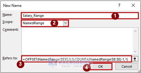
Note: Column E is selected in this formula. The NamedRange is the name of the worksheet name.
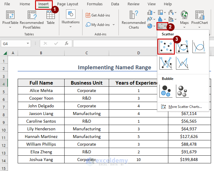
- Select a cell.
- We selected cell G4.
- Go to the Insert tab >> Select the Insert Scatter or Bubble Chart group.
- Select Scatter chart.
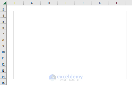
- A blank Scatter chart or plot space will appear.
- Click on the plot box >> Go to the Chart Design tab.
- From the Data group >> Choose Select Data.
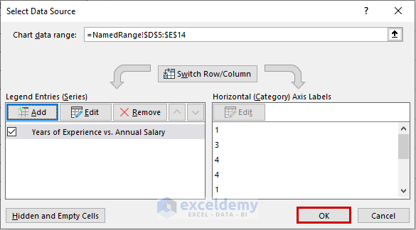
- ASelect Data Source dialog box will appear.
- Fill out the Select Data Source dialog box and click Add.

- An Edit Series dialog box will appear.
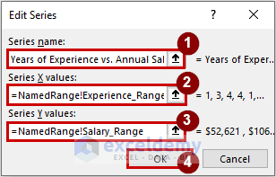
- Under the Series name option, type Years of Experience vs. Annual Salary.
- Inside the Series X values, to select the Years of Experience data range, type:
=NamedRange!Experience_Range- Inside the Series Y values, to select the Years of Experience data range, type:
=NamedRange!Salary_Range
- Click OK.
- The Select Data Source dialog box will show up.
- Click OK.
- The dynamic scatter plot in Excel is created.
Download Practice Workbook
You can download the practice workbook here.
Related Articles
- How to Create Scatter Plot Matrix in Excel
- How to Create Multiple Regression Scatter Plots in Excel
- How to Connect Dots in Scatter Plots in Excel
- How to Combine Two Scatter Plots in Excel
- How to Create a 3D Scatter Plot in Excel
- How to Create Clustered Scatter Plot in Excel
<< Go Back To Scatter Chart in Excel | Excel Charts | Learn Excel
Get FREE Advanced Excel Exercises with Solutions!
