Today we will discuss how to make a categorical scatter plot in Excel. A scatter plot represents different numeric values with a combination of dots. The position of each dot with respect to the vertical and horizontal axis represents different data points. A categorical scatter plot illustrates the distribution of multiple categories in a single plot using dots.
How to Make a Categorical Scatter Plot in Excel
In this article, we will demonstrate with examples how we can make a categorical scatter plot for different data points in Excel. We can create a categorical scatter plot using line charts in Excel. We can also use functions such as AVERAGE and STDEV.S to calculate the mean value and standard deviation and subsequently create a categorical scatter plot in Excel.
Method 1: Apply Line Chart to Create a Categorical Scatter Plot in Excel
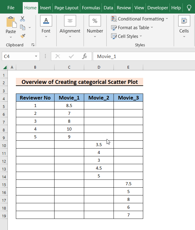
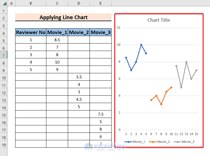
In this method, we will make a categorical scatter plot from a line chart. This method is simple and easy to understand. Here in the worksheet, we have 3 categories of movies. The categories are Movie_1, Movie_2, and Movie_3. 5 people watched these movies and gave ratings on a scale of 1 to 10. Reviewer No represents the reviewer. Every row of the three categorical fields shows the ratings for the movies by each reviewer. To make a categorical scatter plot from this dataset, follow the steps below.
Steps:
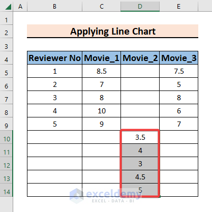
- To begin, we need to rearrange our dataset. We need to move the entries of the second categorical field in such a way that the first entry of the second categorical field remains below and next to the last entry of the first categorical field. So, select cells D5:D9.
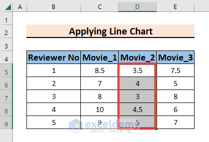
- Secondly, move the entries of cells D5:D9 to D10:D14.
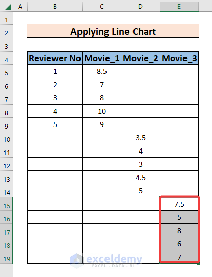
- Similarly, with the third categorical field, we will move the entries in such a way that the first entry of the third categorical field remains below and next to the last entry of the second categorical field. We are moving the entries of cells E5:E9 to E15:E19.
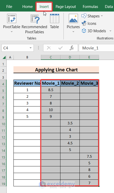
- Now, select the cells C4:E19 and go to the Insert tab.
- After that, click on the Line Chart from the Charts group.
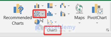
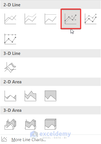
- Then, select an appropriate line chart. We are selecting Line with Markers from 2-D Line charts.
- Subsequently, you will see a 2-D line chart of the selected data points.
- Next, click on the chart and go to the Chart Design tab.
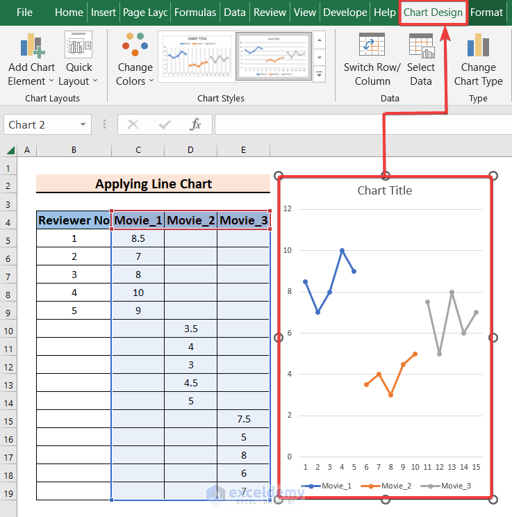
- Then, select the Switch Row/Column option.
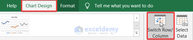
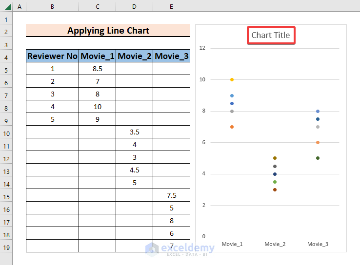
- After that, you will see a categorical scatter plot of your data points.

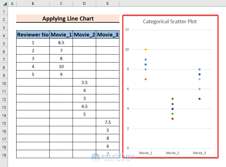
- Then, you may click on the Chart Title and give your chart a suitable name.
- Finally, you will have a categorical scatter plot of your data points showing the ratings for every movie category individually.
Method 2: Use Mean and Standard Deviation to Create a Categorical Scatter Plot in Excel
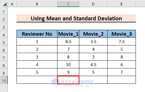
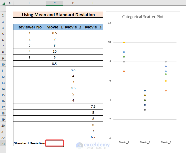
In this method, we will create a categorical scatter plot by showing the mean and standard deviation for each category. This method includes very simple calculation steps. The dataset is the same as Method 1. Simply follow the steps below.
Steps:
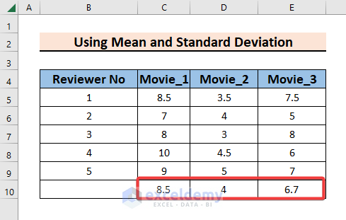
- First, we need to calculate the arithmetic mean of the entries of each category. Select a cell where you want to put the value of the mean for the first category. We are selecting cell C10.
- Secondly, enter the formula into the cell:
=AVERAGE(C5:C9)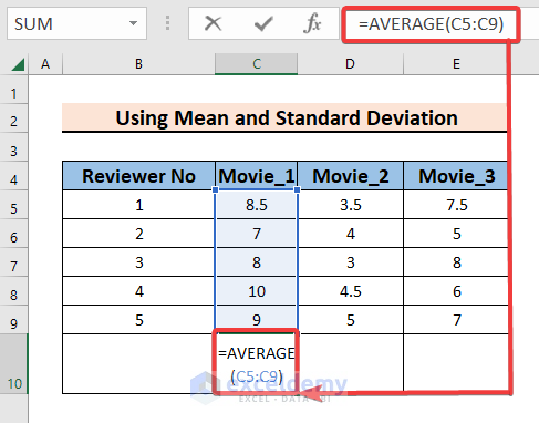
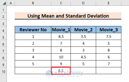
- Thirdly, press Enter and you will see the value of the arithmetic mean for the first category.
- Then, use the Fill Handle to Autofill data from C10:E10.
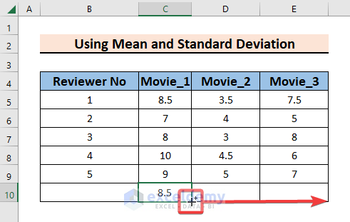
- Next, you will see the means for all categories in cells C10:E10.
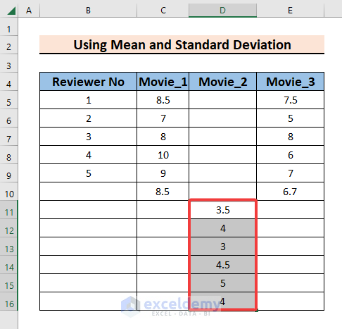
- Now, just like Method 1, we need to move the entries of the second categorical field in such a way that the first entry of the second categorical field remains below and next to the last entry of the first categorical field. Here, we are moving the entries of cells D5:D10 to D11:D16.
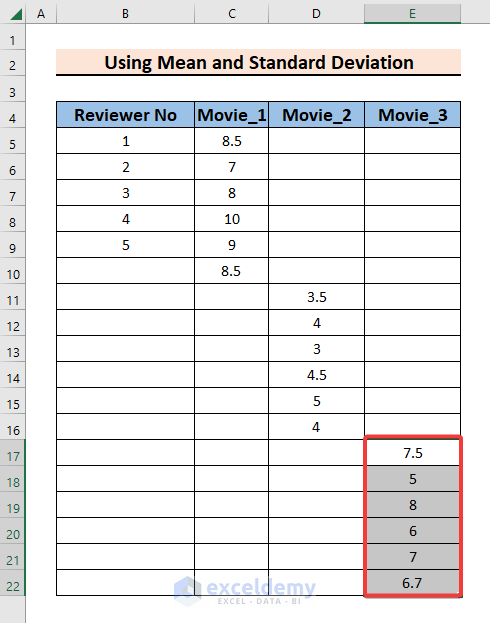
- Similarly, with the third categorical field, we will move the entries in such a way that the first entry of the third categorical field remains below and next to the last entry of the second categorical field. We are moving the entries of cells E5:E10 to E17:E22.
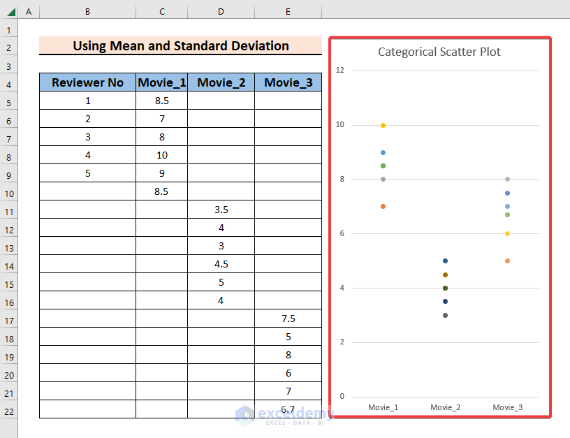
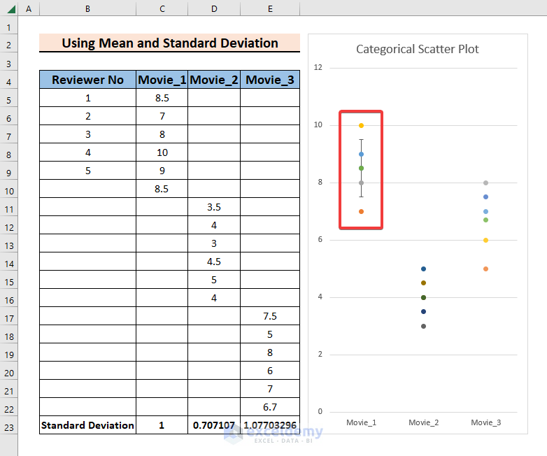
- Now, select the cells C4:E22 and follow Method 1 to create a categorical scatter plot.
- Next, we need to calculate the standard deviation for the data points. Select cell C23 to put the value of the standard deviation for the first category.
- Then, enter the formula into the cell:
=STDEV.S(C5:C10)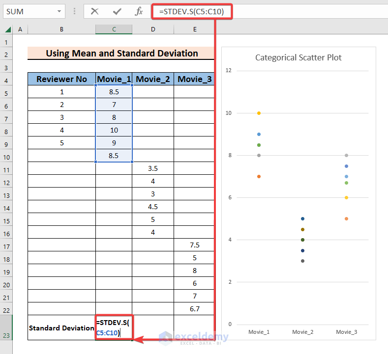
- After that, to calculate the standard deviation for the second category select cell D23 and enter the formula below:
=STDEV.S(D11:D16)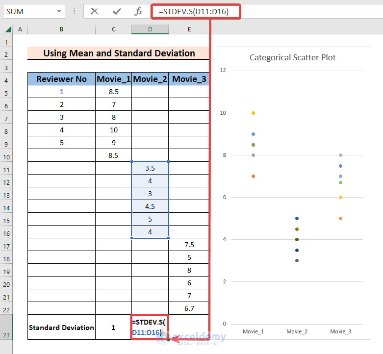
- Next, to calculate the standard deviation for the third category select cell E23 and enter the formula below:
=STDEV.S(E17:E22)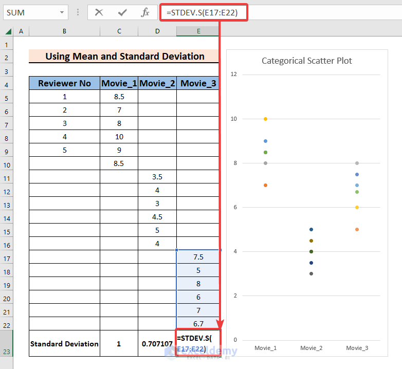
- Now, in the chart, find the data point that represents the mean of the first category.
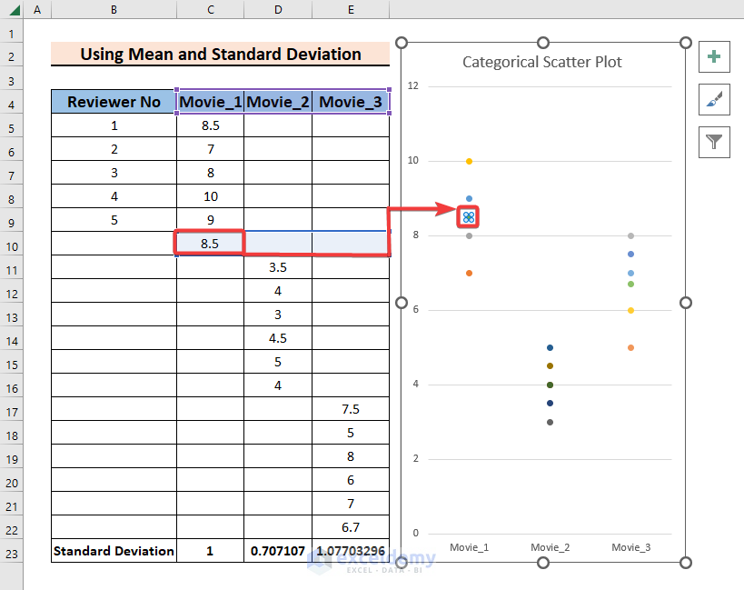
- Then, click on the mean data for the first category and select the plus (+) icon and go to different Chart Elements option, select Error Bars > More Options.
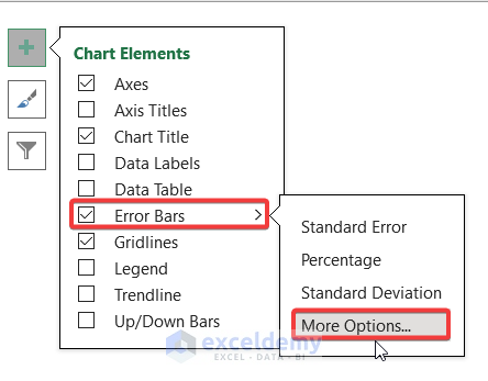
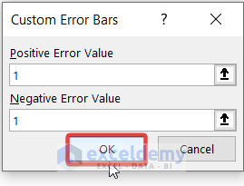
- Subsequently, from Format Error Bars, select Custom > Specify Value.
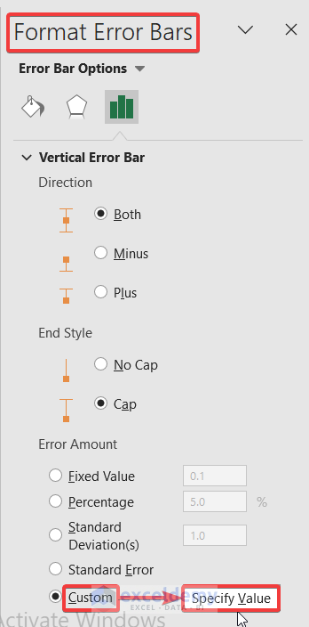
- Then, you will see Custom Error Bars. Put the value of cell E23 as the value for both Positive Error Value and Negative Error Value.
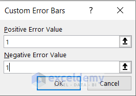
- Then, press OK.
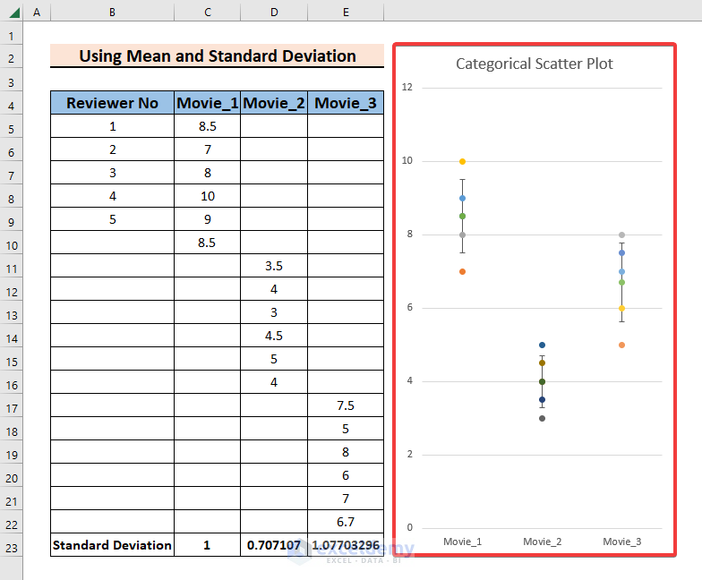
- After that, you will see the mean associated with the standard deviation for the first category.
- Now, do the same steps with the means of the rest of the categories.
- Finally, you will have a categorical scatter plot showing the mean and standard deviation for each category.
Download Practice Book
You can download this practice book while going through this article.
Conclusion
In this article, we have talked in detail about how to make a categorical scatter plot in Excel. This article will allow users to use Excel more efficiently and effectively. If you have any questions regarding this essay, feel free to let us know in the comments. Also, if you want to see more Excel content like this, please visit our website, Exceldemy.com and unlock a great resource for Excel-related content.
Related Articles
- How to Add Multiple Series Labels in Scatter Plot in Excel
- How to Create Scatter Plot Matrix in Excel
- How to Create Multiple Regression Scatter Plots in Excel
- How to Connect Dots in Scatter Plots in Excel
- How to Create Dynamic Scatter Plot in Excel
- How to Combine Two Scatter Plots in Excel
- How to Create a 3D Scatter Plot in Excel
- How to Create Heat Map Scatter Plot in Excel
- How to Create Clustered Scatter Plot in Excel
<< Go Back To Scatter Chart in Excel | Excel Charts | Learn Excel
Get FREE Advanced Excel Exercises with Solutions!
