A Heat Map Scatter Plot in Excel is a type of data visualization that can be created in Microsoft Excel to represent the density of data points in a scatter plot. It is a powerful tool that can help to identify patterns and trends in large sets of data. By using color to represent the density of data points, a Heat Map Scatter Plot can quickly highlight areas of high or low concentration, making it easier to identify clusters and outliers in the data. Whether you are working with sales data, scientific research, or any other type of data set, a Heat Map Scatter Plot can provide valuable insights that might otherwise be missed. In this article, we will explore how to create a Heat Map Scatter Plot in Excel and how it can be used to analyze data.
How to Create Heat Map Scatter Plot in Excel: 2 Methods
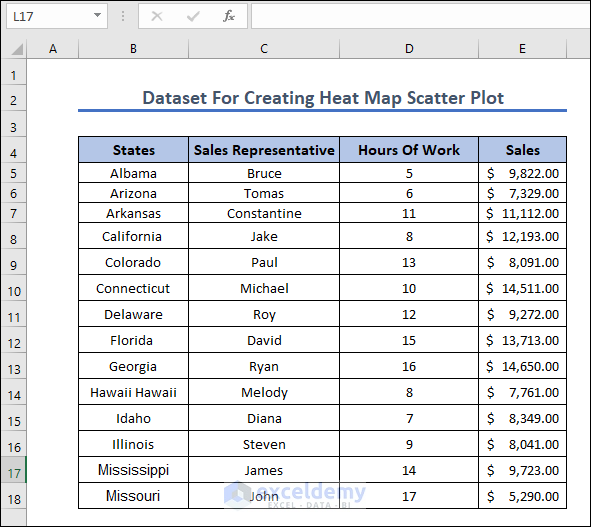
We have used the data table below to show two methods to create a heat map scatter plot in Excel. In the first method, we used a scatter plot added a color scheme, and then created a method to create a 3D heatmap scatter plot.
1. How to Heat Map Scatter Plot Using Data Table
In this section, we are going to show how you can create your own heat map scatter plot using a data table. You have to create a scatter plot first, then add a gradient color scheme to make your own heat map.
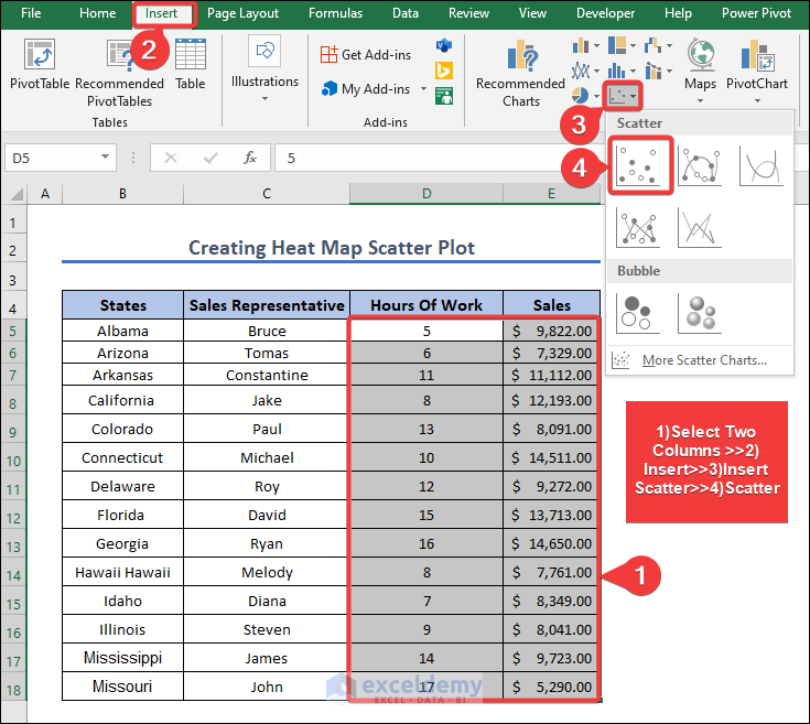
- First, we have to create a scatter graph by selecting two columns (“Hours of Work” & “Sales”) >>Going to the Insert Button>>Insert Scatter, then we select Scatter, and the scatter graph will generate automatically.
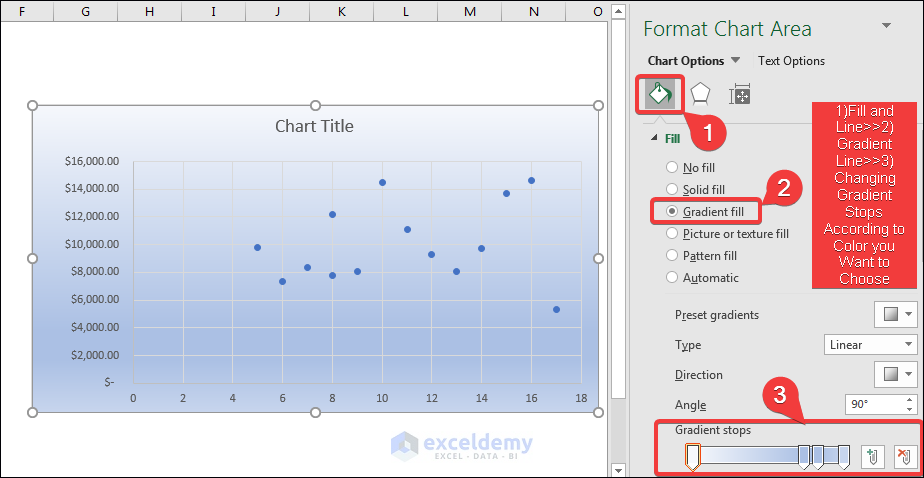
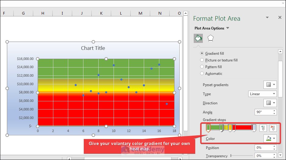
- After generating the Scatter graph, we are going to use gradient fill to separate data. To do that we have gone to Format Chart Area which will be automatically created after selecting Scatter and Chart Options like below.
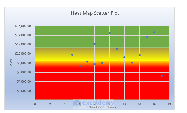
- Now, using your own gradient stop color scheme, you can create your own heat map. Here, I have used green to identify satisfactory sales, yellow for medium, and red for less satisfactory sales after separating three gradients like below.
- After giving the proper Axis Title and Chart Title, we have the final heat map. Here the Y axis is the Sales and the X axis is the Number of Hours.

2. Heat Map Scatter Plot on 3D Map
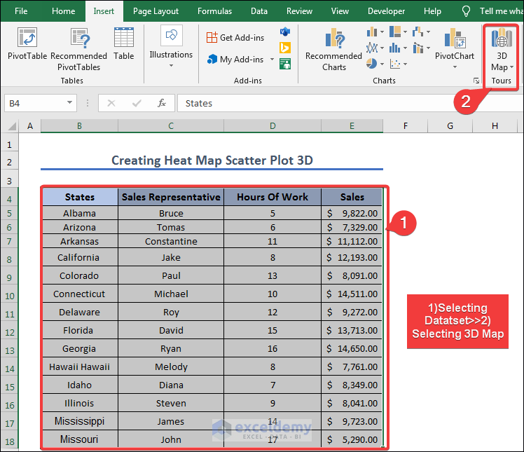
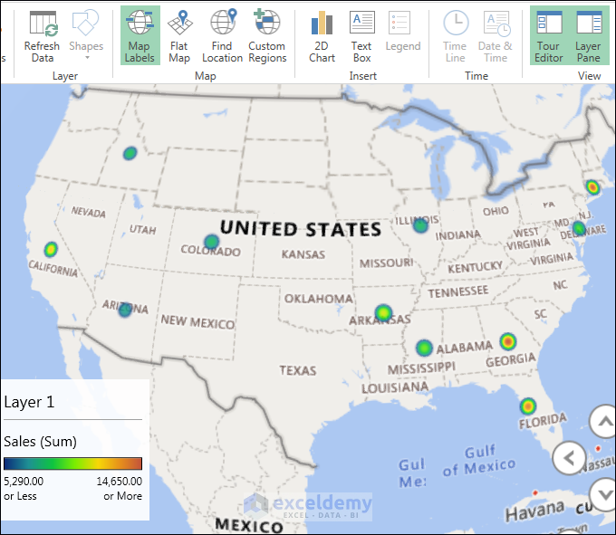
In this section, we are going to create a heat map scatter plot on a 3D map. First, we have to include the states that will create a scatter plot and add sales values to add a heat map. To do so, we have to follow the following instructions.
- First, for creating a heat map scatter plot on a 3D map we have to select the data table first and select the 3D map.
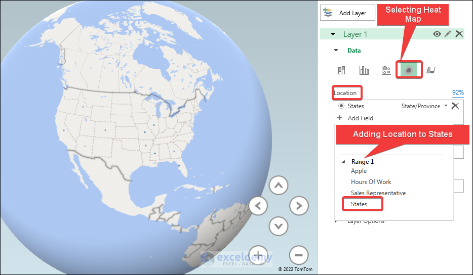
- Then we are going to select Location to States and select the heat map. Selecting States and heat map will create a scatter chart according to the states.
- Then we are going to add sales in Value. Thus it is going to make a heat map according to Sales.
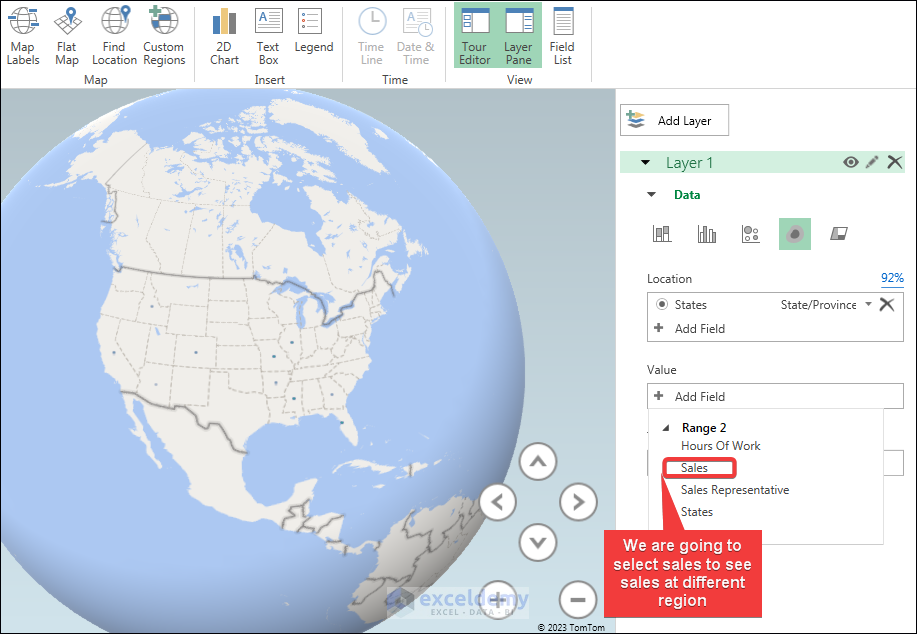
- Finally, we get the ultimate 3D heat map scatter plot in 3D. If you select Map Labels it will be beautiful like below.
How to Create Heat Map Using Excel Conditional Formatting
In this article, we are going to create a heat map using conditional formatting. It is an easy process just going to conditional formatting, and selecting color scales on your own you can create a heat map using conditional formatting.
- First, we have to select the column of sales and then we go to Conditional Formatting>>Color Scales and then select a color scheme.
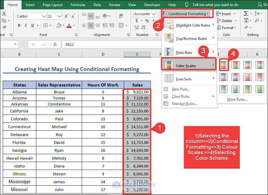
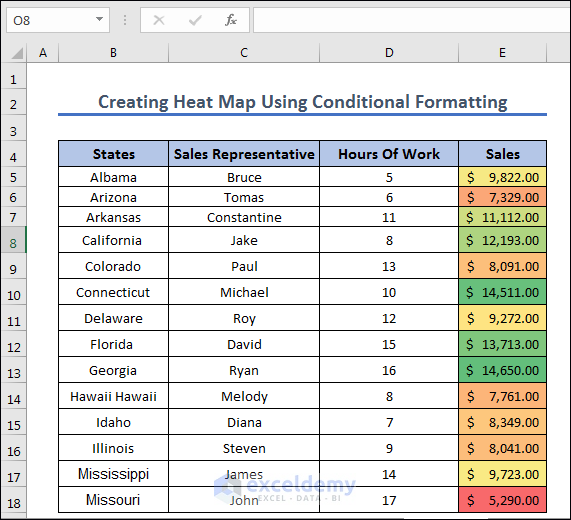
- After selecting the color scheme we will find the heatmap like below. You can select any color scheme you like
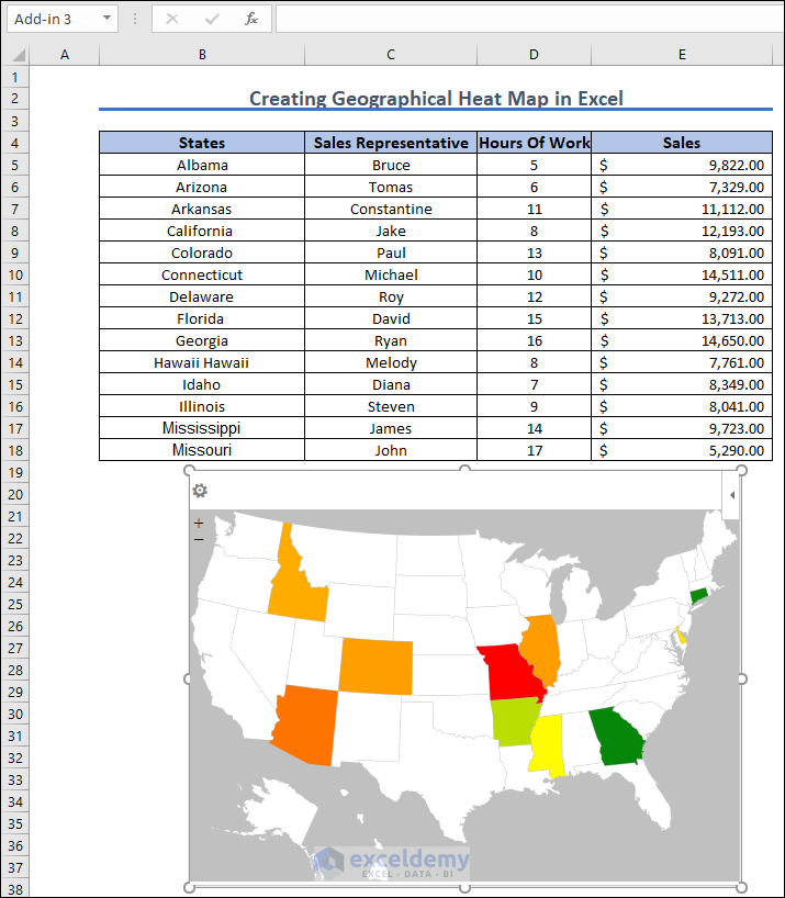
How to Create a Geographical Heat Map in Excel
In this section, we are going to show you a step-by-step method to create a geographical heat map in Excel. To do so we are going to follow the following steps to create a geographical heatmap.
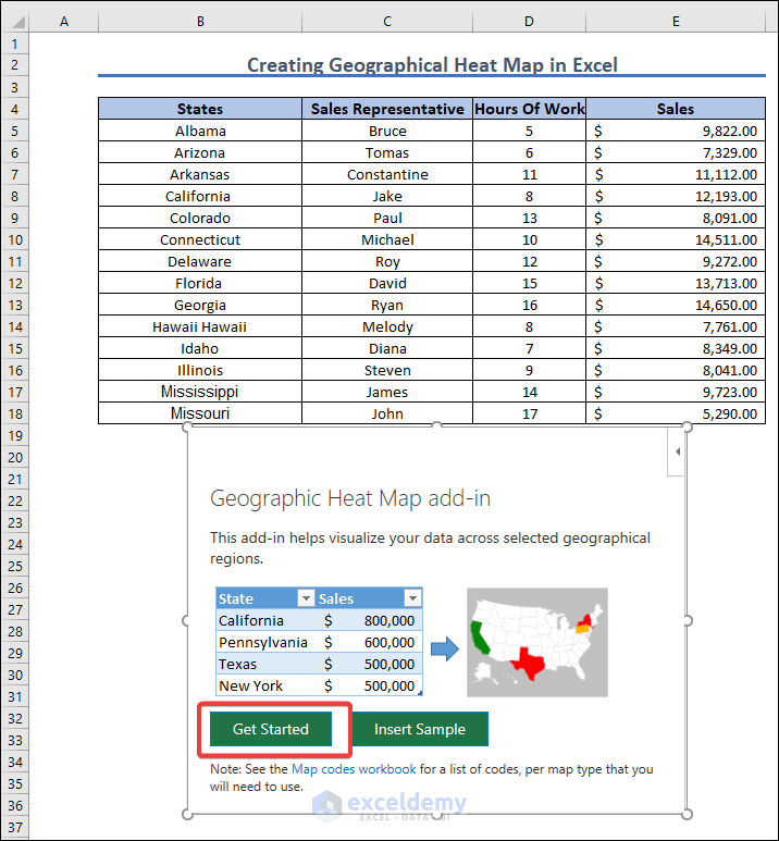
- First, we are going to select Get Add-ins and Search for Map and then Add Geographical Heat Map.
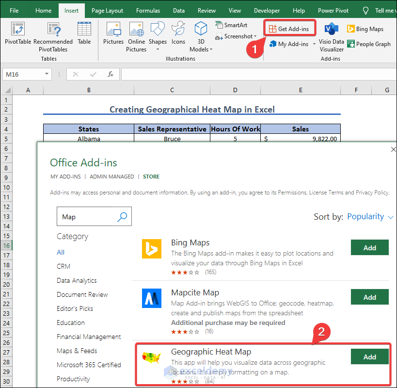
- After pressing the Add button we are going to have a window like below and select Get Started.
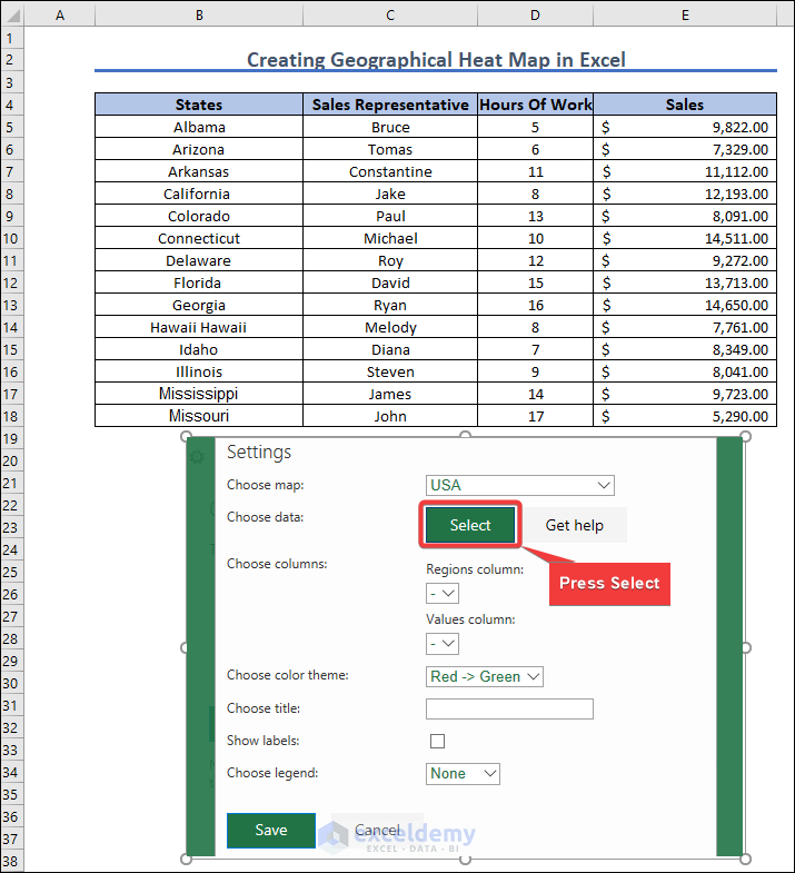
- Then we are going to choose the map as the USA and press Select. Here we have used USA because all the states are from the USA.
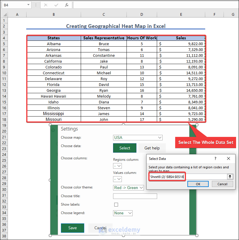
- After pressing Select, we are going to select the whole data set like below. After pressing select, the window to give range will automatically pop up. Then select the whole data set.
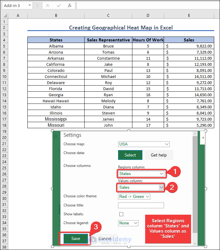
- Then we are going to set the Regions column to States and the Values column to Sales. Because we are going to see sales in different states.
- Finally, we get the geographical heat map. Where we see the heat map according to sales.
Frequently Asked Questions?
Q: What is a Heat Map Scatter Plot in Excel?
A: A Heat Map Scatter Plot is a type of data visualization that represents the density of data points in a scatter plot using color. It helps to identify patterns and trends in large data sets.
Q: What types of data are suitable for a Heat Map Scatter Plot?
A: A Heat Map Scatter Plot is suitable for any type of data that can be plotted on a scatter plot. It is particularly useful for data sets with a large number of data points, where it can help to identify clusters and outliers.
Q: What are the advantages of using a Heat Map Scatter Plot in Excel?
A: The advantages of using a Heat Map Scatter Plot in Excel include the ability to quickly identify areas of high or low data density, which can help to identify patterns and trends that might be missed using other types of data visualizations. It can also help to highlight outliers and clusters in the data, making it easier to draw conclusions and make data-driven decisions.
Q: Can I customize the color gradient in a Heat Map Scatter Plot?
A: Yes, you can customize the color gradient in a Heat Map Scatter Plot to suit your preferences or to better highlight specific areas of the data. Excel’s built-in conditional formatting feature allows you to choose from a range of color schemes or create your own custom gradient.
Things to Remember
Here are some things to remember for the heat map scatter plot.
- Make sure your data is properly formatted: Before creating a Heat Map Scatter Plot, ensure that your data is properly formatted, with each column representing a variable and each row representing an observation.
- Choose the right type of data: A Heat Map Scatter Plot is most useful for data sets with a large number of data points, where it can help to identify patterns and trends that might be missed using other types of data visualizations.
- Create a scatter plot: To create a Heat Map Scatter Plot, start by creating a regular scatter plot in Excel.
- Add a color gradient: Once you have created a scatter plot, you can add a color gradient to represent the density of data points. You can use Excel’s built-in conditional formatting feature or a third-party add-in to create the color gradient.
- Choose the right color scheme: Choose a color scheme that is appropriate for your data and that makes it easy to identify areas of high or low data density.
- Use a legend: Include a legend in your Heat Map Scatter Plot to help viewers understand the color gradient and what it represents.
- Consider scaling: Depending on the size of your data set, you may need to adjust the scaling of your Heat Map Scatter Plot to ensure that it is easy to read and interpret.
- Be mindful of outliers: While a Heat Map Scatter Plot can help to identify outliers, it is important to be mindful of their impact on the overall visualization and to consider excluding them if necessary.
- Use appropriate labeling: Make sure to label your axes and include a title that accurately reflects the data being represented in your Heat Map Scatter Plot.
- Test and refine: Finally, it is important to test your Heat Map Scatter Plot with different color schemes and scaling options to ensure that it effectively represents your data and is easy to interpret.
Download Practice Workbook
Conclusion
In conclusion, a heat map scatter plot in Excel is a powerful tool that can help to identify patterns and trends in large datasets. By representing the density of data points using color, the plot can quickly highlight areas of high or low concentration, making it easier to identify clusters and outliers in the data. While creating it may seem daunting at first, following the proper steps and considerations can lead to a visually impactful and informative data visualization. Whether you are working with sales data, scientific research, or any other type of data set, a heat map scatter plot can provide valuable insights that might otherwise be missed.
Related Articles
- How to Add Multiple Series Labels in Scatter Plot in Excel
- How to Make a Categorical Scatter Plot in Excel
- How to Create Scatter Plot Matrix in Excel
- How to Create Multiple Regression Scatter Plots in Excel
- How to Connect Dots in Scatter Plots in Excel
- How to Create Dynamic Scatter Plot in Excel
- How to Combine Two Scatter Plots in Excel
- How to Create a 3D Scatter Plot in Excel
- How to Create Clustered Scatter Plot in Excel
<< Go Back To Scatter Chart in Excel | Excel Charts | Learn Excel
Get FREE Advanced Excel Exercises with Solutions!
