A clustered scatter plot is a type of chart in Excel that displays data points as individual dots on a graph. Unlike a regular scatter plot where all data points are plotted together, a clustered scatter plot groups data points into clusters based on their similarities.
Let’s create one to demonstrate.
Step 1 – Preparing Dataset and Reference Data
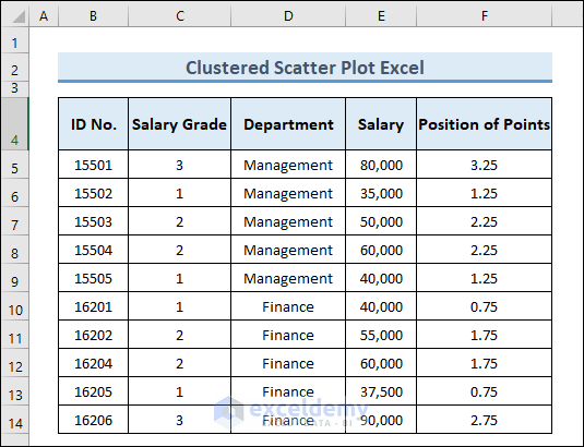
To create the clustered scatter plot, we’ll use the following sample dataset containing the data of some employees in an office.
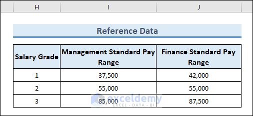
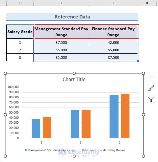
We also need reference values to compare with the values in the dataset:
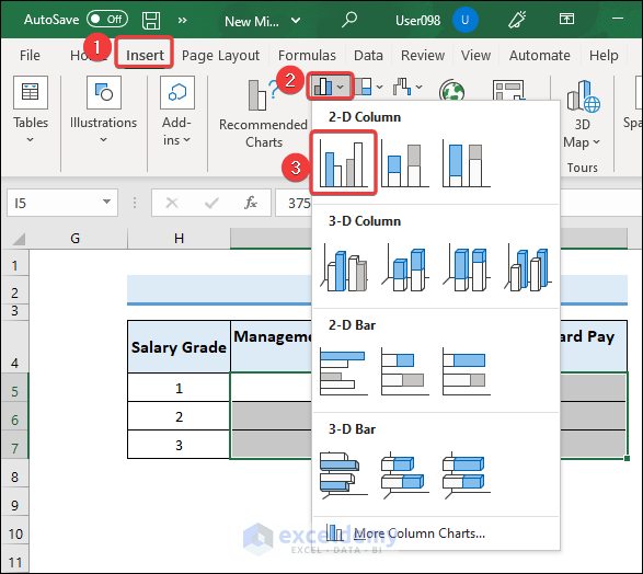
Step 2 – Inserting 2D Column
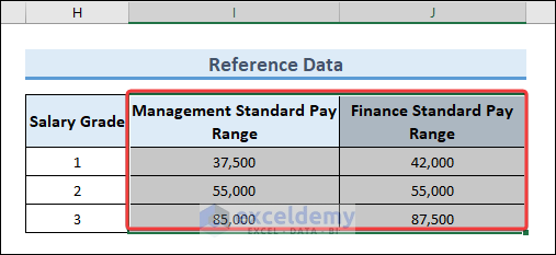
- Select the data range in the reference data.
- Insert a 2D Column chart of this data by following the steps in the image below.
The chart below is generated in the worksheet.
Step 3 – Modifying the Column Chart
The chart needs to be modified further to clearly visualize it.
- Right-click on any column of the chart and select Format Data Series from the context menu.
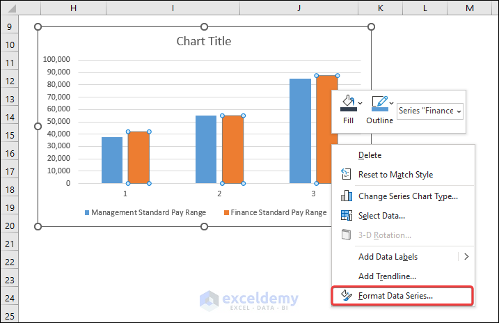
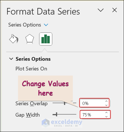
A sidebar will appear where we will modify some values.
- Set the “Series Overlap” to 0 and “Gap Width” to 75.
- Change the color of the columns to improve readability as in the image below.
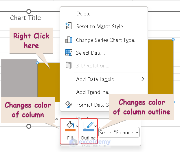
The column chart now looks like the image below.
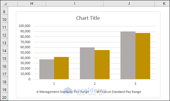
Step 4 – Inserting Dataset into Column Chart
We need to insert our dataset into the chart with an accurate position in the chart.
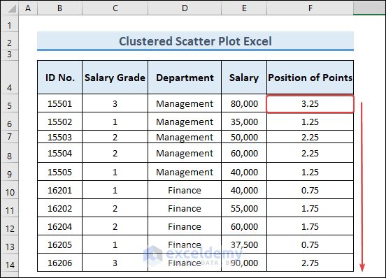
- To define the “X-Axis” positions, enter the following formula into cell F5:
=IF(D5="Management",C5+0.25,C5-0.25)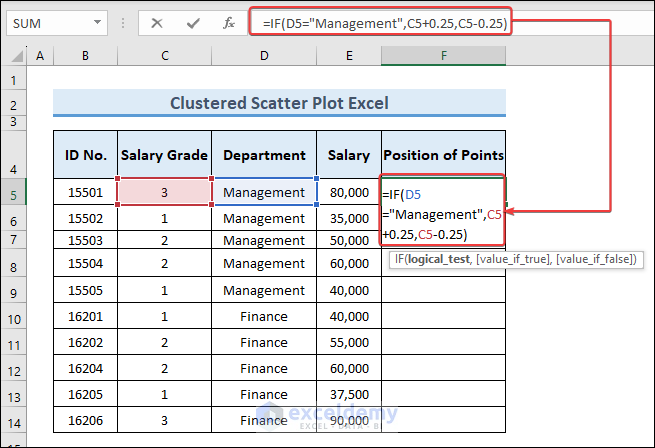
- Press Enter to return a value in the cell.
- Use the AutoFill tool to fill the values in the remaining cells.
- Select the data for the “Management” department on the X-axis as per the image below.
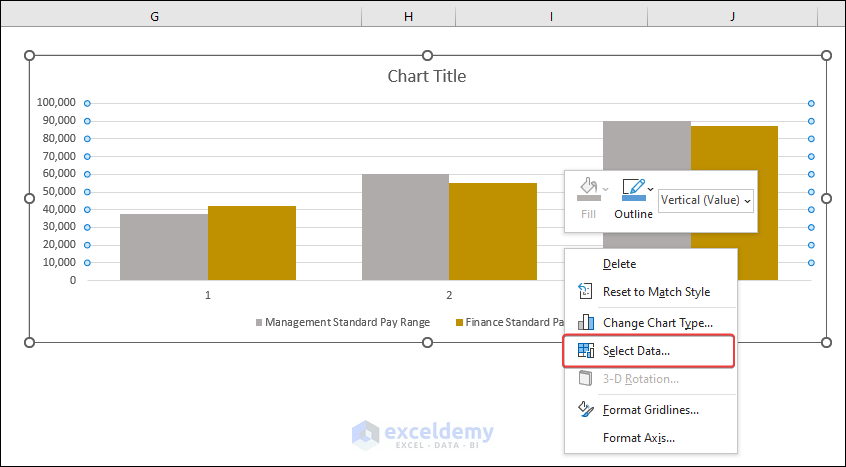
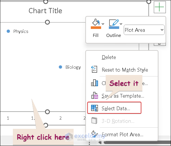
- Right click on the chart.
- Click on “Select Data”.
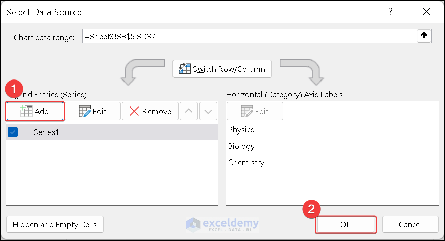
A Select Data Source dialog box opens
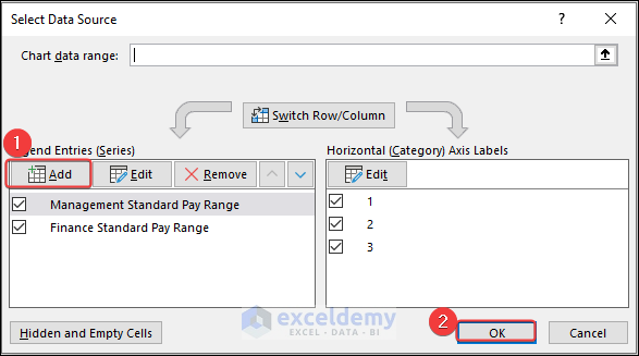
- Enter the name of the series.
- Select the range of values associated with it.
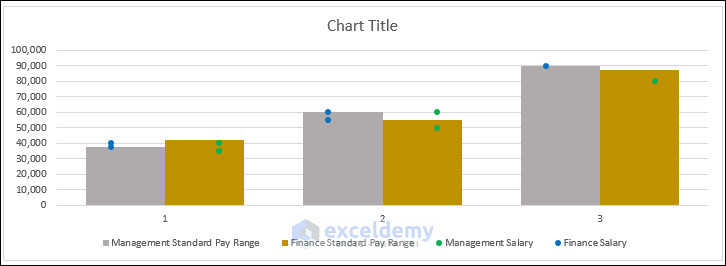
The data for the employees of the Management department has been plotted.
- To insert the data for the Finance department, repeat the whole process.
Our chart now looks like the image below.
Step 5 – Clustering Data Points into Chart
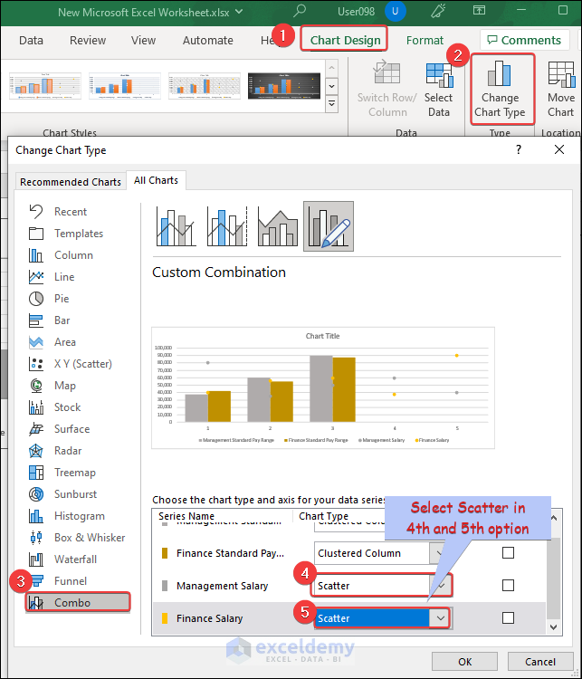
- From the Chart Design tab, click Select Data.
- In the Change Chart Type dialog box that opens, choose Combo from the Recommended Charts list.
- Select Scatter as the last two options as in the picture below.
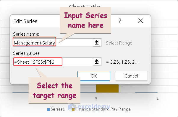
- Follow the steps in the video below to modify the “Management Salary” as well as the “Finance Salary” ranges, because the X-axis data is missing in both cases.
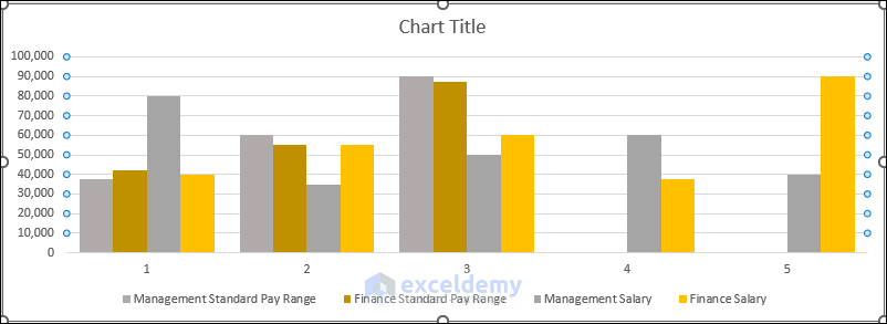
We have our desired scattered plot.
How to Create a Scatter Plot with Labels in Excel
Having labels of the data points in a scatter plot makes interpretation of the data much easier.
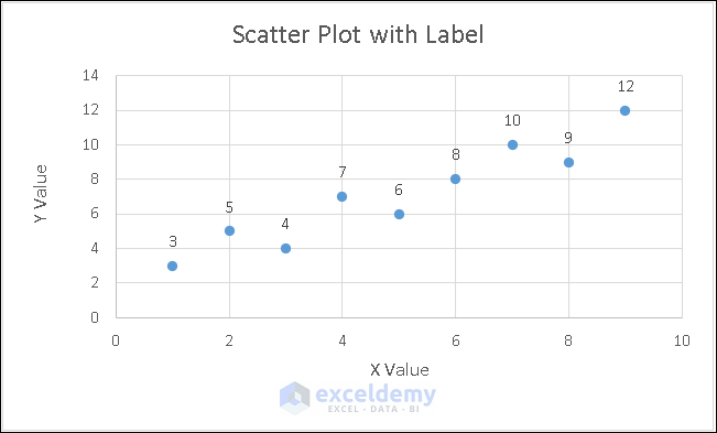
To demonstrate how to add labels in a scatter plot, we’ll use the dataset below.
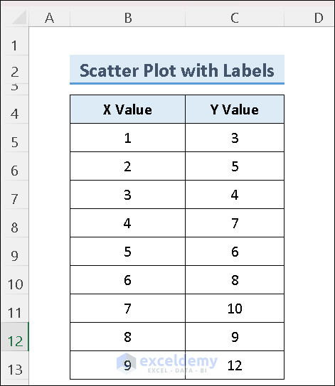
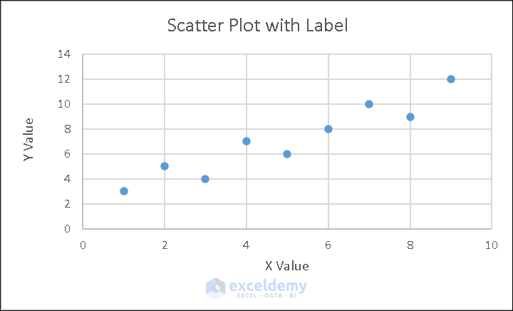
After creating a scatter chart of the above dataset, it looks like the image below.
Let’s add a data label to the above plot.
Steps:
- Click on the chart.
- Click the Plus (+) sign.
- Tick the Data Labels option.
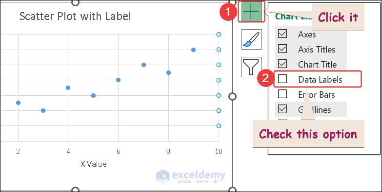
The output looks like the following image.
How to Create a Scatter Plot with Different Colors
In the following dataset, we have some subjects and the number of students assigned to each.
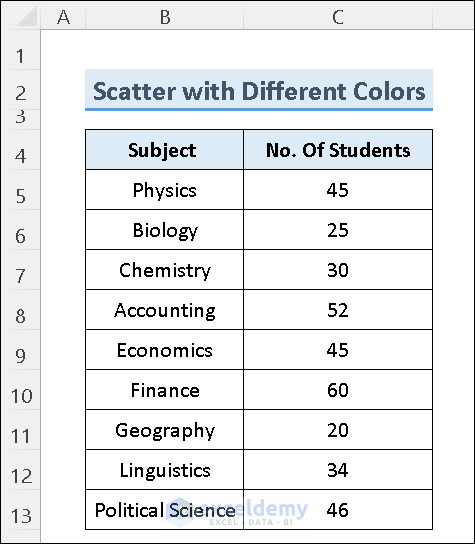
Our desired scatter plot will show the number of students in different subjects grouped into different colors. Physics, Chemistry and Biology students will be shown in one color; Accounting, Economics and Finance in another color; and the rest in a different color entirely.
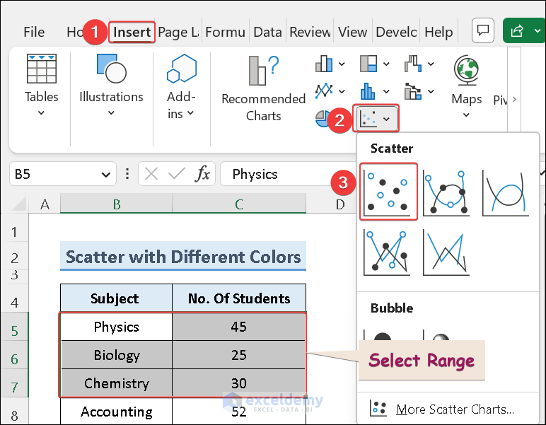
Steps:
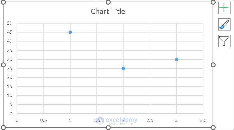
- Select the range and insert a “Scatter Plot” in a worksheet as follows:
This will generate a scatter plot like the image below.
- Add a label to the plot as described above.
- Add a new data range as in the following image:
A Select Data Source dialog box will appear.
- Click Add under Legend Entries (Series).
- Click OK.
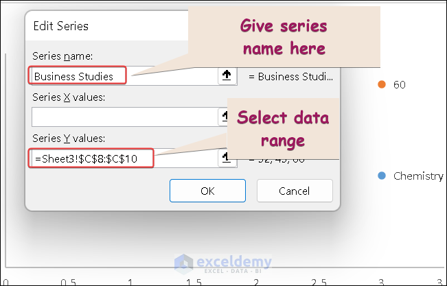
A new dialog box appears prompting to select a range.
- Enter a Series name.
- Enter the range data in Series Y values.
- Click OK.
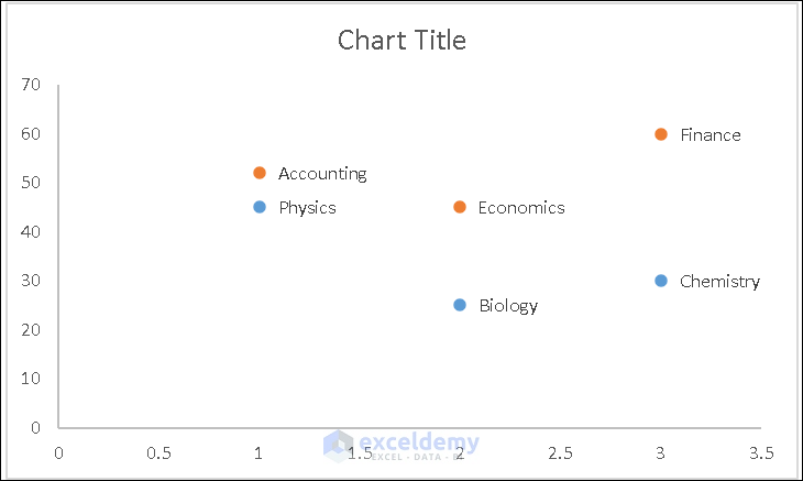
A chart with different colors for different data will be generated.
Frequently Asked Questions(FAQs)
1. What is a clustered scatter plot in Excel?
A type of chart that displays data points as individual dots on a graph. The data points are grouped into clusters based on their similarities.
2. What are the advantages of using a clustered scatter plot in Excel?
A clustered scatter plot in Excel can help you visualize complex data sets and identify patterns or trends within each cluster.
3. Can I customize the appearance of my clustered scatter plot in Excel?
Yes, by adjusting the chart’s colors, fonts, labels, and other formatting options.
Download Practice Workbook
Related Articles
- How to Make a Categorical Scatter Plot in Excel
- How to Create Scatter Plot Matrix in Excel
- How to Create Multiple Regression Scatter Plots in Excel
- How to Connect Dots in Scatter Plots in Excel
- How to Create Dynamic Scatter Plot in Excel
- How to Combine Two Scatter Plots in Excel
- How to Create a 3D Scatter Plot in Excel
<< Go Back To Scatter Chart in Excel | Excel Charts | Learn Excel
Get FREE Advanced Excel Exercises with Solutions!
