What Is Multiple Regression?
Multiple regression is a mathematical technique that makes statistically based predictions about a dependent variable by using several independent variables. The purpose of multiple regression is to predict the nature of dependent variables with respect to corresponding independent variables. Within the analysis, independent variables affect the dependent variable through the changes we make to them.
How to Create Multiple Regression Scatter Plot in Excel
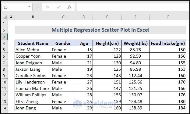
To demonstrate how to create multiple regression scatter plots in Excel, we have a sample dataset with 11 rows and 6 columns.
Food Intake(gm) is the dependent variable and Age, Height(cm), and Weight(lbs) are the independent variables.
Step 1 – Enable the Data Analysis Tab
The Data tab does not contain the Data Analysis command by default. You need to manually activate it.
Steps:
- Go to File >> Options.
- Select Add-ins >> Excel Add-ins >> Go
- Check Analysis ToolPak in the Add-ins available: section and click OK.
The Data Analysis Ribbon will appear in the Data Tab.
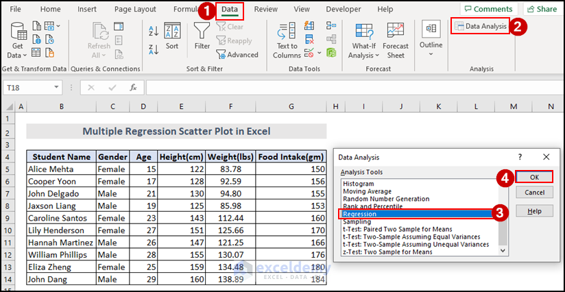
Step 2 – Create the Multiple Regression Analysis in Excel
Steps:
- From the Data tab >> select Data Analysis
- A dialog box will show up. Select Regression from Analysis Tools and click OK.
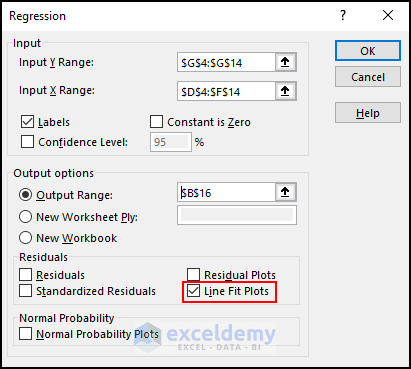
- Select the range of dependent variables (Input Y Range). In this case, it’s G4:G14.
- Select the range of independent variables (Input X Range). E.g., D4:F14.
- Check Labels and select Output Range: in the Output Options. I have selected $B$16 to show regression analysis in the current sheet. You can also select New Worksheet Ply: in the Output Options to show regression analysis.
- Click OK.
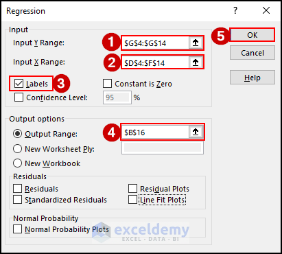
You will see regression analysis in cell B16 of your current worksheet.
Step 3 – Create the Multiple Regression Scatter Plot in Excel
Steps:
- Check the Line Fit Plots of Regression dialog box and click OK.
We get 3 scatter plots of 3 independent variables based on the dependent variable.
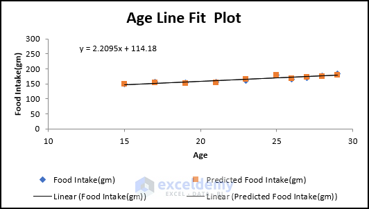
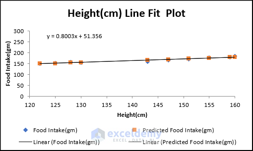
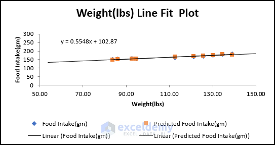
From these scatter plots, it is clearly visible how these variables are connected with one another. There are three types of Correlation in scatter plotting:
- Positive Correlation: If, with the increase in the x variable, the y variable also increases, then it is a positive correlation. In the Weight(lbs) Vs Food Intake(gm) scatter plot, we can see that with the increase in weight, the amount of food intake is also increasing.
- Negative Correlation: If, with the increase in the x variable, the y variable also decreases, then it is a negative correlation.
- No Correlation: If there is no connection between the variables, then there is no correlation. For example, students’ gender has no correlation with their food intake.
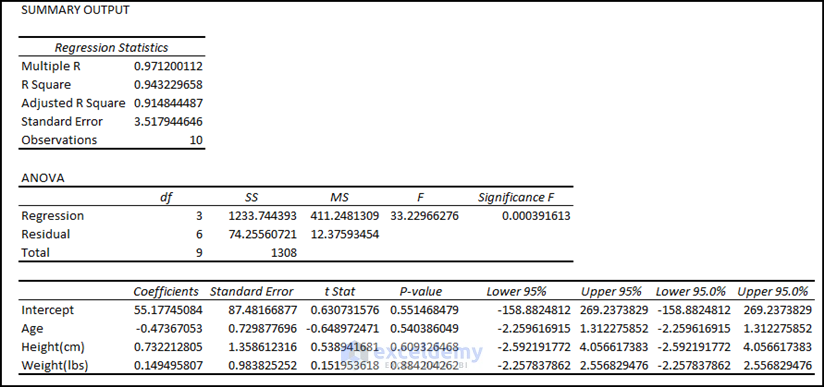
How to Interpret the Result of Excel Multiple Regression
Regression Statistics:
In the Regression Statistics portion, we see values for some parameters.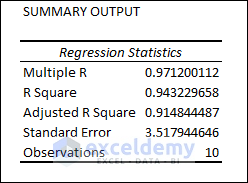
- Multiple R: This refers to the Correlation Coefficient that determines how strong the linear relationship among the variables is. The range of values for this coefficient is (-1, 1). The strength of the relationship is proportionate to the absolute value of Multiple R.
- R Square: It is another Coefficient to determine how well the regression line will fit. It also shows how many points fall on the regression line. In this example, the value of R2 is 94, which is good. It implies that 94% of the data will fit the multiple regression lines.
- Adjusted R Square: This is the adjusted R squared value for the independent variables in the model. It is suitable for multiple regression analysis and so for our data. Here, the value of Adjusted R Square is 91.
- Standard Error: This determines how perfect your regression equation will be.
- Observations: The number of observations in the dataset is 10.
Analysis of Variance (ANOVA):
We can see some other parameters in the ANOVA analysis section.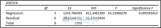
- df: The ‘degrees of freedom’ is defined by df. The value of df here is 3 because we have 3 types of independent variables.
- SS: SS refers to the sum of squares. If the Residual Sum of the Square is much smaller than the Total Sum of Square, your data will fit in the regression line more conveniently. Here, the Residual SS is much smaller than Total SS, so we can predict that our data may fit in the regression line in a better way.
- MS: MS is the mean square. The values of Regression and Residual MS are 411.2481309 and 12.37593454 respectively.
- F and Significance F: These values determine the reliability of the regression analysis. If the Significance F is less than 05, the multiple regression analysis is suitable to use. Otherwise, you may need to change your independent variable. In our dataset, the value of Significance F is 0.000391613 which is good for analysis.
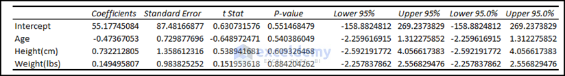
Regression Analysis Output:
Coefficients and Others:
In this section, we get the values of the coefficients for the independent variables- Age, Height(cm) and Weight(lbs). We can also find the following information for each coefficient: its Standard Error, t Stat, P-value, and other parameters.
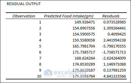
Residual Output:
The Residual Values help us understand how much the predicted price deviates from its actual value and the standard value of residuals that would be acceptable.
Difference Between Linear and Multiple Regression
Linear regression is a simple technique that involves fitting a straight line to a set of data points. It is used when there is only one independent variable and one dependent variable, and the relationship between the two variables is assumed to be linear. The goal of linear regression is to find the line of best-fit line that minimizes the distance between the observed data points and the predicted values.
Multiple regression is used when there are multiple independent variables that may be related to the dependent variable. The goal of multiple regression is to find the best-fit equation that can predict the value of the dependent variable based on the values of the independent variables. Multiple regression can help us understand the relative importance of each independent variable in predicting the outcome.
Download Practice Workbook
Related Article
- How to Make a Categorical Scatter Plot in Excel
- How to Create Scatter Plot Matrix in Excel
- How to Connect Dots in Scatter Plots in Excel
- How to Create Dynamic Scatter Plot in Excel
- How to Combine Two Scatter Plots in Excel
- How to Create a 3D Scatter Plot in Excel
- How to Create Clustered Scatter Plot in Excel
<< Go Back To Scatter Chart in Excel | Excel Charts | Learn Excel
Get FREE Advanced Excel Exercises with Solutions!
