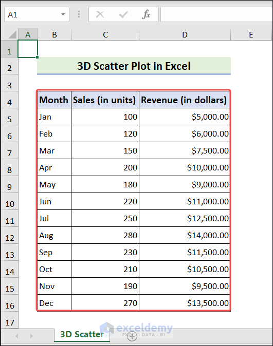
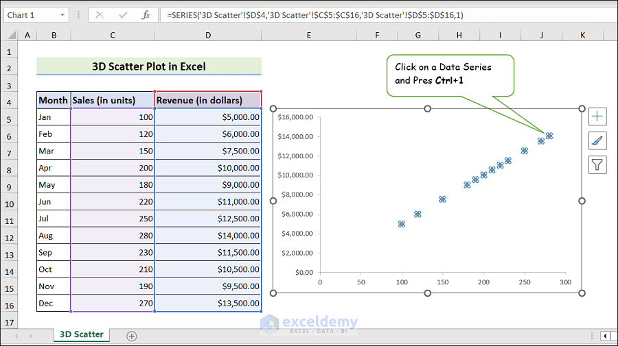
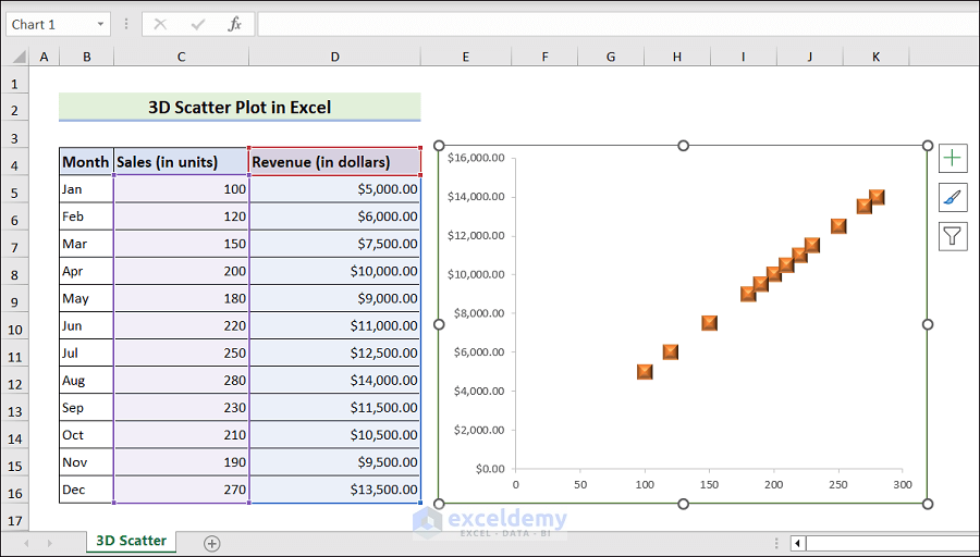
Suppose you have the following dataset to use for a 3D Scatter Plot.
Insert a Scatter Chart
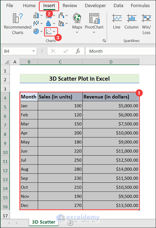
Steps:
- Select the active range (B4:D16 in this example)
- Go to the Insert tab and expand Insert Scatter.
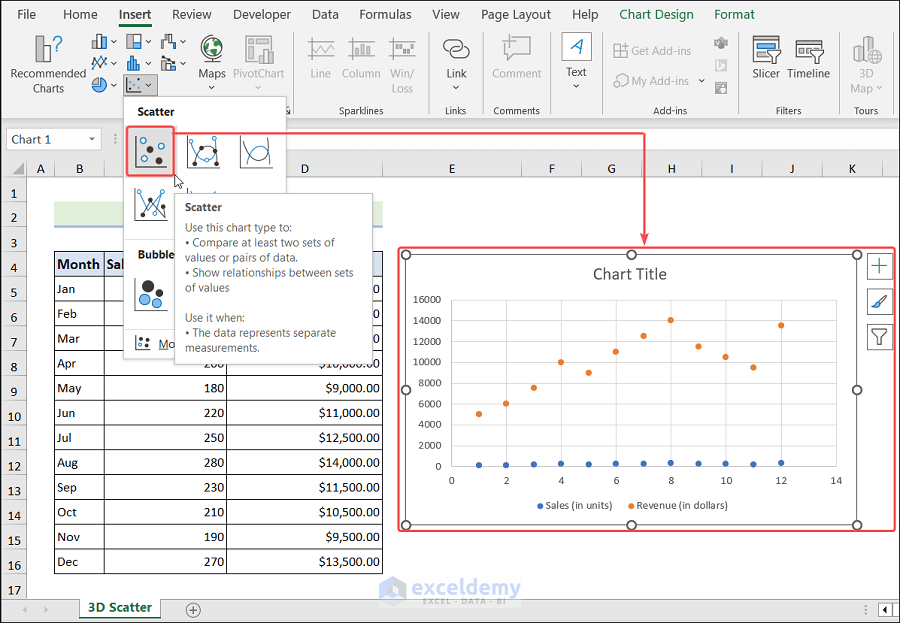
- Click on Scatter to insert a scatter chart.
Adjust Scatter Chart Settings
Steps:
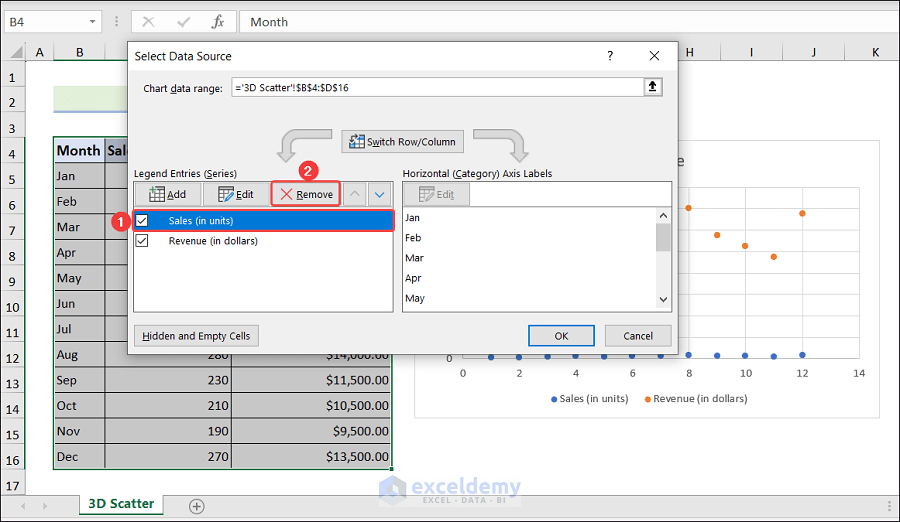
- Right-click on the chart area and choose Select Data from the context menu.
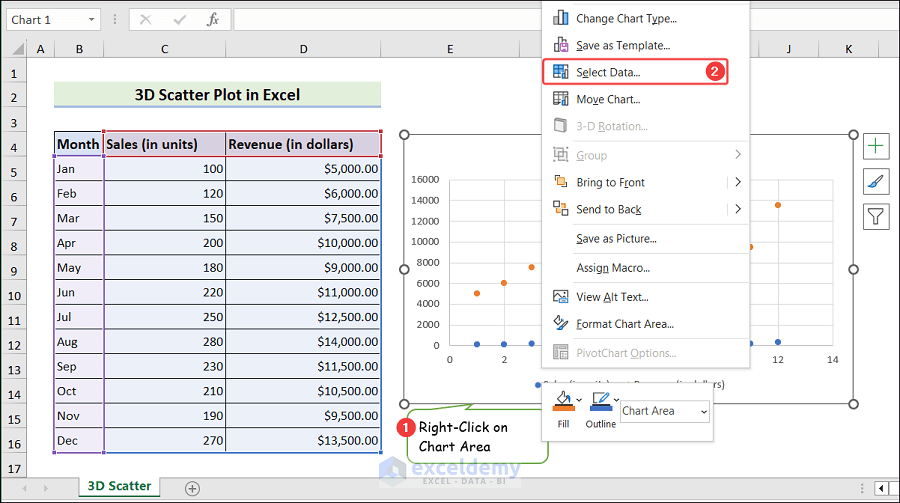
- The Select Data Source window will open.
- Click on the Sales (in Units) series and choose Remove.
- Choose the Revenue (in dollars) series and click on Edit.
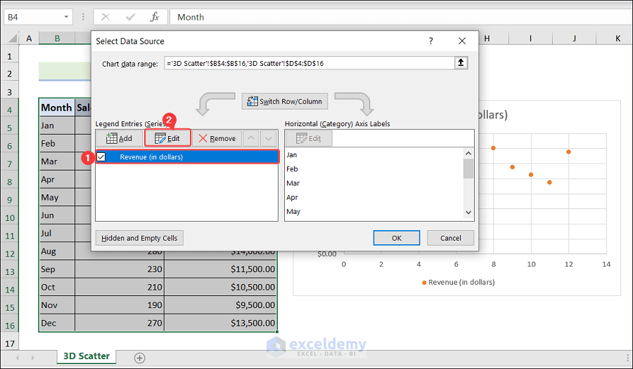
- The Edit Series window will pop up.
- Insert the appropriate data and hit OK.
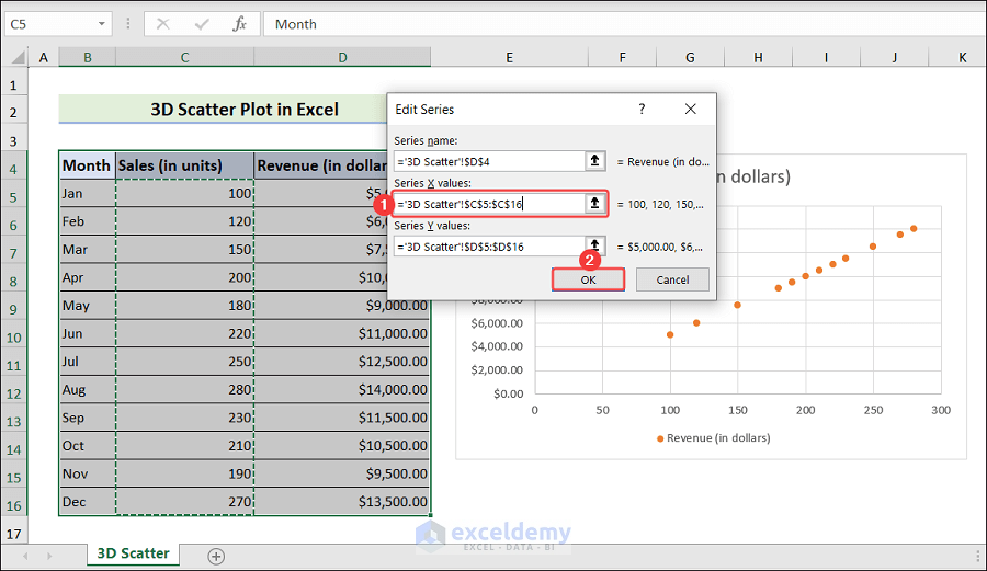
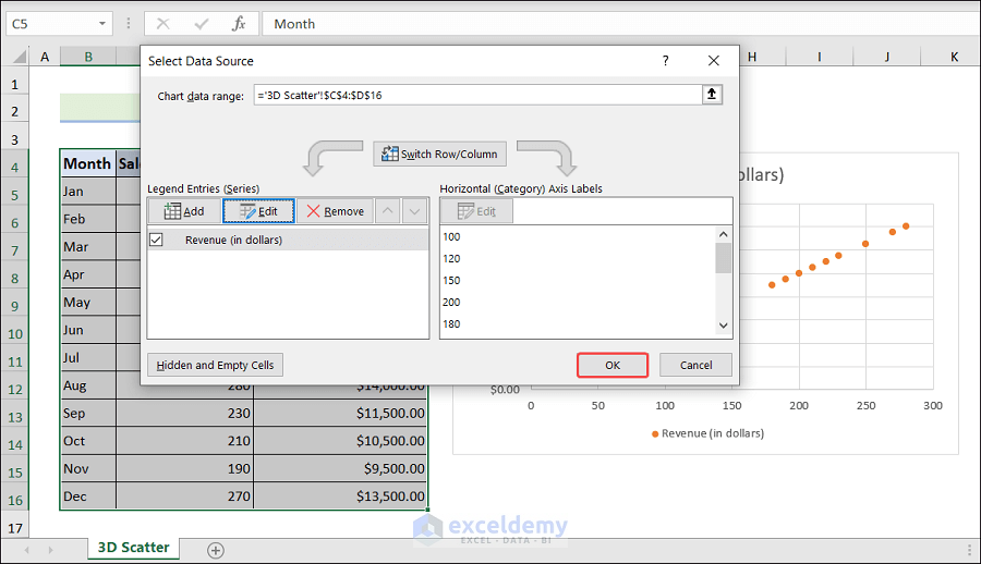
- Click OK.
Format Data Series in Scatter Chart
Steps:
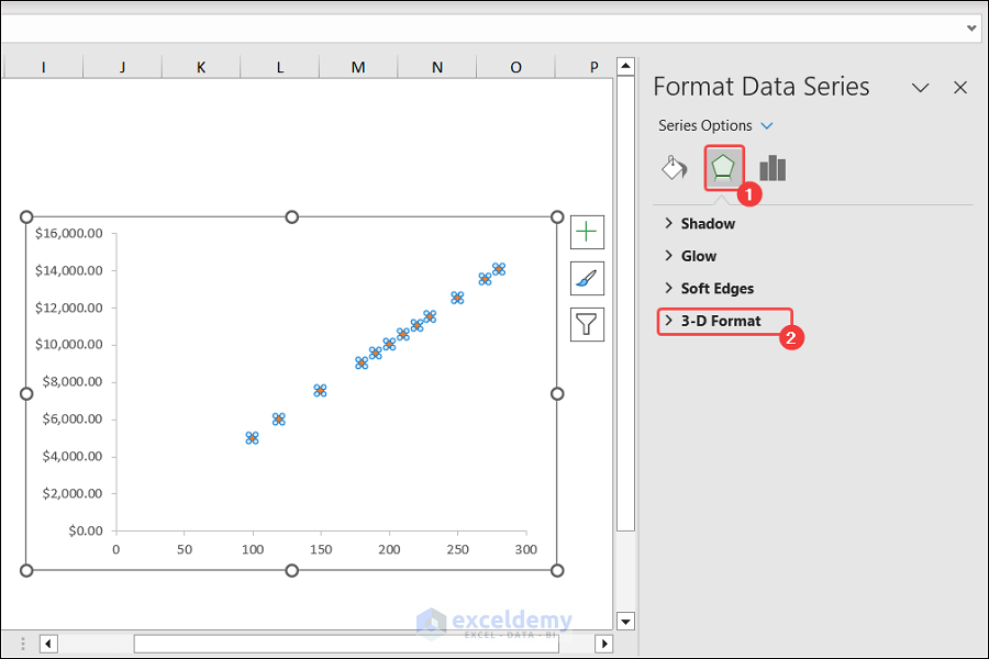
- Click on a Data Series and press the Ctrl+1 keys.
- The Format Data Series pane will open.
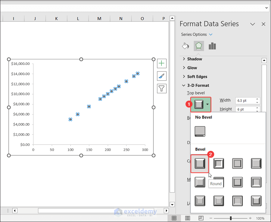
- Click on the Effects icon and expand 3-D Format.
- Click on Top bevel and choose Round.
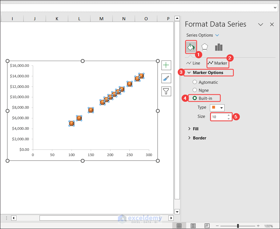
- Choose Fill & Line and click on Marker
- Expand Marker Options.
- Check Built-in and increase the size.
Save and Display 3D Scatter Plot
Steps:
- Place the 3D scatter chart in the appropriate location.
- Save the workbook.
Things to Remember
- Scatter plots show the degree to which variables are correlated.
- The two variables in the scatter chart are X and Y.
Frequently Asked Questions
What is a 3D plot?
- A 3D plot is a graph that shows data in three dimensions. It allows easier exploration of relationships and patterns.
What is the use of a 3d scatter plot?
- A 3d scatter chart is used to identify clusters and trends and provide deeper insights.
How do you make a scatter plot with 3 Excel data sets?
- Put your data into three separate columns.
- Select all the data and Insert a scatter plot.
- Right-click on Chart Area, and click on Select Data.
- Click Add to add each set of data one by one.
Download Practice Workbook
Related Articles
- How to Create Scatter Plot Matrix in Excel
- How to Create Multiple Regression Scatter Plots in Excel
- How to Connect Dots in Scatter Plots in Excel
- How to Create Dynamic Scatter Plot in Excel
- How to Combine Two Scatter Plots in Excel
<< Go Back To Scatter Chart in Excel | Excel Charts | Learn Excel
Get FREE Advanced Excel Exercises with Solutions!
