In many cases, we might need to create a scatter plot with multiple series of data. The next thing we need to do after creating such a type of scatter plot is add labels to make the chart more understandable. In Microsoft Excel, we can add multiple series labels by following some easy steps. This article demonstrates how to add multiple series labels in a scatter plot in Excel.
Why Do We Need to Add Multiple Series Labels in Scatter Plots?
A Scatter Plot is a special kind of graph in Excel that helps us understand the relationship between two or more than two variables in Excel. Now, to show relationships between more than two variables, we use multiple series in Excel. In this case, if we don’t add labels to these series, any other person viewing the chart might find it difficult to understand. So, to make your chart or graph more readable or understandable, you can add multiple series labels in the Scatter Plot.
How to Add Multiple Series Labels in Scatter Plot in Excel: 5 Steps
Adding Multiple Series Labels in a Scatter Plot includes some easy steps. In the following stages of this article, I will show you how to add Multiple Series Labels in a Scatter Plot in Excel with an easy example.
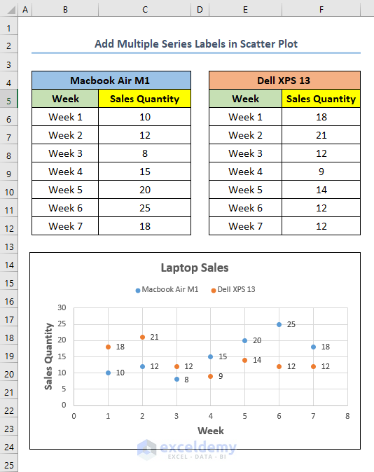
Let’s assume you are the owner of a laptop shop. In your shop, you have two models of laptops that you sell. One is a Macbook Air M1 and the other one is a Dell XPS 13. Now, you want to plot the sales quantity of these models in different weeks in a Scatter Plot. Also, you want to add Multiple Series Labels in the chart to make it more understandable for future reference. At this point, follow the steps below to do so.

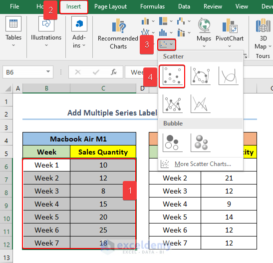
⭐ Step 01: Create a Single Series Scatter Plot from Dataset
In the first step, we will create a Scatter Plot for the laptop model Macbook Air M1.
- First, select the range B6:C12.
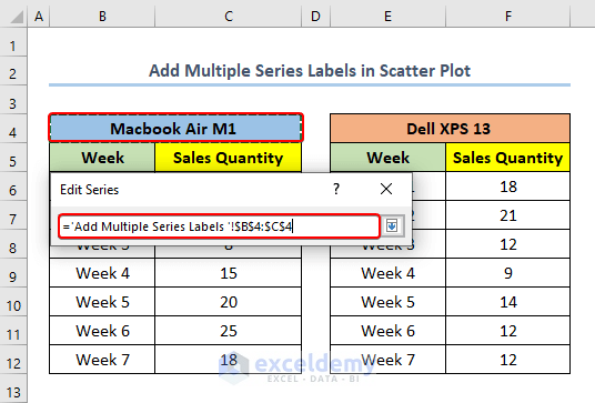
In this case, B6 is the first cell of the column Week and cell C12 is the first cell of the column Sales Quantity for the model Macbook Air M1.
- Then, go to the Insert tab.
- Next, from Charts select Insert Scatter (X,Y) or Bubble Chart.
- Now, select the Scatter chart.
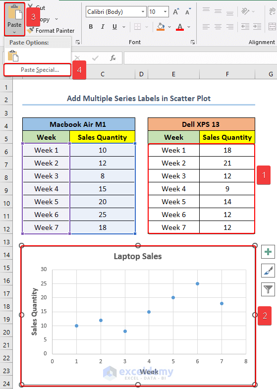
⭐ Step 02: Add Multiple Series to the Scatter Plot
Consequently, in the second step, we will add the data series for the model Dell XPS 13 to the Scatter Chart.
- First, select the range E6:F12.
In this case, E6 is the first cell of the column Week and cell F12 is the first cell of the column Sales Quantity for the model Dell XPS 13.
- Then, copy the range.
- Next, click on the chart.
- After that, from just below the top left of your window, click on Paste.
- Now, select Paste Special.
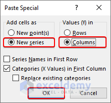
- At this point, a new box will appear named as Paste Special.
- Subsequently, check the circles for New Series from Add cells as and Columns from Values (Y) in.
- Then, click OK.
Note: Similarly, you can add more data series if you wish using this step.
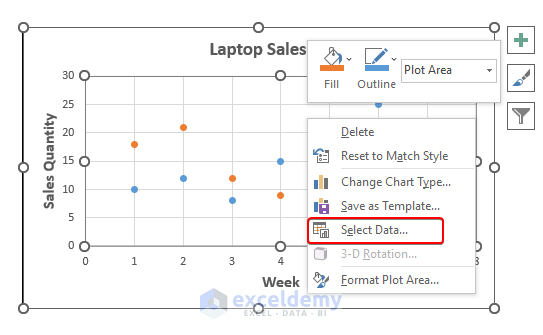
⭐ Step 03: Edit Multiple Series Labels in Scatter Plot in Excel
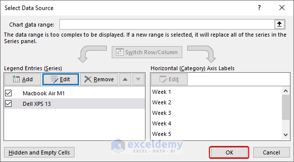
Eventually, in this step, we will edit the series name for each of the data series. Generally, Excel assigns Series 1, Series 2, etc. names to different data series.
- First, Right-Click on the chart.
- Next, click on Select Data.
- At this point, from Legend Entries (Series) select Series1 and click on Edit.
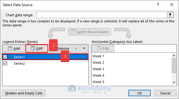
- Then, from the Series name, click on the Select Range button.
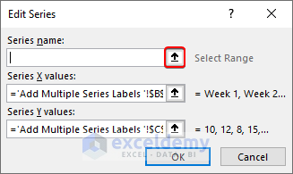
- Now, select cell B4 which indicates the model Macbook Air M1.
- Next, press ENTER.
- After that, click on OK.
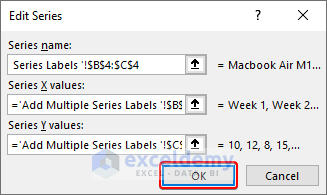
- Similarly, change the Series Name of Series2 to Dell XPS 13.
- Consequently, click on OK.
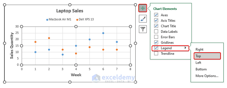
⭐ Step 04: Add Legend to the Scatter Plot
In this step, we will add a legend to the chart, which will work as a label for different data series.
- First, select the chart.
- Then, click on the Chart Elements button.
- After that, check the box beside the Legend and then go to the Legend Options.
- Now, from those options, select according to your preference. In this case, we choose Top.
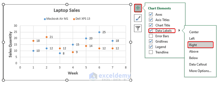
⭐Step 05: Add Data Labels to Multiple Series in Scatter Plot
Now, in this step, we will add labels to each of the data points.
- First, select the chart.
- Next, click on the Chart Elements button.
- Then, check the Data Labels box.
- After that, from the Data Labels Options, select the position of the labels. In this case, we choose Right.
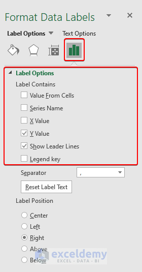
- At this point, if you want other data in your labels, go to More Options or simply double-click on the labels.
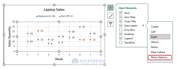
- Now, from the Label Options, go to Label Contains and choose the data you want to add to your label.
Finally, after following all the steps above, you will get your output as shown in the below screenshot.
Download Practice Workbook
You can download the practice workbook from the link below.
Conclusion
In this article, I showed five easy steps to add labels to multiple series in a scatter plot in Microsoft Excel. Moreover, you can use these steps for as many data series as you want.
Last but not least, I hope you found what you were looking for in this article. If you have any queries, please drop a comment below. Also, if you want to read more articles like this, you can visit our website ExcelDemy.
Related Articles
- How to Create Scatter Plot Matrix in Excel
- How to Create Multiple Regression Scatter Plots in Excel
- How to Connect Dots in Scatter Plots in Excel
- How to Create Dynamic Scatter Plot in Excel
- How to Combine Two Scatter Plots in Excel
- How to Create a 3D Scatter Plot in Excel
- How to Create Heat Map Scatter Plot in Excel
- How to Create Clustered Scatter Plot in Excel
<< Go Back To Scatter Chart in Excel | Excel Charts | Learn Excel
Get FREE Advanced Excel Exercises with Solutions!
