


Excel has powerful charting tools, but deciding which chart to use and how to build it efficiently is where most people get stuck. Creating a useful Excel chart involves more than selecting a range and clicking Insert Chart. You first need to decide what the chart should communicate, correctly summarize the source data, and choose a chart type that matches the analysis. ChatGPT can help with each of these tasks.
In this tutorial, we will show how you can visualize Excel data with ChatGPT, from getting smart chart-type recommendations based on your data structure to generating the exact formulas and VBA code needed to build those charts automatically.
Ask ChatGPT for Chart Type Recommendations
The Golden Rule of Prompting: ChatGPT gives generic answers to generic prompts. Give it structure, and it gives you precision. Always include:
- What the data represents (sales, survey results, timelines, etc.)
- The shape of your data (columns/rows, data types)
- What question you are trying to answer (comparison, trend, distribution, relationship)
- How many categories or series you are working with
Weak vs. Strong Prompts:
Weak prompt:
"What chart should I use for my sales data?"
Strong prompt:
"Act as an Excel data visualization consultant. My data is in cells A1:H25 and contains
Month, Region, Product, Units Sold, Revenue, Expenses, and Profit. Recommend suitable
Excel charts for the following purposes: Showing the monthly revenue and profit trend,
comparing total revenue across regions.
For each recommendation, specify the chart type, the required columns, whether the data
needs to be summarized, and why the chart is suitable."
The second prompt gives ChatGPT enough context to reason about trend (growth) versus magnitude (volume), which typically means it will suggest a line chart for trends or a combination approach, rather than defaulting to a generic bar chart.
What ChatGPT Will Typically Recommend:
| Purpose | Recommended Chart | Required Columns | Data Needs to Be Summarized? | Why This Chart Is Suitable |
| Show the monthly revenue and profit trend | Line Chart (Two Series) | Month, Revenue, Profit | No, if each month appears once. Yes, if there are multiple records per month (sum Revenue and Profit by Month using a PivotTable or SUMIFS). | A line chart clearly displays trends over time. Using two lines allows you to compare how Revenue and Profit change each month and identify seasonal patterns, growth, or declining performance. |
| Compare total revenue across regions | Clustered Column Chart (or Bar Chart if there are many regions) | Region, Revenue | Yes, if multiple products or transactions exist for each region. Sum Revenue by Region first. | Column charts make it easy to compare total revenue among regions. Differences in column height immediately show the highest- and lowest-performing regions. |
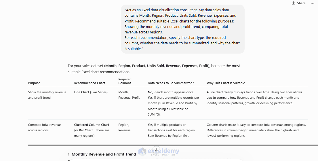
The chart recommendation is only the starting point. For both the monthly and regional charts, the source data must first be summarized because each month and region appears more than once.
ChatGPT also describes the steps to create the Monthly Revenue and Profit Trend chart and the Compare Total Revenue Across Regions chart, but you must generate a separate summary table to do so. In the next section, we will use ChatGPT to generate the required formulas.
Ask ChatGPT to Write Chart-Ready Formulas
Before a chart looks good, your data often needs shaping. This is where ChatGPT saves the most time — instead of manually calculating totals, you can ask ChatGPT to create the required helper formulas.
Prompt:
"My Excel data is in A1:G25. Month is in column A, Region is in column B, Revenue is
in column E, and Profit is in column G. Create a monthly summary with Total Revenue,
Total Profit, and Profit Margin. Use standard Excel formulas and provide the exact
formula for each column."
ChatGPT output:
ChatGPT suggests the following setup with formula explanations.
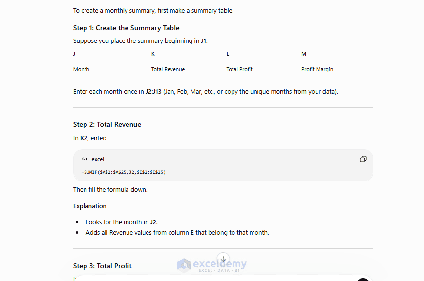
Step 1: Create the Summary Table
Place the summary beginning in J1.
| J | K | L | M |
| Month | Total Revenue | Total Profit | Profit Margin |
Enter each month once in J2:J13 (Jan, Feb, Mar, etc., or copy the unique months from your data).
Step 2: Total Revenue
In K2, enter:
=SUMIF($A$2:$A$25,J2,$E$2:$E$25)
Then fill the formula down.
Explanation
- Looks for the month in J2.
- Adds all Revenue values from column E that belong to that month.
Step 3: Total Profit
In L2, enter:
=SUMIF($A$2:$A$25,J2,$G$2:$G$25)
Then copy downward.
Explanation
- Finds the same month.
- Sums all Profit values from column G.
Step 4: Profit Margin
In M2, enter:
=IF(K2=0,"",L2/K2)
Copy downward.
Format column M as Percentage.
Explanation
- Divides Total Profit by Total Revenue.
- Returns a blank if Revenue is zero to avoid a #DIV/0! error.
Copy and paste all the formulas in Excel to build the monthly summary table.

Build a Chart from the Formula Results
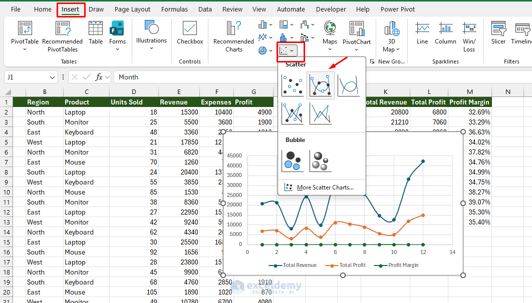
To create the monthly performance chart manually:
- Select cells J1:L13
- Go to the Insert tab >> select Scatter Smooth Line with Markers
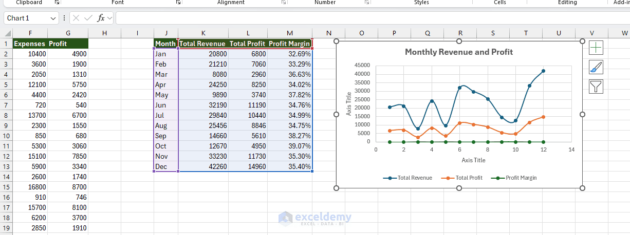
- Change the chart title to Monthly Revenue and Profit
- Place the legend at the bottom of the chart
- Add axis titles if they make the chart easier to understand
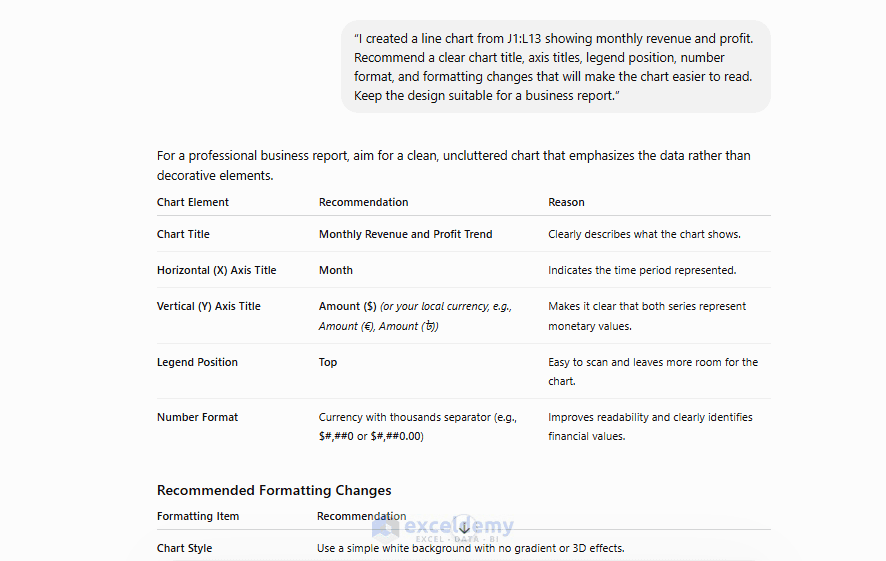
You can also ask ChatGPT for formatting suggestions:
"I created a line chart from J1:L13 showing monthly revenue and profit. Recommend a
clear chart title, axis titles, legend position, number format, and formatting changes
that will make the chart easier to read. Keep the design suitable for a business report."
This type of prompt helps you improve the chart without asking ChatGPT to modify the workbook directly.
Ask ChatGPT to Write VBA for Chart Automation
This is where ChatGPT provides the biggest leverage. Building charts via VBA means you can regenerate them instantly whenever data changes, or build dozens of charts in seconds.
Prompting Tips for VBA Chart Code:
Be specific about:
- Chart type (xlColumnClustered, xlLine, xlXYScatter, etc.)
- Data source range
- Where the chart should be placed
- Formatting details (title, axis labels, colors, legend position)
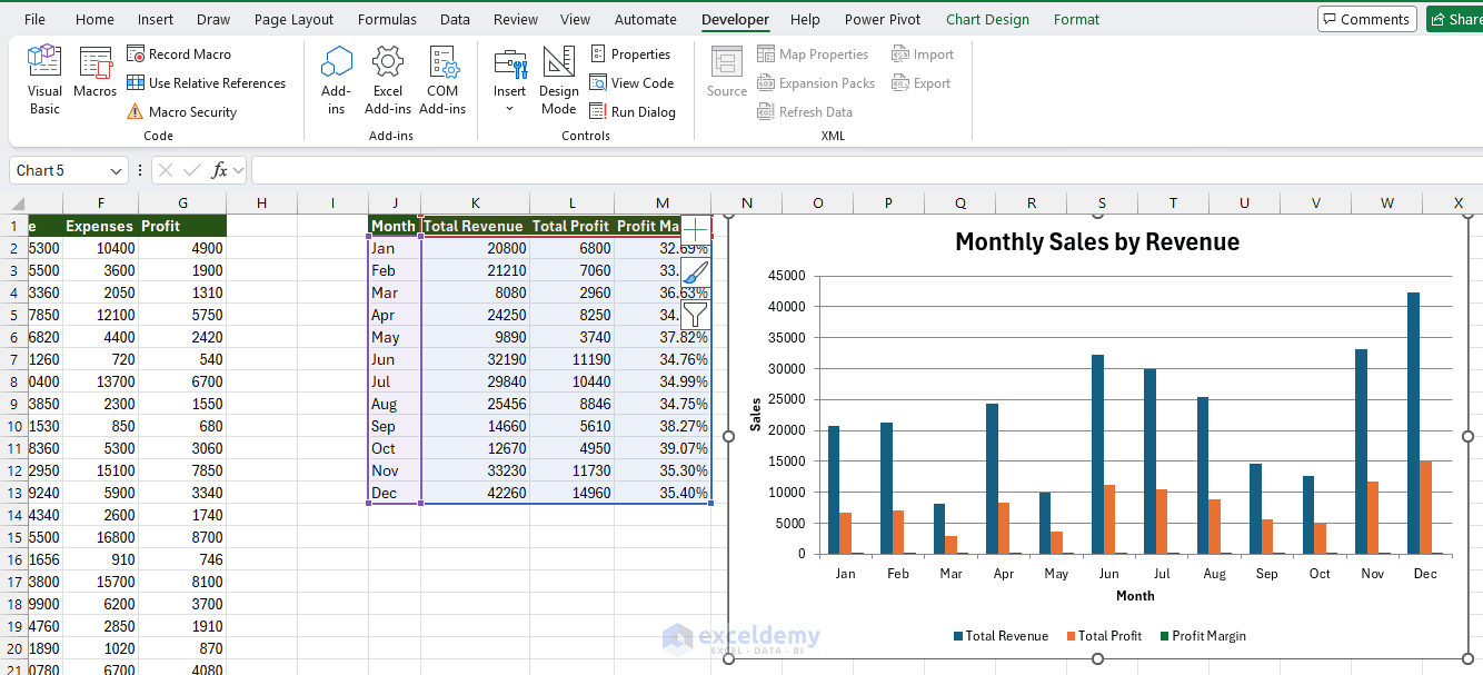
Example 1: Basic Clustered Column Chart via VBA
Prompt:
"Write VBA to create a clustered column chart from data in the SalesData sheet,
range J1:M13 (headers in row 1), placed on the same sheet, with a chart title
'Monthly Sales by Revenue'."
ChatGPT output:
Sub CreateMonthlySalesByRevenueChart()

    Dim ws As Worksheet
    Dim chartObj As ChartObject

    Set ws = ThisWorkbook.Worksheets("SalesData")

    'Create chart on the same sheet
    Set chartObj = ws.ChartObjects.Add( _
        Left:=ws.Range("O2").Left, _
        Top:=ws.Range("O2").Top, _
        Width:=500, _
        Height:=300)

    With chartObj.Chart
        .SetSourceData Source:=ws.Range("J1:M13")
        .ChartType = xlColumnClustered

        .HasTitle = True
        .ChartTitle.Text = "Monthly Sales by Revenue"

        .HasLegend = True
        .Legend.Position = xlLegendPositionBottom

        .Axes(xlCategory).HasTitle = True
        .Axes(xlCategory).AxisTitle.Text = "Month"

        .Axes(xlValue).HasTitle = True
        .Axes(xlValue).AxisTitle.Text = "Sales"
    End With

End Sub
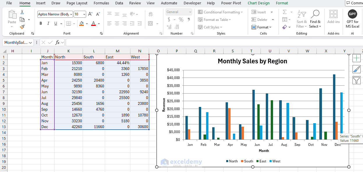
Example 2: Clustered Column Chart to Show Regional Summary
Prompt:
"Write VBA to create a clustered column chart from data in the SalesData sheet,
range A1:G25 (headers in row 1), placed on the same sheet, with a chart title
'Monthly Sales by Region'."
ChatGPT output:
Sub CreateMonthlySalesByRegionChart()

    Dim ws As Worksheet
    Dim lastRow As Long
    Dim summaryRange As Range
    Dim chartObj As ChartObject

    Set ws = ThisWorkbook.Worksheets("SalesData")
    'Create summary headers
    ws.Range("J1").Value = "Month"
    ws.Range("K1").Value = "North"
    ws.Range("L1").Value = "South"
    ws.Range("M1").Value = "East"
    ws.Range("N1").Value = "West"

    'Create month list
    ws.Range("J2:J13").Value = Application.Transpose(Array( _
        "Jan", "Feb", "Mar", "Apr", "May", "Jun", _
        "Jul", "Aug", "Sep", "Oct", "Nov", "Dec"))

    'Revenue by Month and Region
    ws.Range("K2").Formula = "=SUMIFS($E$2:$E$25,$A$2:$A$25,$J2,$B$2:$B$25,K$1)"
    ws.Range("K2").AutoFill Destination:=ws.Range("K2:N13")

    Set summaryRange = ws.Range("J1:N13")

    'Create clustered column chart
    Set chartObj = ws.ChartObjects.Add( _
        Left:=ws.Range("J15").Left, _
        Top:=ws.Range("J15").Top, _
        Width:=650, _
        Height:=350)

    chartObj.Name = "MonthlySalesByRegionChart"

    With chartObj.Chart
        .SetSourceData Source:=summaryRange
        .ChartType = xlColumnClustered

        .HasTitle = True
        .ChartTitle.Text = "Monthly Sales by Region"

        .HasLegend = True
        .Legend.Position = xlLegendPositionBottom

        .Axes(xlCategory).HasTitle = True
        .Axes(xlCategory).AxisTitle.Text = "Month"

        .Axes(xlValue).HasTitle = True
        .Axes(xlValue).AxisTitle.Text = "Revenue"
        .Axes(xlValue).TickLabels.NumberFormat = "$#,##0"
    End With

End Sub
Here, the VBA macro builds a regional summary table directly in the Excel sheet and then creates the clustered column chart from it.
Use the ChatGPT Add-in Directly in Excel
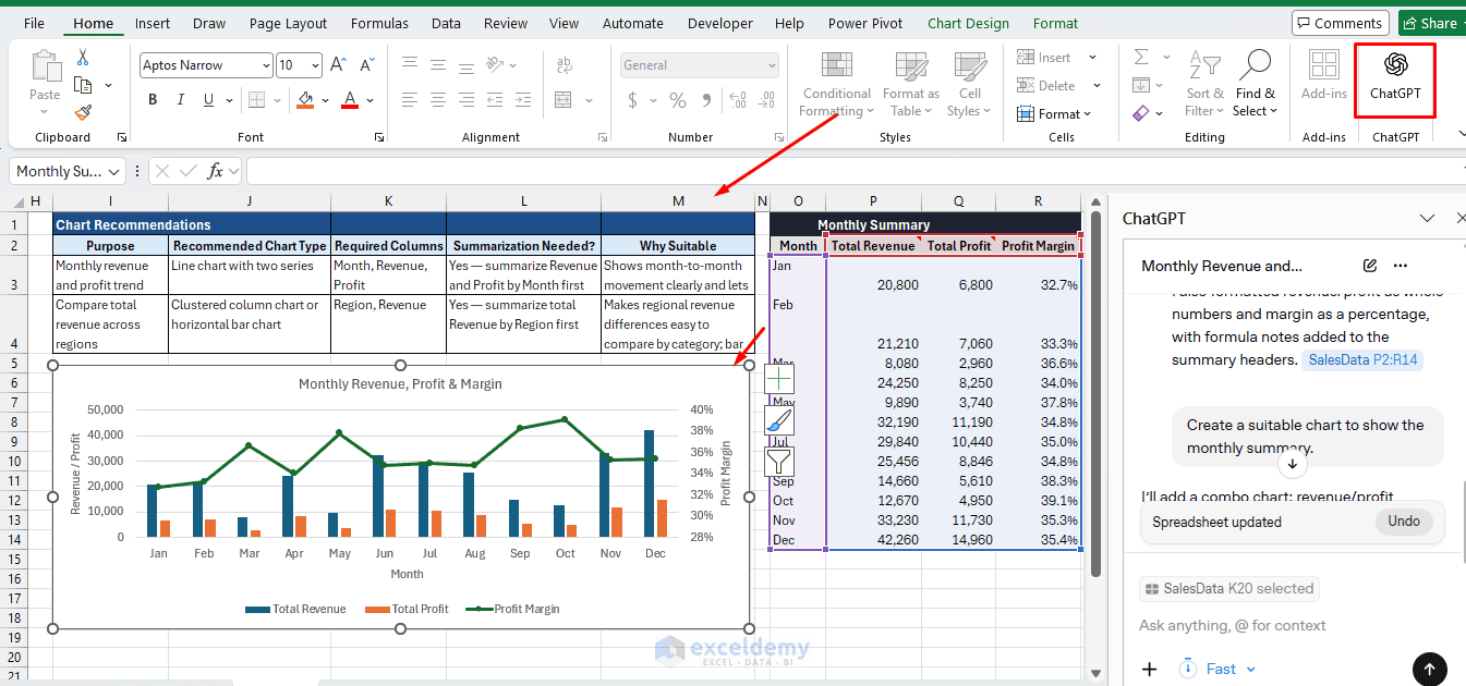
You can use ChatGPT directly in Excel, which is more convenient and efficient — no more copying formulas back and forth between windows. The add-in can insert formulas and charts directly, and it can edit the Excel sheet in place.
One key advantage is that you do not need to describe your data in detail. ChatGPT can read the sheet directly. Just give it a command, and it will create the visualizations and formulas for you.
Steps:
- Install the ChatGPT add-in in Excel
- Go to the Home tab >> select ChatGPT
- Connect Excel with your ChatGPT credentials
- Use the following simpler prompts:
"Create a monthly summary with Total Revenue, Total Profit, and Profit Margin.
Use standard Excel formulas and provide the exact formula for each column."
"Create a suitable chart to show the monthly summary."
Common Pitfalls to Avoid
- Vague prompts get vague charts: Always specify ranges, headers, and what comparison you are making.
- Not testing VBA on a copy first: Chart-generation macros can overwrite existing charts if names clash. Always run
On Error Resume Nextdeletion blocks, or test on a duplicate file. - Ignoring axis scale issues in combo charts: If your two series have very different magnitudes (e.g. revenue in thousands versus a percentage), always ask ChatGPT to place the smaller series on a secondary axis.
- Trusting chart-type suggestions blindly: ChatGPT reasons from your description, not your actual data. If your description is inaccurate, sanity-check the result yourself.
Conclusion
ChatGPT turns Excel from a static spreadsheet tool into a dynamic visualization partner. The key is clear, structured prompting: describe your data, state your goal, and ask specifically for formulas, steps, or VBA. ChatGPT can accelerate Excel visualization by helping with both the analytical and technical parts of the process — recommending a chart based on the question you are trying to answer, writing formulas that summarize the source data, and generating VBA that builds and formats the finished chart. The key skill is not simply asking “make me a chart”; it is learning how to describe your data precisely so ChatGPT gives you accurate, usable output.
Get FREE Advanced Excel Exercises with Solutions!


Hi Shamima. Thank you so much for a very detailed but easily followed explanation of how to use ChatGPT with Excel. I appreciate all the effort you have put into this tutorial.
Thanks again.
Kind regards
Rob
Hello Rob,
You are most welcome. Thanks for your feedback and appreciation. I try to create detailed tutorial so that it help my users to follow the guideline easily. Glad to hear that you liked my tutorial.
Regards,
ExcelDemy