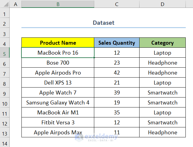
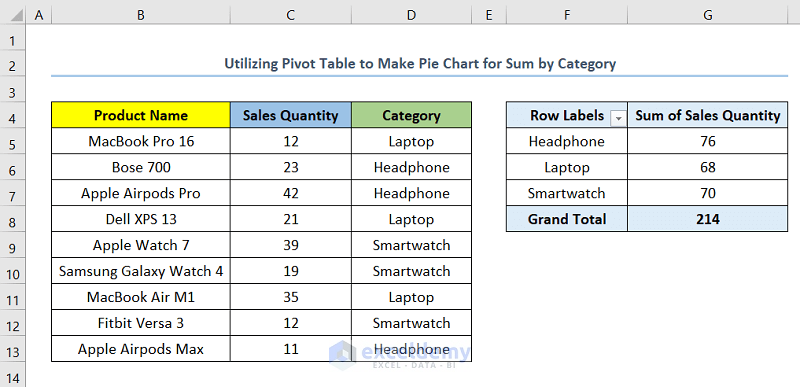
We have a dataset with a list of products that fall into three categories and their Sales Quantity. The categories are Laptop, Headphone, and Smartwatch. We want to create a Pie Chart for the sum by category.
Method 1 – Using the SUMIF Function
Steps:
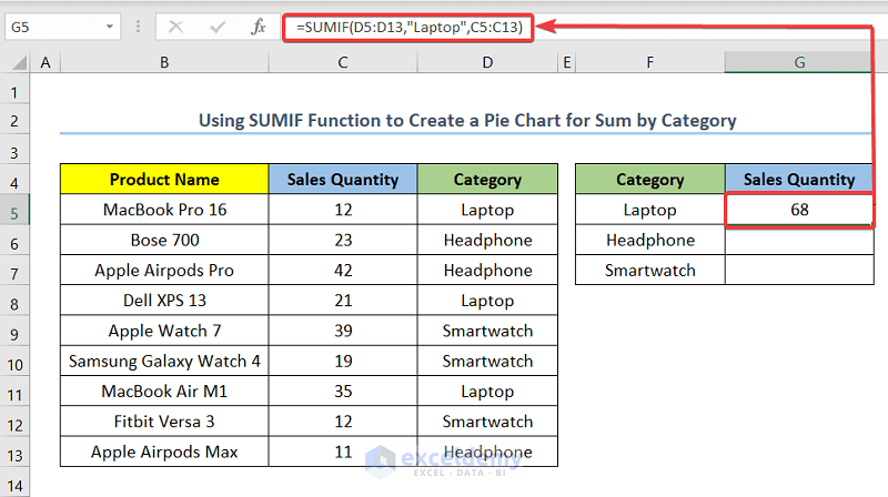
- Select cell G5 and insert the following formula.
=SUMIF(D5:D13,"Laptop",C5:C13)Cell G5 is the cell indicating the Sales Quantity of the category Laptop.
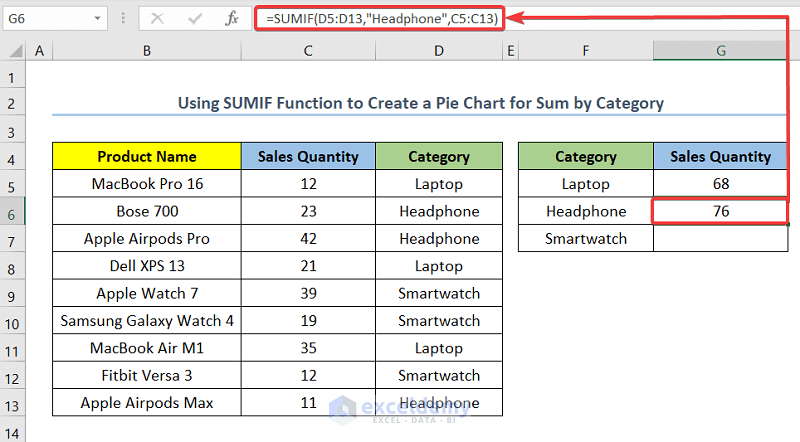
- Select cell G6 and insert the following formula.
=SUMIF(D5:D13,"Headphone",C5:C13)Cell G6 is the cell indicating the Sales Quantity of the category Headphone.
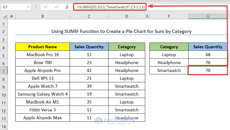
- Select cell G7 and insert the following formula.
=SUMIF(D5:D13,"Smartwatch",C5:C13)Cell G7 is the cell indicating the Sales Quantity of the category Smartwatch.
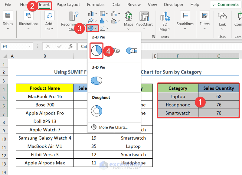
- Select the range F4:G7.
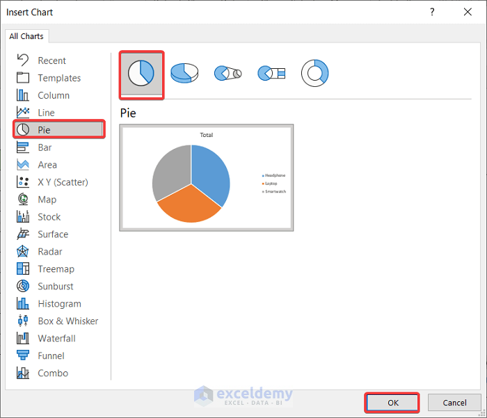
- Go to the Insert tab.
- Select Insert Pie or Doughnut Chart.
- Click on Pie to insert a Pie Chart.
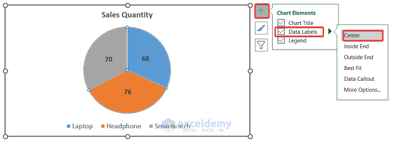
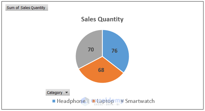
After inserting the Pie Chart, we will format the chart and add elements to make the chart more understandable and visually appealing.
- Double-click on the data series to format the data series according to your preference.
- Click on Chart Element and go to Data Labels and choose Center to add the Sales Quantity value to the center of each proportion.
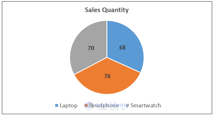
You will have your output as shown in the below screenshot.
Read More: How to Group Small Values in Excel Pie Chart
Method 2 – Utilizing a Pivot Table
Steps:
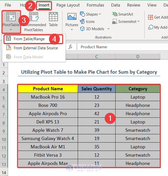
- Select the whole dataset.
- Go to the Insert tab.
- Select Pivot Table.
- Click on From Table/Range.
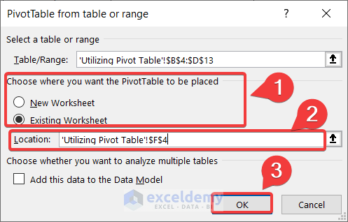
- Select Existing Worksheet, or the worksheet you want to keep your Pivot Table in.
- In Location, select the cell you want your Pivot Table to start. We chose cell F4.
- Click on OK.
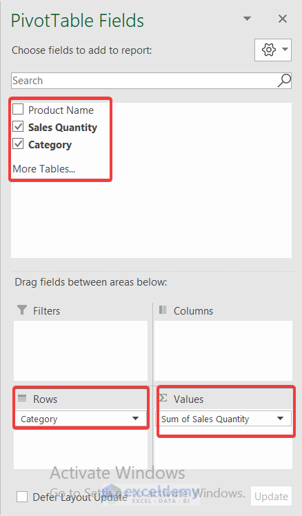
- From Pivot Table Fields, select Sales Quantity and Category.
- Drag Category to Rows and Sales Quantity to Values field.
- You will have the Pivot Table as shown in the screenshot below.
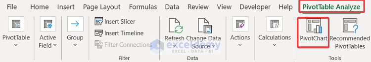
- Select any cell on the Pivot Table.
- Go to the tab PivotTable Analyze.
- Click on PivotChart.
- Go to Pie from the All Charts options.
- Select Pie and click on OK.
- Format and add elements to the chart as mentioned in the above method.
Note: This method is dynamic. That means if you add a new entry with its category and update the PivotTable range, you’ll get an updated chart automatically.
Read More: [Solved]: Excel Pie Chart Not Grouping Data
How to Sum Data and Create a Pie Chart in Excel
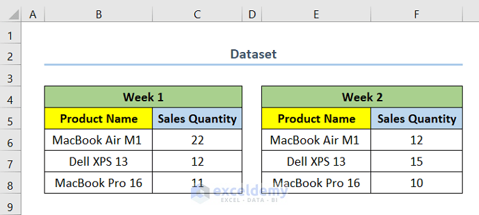
We have a dataset where we have the Sales Quantity of three different products for two different weeks as shown in the screenshot below. We want to sum the Sales Quantity for each of the products over the weeks and create a Pie Chart.
Steps:
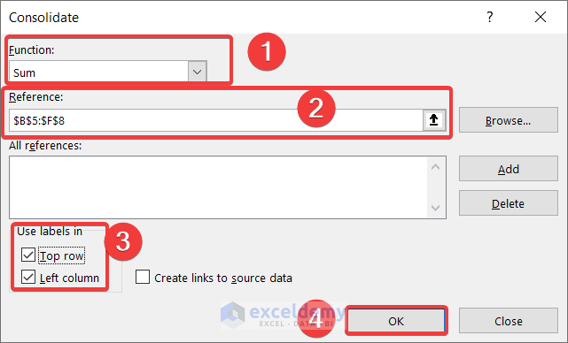
- Select the cell you want to keep your consolidated data.
- Go to the Data tab.
- From Data Tools, select Consolidate.

- For Function, select Sum.
- In Reference, select the range B5 to F8.
- For Use labels in, check the boxes for Top Row and Left Column.
- Click on OK.
- Select the range B11:C14, which represents the range for the consolidated data.
- Go to the Insert tab.
- Select Insert Pie or Doughnut Chart.
- Click on Pie to insert a Pie Chart.

- Format and add elements to the chart as mentioned in the above method.
Read More: How to Make Pie Chart by Count of Values in Excel
Things to Remember
- In Excel, you can not directly insert a Pie Chart for sum by category.
- In order to create a Pie Chart for sum by category, you need to categorize the data using other functions or features first.
- You can use a Bar Chart in Excel which will automatically give you a chart for sum by category.
Download the Practice Workbook
Related Articles
- How to Create Pie Chart Legend with Values in Excel
- How to Show Total in Excel Pie Chart
- How to Show Percentage in Excel Pie Chart
- How to Show Percentage and Value in Excel Pie Chart
- How to Show Percentage in Legend in Excel Pie Chart
<< Go Back To Excel Pie Chart | Excel Charts | Learn Excel
Get FREE Advanced Excel Exercises with Solutions!
