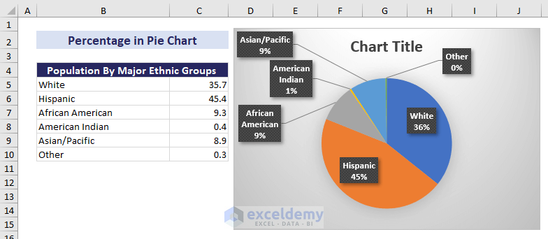
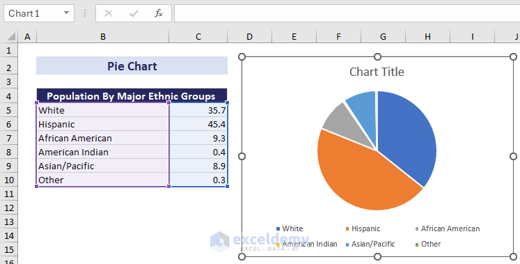
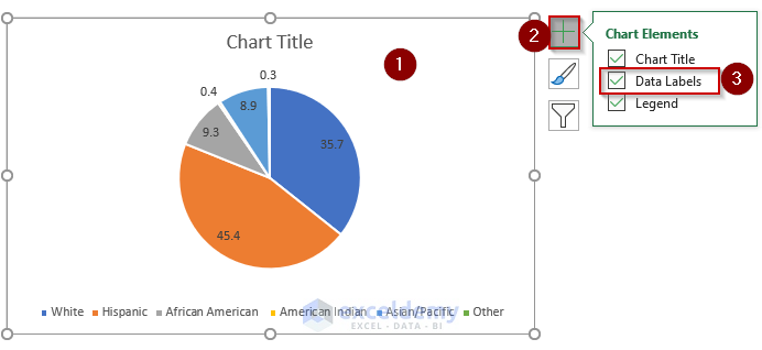
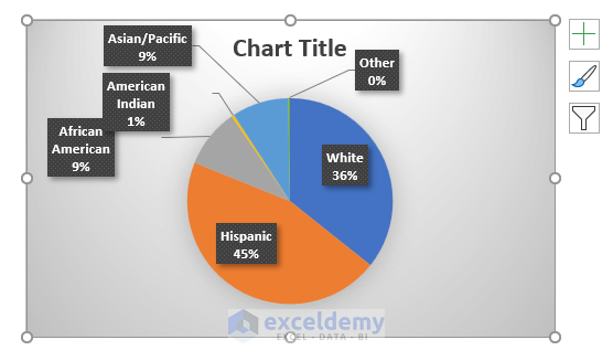
Below, we have the population percentages by major ethnic groups in Southern California. We have created a pie chart using this data and added percentages.
You can add percentages to your pie chart using Chart Styles, Format Data Labels, and Quick Layout features.
Method 1 – Using the Chart Styles Feature
Stages:
- Click on the pie chart.
- Go to the Chart Design tab > Chart Styles group.
- Select the style 3 or 8.
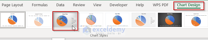
This command shows the percentages for each of the parts of your pie chart.
Note: All the options in the Chart Style group will show percentages if you select them after clicking Style 3 or Style 8.
Read More: How to Show Total in Excel Pie Chart
Method 2 – Applying Format Data Labels
a) Using the Chart Elements Option
The Chart Elements button is the “Plus” (+) sign at the top right corner of a chart that shows available chart element options.
Stages:
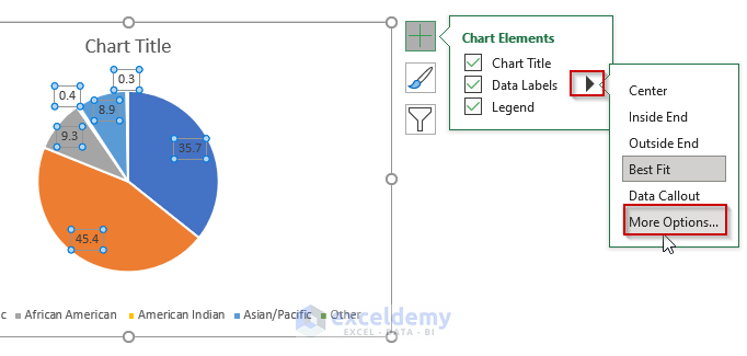
- Click on the pie chart > Chart Elements button > Data Labels checkbox.
- Click the right arrow sign at the right of the Data Labels.
- Select More Options from the dropdown menu.
- In the Format Data Labels panel:
- Go to the Label Options tab > Label Options
- Put a checkmark on Percentage.
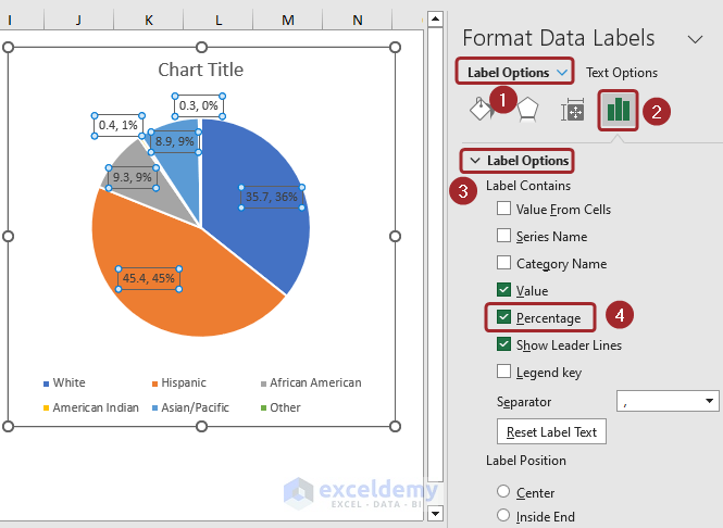
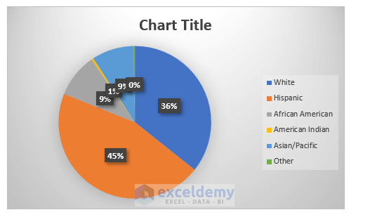
Excel will show the percentage in the pie chart.
Note: If you select the Value option along with the Percentage option, the pie chart shows the actual value for each segment in the data along with its percentage portion.
b) Using Context Menu
Stages:
- Right-click on the pie chart to open the context menu.
- Choose the Add Data Labels option.
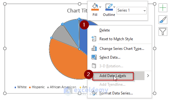
- Right-click the pie chart.
- Select Format Data Labels.
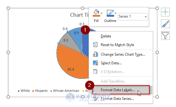
- In the Format Data Labels pane:
- Go to the Label Options tab > Label Options group.
- Put a checkmark on Percentage.

Excel will show the percentage in the pie chart.
Read More: How to Create Pie Chart Legend with Values in Excel
Method 3 – Applying the Quick Layout Feature
Stages:
- Click on the pie chart.
- Go to the Chart Design tab > Quick Layout dropdown > Layout 1.
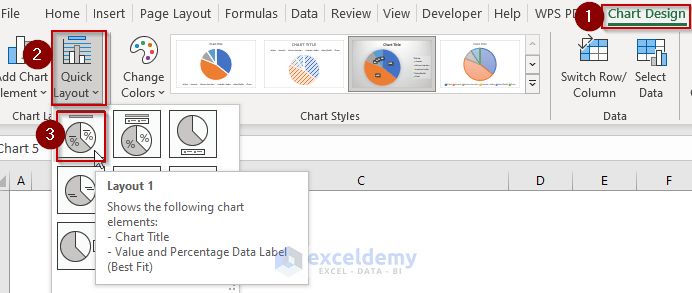
Excel will add percentages to your pie chart.
Note: To show only the percentage excluding the segment title, choose Layout 2 or Layout 6.
Read More: How to Create Pie Chart for Sum by Category in Excel
Download Practice Workbook
Related Articles
- How to Group Small Values in Excel Pie Chart
- How to Show Percentage and Value in Excel Pie Chart
- [Solved]: Excel Pie Chart Not Grouping Data
- How to Make Pie Chart by Count of Values in Excel
<< Go Back To Excel Pie Chart | Excel Charts | Learn Excel
Get FREE Advanced Excel Exercises with Solutions!
