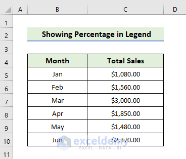
Step 1 – Prepare the Dataset
- We’ll make a dataset containing monthly total sales in different months.
- Input the name of the first 6 months in the range of cells B5:B10 and the total sales of the corresponding month in the range of cells C5:C10.
Read More: How to Show Percentage in Excel Pie Chart
Step 2 – Insert a Pie Chart
- Create an extra column named Legend.
- Use the following formula in the cell C5:
=B5&", "&TEXT((D5/SUM($D$5:$D$10)),"0.00 %")
- Press Enter.
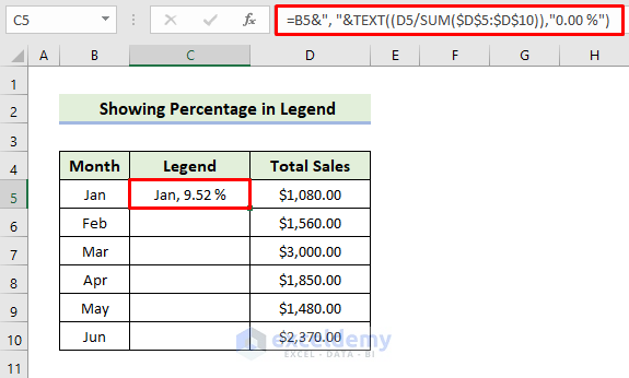
- Drag the Fill Handle icon to fill the other cells with the formula.
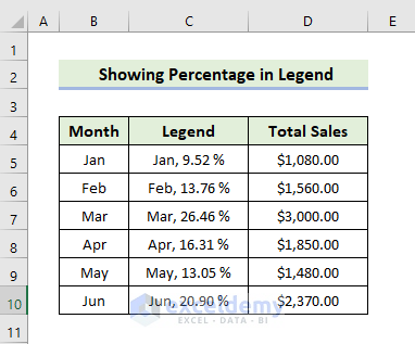
- You will get the following Legend column.
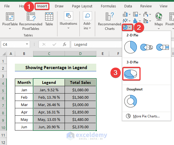
- Select the range of the cells C5:D10.
- In the Insert tab, click on the drop-down arrow of the Insert Pie or Doughnut Chart from the Charts group.
- Choose the 3-D pie from the 3-D Pie section.
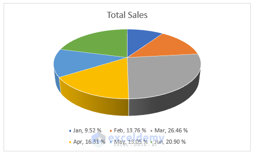
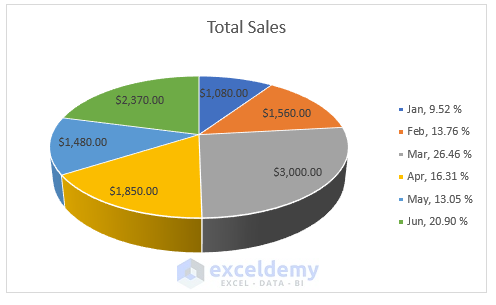
- You will get the following pie chart.
How Does the Formula Work?
- TEXT((D5/SUM($D$5:$D$10)),”0.00 %”)
Here, (D5/SUM($D$5:$D$10) will return the value of the percentage in the decimal format for the January month. Then, you have to input “0.00%” in the second argument. It will multiply the selected number or decimals defined by the first argument by 100 and add a percentage (%) symbol at the end.
- B5&”, “&TEXT((D5/SUM($D$5:$D$10)),”0.00 %”)
The above formula with ampersand will combine cell B5 with the TEXT function value.
Read More: How to Show Percentage and Value in Excel Pie Chart
Step 3 – Show Percentage in Legend
- Click on the chart.
- Select Add Chart Element, and you will see a list of elements.
- Click on them one by one to add, remove, or edit.
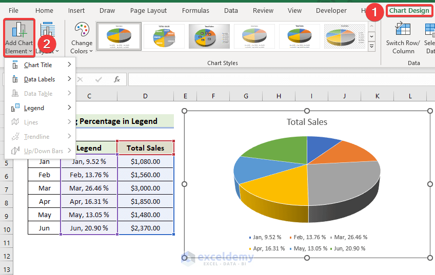
- Alternatively, you can find the list of chart elements by clicking the Plus (+) icon from the top-right corner of the chart.
- Check the element name to add or unmark it to remove it.
- You can find other options to edit the elements by expanding the arrow on the right of its setting.
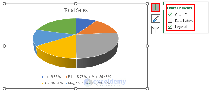
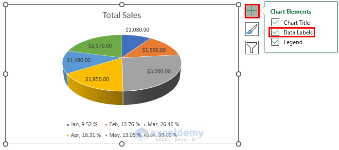
- Click on the Chart Elements icon and select the Data Labels option.
- Click on the Chart Elements icon, select the Legend option, and select the Right option.
- You will get the following pie chart showing the percentages in the legend.
Read More: How to Show Total in Excel Pie Chart
Step 4 – Finalize the Pie Chart
- To modify the chart style, select Chart Design, then select your desired option from the Chart Styles group.
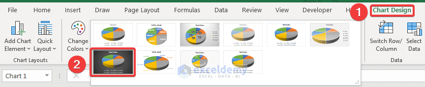
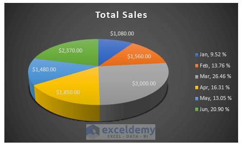
- Here’s a sample result by choosing Style 7.
You can also show the percentage in legend in the Excel Doughnut chart. For that, choose the Doughnut chart option from the drop-down of the Insert Pie or Doughnut Chart located in the Chart group. The rest of the procedure is similar to the pie chart.
Read More: How to Create Pie Chart for Sum by Category in Excel
Download the Practice Workbook
Related Articles
- How to Group Small Values in Excel Pie Chart
- [Solved]: Excel Pie Chart Not Grouping Data
- How to Make Pie Chart by Count of Values in Excel
<< Go Back To Excel Pie Chart | Excel Charts | Learn Excel
Get FREE Advanced Excel Exercises with Solutions!
