Excel Pie Chart Leader Lines Not Showing: Solution in 3 Steps
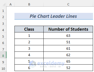
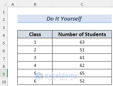
We have the number of students in different classes in a school.
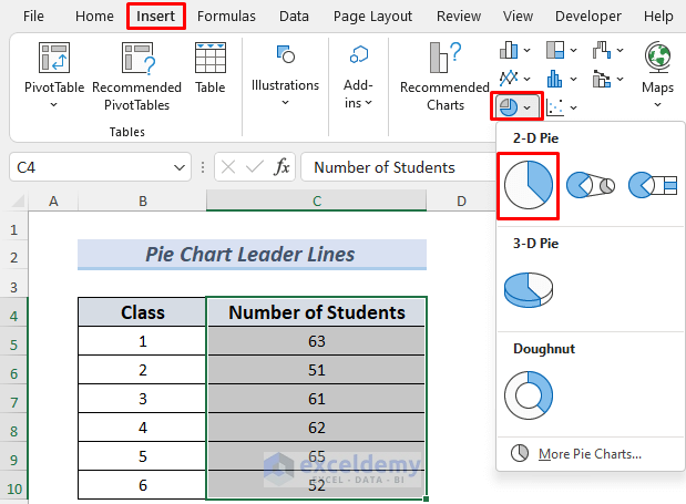
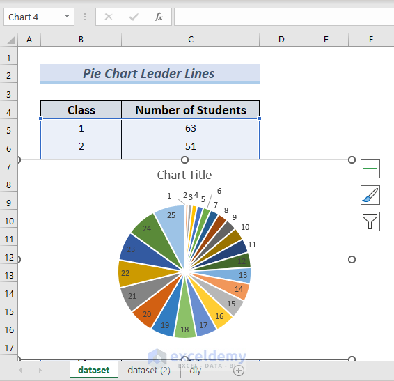
Step 1 – Making a Pie Chart Using Data
- Select the C4:C10 and go to Insert >> Pie Chart >> 2D Pie Chart.
- You can select other Pie Chart options if you want.
- You will see the Number of Students presented in a Pie Chart.

Read More: How to Edit Pie Chart in Excel
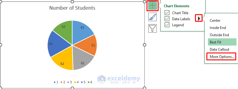
Step 2 – Formatting Data Labels in a Pie Chart to Show Leader Lines Conveniently
We will show the Number of Students in the sectors of the Pie Chart.
- Click on the Plus icon of the Pie Chart and check Data Labels.
- Click on the Arrow icon and select More Options…
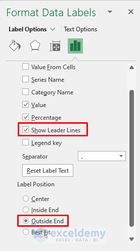
- In Format Data Labels, check Show Leader Lines.
- You may check other options for convenience. We selected Outside End as the Label Position.
Read More: How to Show Pie Chart Data Labels in Percentage in Excel
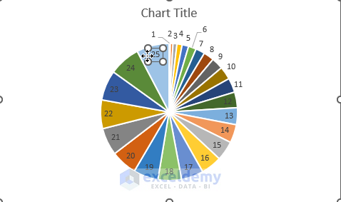
Step 3 – Dragging Data Labels to Show Excel Pie Chart Leader Lines
- We don’t see any Leader Lines in the chart.

- Select the Data Label “52, 15%” and drag it a little bit outside. You will see the corresponding Leader Line marked in the following picture.

- Drag all the Data Labels outside of the Pie Chart one by one. This operation will bring out all the hidden Leader Lines of these Data Labels.

Read More: Add Labels with Lines in an Excel Pie Chart
Practice Section
We’re giving you the dataset of this article so that you can make a dataset like this on your own.
Download the Practice Workbook
Related Articles
- How to Change Pie Chart Colors in Excel
- How to Edit Legend of a Pie Chart in Excel
- How to Rotate Pie Chart in Excel
- How to Explode Pie Chart in Excel
- How to Hide Zero Values in Excel Pie Chart
- Excel Pie Chart Labels on Slices: Add, Show & Modify Factors
<< Go Back To Excel Pie Chart | Excel Charts | Learn Excel
Get FREE Advanced Excel Exercises with Solutions!

This does not always work. I’ve got multiple pie charts in Excel where Excel does not show the leader lines even though I’ve followed these exact steps.
Hello M E,
The above steps are the right ways to show leader lines in the Pie chart when not working. It worked perfectly for me when I manually dragged them but in your case, it did not work probably for these reasons:
1. Best Fit is your selected option.
2. You are not dragging the labels in the correct way.
The leader lines in any chart will only appear if the labels are positioned with Best fit or manually dragged outside of the pie wedges if other options (like Outside End) are selected.
Even then the leader lines appear if the Best fit has to move the label position because they are further from the point they are labeling.
Solution 1:
Leader lines may not appear if Excel with the Best Fit option selected feels they are unimportant.
Excel uses the Best Fit option to arrange the labels without overlapping as best it can. If the Pie wedges are large enough, the labels go to the Inside End. Alternatively, they go to the Outside End to prevent overlaps, in which case the leader lines appear automatically.
Therefore, you sometimes have to manually drag them to appear.
Solution 2:
The correct way to drag (upon Show Leader Lines checked) is to double-click on a data label to select an individual data label. Then, drag the label further from its original point when you see the four headed arrow.
These steps will show you the leader lines in your Pie chart. Further, if you have any difficulties in this case, share your working file here or in our ExcelDemy Forum and we will go through it.
Regards,
Yousuf Khan Shovon