About the Pie Chart Legend
A legend represents entries that correspond to the data displayed in the plot area of a chart. Most Excel charts include legends to help readers interpret the plotted data. When you create a pie chart in an Excel worksheet, legends are automatically generated. You can update or edit these legend entries as needed when your chart data changes.
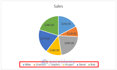
The marked entries in your chart represent the legends for the plotted data.
Method 1 – Updating Data in Excel
Suppose you have a dataset showing sales by salesmen over a specific time period.
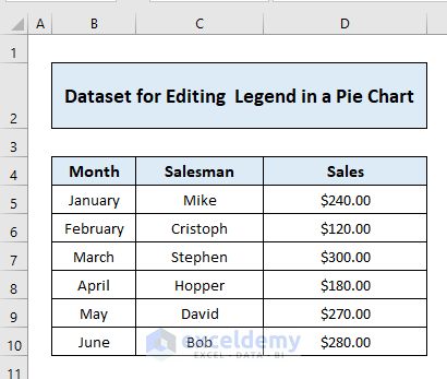
- Create a chart to visualize the shop’s sales during that time.

- To edit the legend using this method:
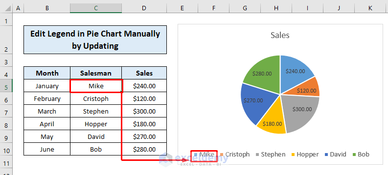
- Click the cell in the worksheet corresponding to the legend you want to change.
-
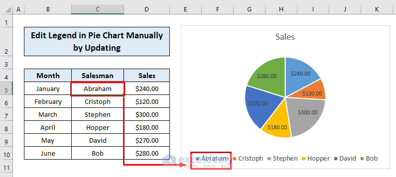
- Enter the new legend text in the cell and press ENTER. The chart’s legend will update accordingly.
-
- Repeat this process for each cell to modify other legends.
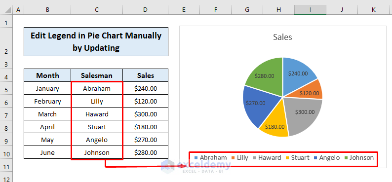
These steps allow you to manually edit legends by updating the data in the cells.
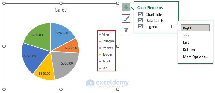
Additionally, you can adjust the orientation of legend entries by:
- Clicking the + sign at the right corner.
- Selecting Legend.
- Choosing an orientation (e.g., Right, Top, Left, Bottom).
Read More: Add Labels with Lines in an Excel Pie Chart
Method 2 – Assigning a New Axis Label Range
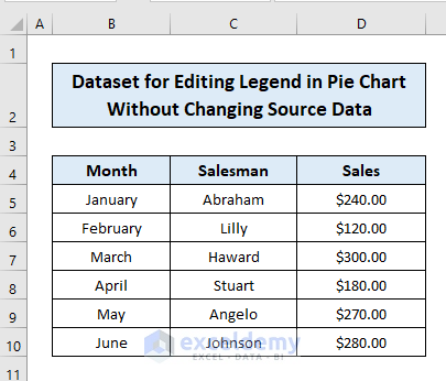
Consider the dataset below, where you want to alter the legend of an Excel pie chart without modifying the data.
Follow these steps:
- Click the chart area.
- Go to the Chart Design tab and click Select Data.
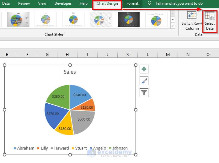
- Edit the Horizontal (Category) Axis Labels.
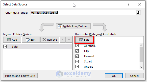
- Assign a new axis label range by typing the desired legends separated by commas (e.g., initial letters of salesman names).
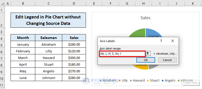
- Click OK to confirm.
- Your pie chart’s legends will be updated accordingly.
This method allows you to change the legend without affecting the source data values.
Read More: How to Edit Pie Chart in Excel
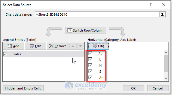
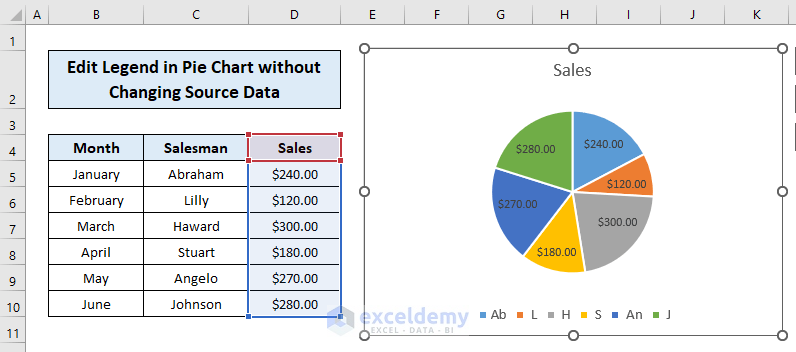
Method 3 – Changing the Source
Assume you’ve created a 3-D pie chart based on your previous dataset.
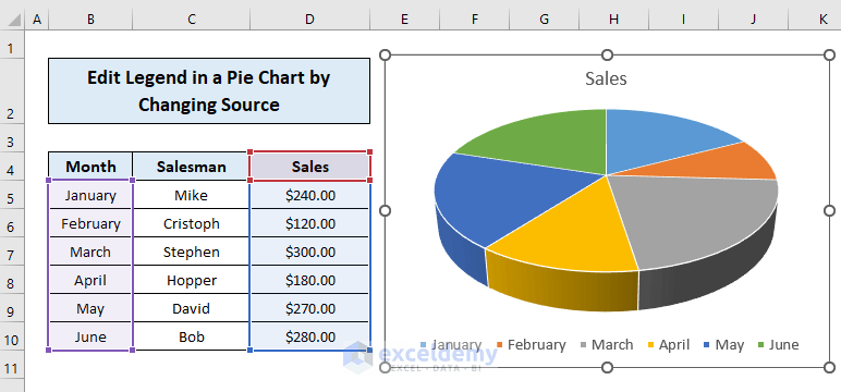
To change the legend by altering the source:
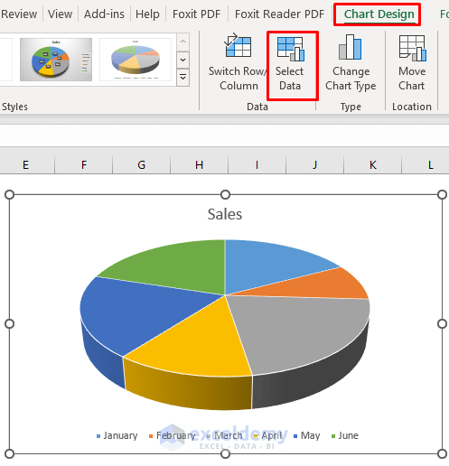
- Click the chart area.
- Go to the Chart Design tab and click Select Data.
- In the Select Data Source dialog box, click Edit for the Horizontal Axis Labels (since we want to modify them).
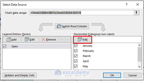
- Assign the desired axis label range and click OK.
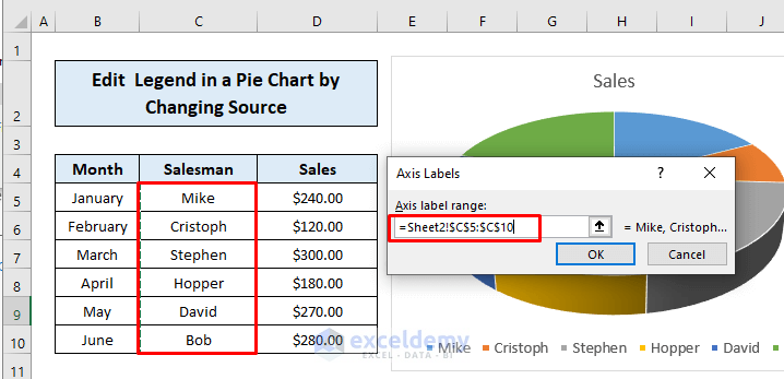
- Confirm by clicking OK in the dialog box.
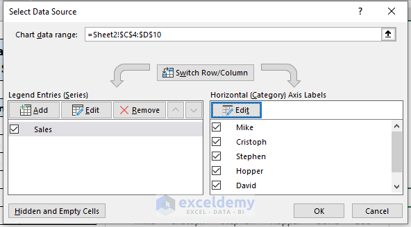
- Your updated pie chart with the modified legend will be displayed.
 That’s how you can easily edit the legend of an Excel pie chart by changing the source itself.
Read More: How to Change Pie Chart Colors in Excel
Download Practice Workbook
You can download the practice workbook from here:
Related Articles
- How to Rotate Pie Chart in Excel
- How to Explode Pie Chart in Excel
- [Fixed] Excel Pie Chart Leader Lines Not Showing
- How to Hide Zero Values in Excel Pie Chart
- Excel Pie Chart Labels on Slices: Add, Show & Modify Factors
<< Go Back To Edit Pie Chart in Excel | Excel Pie Chart | Excel Charts | Learn Excel
Get FREE Advanced Excel Exercises with Solutions!
