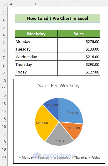
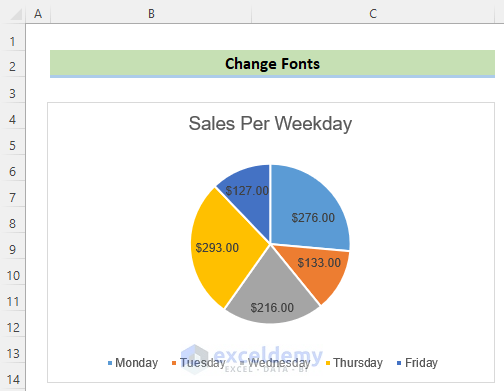
We will use this sample dataset with a pie chart to illustrate the different modification aspects.
Modification 1 – Change Chart Color
Steps:
- Click the pie chart to add two tabs named ChartDesign and Format in the ribbon.
- Go to the Chart Design tab from the ribbon. Click on the Change Colors tool and choose any color.
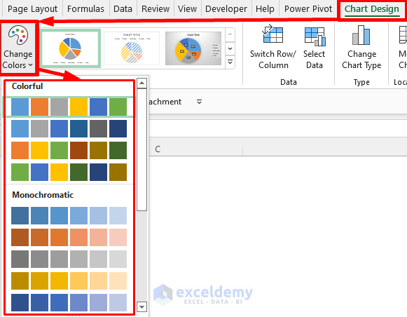
The pie chart color will change based on the selected color.

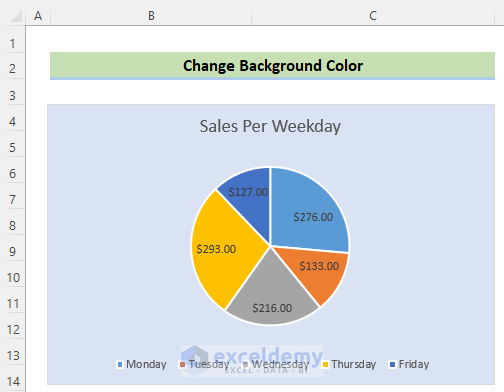
Modification 2 – Change Background Color
Steps:
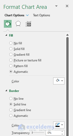
- Double-click on your pie chart area to create a new ribbon named Format Chart Area.

- Go to the Chart Options menu >> Fill & Line icon >> Fill group >> Solid fill option >> Fill Color icon >> choose any color as the background.
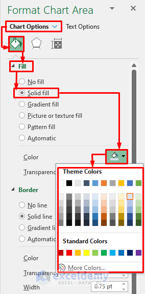
- The background can also be changed as Gradient fill, Picture or texture fill, Pattern fill etc. using the other fill options.
- The pie chart color will change accordingly.
Modification 3 – Change Font of Pie Chart
Steps:
- Left-click on the chart area.
- Go to the Home tab >> Font group >> Font list >> choose your desired font.
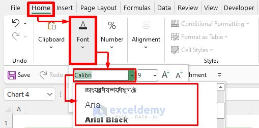
The font in the pie chart will change to the chosen format.
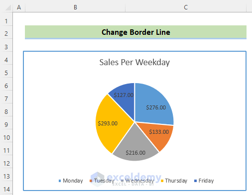
Modification 4 – Change Chart Border
Steps:
- Double-click on your pie chart area to create a new ribbon named Format Chart Area.
- Go to the Chart Options menu >> Fill & Line icon >> Border group and choose any type of border line.
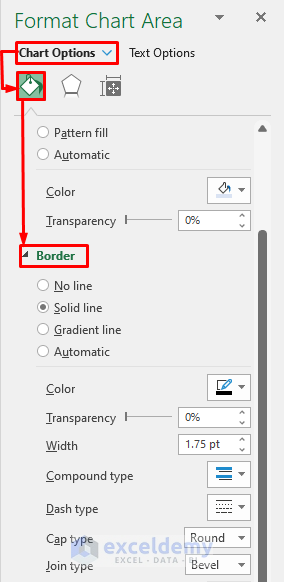
- If you want a solid line border, choose the option Solid line. From the Color option, you can fix the border color. You can fix transparency from the Transparency option. You can also fix the width of a borderline using the Width option. And, you can set the border type from the Dash type option.
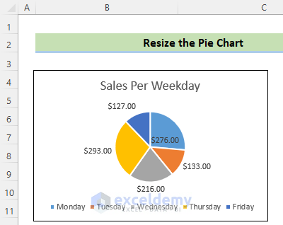
Modification 5 – Resize Pie Chart
Steps:
- Click on the pie chart area.
- Place your cursor on any of the circle marks outside the border of the chart to get the double arrow sign.
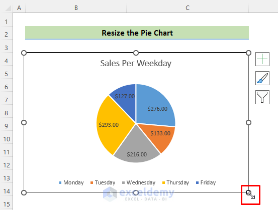
- Drag the double arrow outward to increase the chart area and inward to decrease the chart area.
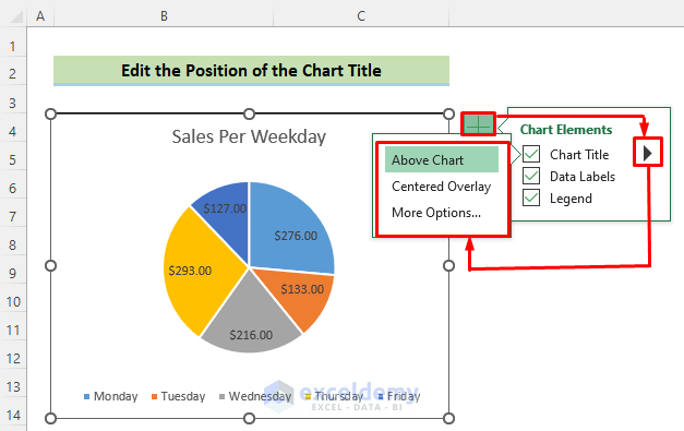
Modification 6 – Change Chart Title Position
Steps:
- Click on the chart area.
- Click on the Chart Elements.
- Click on the rightward arrow situated on the right side of the Chart Title option. Choose any of the position options.
Note:
Make sure that the Chart Title option is checked. Otherwise, the chart title will not be displayed in the chart area.
Modification 7 – Change Data Labels Position
Steps:
- Click on the chart area.
- Click on the Chart Elements.
- Click on the rightward arrow situated on the right side of the Data Labels option. Choose any of the position options.
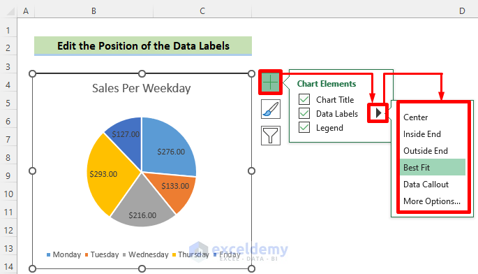
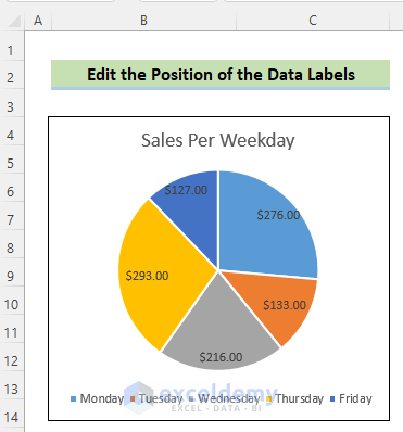
The position of the data labels will change accordingly.
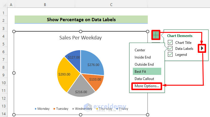
Modification 8 – Show Percentage on Data Labels
Steps:
- Click on the chart area.
- Click on the Chart Elements. Click on the rightward arrow situated on the right side of the Data Labels option. Click on More Options.
- A new ribbon named Format Data Labels will appear at the right side of your Excel file. Go to the Label Options menu >> Label Options group >> put a checkmark on Percentage.
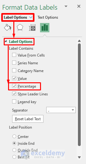
Percentage values will be added to the data labels.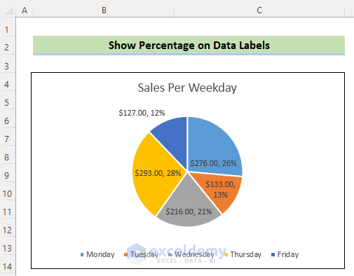
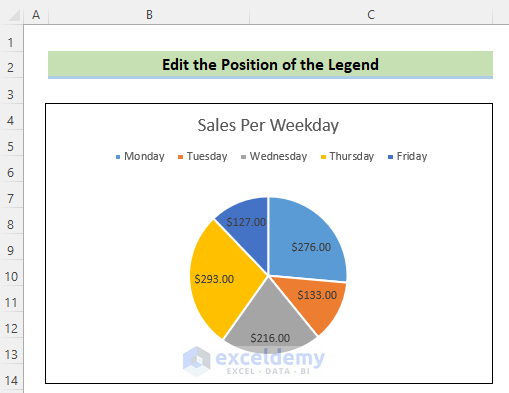
Modification 9 – Change Pie Chart’s Legend Position
Steps:
- Click on the chart area.
- Click on Chart Elements. Click on the rightward arrow situated on the right side of the Legend option. Choose any of the position options.
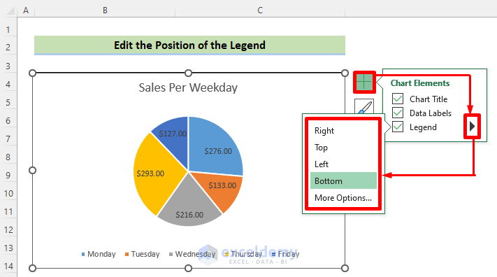
It will change the position of the legend accordingly.
Modification 10 – Edit Pie Chart Using Switch Row/Column Button
Steps:
- Click on the chart area.
- Go to the Chart Design tab on the ribbon. Click on Switch Row/Column.
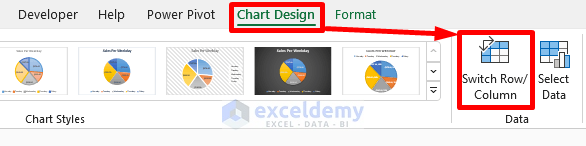
It will switch the row and column of your pie chart.
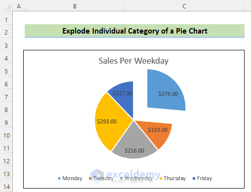
Modification 11 – Explode Individual Category of a Pie Chart
Steps:
- Click on the pie chart. Click on the specific category which you want to explode. Drag the category outward to explode this individual category.
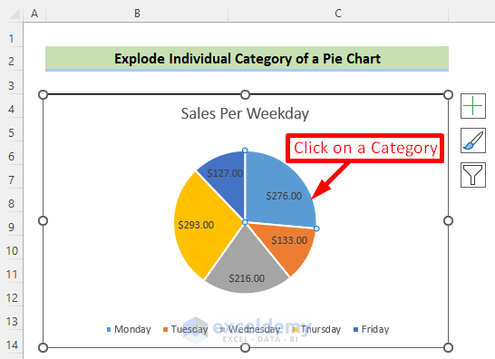
It will explode the selected category on the pie chart. If we click on the Monday category which represents $276.00 data, and drag it outward, the result will look as shown below.
Read More: How to Explode Pie Chart in Excel
Download Practice Workbook
Edit Pie Chart in Excel: Knowledge Hub
- How to Change Pie Chart Colors in Excel
- How to Edit Legend of a Pie Chart in Excel
- How to Rotate Pie Chart in Excel
- How to Hide Zero Values in Excel Pie Chart
<< Go Back To Excel Pie Chart | Excel Charts | Learn Excel
Get FREE Advanced Excel Exercises with Solutions!
