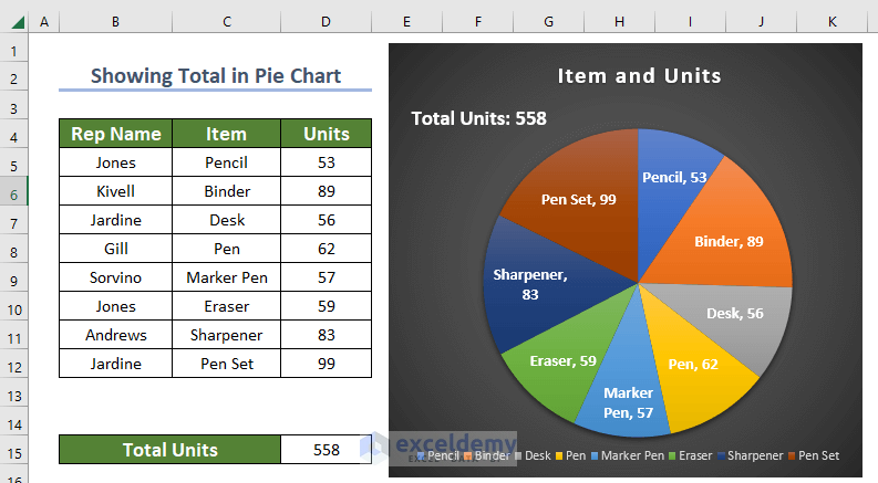
Method 1 - Using Text Box in Pie Chart to Show Total Step 1: Inserting Pie Chart Select the preferred range for which you want to create the ...
What Is a Pie Chart? A Pie Chart is a circular graph divided into sectors, each representing a proportion of the whole. The area of each portion ...
Excel Pie Chart Leader Lines Not Showing: Solution in 3 Steps We have the number of students in different classes in a school. Step 1 - ...
To demonstrate how to show Percentage and Value in an Excel Pie Chart, we'll use the following sample dataset: Step 1 - Selecting the ...
Method 1 - Add a New Column to the Existing Dataset Start by entering a new column just by the side of the data table. Fill them with “1” to ...
The Excel Pie chart is a familiar figure to all of us. We use this type of chart to visualize the total amount in percentage. Like every type of ...
Method 1 - Group Small Values with Pie of Pie Chart Prepare Your Data Input the names of the 12 months in cells B5:B15. Enter the total ...
We have a dataset with a list of products that fall into three categories and their Sales Quantity. The categories are Laptop, Headphone, and ...
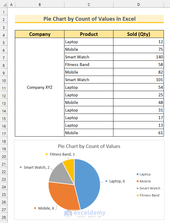
Dataset Overview To illustrate the methods, we’ve chosen a dataset with three columns: Company, Product, and Sold (Qty). Method 1 - ...
Step 1 - Prepare the Dataset We'll make a dataset containing monthly total sales in different months. Input the name of the first 6 months in ...
Method 1 - Editing Horizontal Axis Labels to Create Excel Pie Chart Legend with Values Steps: Select the cell range B4:C9. From the Insert ...
We will use this sample dataset with a pie chart to illustrate the different modification aspects. Modification 1 - Change Chart Color ...
Below, we have the population percentages by major ethnic groups in Southern California. We have created a pie chart using this data and added ...
Method 1 - Using Charts Group to Make a Pie Chart in Excel Step 1: Inserting Pie Chart Select the data range with which you want to make the ...
Most of us are familiar with standard Excel chart types such as a pie chart, a column chart, and a line chart, as well as the types of data they are ...
Advanced Excel Exercises with Solutions PDF

![[Fixed] Excel Pie Chart Leader Lines Not Showing](https://www.exceldemy.com/wp-content/uploads/2022/07/excel-pie-chart-leader-lines-not-showing-9.png?v=1697346804)