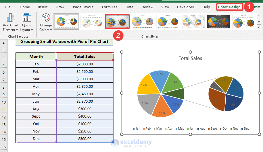
Method 1 – Group Small Values with Pie of Pie Chart
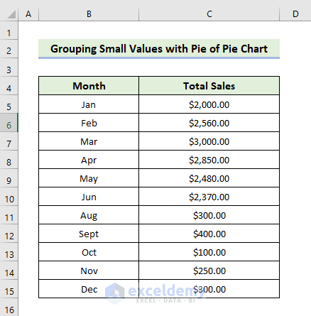
- Prepare Your Data
- Input the names of the 12 months in cells B5:B15.
- Enter the total sales for each corresponding month in cells C5:C15.
- The X-axis variables are represented by row headers, while Y-axis variables are represented by column headers.
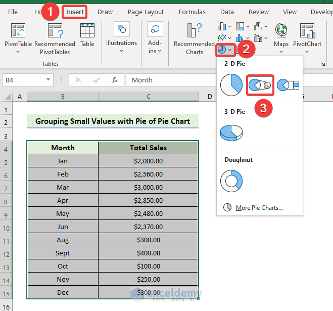
- Insert the Pie of Pie Chart
- Select the range of cells B5:C15.
- In the Insert tab, click the drop-down arrow next to Pie or Doughnut Chart in the Charts group.
- Choose the Pie of Pie chart type.
-
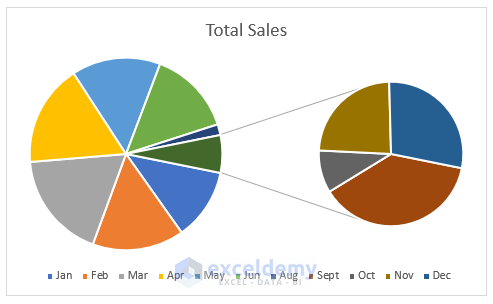
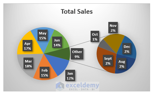
- This chart allows you to combine small values into the Other category.
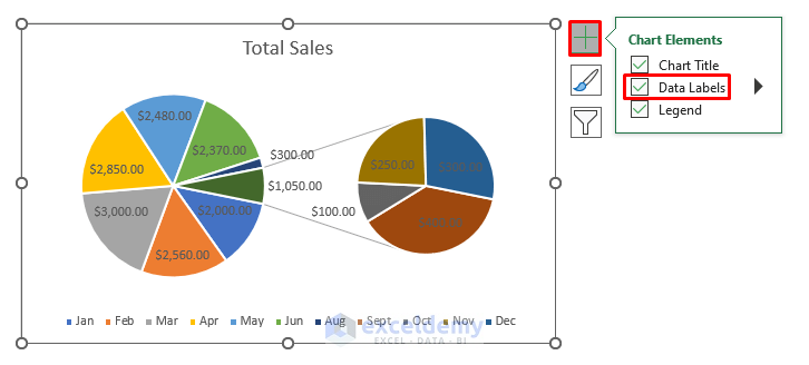
- Customize the Chart
- Click the plus icon (+) on the chart to access chart elements.
- Mark elements to add or unmark elements to remove.
- Edit elements using the options available.
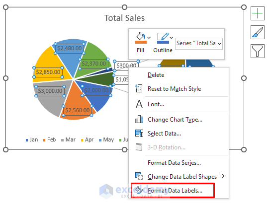
- Enable Data Labels to display corresponding data on the chart.
-
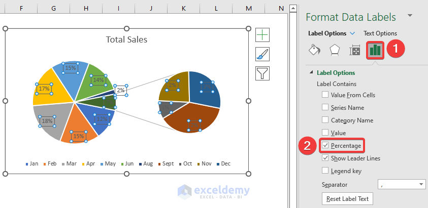
- Double-click the Data Labels and select Format Data Labels.
-
- In the Label Options drop-down, choose Percentage instead of Value.
- Combine Small Values
- Right-click any slice of the chart and select Format Data Series.
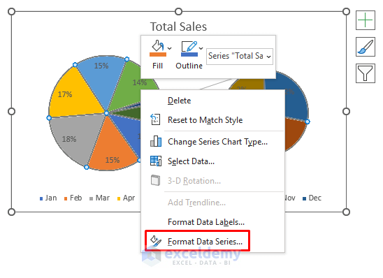
-
- In the Format Data Series window, choose Percentage Value in the Split Series By drop-down.
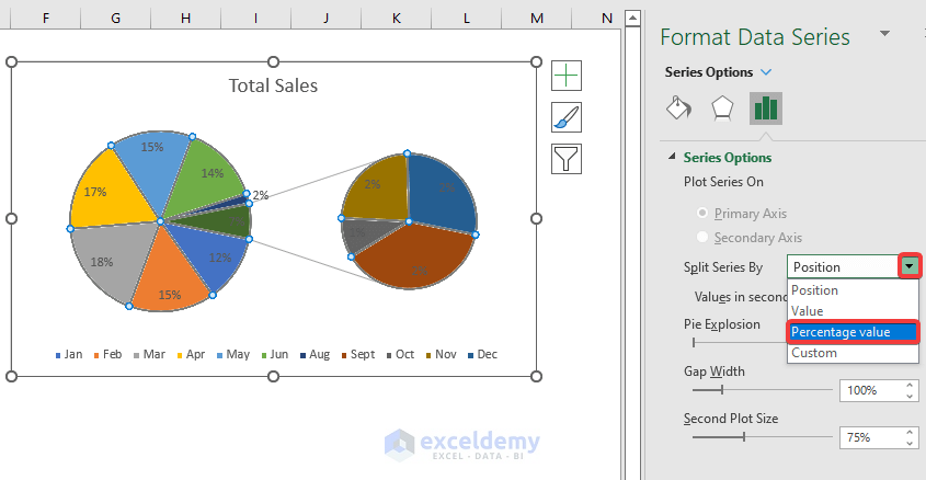
-
- Specify a threshold (e.g., 5%) in the Values less than box.
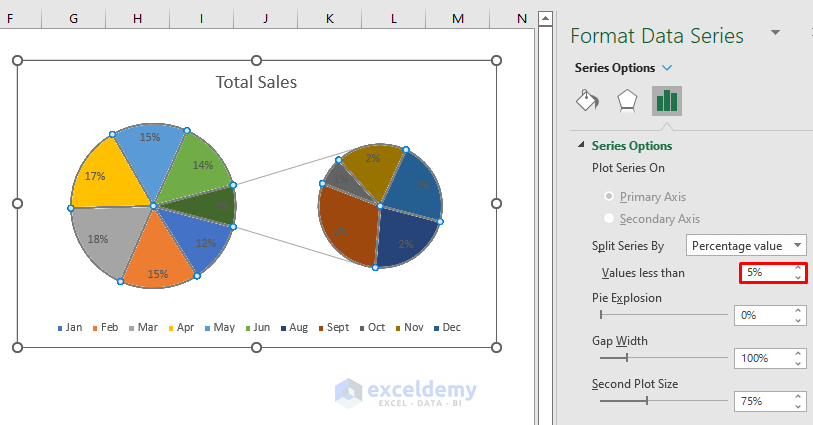
-
- This combines small values (less than 5%) into the Other category.
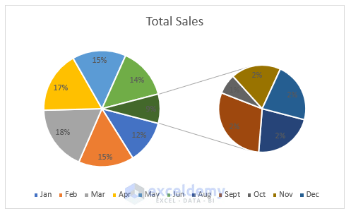
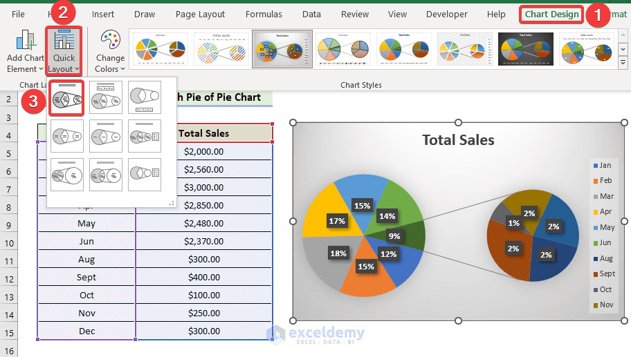
- Modify Chart Style
- Go to Chart Design and select your desired style (e.g., Style 3) from the Chart Styles group.
-
- The pie of pie chart will display as follows:
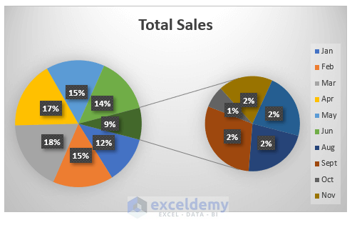
- Show Small Values in the Chart
- To display the combined small values, modify the chart style further.
- Select Chart Design, then Quick Layout, and choose Layout 1 from the Quick Layout group.
By following these steps, you’ll create a pie of pie chart that effectively groups small values.
Read More: [Solved]: Excel Pie Chart Not Grouping Data
Method 2 – Group Small Values with a Bar of Pie Chart
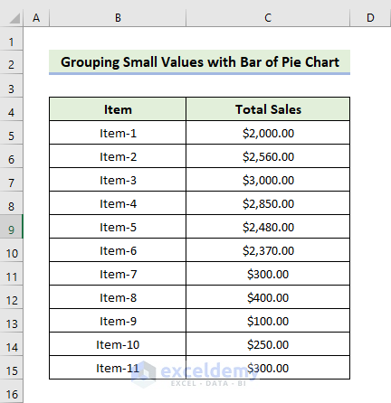
- Prepare Your Data
- Input the names of the items in cells B5:B15.
- Enter the total sales for each corresponding item in cells C5:C15.
- The X-axis variables are represented by row headers, while Y-axis variables are represented by column headers.
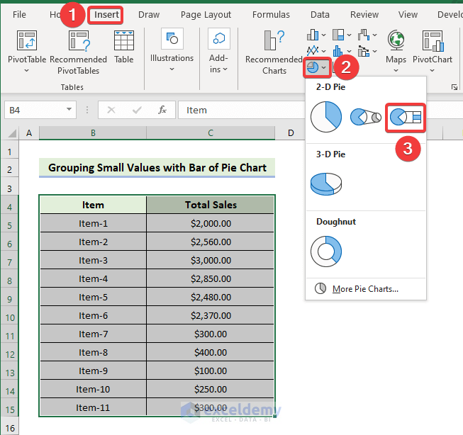
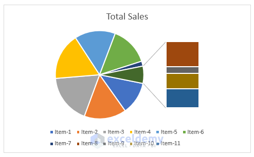
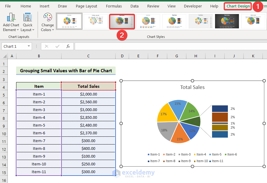
- Insert the Bar of Pie Chart
- Select the range of cells B5:C15.
- In the Insert tab, click the drop-down arrow next to Pie or Doughnut Chart in the Charts group.
- Choose the Bar of Pie chart type.
- This chart allows you to combine small values into the Other category.
-
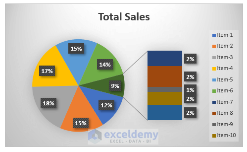
- The bar of a pie chart will be displayed:
- Customize the Chart
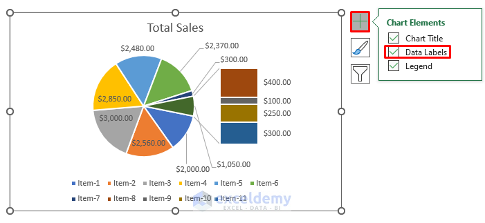
- Click the plus icon (+) on the chart to access Chart Elements.
- Mark elements to add or unmark elements to remove.
- Edit elements using the available options.
- Enable data labels to display corresponding data on the chart.
-
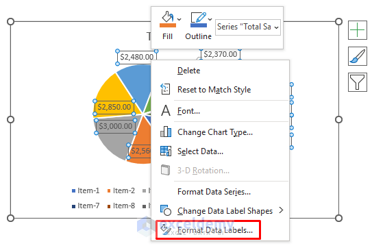
- Double-click the data labels and select Format Data Labels.
-
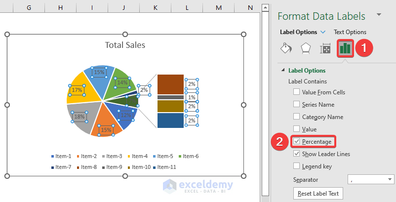
- In the Label Options drop-down, choose Percentage instead of Value.
-
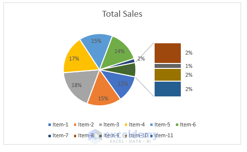
- The data percentage will appear in the pie of pie chart.
- Combine Small Values
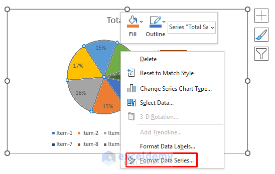
- Right-click any slice of the chart and select Format Data Series.
-
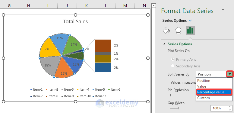
- In the Format Data Series window, choose Percentage Value in the Split Series By drop-down.
-
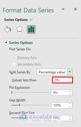
- Specify a threshold (e.g., 5%) in the Values less than box.
-
- This combines small values (less than 5%) into the Other category.
- Modify Chart Style
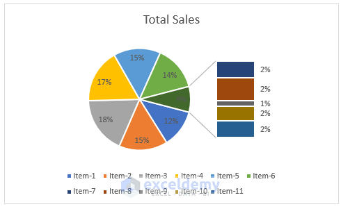
- Go to Chart Design and select your desired style (e.g., Style 3) from the Chart Styles group.
-
- The following pie of pie chart will display:
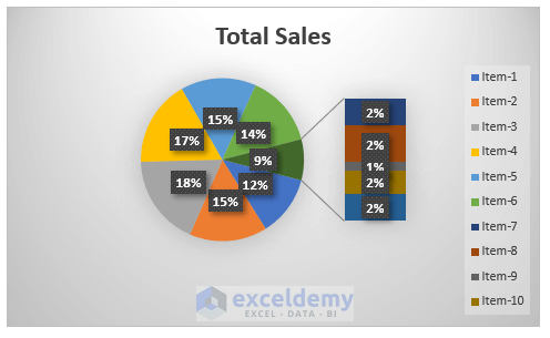
- Display Small Values
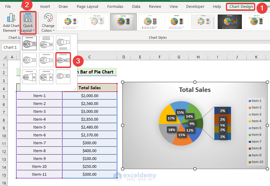
- To show the combined small values, further modify the chart style.
- Select Chart Design, then Quick Layout, and choose Layout 6 from the Quick Layout group.
Read More: How to Make Pie Chart by Count of Values in Excel
Things to Remember
✎ Before inserting a pie chart, select anywhere in the dataset.
✎ Avoid pie charts for large datasets to prevent confusion.
✎ When switching rows and columns, ensure all relevant data is selected.
Download Practice Workbook
You can download the practice workbook from here:
Related Articles
- How to Create Pie Chart Legend with Values in Excel
- How to Show Percentage in Excel Pie Chart
- How to Show Percentage and Value in Excel Pie Chart
- How to Show Percentage in Legend in Excel Pie Chart
- How to Show Total in Excel Pie Chart
- How to Create Pie Chart for Sum by Category in Excel
<< Go Back To Excel Pie Chart | Excel Charts | Learn Excel
Get FREE Advanced Excel Exercises with Solutions!
