What Is a Pie Chart?
A Pie Chart is a circular graph divided into sectors, each representing a proportion of the whole. The area of each portion corresponds to the quantity it represents. Pie charts are useful for displaying data classified into nominal or ordinal categories. For example, you can use a pie chart to show the different flavors of ice cream sold in a store.
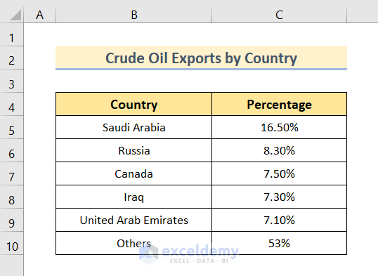
Dataset Overview
We will use the following dataset to show how to add labels with lines in an Excel pie chart. The dataset is a list of crude oil exports by country. In the Country column, there is a list of oil exporting counties and in the Percentage column, their export quantity in percentage.
Step 1 – Inserting a Pie Chart
Before adding labels, you need to generate a pie chart:
- Select the entire dataset.
- Go to the Insert tab.
- From the Charts group, click on the Insert Pie or Doughnut Chart drop-down menu.
- Choose the 3-D Pie option (you can also use 2-D Pie if preferred).
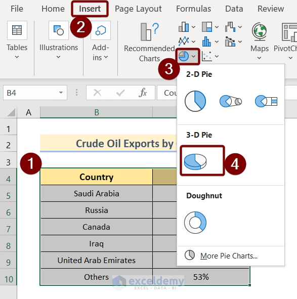
After selecting the 3-D Pie command, the pie chart will be generated.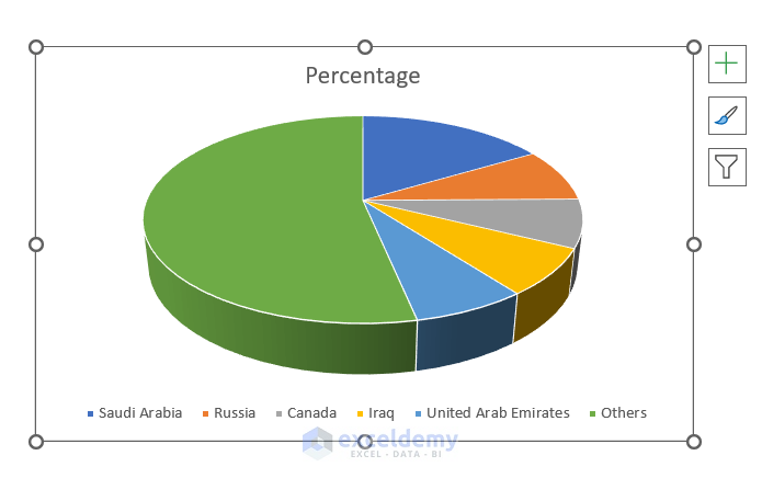
Read More: Excel Pie Chart Labels on Slices: Add, Show & Modify Factors
Step 2 – Enabling Data Labels
By default, the pie chart won’t have data labels. You need to enable them manually:
- Click on the Pie Chart.
- Click the plus icon at the top-right corner of the pie chart.
- Select Data Labels from the Chart Elements list.
You’ll see various data label position options, such as:
-
- Center
- Inside End
- Outside End
- Best Fit
- Data callout
Choose the desired option (e.g., Outside End).

Read More: How to Edit Pie Chart in Excel
Step 3 – Adding Labels with Lines
To enable lines for the data labels:
- Click on any data label to select it.
- Right-click on the data label.
- From the Context Menu, choose Format Data Labels.
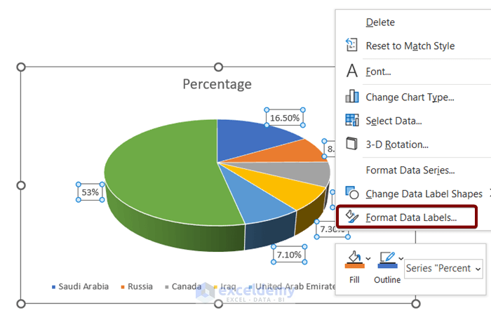
- In the Format Data Labels dialog box, select Show Leader Lines.
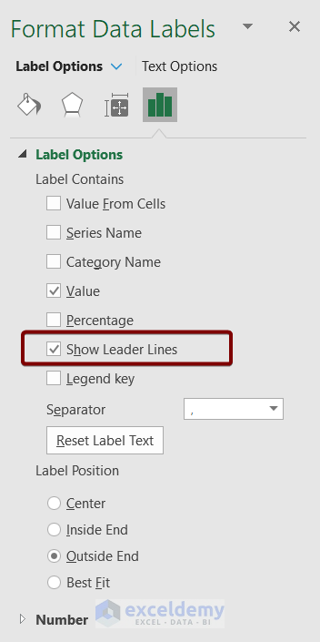
- Manually reposition each data label by dragging it away from the pie chart.
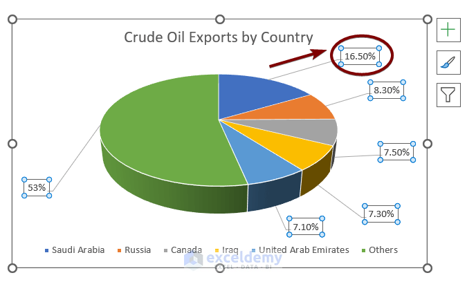
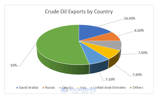
Once you’ve dragged away all the data labels, they’ll be connected with leader lines.
Read More: How to Edit Legend of a Pie Chart in Excel
Advantages of Using Pie Charts
- Easy to understand and interpret.
- Take up less space than other types of graphs.
- Can be used to compare data from different categories.
Disadvantages of Using Pie Charts
- Can be difficult to compare data if the categories are not of equal size.
- Can be misleading if the data is inaccurately represented.
Download Practice Workbook
You can download the practice workbook from here:
Related Articles
- How to Change Pie Chart Colors in Excel
- How to Rotate Pie Chart in Excel
- How to Explode Pie Chart in Excel
- [Fixed] Excel Pie Chart Leader Lines Not Showing
- How to Hide Zero Values in Excel Pie Chart
<< Go Back To Excel Pie Chart | Excel Charts | Learn Excel
Get FREE Advanced Excel Exercises with Solutions!
