The Excel Pie chart is a familiar figure to all of us. We use this type of chart to visualize the total amount in percentage. Like every type of chart, a pie chart can display data labels for the convenience of its users. These data labels can be modified in several ways. In this article, we will show some suitable examples to show Excel pie chart labels on slices. If you are curious about it, download our practice workbook and follow us.
Excel Pie Chart Labels on Slices: Add, Show & Modify Factors: 5 Examples
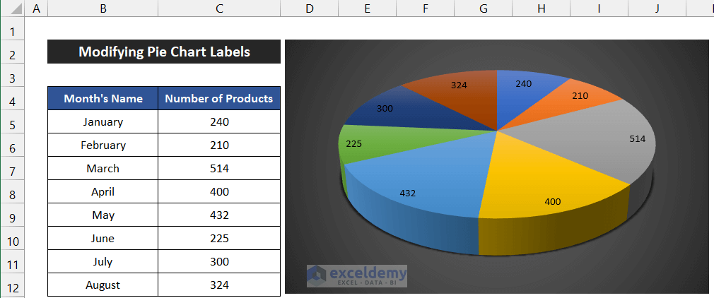
To demonstrate the examples, we consider a dataset of the production amount of the first eight months of an industry. The name of the months is in the range of cells B5:B12, and the number of products is in the range of cells C5:C12.

1. Showing Pie Chart Labels on Slices
We have to follow the following steps to insert the pie chart with data labels.
📌 Steps:
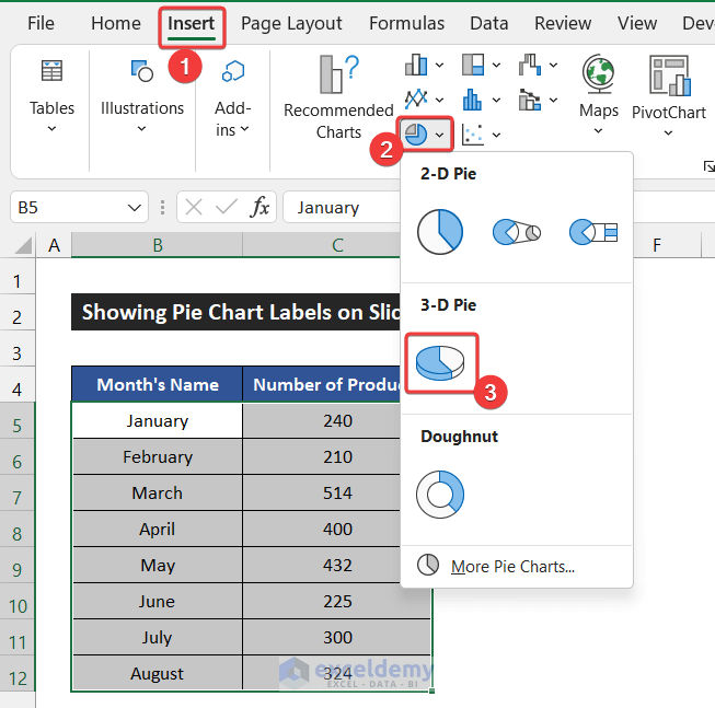
- First, select the range of cells B5:C12.
- After that, in the Insert tab, click on the drop-down arrow of the Insert Pie or Doughnut Chart.
- Then, choose the 3-D Pie option from the 3-D Pie section.
- The chart will appear in front of you.
- Now, we will do all the tasks on the data labels. So, click on the Chart Element icon and only check the Data Labels option.
- You will find the data labels on the pie chart.

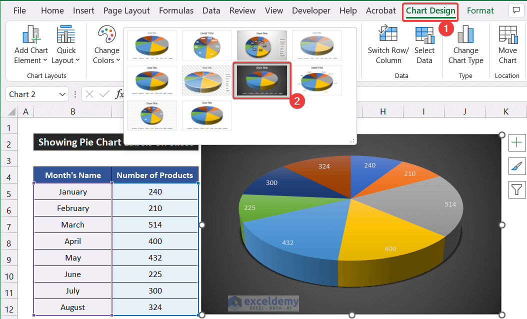
- Moreover, you can change the chart style from the Chart Design tab.
- For that, in the Chart Design tab, choose your desired chart style. For our chart, we choose Style 7 from the Chart Style group.
- Our task is completed.
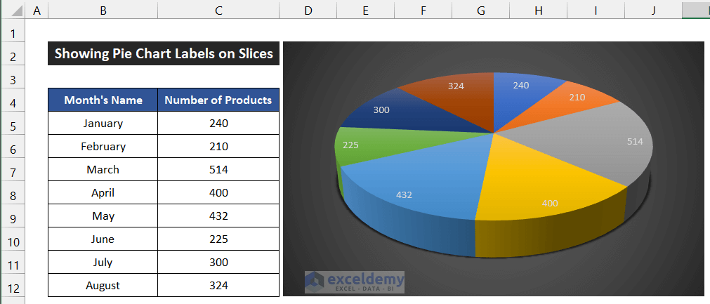
Finally, we can say that our working method worked perfectly, and we are able to show Excel pie chart labels on slices.
Read More: Add Labels with Lines in an Excel Pie Chart
2. Modifying Pie Chart Labels
Now, we will demonstrate to you all the ways to modify the data labels font. We are going to show the changing procedure of font color, style, and size.
2.1 Changing Font Color
First, we will show you how to change the Font Color of the data labels. The steps of this task are given as follows:
📌 Steps:
- First of all, click on the data labels to select all of them.

- Now, in the Home tab, click on the drop-down arrow of the Font Color from the Font group and choose your desired color.
- For our chart, we choose Black, Text 1.
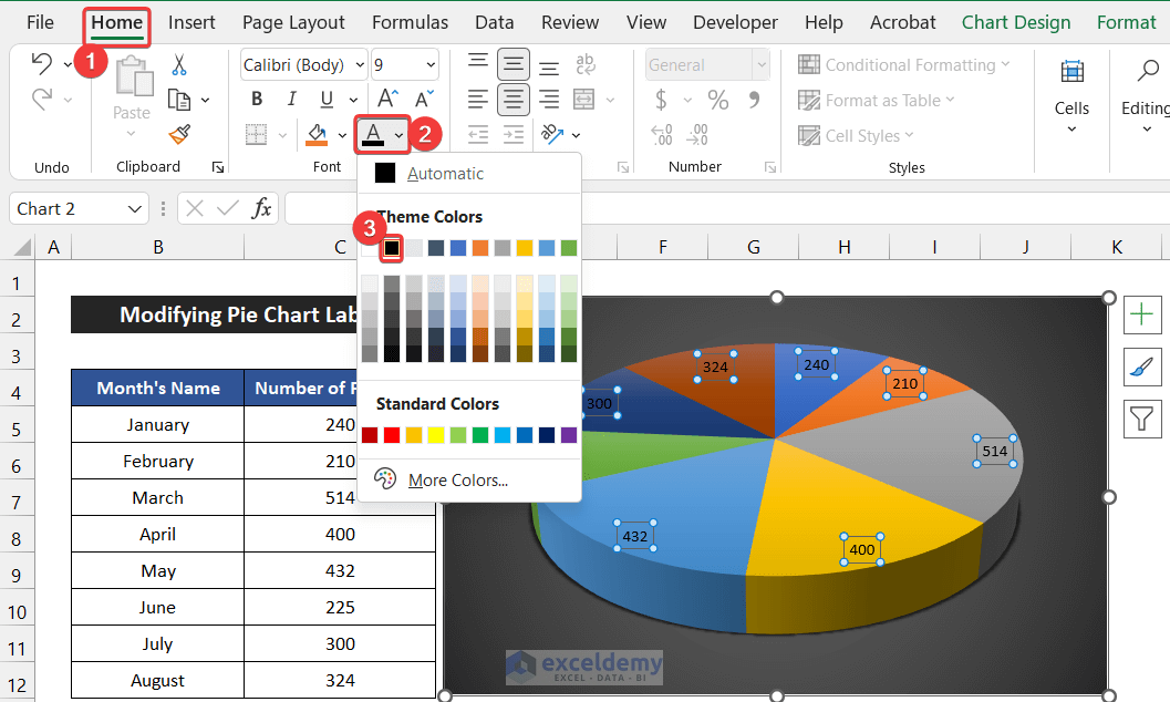
- You will see all the font colors of the data labels changed.
- Besides it, you can select the More Colors option to get your desired font color.

Thus, we can say that our procedure worked perfectly, and we are able to change the Excel pie chart labels color on slices.
Read More: How to Edit Pie Chart in Excel
2.2 Changing Font Style
In this step, we will show you the way to change the Font Style. The procedure for this task is given below:
📌 Steps:
- At first, click on the data labels to select all of them.
- After that, in the Home tab, click on the drop-down arrow of the Font box from the Font group and choose your desired font style.
- In our chart, we choose the Times New Roman font.
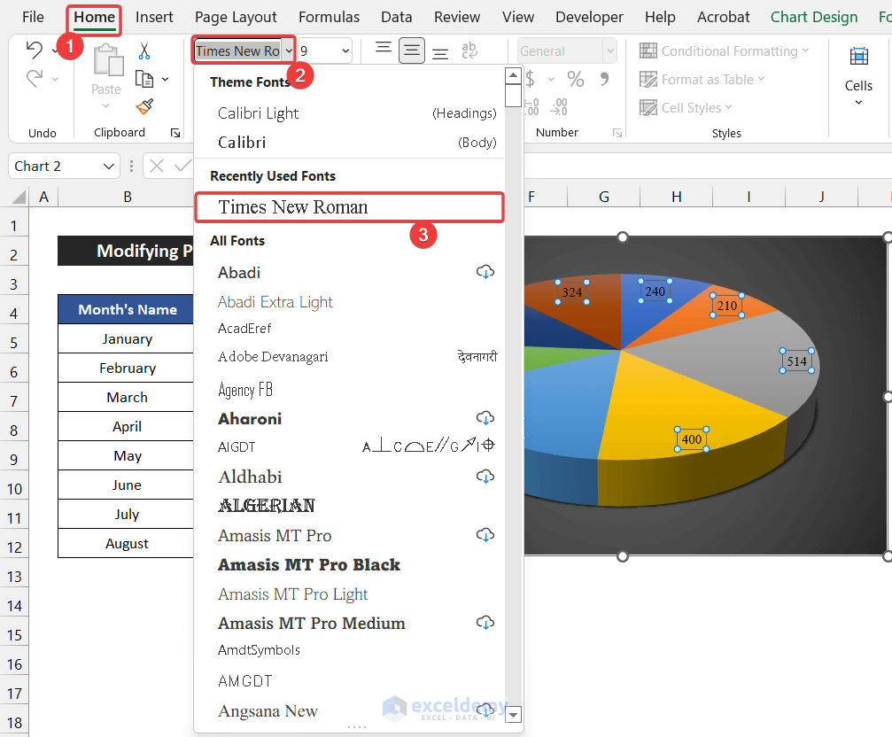
- You will see all the font styles of all the data labels and get the new font style.
Finally, we can say that our procedure worked perfectly, and we are able to change the Excel pie chart labels style on slices.
Read More: How to Change Pie Chart Colors in Excel
2.3 Changing Font Size
In the following step, we are going to demonstrate to you the way to change the Font Size. The steps for this task are given below:
📌 Steps:
- At first, click on the data labels to select all of them.
- Now, in the Home tab, click on the drop-down arrow of the Font Size from the Font group and choose your desired font size.
- In our case, we choose the 11 font size.
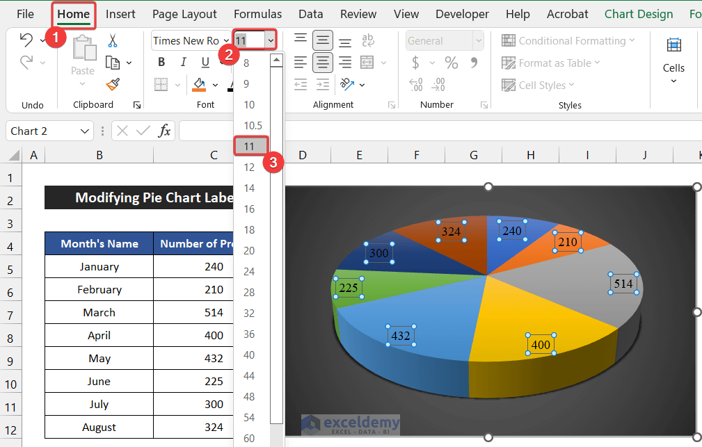
- You will see the size of the font will increase.
- Besides it, you can click on the Font Size box.
- As a result, the font size gets selected.
- Now, write down the font size using your keyboard.
- Press Enter.
- You will get the font size increased.

- Moreover, you can use the Increase Font Size and Decrease Font Size commands to enlarge and reduce the font size. However, those commands will increase or decrease the font size one unit at a time.

In the end, we can say that our methods worked successfully, and we are able to change the Excel pie chart labels size on slices.
Read More: How to Edit Legend of a Pie Chart in Excel
3. Adding Multiple Types of Data Labels
Now, we will demonstrate how to show different types of data in the data labels of the pie chart. We are going to add values, percentages, and category names to our pie chart.
3.1 Adding Value in Data Labels
In the first step, we will show how to add the Values to the data labels. The steps to add values to the data labels are given below:
📌 Steps:
- Adding value to data labels is quite an easy job. When you check the Data Labels option on the Chart Elements icon, it will automatically show the values.

- However, if the values are not showing, then double-click on the data labels on the pie chart.
- As a result, a side window called Format Data Labels will appear.
- Now, go to the drop-down of the Label Options to Label Options tab.
- Then, check the Value option.
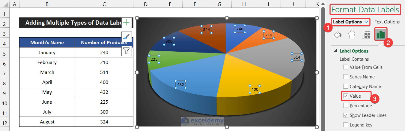
- You will get the values in the data labels.
At last, we can say that our process worked precisely, and we are able to show values in the Excel pie chart labels on slices.
Read More: How to Rotate Pie Chart in Excel
3.2 Inserting Percentage
Now, we will show how to add the Percentages to the data labels. The procedure to add percentages to the data labels is given below step-by-step:
📌 Steps:
- First of all, double-click on the data labels on the pie chart.
- As a result, a side window called Format Data Labels will appear.
- Then, go to the drop-down of the Label Options to Label Options tab.
- After that, check the Percentages option and uncheck all other options.
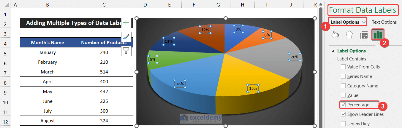
- You will get the percentages in the data labels.

So, we can say that our method worked perfectly, and we are able to show percentages in the Excel pie chart labels on slices.
Read More: How to Hide Zero Values in Excel Pie Chart
3.3 Adding Category Name
Here, we are going to show how to add the Category Name to the data labels. The method to add category names to the data labels is given below step-by-step:
📌 Steps:
- First, double-click on the data labels on the pie chart.
- As a result, a side window called Format Data Labels will appear.
- Now, go to the drop-down of the Label Options to Label Options tab.
- Then, check the Category Name option.
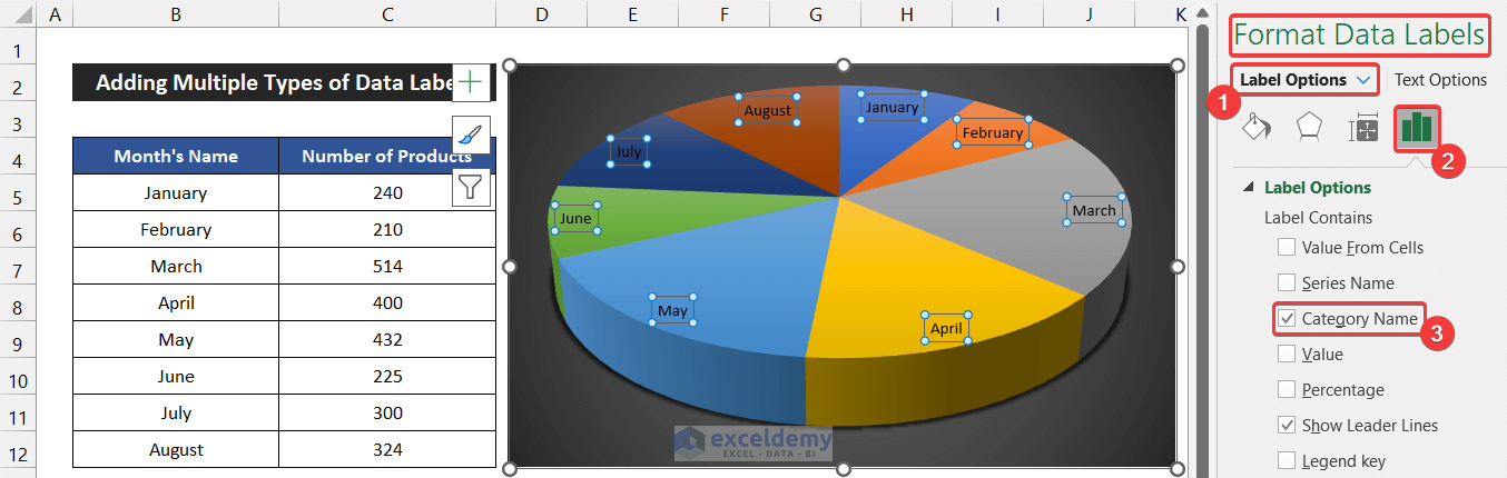
- You will get the category names in the data labels.
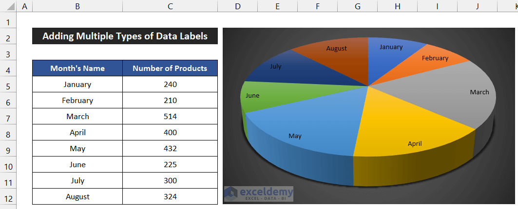
So, we can say that our method worked perfectly, and we are able to show category names in the Excel pie chart labels on slices.
Read More: How to Explode Pie Chart in Excel
4. Changing Background of Labels
We can also modify the background of the data labels and the shape outline of our pie chart. Now, we are going to demonstrate the process.
4.1 Modifying Label Fill
In this step, we will change the data label shape fill. The steps to modify the background fill of the data labels are given below.
📌 Steps:
- At first, double-click on the data labels.
- As a result, a side window called Format Data Labels will appear.
- After that, go to the drop-down of the Label Options to Fill & Lines tab.
- Now, in the Fill section, you will see several options to modify the background fill.
- Choose your desired one. In our case, we choose the Gradient fill.
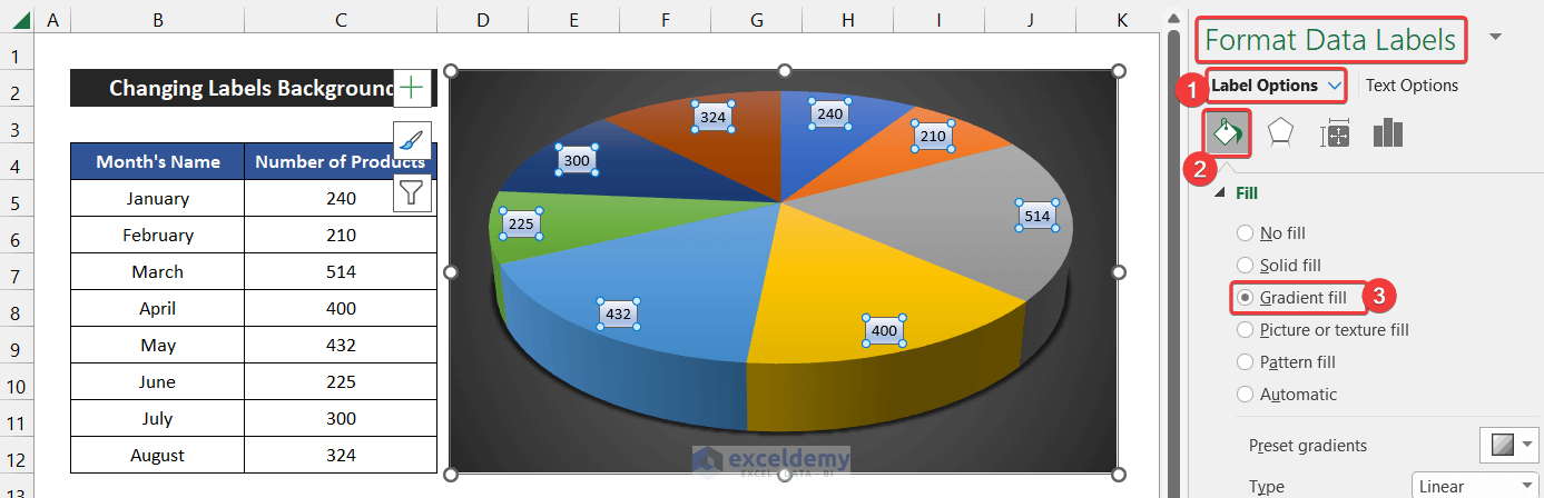
- You will see the background fill of the data labels will change.

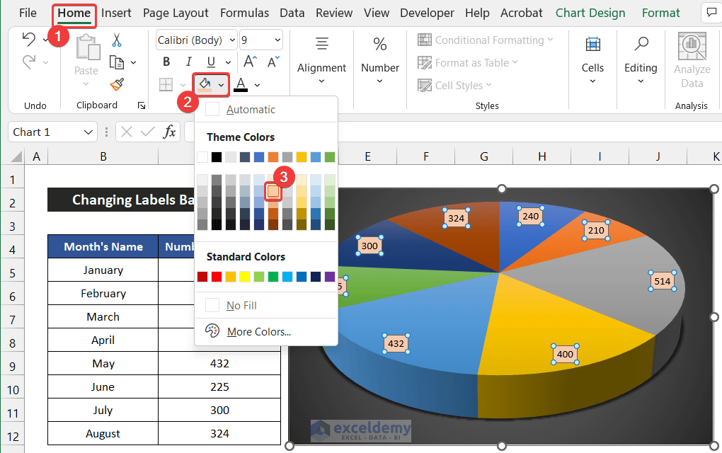
- Moreover, you can change the fill background color from the Home and Format tabs.
- For that, in the Home tab, click the drop-down arrow of the Fill Color option from the Font tab and choose your desired color. In our case, we choose the Orange, Accent 2, Lighter 60%.
- The background will be changed.
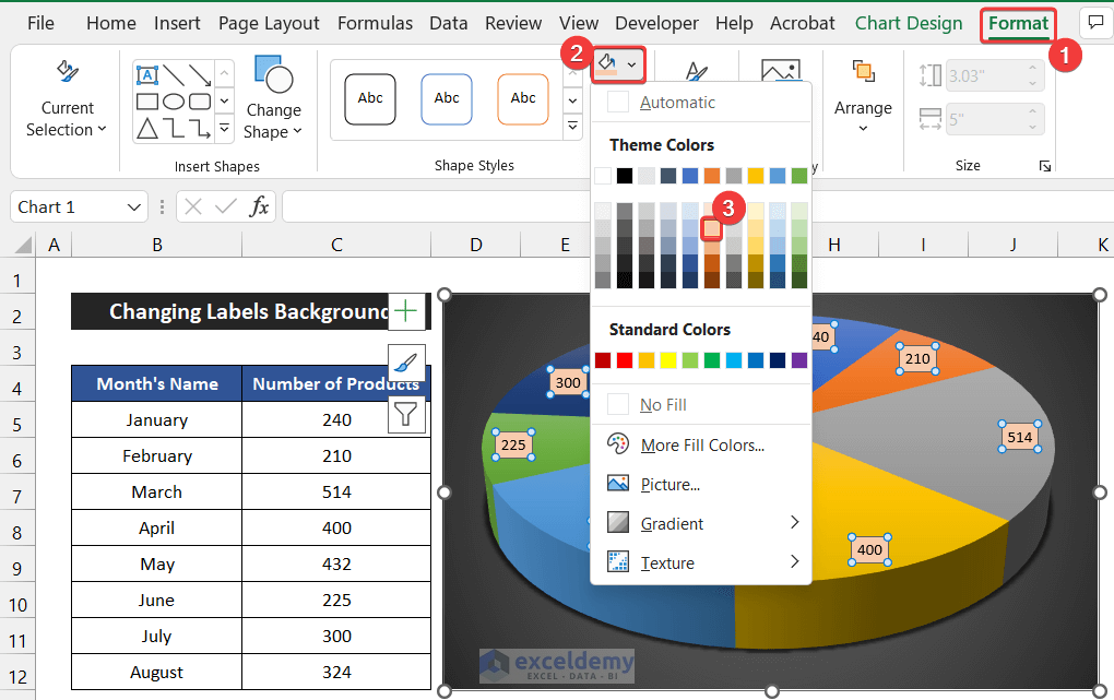
- Besides it, you can change the background from the Format tab.
- In the Format tab, click on the drop-down arrow of the Shape Fill option from the Shape Styles group.
- Choose your desired color. In our chart, we choose the Orange, Accent 2, Lighter 60% color.
- You will get the data labels with a different background color.
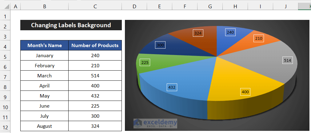
Thus, we can say that our method worked perfectly, and we are able to modify the fill background in Excel pie chart labels on slices.
4.2 Changing Label Shape Outline
Besides changing the data label background fill, we can also change the data label shape outline. It will help us to separate the data labels from the pie chart.
📌 Steps:
- First of all, click on the data labels on the pie chart.
- Now, in the Format tab, click on the drop-down arrow of the Shape Outline from the Shapes Style group.
- Then, choose your desired color for the shape outline. We choose White, Background 1 color for our shape outline.

- You will see the shape outline color will change.
Finally, we can say that our method worked successfully, and we are able to modify the shape outline in Excel pie chart labels on slices.
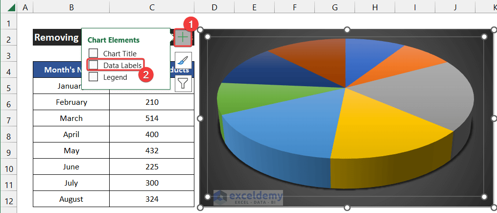
5. Removing Pie Chart Labels on Slices
In this step, we will show you how to remove data labels from the pie chart. The procedure is shown below step by step:
📌 Steps:
- First, select the chart and click on the Chart Elements icon.
- Now, uncheck the Data Labels option.
- You will see the data labels will disappear from the chart.
- Moreover, you can remove the data labels using your keyboard.
- For that, click the data labels and make sure all the data labels are selected.
- After that, press the Delete key.
- You will get the data labels removed.
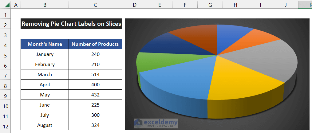
In the end, we can say that our procedure worked perfectly, and we are able to remove the data labels from the Excel pie chart on slices.
Read More: [Fixed] Excel Pie Chart Leader Lines Not Showing
Download Practice Workbook
Conclusion
That’s the end of this article. I hope that this article will be helpful for you and you will be able to show Excel pie chart labels on slices. Please share any further queries or recommendations with us in the comments section below if you have any further questions or recommendations.
Don’t forget to check our website ExcelDemy for several Excel-related problems and solutions. Keep learning new methods and keep growing!
<< Go Back To Excel Pie Chart | Excel Charts | Learn Excel
Get FREE Advanced Excel Exercises with Solutions!
