The 3D pie chart consists of a circle that is divided into segments, each representing a proportion of the share of each value in a dataset. The chart is very helpful in understanding the share of each segment in a dataset. It adds aesthetics to the plain pie chart by making it more lively. In this article, we will see how to create a 3D pie chart in Excel.
How to Create a 3D Pie Chart in Excel: Step-by-Step Procedures
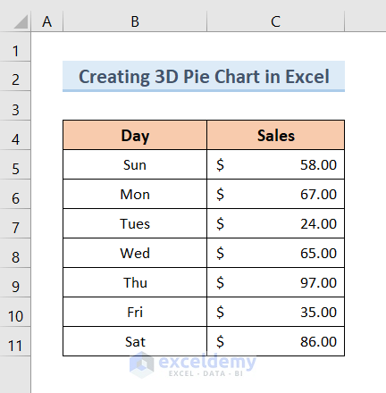
In order to create a 3D pie chart in Excel, we will need a dataset like the below image. The dataset contains Days of the Week and Sales Per Day. The 3D pie chart is most useful when it is created from two variables. Now we will create a 3D pie chart in Excel from this dataset to represent the share of each day’s sale in a single chart.
Step 1: Select Dataset
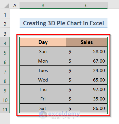
- First, select the entire dataset like the image below.
Step 2: Insert 3D Pie Chart
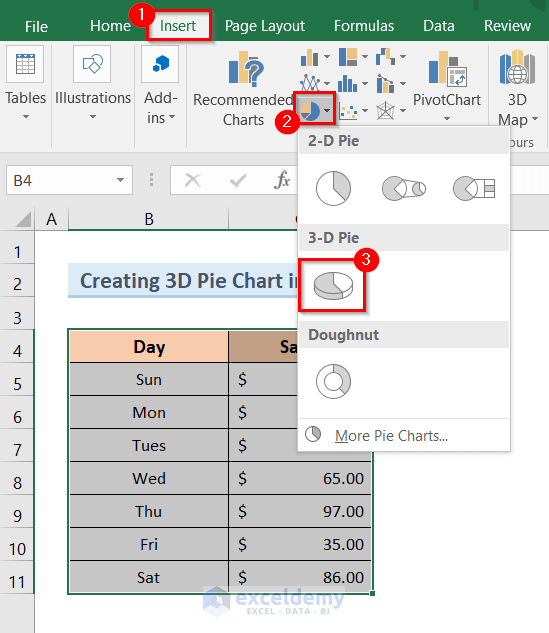
- Next, click on the Insert tab >> Insert Pie or Doughnut Chart drop-down >> 3-D Pie option like the image below.
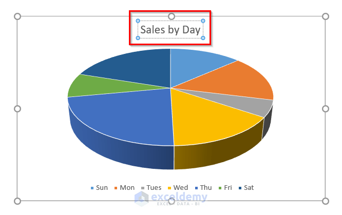
- As a result, it will create a 3D pie chart like the below one.

Read More: How to Make a Pie Chart in Excel
Step 3: Change Chart Title and Deselect Legend
- After that, click on the Chart Title and change it as you want like the image below.
- Next, click on the Chart Elements option.
- Then, deselect the Legend option from the Chart Elements.

Read More: How to Create & Customize Bar of Pie Chart in Excel
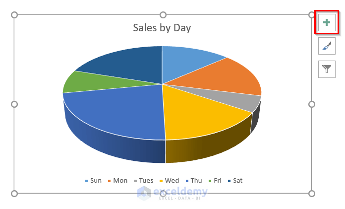
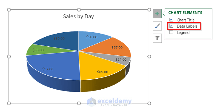
Step 4: Add and Format Data Labels of 3D Pie Chart
- Subsequently, select the Data Labels from the Chart Elements like the image below.
- As a result, it will add the Data Labels to your 3D pie chart.
- Now, in order to format the Data Labels, click on any Data Label and right-click on your mouse.
- Hence, a pop-up window will appear.
- After that, click on the Format Data Labels option from the pop-up window.
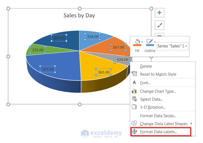
- Then, a new pop-up window Format Data Labels will appear at the rightmost position of the screen like the image below.

- Now, select the Category Name option from the Label Contains and the Outside End option from the Label Position.

Read More: How to Make Pie of Pie Chart in Excel
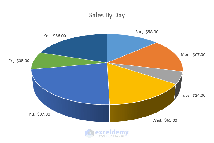
Final Output
- Finally, your 3D Pie Chart is ready and you will see an output like the image below.
Things to Remember
- If you want to represent a proportion of the share of each value in a dataset and show a comparison among them, the 3D pie chart will be the best option for you.
- The 3D pie chart is really useful for two variables. When the number of variables increases, the chart becomes visually complex.
- After creating the 3D pie chart, you can modify the chart and format the data labels in your own way.
Conclusion
Hence, follow the above-described steps. Thus, you can easily learn how to create a 3D pie chart in Excel. Hope this will be helpful. Follow the ExcelDemy website for more articles like this. Don’t forget to drop your comments, suggestions, or queries in the comment section below.
Related Articles
- How to Make Multiple Pie Charts from One Table
- How to Make a Gender Pie Chart in Excel
- How to Make a Multi-Level Pie Chart in Excel
- How to Create Square Pie Chart in Excel
- How to Make a Budget Pie Chart in Excel
<< Go Back To Make a Pie Chart in Excel | Excel Pie Chart | Excel Charts | Learn Excel
Get FREE Advanced Excel Exercises with Solutions!
