Method 1 – Using Charts Group to Make a Pie Chart in Excel
Step 1: Inserting Pie Chart
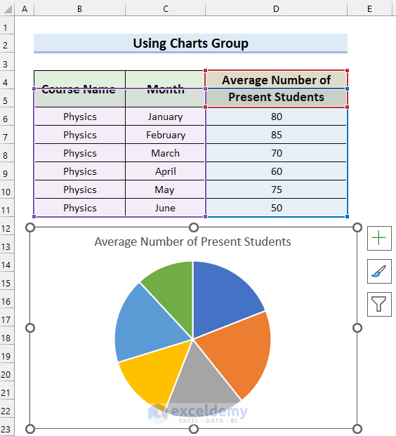
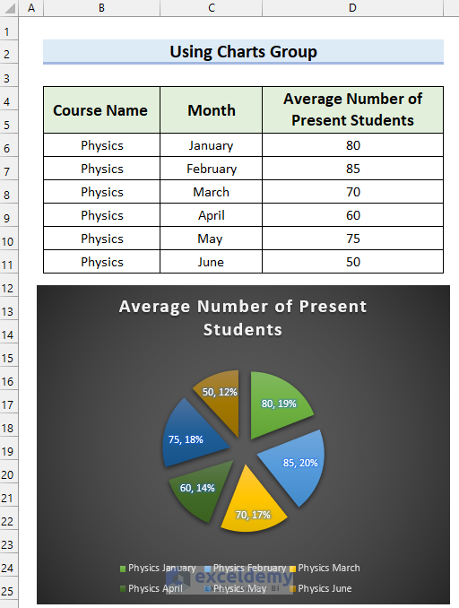
- Select the data range with which you want to make the Pie Chart. Selected cell range B4:D11.
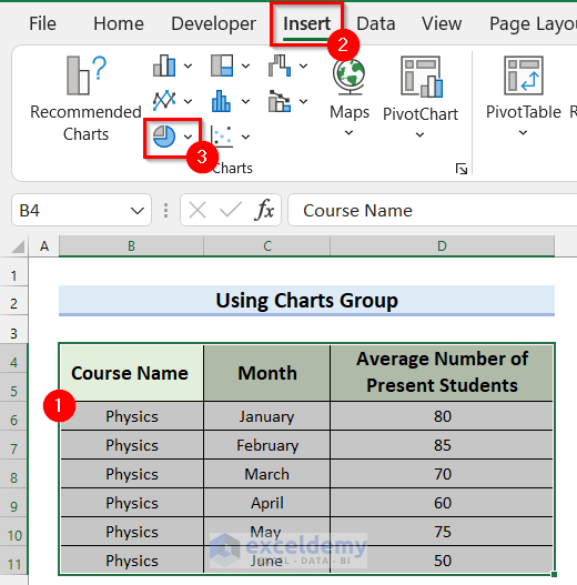
- Go to the Insert tab.
- Select Insert Pie or Doughnut Chart from the Charts group.
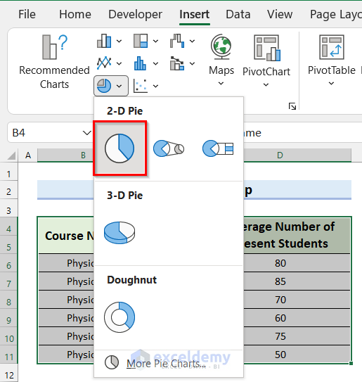
A drop-down menu will appear.
- Select the type of Pie Chart you want. Selected Pie from 2-D Pie.
You will see a Pie Chart with your selected data inserted into the Excel Sheet.
Step 2: Adding Legend and Data Labels to Pie Chart
- Select the Pie Chart.
- Select Chart Elements.
- Select Legend.
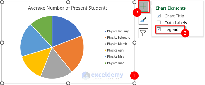
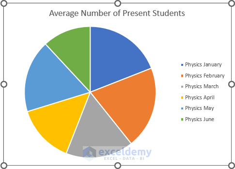
You will see that you have added Legend to your chart.
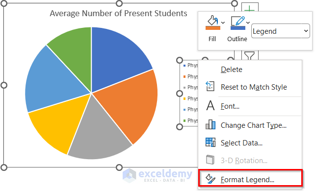
We will format the Legend.
- Right-click on the Legends.
- Select Format Legend.
The Format Legend task pane will appear on the right side of the screen.
- Select the Legend Position you want for your chart. Selected Bottom.
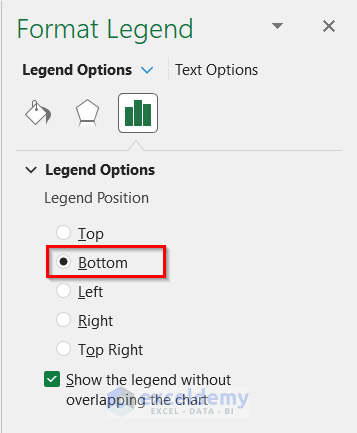
See that the Legends are shown at the bottom of the chart.

Add the Data Label to the Pie Chart in Excel.
- Select the Pie Chart.
- Check the Data Labels.
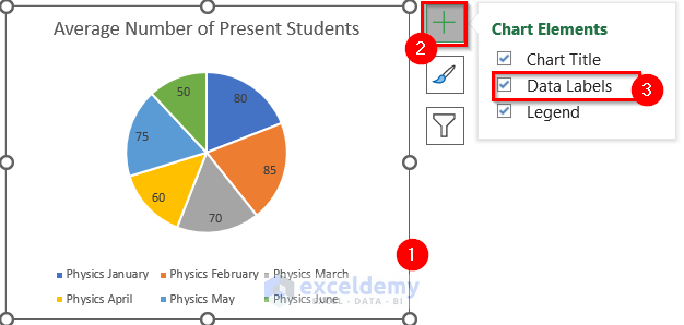
You will see that you have added the Data Labels to your Pie Chart.

Step 3: Formatting Pie Chart in Excel
- Select the Pie Chart.
- Select Chart Styles.
- Select the Style tab.
- Select the Chat Style you want for your chart. Selected Style 7.

You can see that I have changed the Chart Style to my desired style.
Change the color of the Pie Chart.
- Select the Pie Chart.
- Select Chart Styles.
- Select the Color tab.
- Select the Color Palette you want for your chart. Selected Colorful Palette 4.
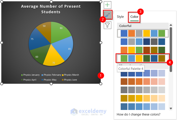
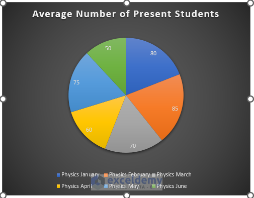
See how the Pie Chart looks after formatting it.

Step 04: Adding Percentage to Pie Chart
- Right-click on the Pie Chart.
- Select Format Data Labels.
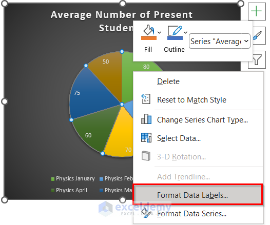
The Format Data Labels task pane will appear on the right side of the screen.
- Select the Label Options tab.
- Select Percentage.
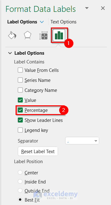
See that Percentage is added to your Pie Chart.

The Data Labels give them a clearer look.
- Right-click the Pie Chart.
- Select Format Data Labels.
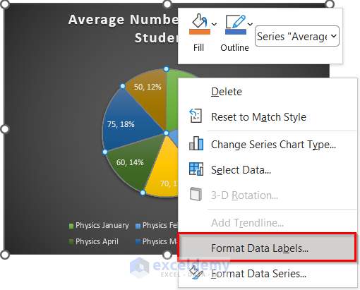
The Format Data Labels task Pane will appear on the right side of the screen.
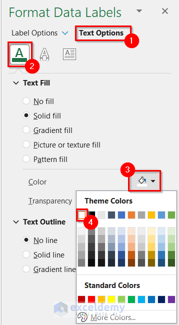
- Select Text Options.
- Select the Text Fill and Outline tab.
- Select the drop-down option for Color.
- Select the color you want for your text. Selected White color.
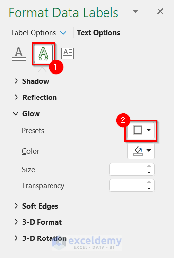
- Select the Text Effects tab.
- Select the drop-down option for Presets.
- Select the Glow Variation you want. Selected the marked Glow Variation.
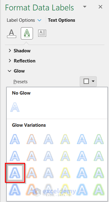
See that the Data Labels are looking clearer than before.
Step 5: Filtering Pie Chart
- Select the Pie Chart.
- Select Chart Filters.
- Select the Value tab.
- Select the fields you want to show in your Pie Chart. Selected the first 3 months.
- Select Apply.
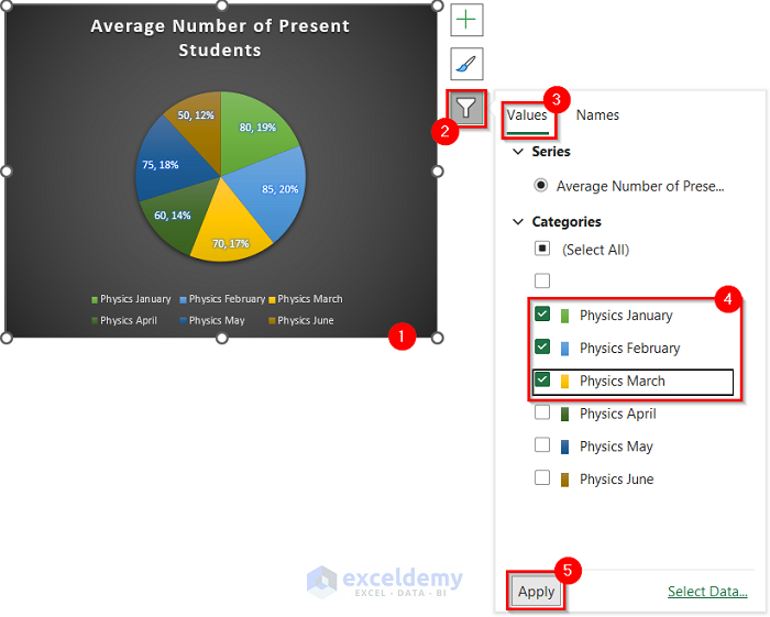
See that you have Filtered your pie chart as you wanted.

Step 6: Exploding Pie Chart in Excel
- Right-click on the Pie Chart.
- Select Format Data Series.
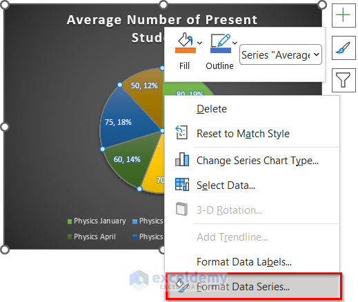
The Format Data Series task pane will appear on the right side of the screen.
- Increase the Pie Explosion according to your preference. Selected 20%.
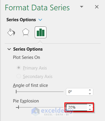
You got your desired Exploded Pie Chart.
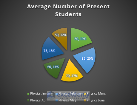
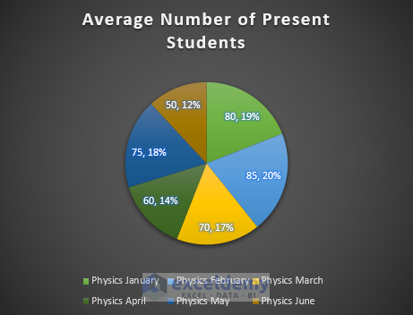
See how the final Pie Chart looks.
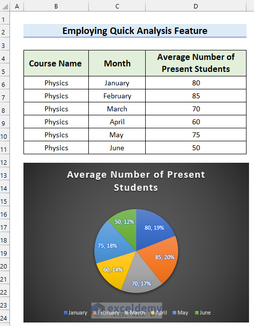
Method 2 – Employing Quick Analysis Feature to Make a Pie Chart in Excel
Steps:
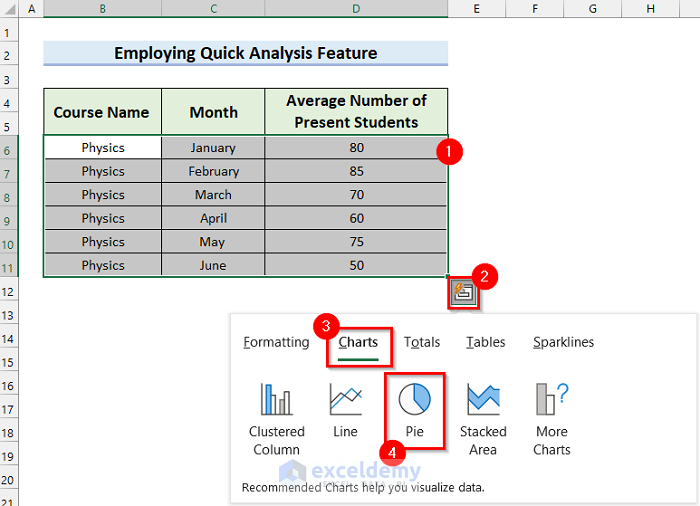
- Select the data range you want to insert in the Pie Chart. Selected cell range B6:D11.
- Click on the Quick Analysis button.
After that, a drop-down menu will appear.
- Select the Charts tab.
- Select Pie.
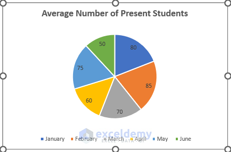
You will see a Pie Chart with your selected data inserted into the Excel sheet.
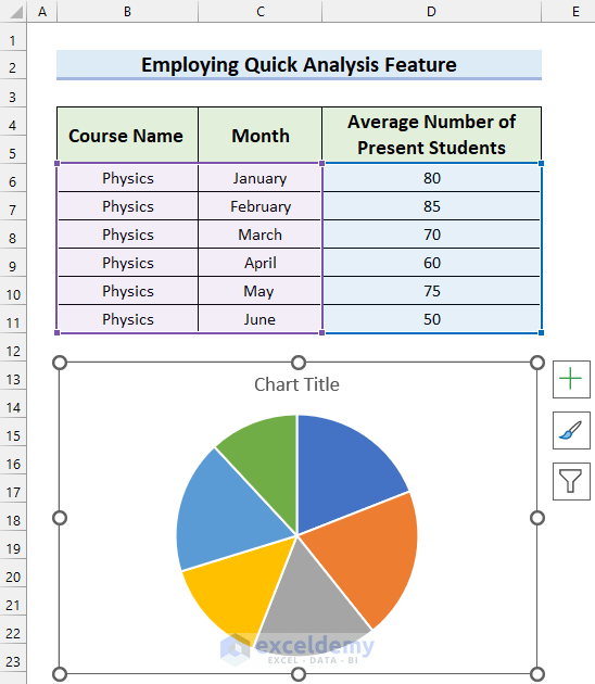
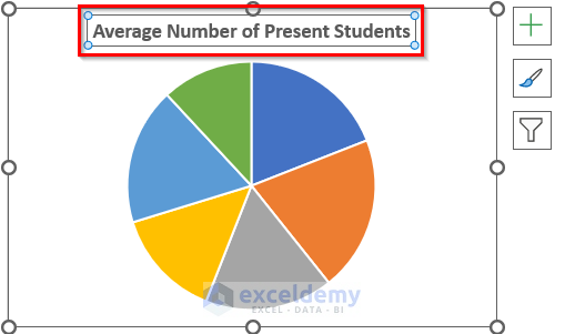
- Change the Chart Title by selecting the marked portion in the following picture. We changed mine to the Average Number of Present Students.
- Add Legend and Data Labels by following the procedure from Step 2 of method 1.
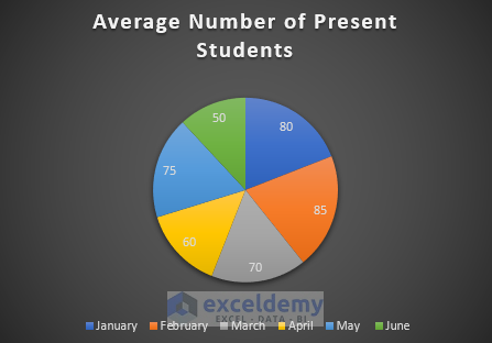
- Format the Pie Chart by following the procedure from Step 3 of method 1.
- Add the Percentage to the Pie Chart by following the procedure from Step 4 of Method 1.
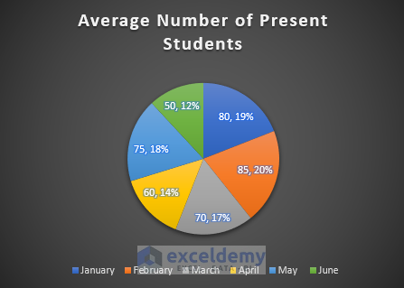
You will get your desired Pie Chart. In the following picture, you can see the final Pie Chart.
You can also Filter the Pie Chart by following Step 5 from Method 1.
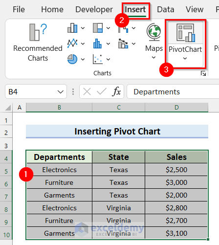
Method 3 – Inserting Pivot Chart to Make a Pie Chart in Excel with Multiple Data
Steps:
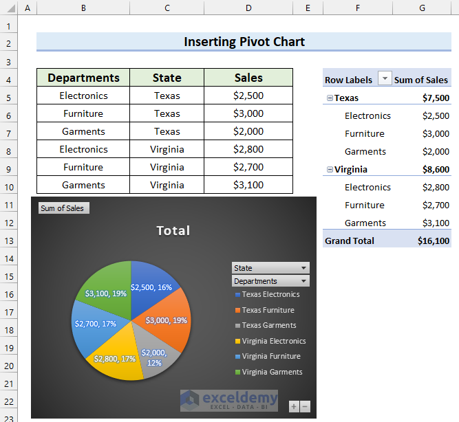
- Select the data range for the Pie Chart. Selected B4:D10.
- Go to the Insert tab.
- Select the Pivot Chart.
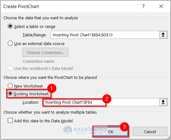
A dialog box named Create PivotChart will appear. Your selected data range will automatically be selected as Table/Range.
- Select Existing Worksheet.
- Select the Location where you want your Pivot Chart.
- Select OK.
You will see a blank Pivot Table and a blank Pivot Chart has been inserted into your worksheet.
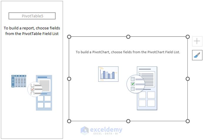
You will see the PivotChart Fields task pane will appear on the right side of the screen. You will have to choose your fields here.
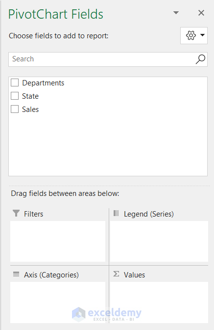
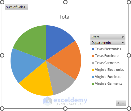
- Select and drag the fields you want in Axis (Categories) area. Here, I selected Departments and State because you want both the Pivot Chart.
- Select and drag the field you want in the Values area. Selected Sales.
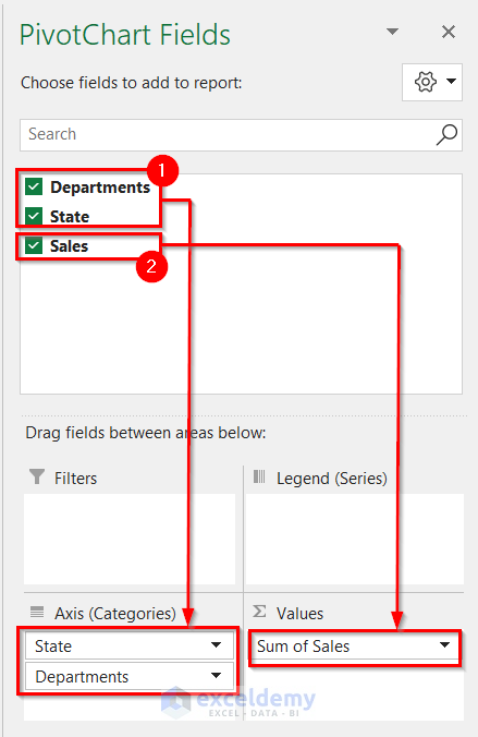
You will see that your selected data is inserted into the Pivot Chart and the Pivot Table. The chart is a Column Chart. Change the chart to a Pie Chart.

- Right-click on the Pie Chart.
- Select Change Chart Type.
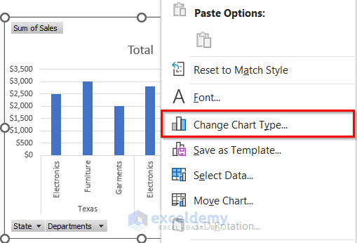
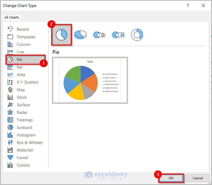
The Change Chart Type dialog box will appear.
- Select Pie from All Charts.
- Select the type of Pie Chart you want. Selected Pie.
- Select OK.
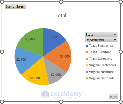
You will see the Pivot Chart has changed to a Pie Chart.
- Add Data Labels by following Step 2 of Method 1.
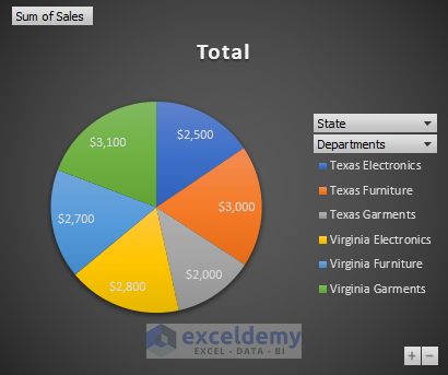
- Format the Pie Chart by following the procedure from Step 3 of Method 1.
- Add a percentage to the Pie Chart by following Step 4 of Method 1.
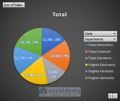
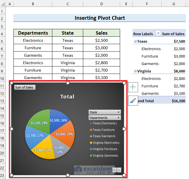
You can see my final Pie Chart.
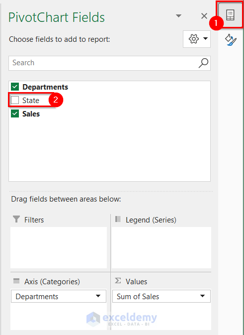
Change the fields in the Pie Chart.
- Select the Pie Chart.
- Select the PivotChart Fields button.
The PivotChart Fields task pane will appear.
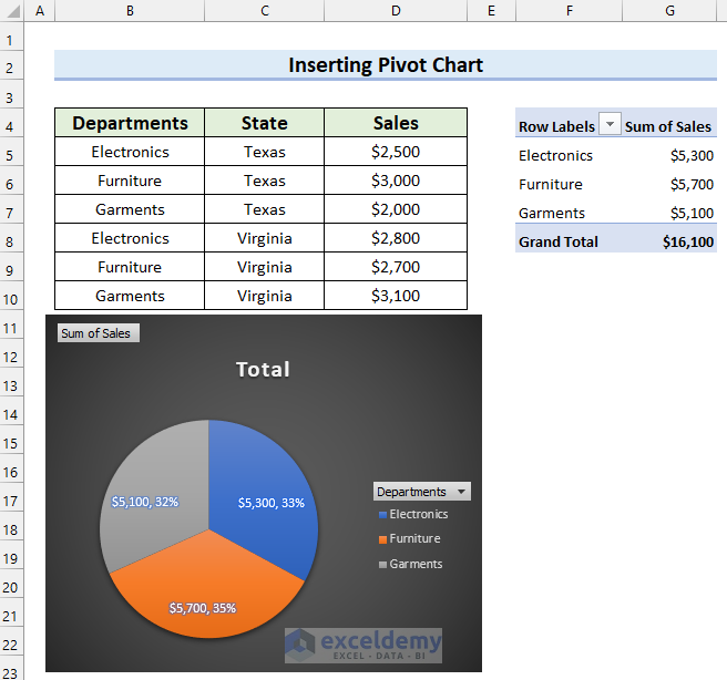
- Uncheck the field you do not wish to see in your Pie Chart. We unchecked State because you want to see the Sales in each Department.
You got the desired Pie Chart. You can also Explode it by following Step 6 from Method 1.
Method 4 – Make a Pie Chart with Subcategories
4.1. Using Pie of Pie Chart to Create a Pie Chart with Subcategories
Step 1: Inserting Pie Chart with Subcategories
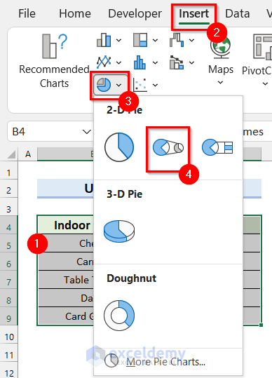
- Select the data range you want to display on your Pie Chart. Selected cell range B4:C9.
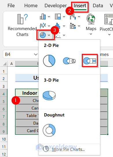
- Go to the Insert tab.
- Select Insert Pie or Doughnut Chart.
- Select Pie of Pie.
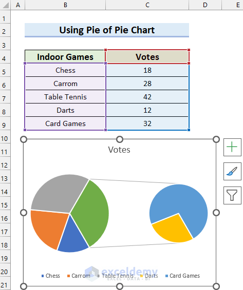
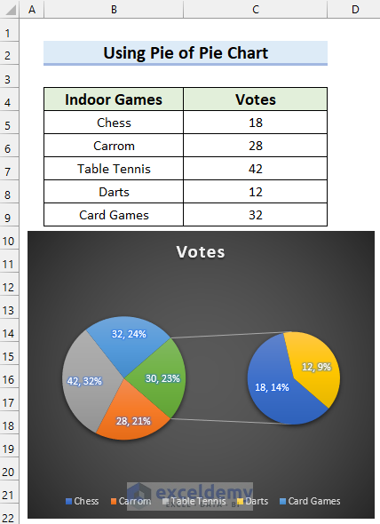
You will see that you have inserted a Pie Chart with subcategories. The Votes for Darts and Card Games are shown in a Secondary Pie Chart.
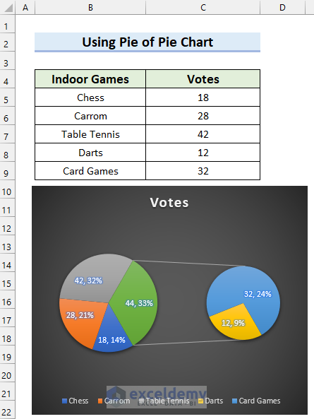
- Add Data Labels by following Step 2 of Method 1.
- Format the Pie Chart by following Step 3 from Method 1.
- Add the Percentage to the Pie Chart with Step 4 from Method 1.
You can see my final Pie Chart with subcategories after these steps.
You can also filter this Pie Chart by following Step 5 of Method 1.
Step 2: Changing Data Categories for Secondary Chart (Percentage Value)
- Right-click on the Pie Chart.
- Select Format Data Series.
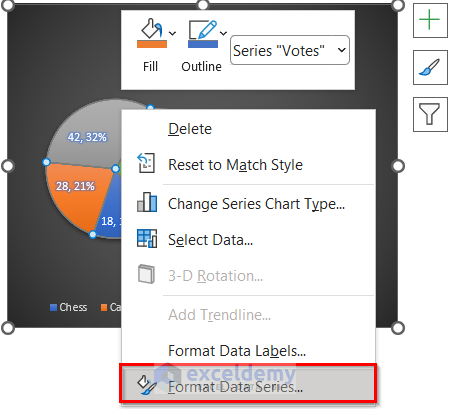
The Format Data Series task pane will appear on the right side of the screen.
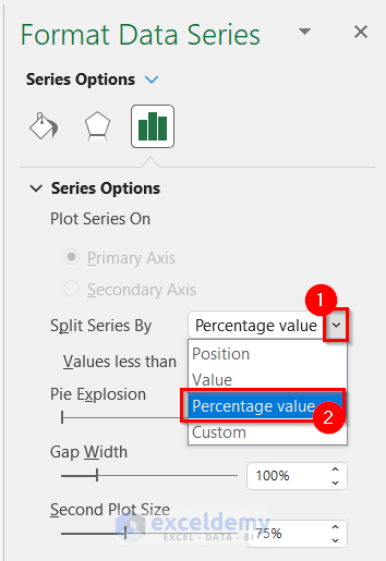
- Select the drop-down option for Split Series By.
- Select the option you want. Selected Percentage value.
- Write a value for Values less than. We wrote 20%. That means the values less than 20% will be displayed on the Secondary Pie Chart.
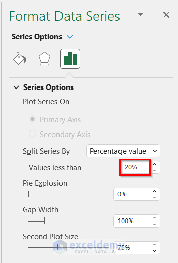
See the final Pie Chart with subcategories, and the values that are less than 20% are displayed on the Secondary Pie Chart.
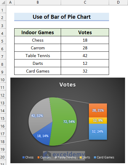
4.2. Use of Bar of Pie Chart to Create a Pie Chart with Subcategories
Step 1: Inserting Bar of the Pie Chart with Subcategories
We’ll show you how you can insert a Bar of Pie Chart.
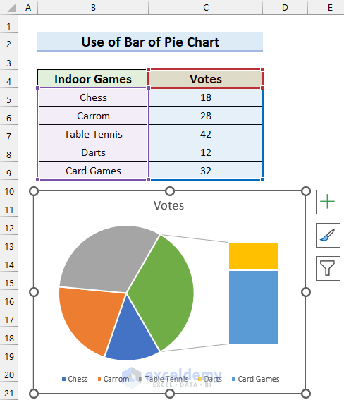
- Select the data range you want to display on your Pie Chart. Selected cell range B4:C9.
- Go to the Insert tab.
- Select Insert Pie or Doughnut Chart.
- Select Bar of Pie.
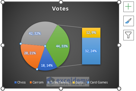
You will see that you have inserted a Pie Chart in Excel with subcategories.
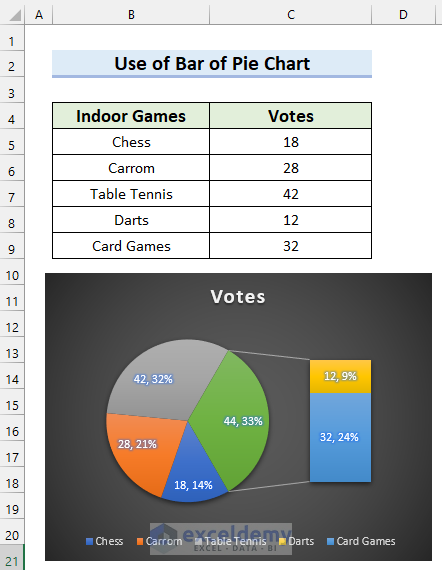
- Add Data Labels by following Step 2 of Method 1.
- Format the Pie Chart by following Step 3 from Method 1.
- Add the Percentage to the Pie Chart by Step 4 from Method 1.
See the final Bar of Pie Chart with subcategories after these steps.
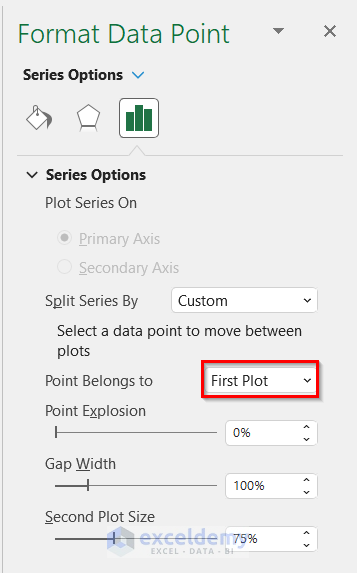
Step 2: Changing Data Categories for Secondary Chart (Custom)
- Right-click on the Pie Chart.
- Select Format Data Series.
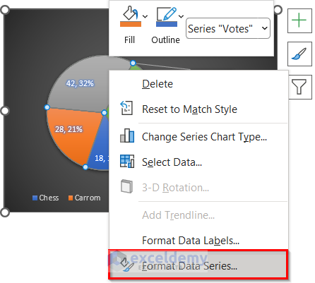
The Format Data Series task pane will appear on the right side of the screen.
- Select the drop-down option for Split Series By.
- Select the option you want. We selected Custom.
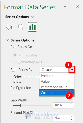
This option will allow me to customize the fields.
- Select the field you want to move to. Selected Carrom because we want to move it to the Secondary Chart.
In the Format Data Point task pane, you will see that the selected Point Belongs to the First Plot.
Shift this point to the Second Plot.
- Select the drop-down option for Point Belongs to.
- Select Second Plot from the drop-down menu.
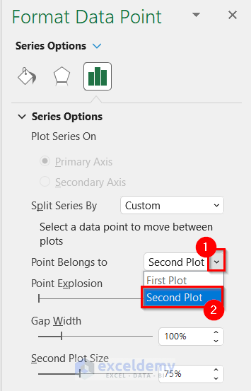
You will see that your selected data category is moved to the Secondary Chart.
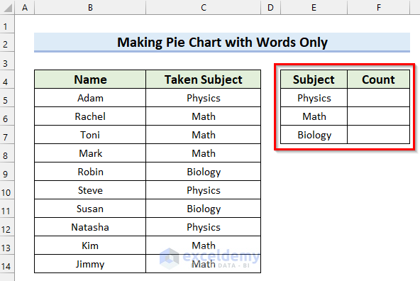
Method 5 – Creating a Pie Chart in Excel with Only Words
Steps:
- Make a table to count the number of students who have taken a particular subject.
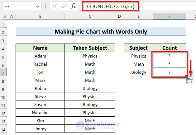
- Select the cell where you want to calculate the number of students who have taken a particular subject. We selected cell F5.
- In cell F5, write the following formula.
=COUNTIF(C5:C14,E5)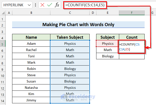
In the COUNTIF function, we selected C5:C14 as the range and E5 as the criteria. The COUNTIF function will count the values in the selected range that match the criteria and return the number.
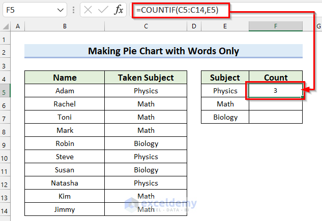
- Press ENTER to get the result.
- Drag the Fill Handle to copy the formula.
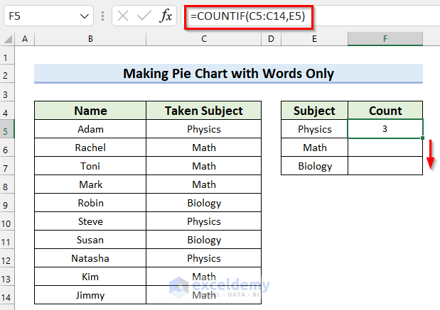
We copied the formula and got the number of students for every subject.
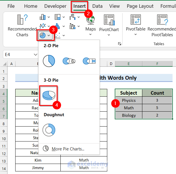
- Select the data range. We selected the cell range E4:F7.
- Go to the Insert tab.
- Select Insert Pie or Doughnut Chart.
- Select the type of Pie Chart you want. We selected 3-D Pie.
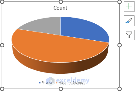
You have inserted a pie chart for your dataset.
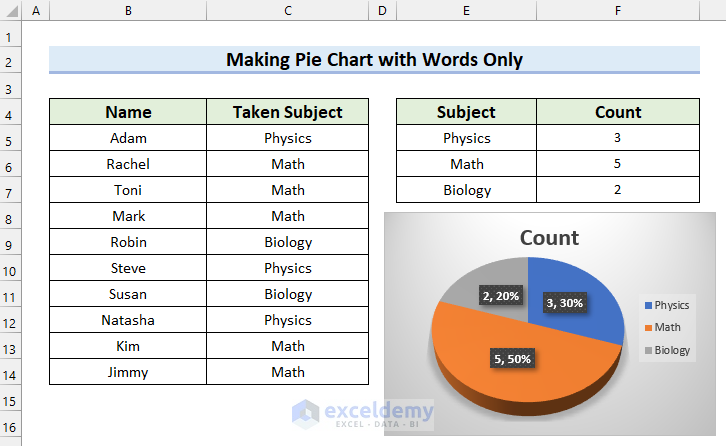
- Add Data Labels by following Step 2 of Method 1.
- Format the Pie Chart by following Step 3 from Method 1.
- Add Percentage to the Pie Chart by following Step 4 from Method 1.
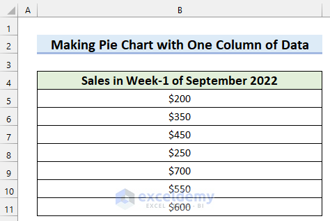
How to Make a Pie Chart in Excel with One Column of Data
It contains the Sales in Week 1 of September 2022. This dataset has only one column, and we will make a Pie Chart with this dataset.
Steps:
- Select the data range for your Pie Chart. We selected cell B4:B11.
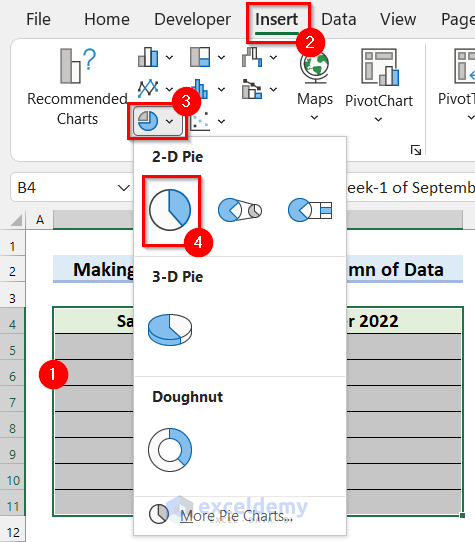
- Go to the Insert tab.
- Select Insert Pie or Doughnut Chart.
- Select the type of Pie Chart you want. Selected Pie from 2-D Pie.
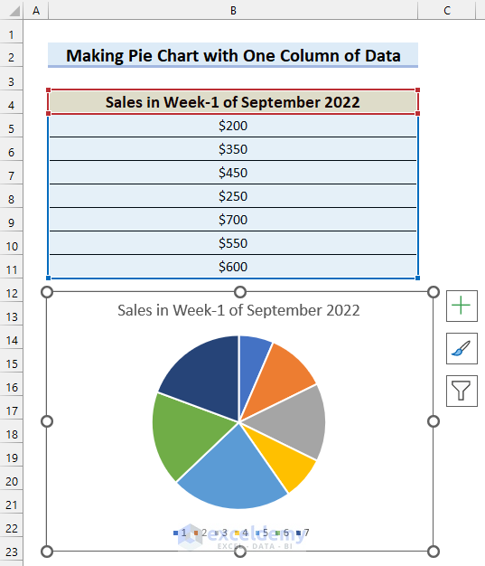
You will see a Pie Chart has been inserted for your selected data.
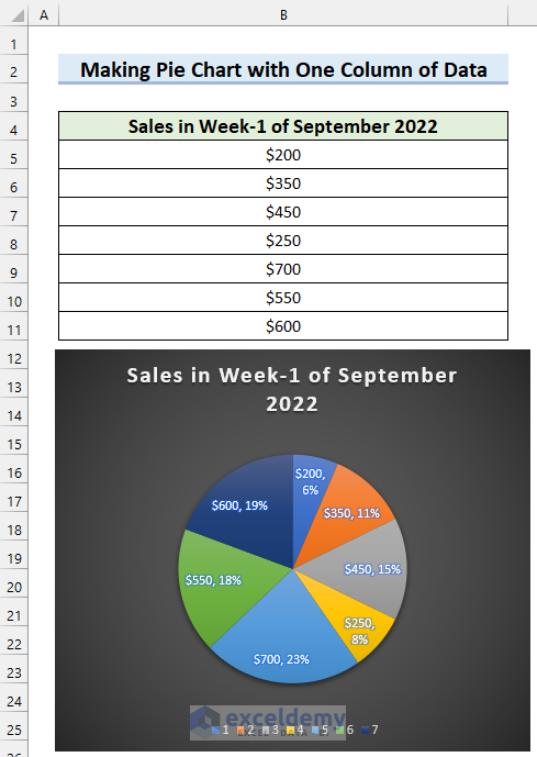
- Add Data Labels by following Step 2 of Method 1.
- Format the Pie Chart by following Step 3 from Method 1.
- Add the Percentage to the Pie Chart by following Step 4 from Method 1.
See how the final Pie Chart with one column of data looks after these steps.
Download Practice Workbook
How to Make a Pie Chart in Excel : Knowledge Hub
<< Go Back To Excel Pie Chart | Excel Charts | Learn Excel
Get FREE Advanced Excel Exercises with Solutions!

Hi, I would like to make a”pie chart” where
– each part has same angle
– the value (ea 0-100%) would be in radial dimendion
Like collums
Can be done in xls?
Hello BORIS!
You can try to “Multilayer Pie Chart” or “Bar of Pie chart” to solve your problem. You can follow this article to create these types of pie charts for your dataset. Please, go through this article,
How to Make a Multi-Level Pie Chart in Excel
I hope, your problem will be solved in this way. You can share more problems in an email at [email protected]