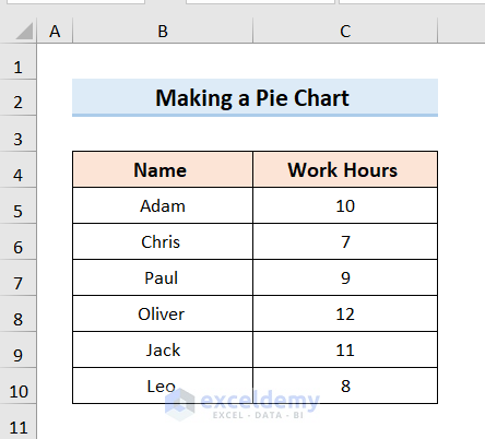
Step 1 – Arranging the Dataset for a Pie Chart in Excel
- Insert the data you need to plot in the chart. We’ll use a list of employees and their working hours.
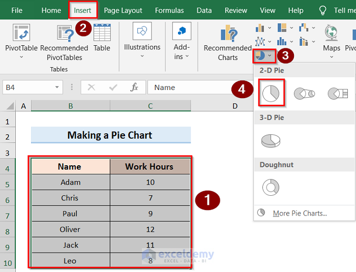
Step 2 – Making an Excel Pie Chart with Words
- Select the data and click on the Insert tab.
- Go to the Insert Pie or Doughnut Chart option and select 2-D Pie.
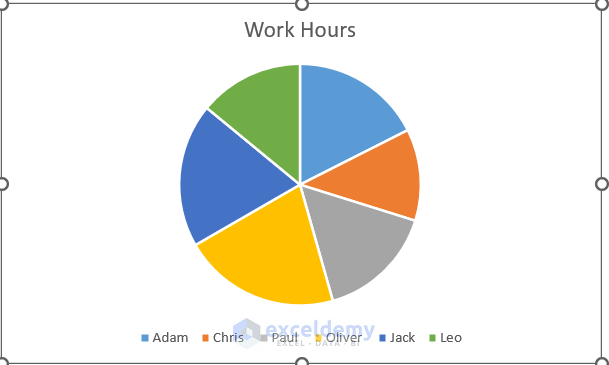
- You will get a basic 2D pie chart.
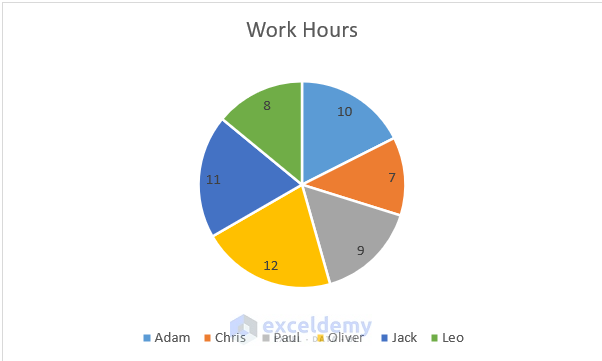
Step 3 – Labeling Chart Data
- Select the graph chart and go to the Chart Elements option.
- Click on the Data Labels option to label the pie chart.
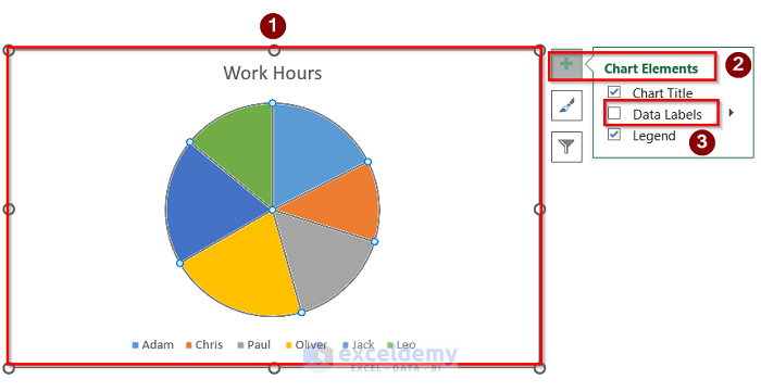
- Here’s the result.
Read More: How to Make Pie Chart in Excel with Subcategories
Formatting an Excel Pie Chart
Using Different Styles and Colors
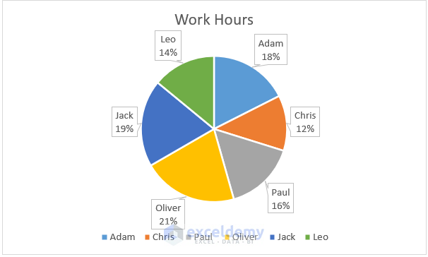
Let’s make the labels pop out of the chart more:
- Select the chart and press the Chart Elements option.
- Under Data Labels, select the Data Callout option.
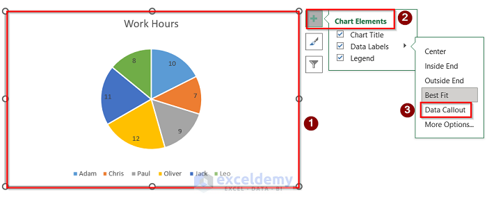
- Here’s the result.
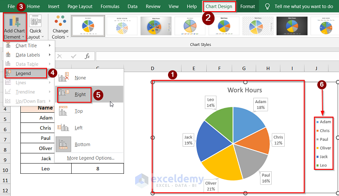
Let’s change the Legend:
- Select the chart and press the Chart Design tab.
- Go to Add Chart Element and use the Legend options to move the legend around.
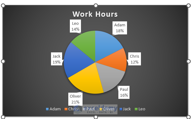
Let’s change the pie coloring style:
- Select the whole chart and go to the Chart Design tab.
- Choose the pie chart style from the ribbon at the top.
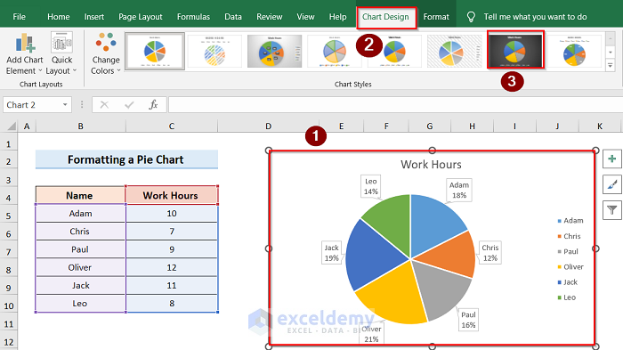
- Here’s a sample.
Read More: How to Create a Pie Chart in Excel from Pivot Table
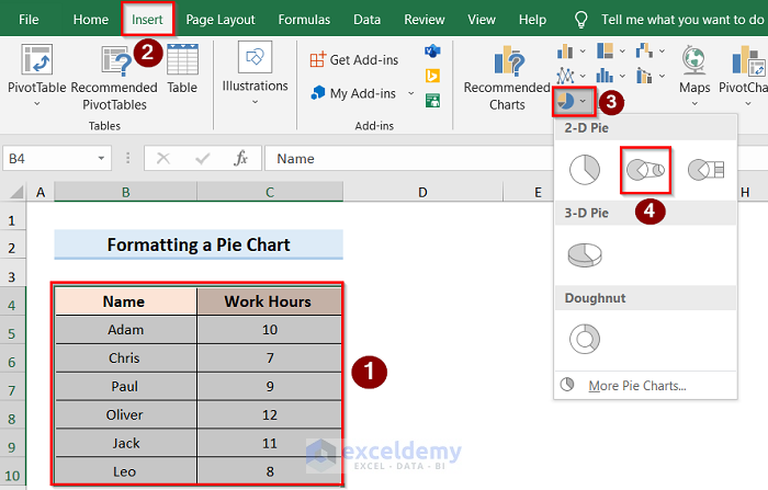
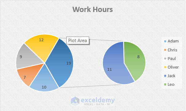
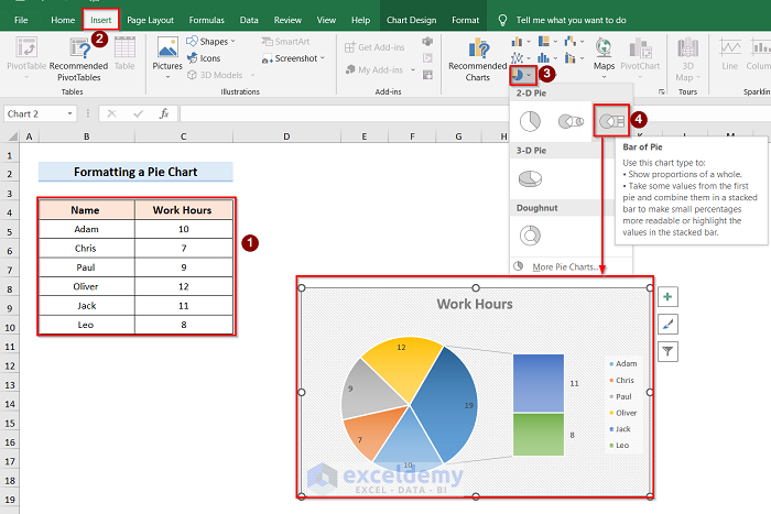
Adding a Pie of Pie or Bar of Pie Chart
- Select the whole data table and go to the Insert tab.
- Go to the Data Callout option and select Pie of Pie.
- Here’s a sample result.
- Alternatively, you can select the Bar of Pie Chart instead of the Pie of Pie Chart option.
Read More: How to Make a Pie Chart in Excel with One Column of Data
Things to Remember
- A 2D pie chart is typically easier to comprehend than a 3D one.
- A pie chart works best if you have only one data series to plot to show each value against the total.
Download the Practice Workbook
Related Articles
- How to Make a Pie Chart with Multiple Data in Excel
- How to Make a Pie Chart in Excel without Numbers
<< Go Back To Make a Pie Chart in Excel | Excel Pie Chart | Excel Charts | Learn Excel
Get FREE Advanced Excel Exercises with Solutions!

Doesn’t work, I get text in a box where the chart should be
Hello A,
Thank you for sharing the issue. This usually happens when Excel treats the selected range as plain text or when the chart is inserted from a text box/shape instead of the actual data range.
Please try the following:
1. Make sure your data is arranged in two separate columns: one column for the words/categories and another column for the values.
2. Select the actual cell range, not a text box.
3. Go to the Insert tab >> select Pie Chart and choose a 2-D Pie Chart.
4. If you still see text inside the chart area, right-click the chart and choose Select Data, then manually select the correct data range.
Also, make sure the value column contains numbers, not numbers stored as text. You can test this by selecting the value cells and changing the format to Number.
If the problem continues, please share a screenshot of your data range and the chart area so we can identify the exact issue.
Regards,
ExcelDemy