What Is the Bar of a Pie Chart in Excel?
The Bar of pie is a type of chart that displays a bar chart with the pie chart.
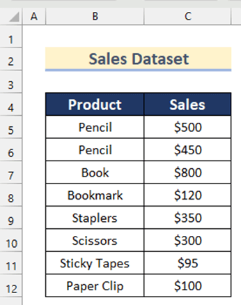
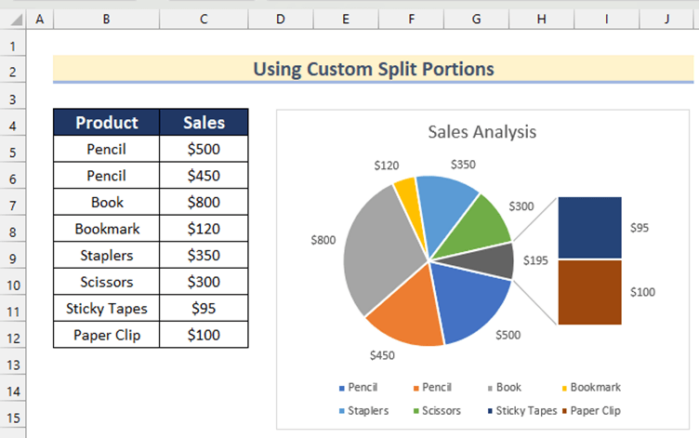
The sample dataset contains Product names and Sales values. Create a bar of pie chart:
Steps:
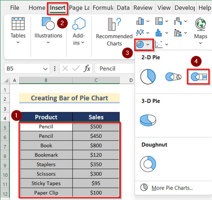
- Select B5:C12.
- Go to the Insert tab >> click Insert Pie or Doughnut chart >> select Bar of Pie.
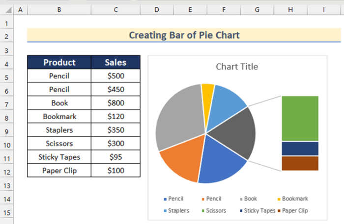
This is the output.
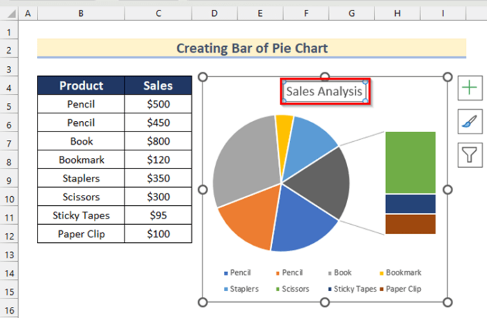
- Click the Chart Title to add a title. Here, Sales Analysis.
Example 1 – Add Chart Elements to Customize the Bar of Pie Chart
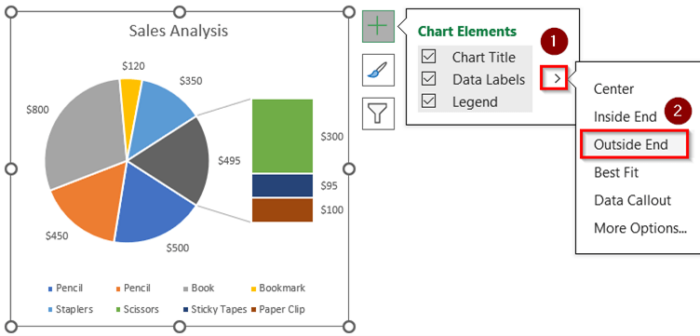
Steps:
- Click the “+” sign to open Chart Elements.
- Check Data Labels.
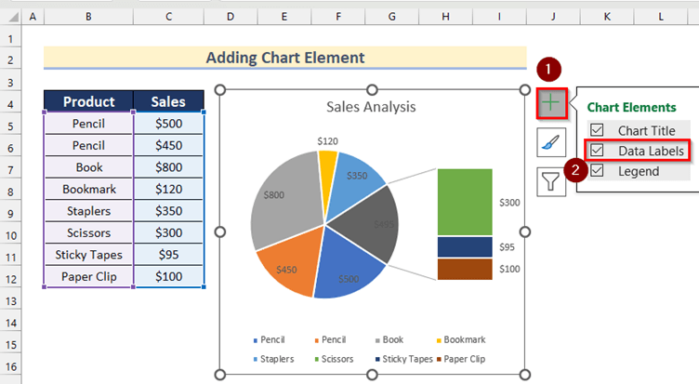
- Click the sign shown below to choose a position for the Data Labels. Here, Outside End.
Read More: How to Make a Pie Chart in Excel
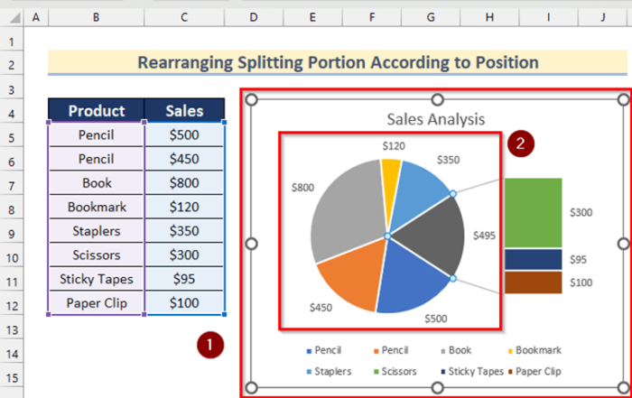
Example 2 – Rearrange the Splitting Portion of the Bar of Pie Chart in Excel
2.1 According to Position
Steps:
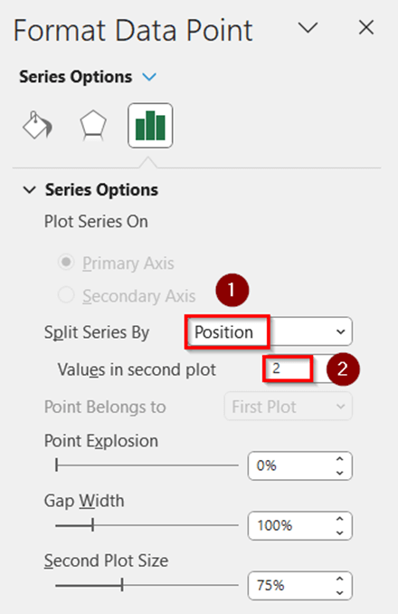
- Select the chart by clicking it.
- Double-click the pie chart.
- In Format Data Point, choose Position in Split Series by.
- Enter a value in Values in second plot. Here, 2.
This is the output.

Read More: How to Create a 3D Pie Chart in Excel
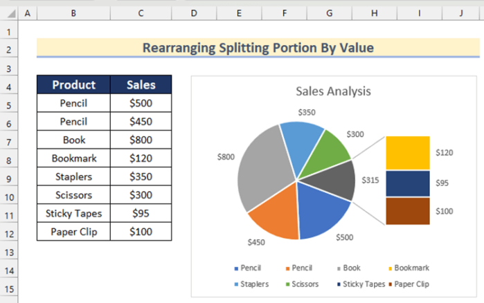
2.2 Based on Value
Steps:
- In Format Data Point, select Value in Split Series By.
- Enter a value in Value less than. Here, 150.
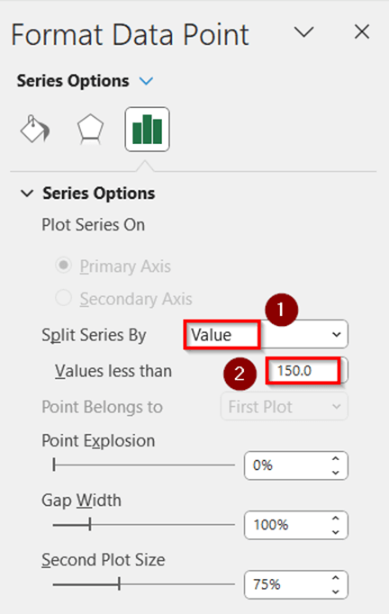
This is the output.
Read More: How to Make Pie of Pie Chart in Excel
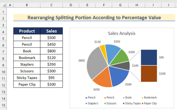
2.3 According to Percentage Value
Steps:
- In Format Data Point, select Percentage value in Split Series By.
- Enter a percentage in Values less than. Here, 4%.
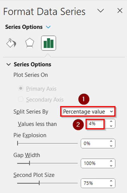
- Products with sales less than 4% will be added to the second plot.
Read More: How to Make a Multi-Level Pie Chart in Excel
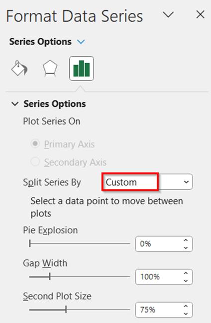
2.4 Custom Split Portions
Steps:
- In Format Data Series, select Custom in Split Series by.
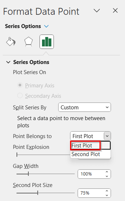
To add Bookmark to the first plot:
- Select it in the chart.
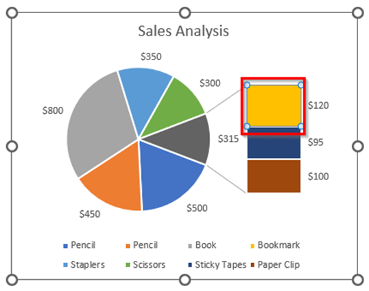
- Select First Plot in Point Belongs to.
The Bookmark is added to the first plot.
Read More: How to Make Multiple Pie Charts from One Table
Example 3 – Change the Pie Explosion to Customize a Bar of Pie Chart
Steps:
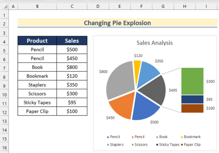
- In Format Data Point, enter a percentage value in Pie Explosion. Here, 3%.
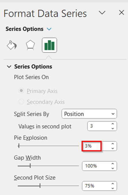
This is the output.
Example 4 – Set the Gap Width Between the Pie and the Stacked Bar Chart
The Gap Width between the pie and stacked bar chart is set to 100% by default. .
Steps:
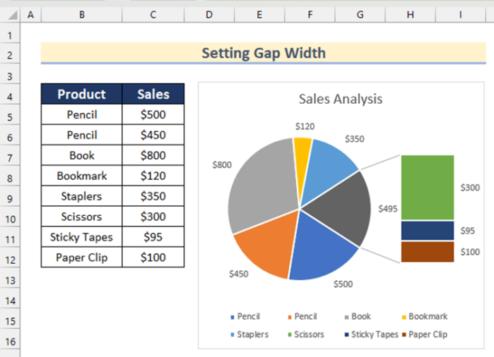
- In Format Data Point, enter a percentage in Gap Width. Here, 80%.
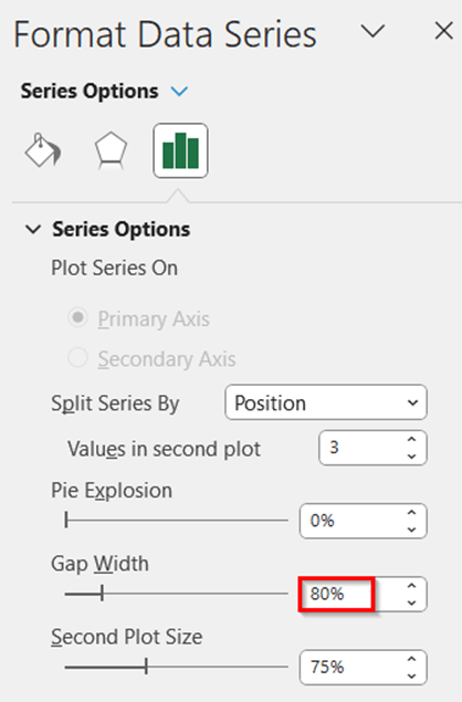
This is the output.
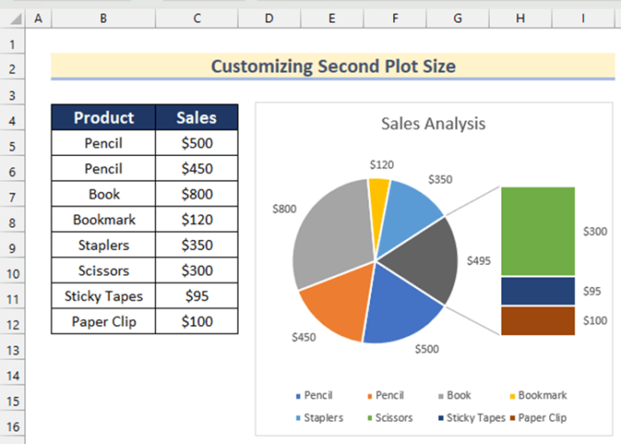
Example 5 – Customize the Second Plot Size of the Bar of Pie Chart in Excel
Steps:
- In Format Data Series, enter a percentage for the second plot size. Here, 90%.
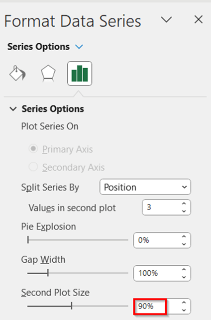
This is the output.
Read More: How to Make a Gender Pie Chart in Excel
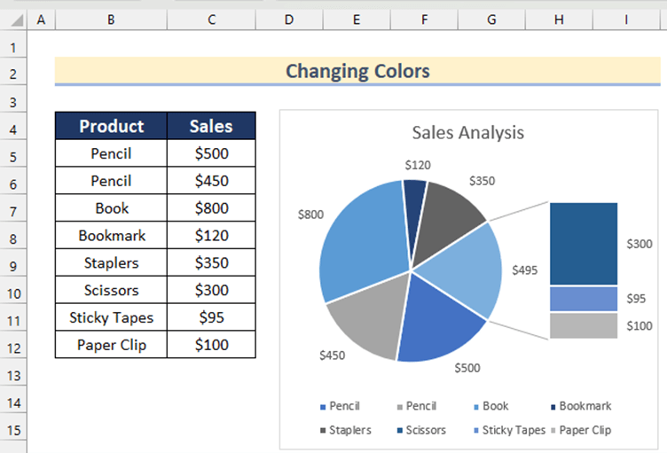
Example 6 – Change the Colors of the Bar of Pie Chart in Excel
Steps:
- Select the chart.
- Go Chart Design >> click Change Colors.
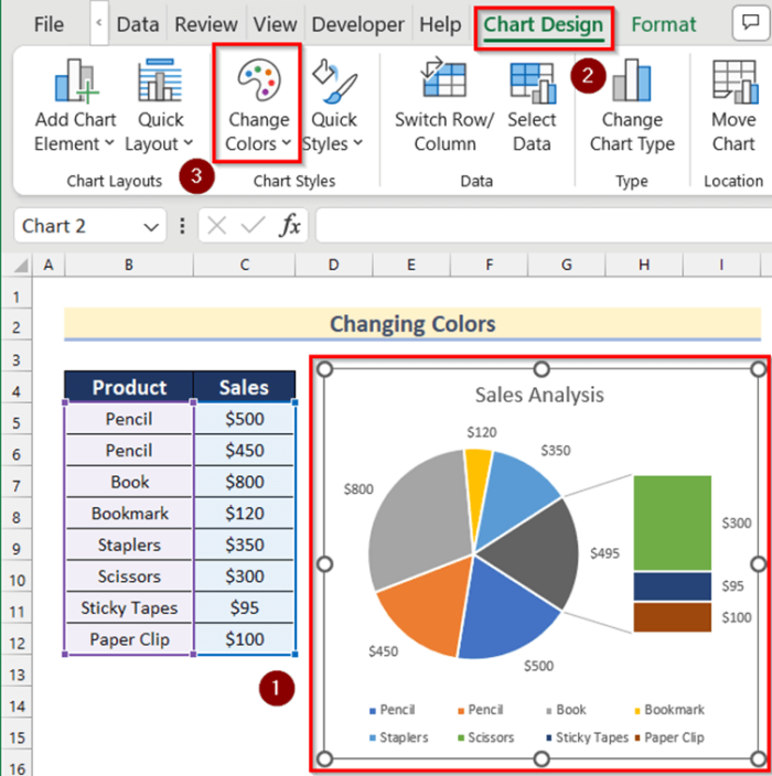
- Select an option.
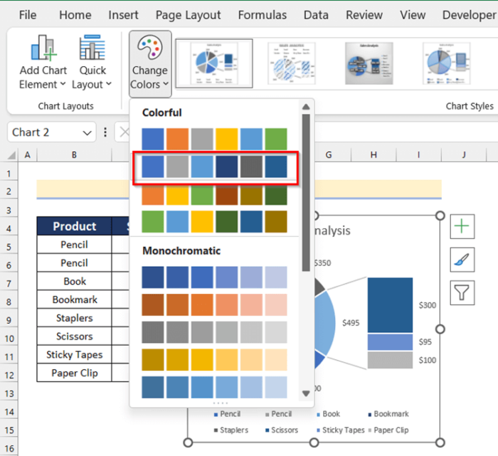
This is the output.
Practice Section
Practice here.
Download Practice Workbook
Related Articles
<< Go Back To Make a Pie Chart in Excel | Excel Pie Chart | Excel Charts | Learn Excel
Get FREE Advanced Excel Exercises with Solutions!
