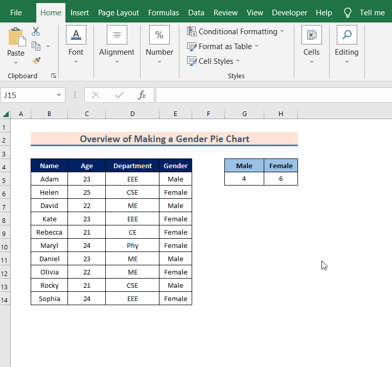
This is an overview:
Method 1 – Using the Percentage to Create a Gender Pie Chart in Excel
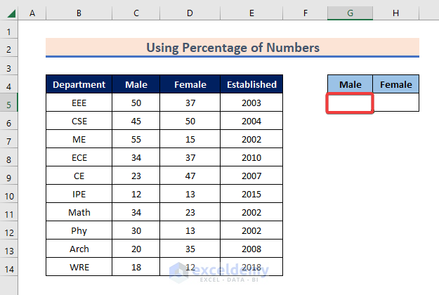
Steps:
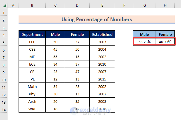
- Select the cell to get the percentage of males. Here, G5.
- Enter the formula:
=SUM(C5:C14)/SUM(C5:D14)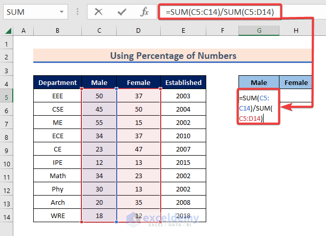
- Press Enter.
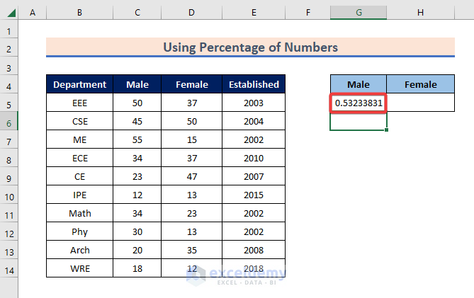
You will see the proportion of males: 0.53233831.
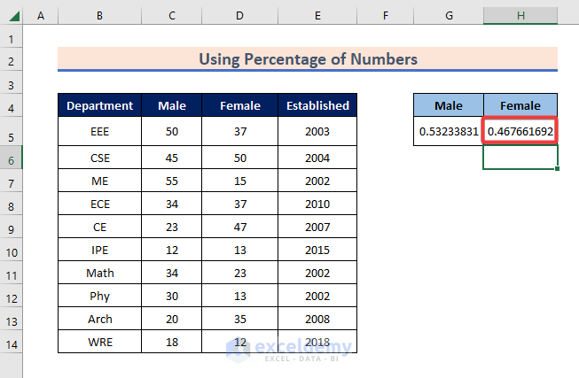
- Enter the formula in H5:
=SUM(D5:D14)/SUM(C5:D14)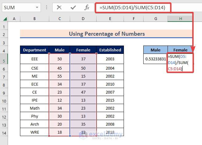
- Press Enter.
You will see the proportion of females:
- Select G5:H5.
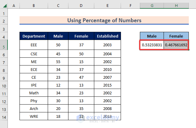
- Go to Number.
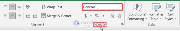
- Select Percentage.
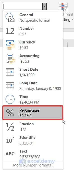
You will see the percentage of males and females in G5 and H5.
- Select G4:H5 and go to Insert.
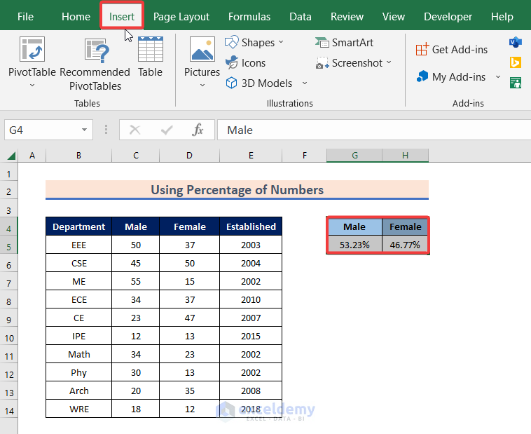
- Select Pie Chart in Charts.

- You will see different types of pie charts. Choose one. Here, 2D Pie.

You will see the gender pie chart showing the distribution of males and females.
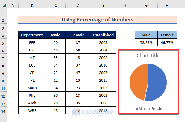
- Click Chart Title and add a title.
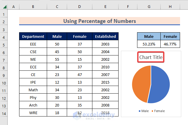
- To see the percentage of males and females inside the pie chart, click the plus (+) icon and select Data Labels.
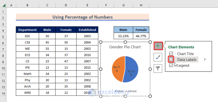
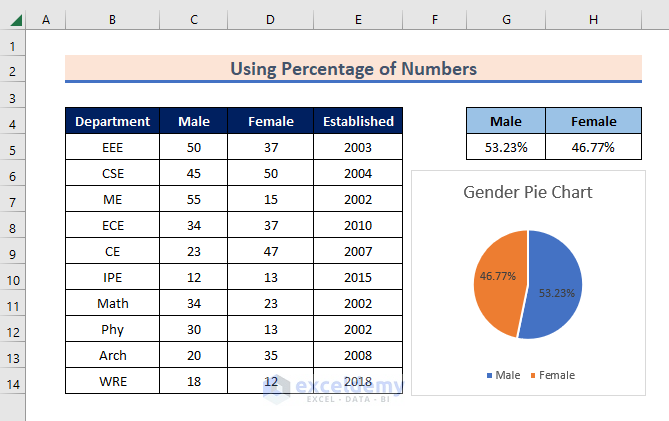
The gender pie chart displays the percentage of males and females:
Read More: How to Create & Customize Bar of Pie Chart in Excel
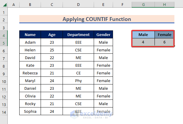
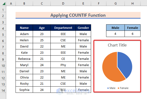
Method 2 – Applying the COUNTIF Function to Create a Gender Pie Chart in Excel
Steps:
- Select a cell to get the number of males. Here, G5.
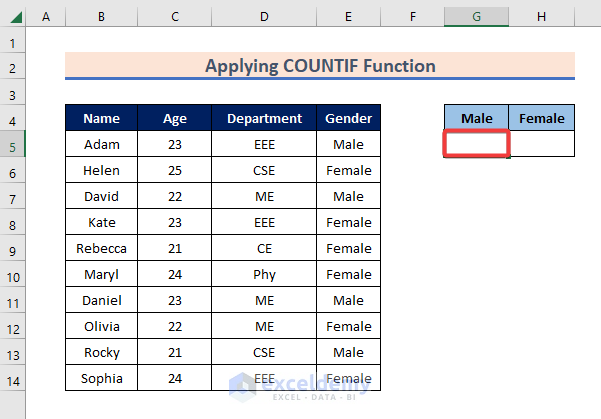
- Enter the formula:
=COUNTIF(E5:E14,"Male")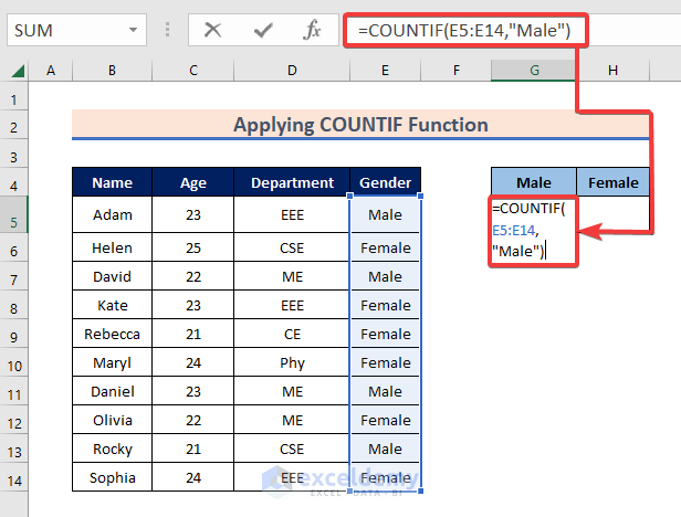
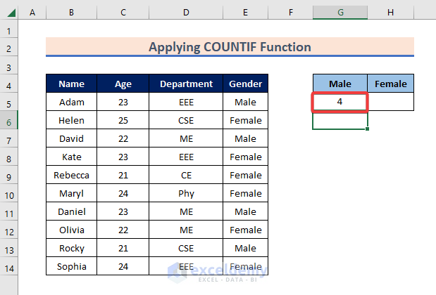
- Press Enter to see the result.
- Select H5 and enter the formula:
=COUNTIF(E5:E14,"Female")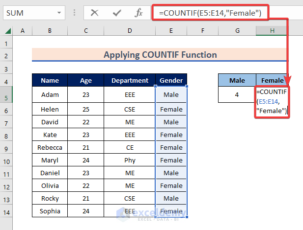
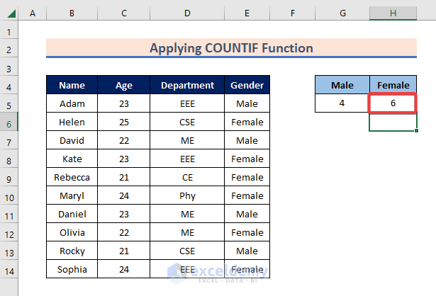
- Press Enter to see the number of females.
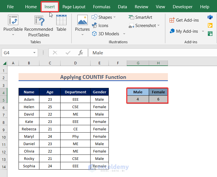
- Select G4:H5.
- Go to Insert.
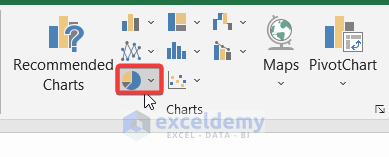
- Select Pie Chart in Charts.
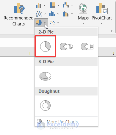
- Select 2D Pie.
The gender pie chart displays the distribution of males and females.
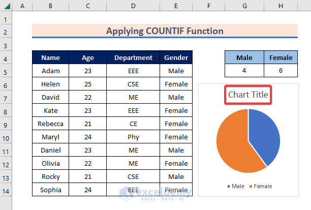
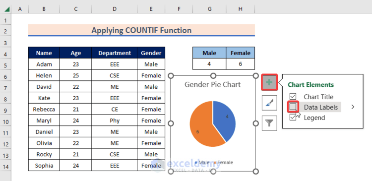
- Change the title by clicking Chart Title.
- To see the exact number of males and females inside the pie chart, click the plus (+) icon and select Data Labels.
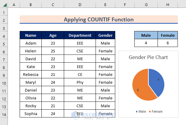
The gender pie chart displays the number of males and females in the dataset.
Related Articles
- How to Make Multiple Pie Charts from One Table
- How to Make Pie of Pie Chart in Excel
- How to Create a 3D Pie Chart in Excel
- How to Make a Multi-Level Pie Chart in Excel
- How to Make a Budget Pie Chart in Excel
<< Go Back To Make a Pie Chart in Excel | Excel Pie Chart | Excel Charts | Learn Excel
Get FREE Advanced Excel Exercises with Solutions!
