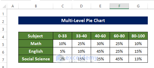
Step 1 – Prepare Dataset
Before we delve into creating the pie chart, we need to collect and organize the information that we will plot. Here, we have information about a student’s marks in different subjects. This information is going to be plotted in different layers, with each layer denoting a subject.
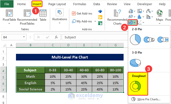
Step 2 – Create Doughnut Chart
- Select the dataset.
- From the Insert tab, click on the Insert Pie or Doughnut Chart.
- From the dropdown menu, click on the Doughnut chart option.
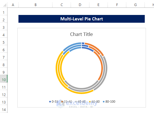
- You will get a doughnut chart with multiple layers.
- This chart needs some modifications as it is too vague to understand appropriately right now.
Read More: How to Make Multiple Pie Charts from One Table
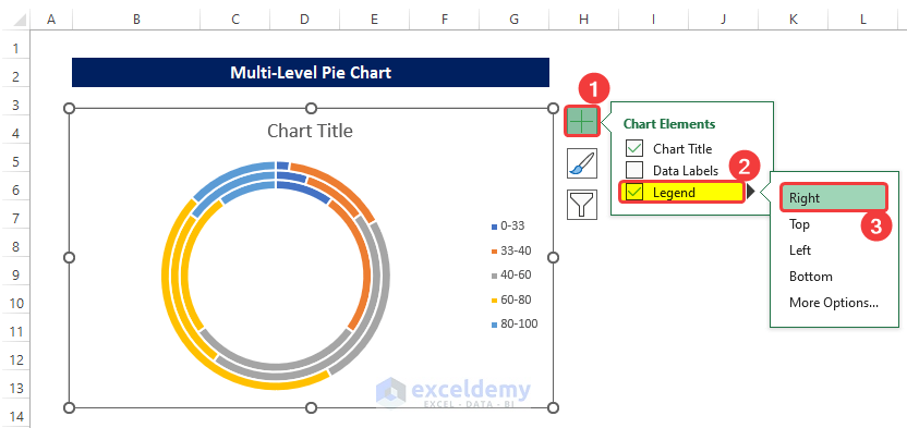
Step 3 – Place the Legend on Right Side
Right now, the legend is set at the bottom of the chart plot area. We’ll move it to the side to make it more visible.
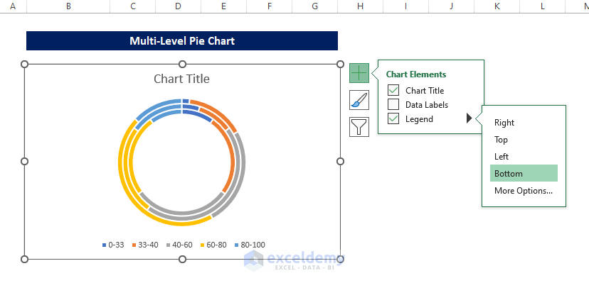
- Click on the Plus icon on the right side of the chart.
- Click on Legend and select Right.
Read More: How to Make Pie of Pie Chart in Excel
Step 4 – Set Doughnut Hole Size to Zero
- Select the innermost circle of the chart and right-click on it.
- From the context menu, click on Format Data Series.
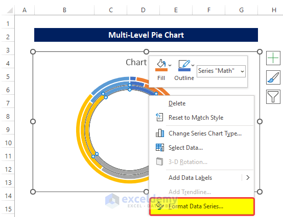
- On the side panel named Format Data Series, go to the Series Options.
- Set Doughnut Hole Size to 0%.
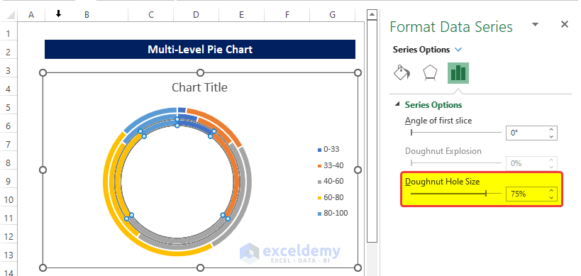
- Drag the slide until the percentage is shown as 0 percent or select the box and type 0%.
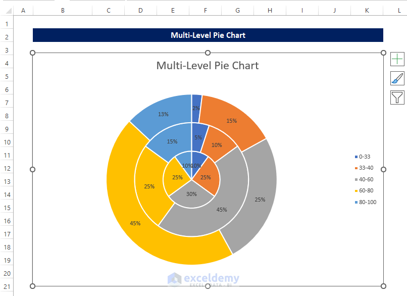
- The doughnut will start looking like a pie chart with multiple layers, but it’s missing the data labels to determine what the layers mean.
Read More: How to Create a 3D Pie Chart in Excel
Step 5 – Add Data Labels and Format Them
- Right-click on the outermost level on the chart.
- From the context menu, click on Add Data Labels.
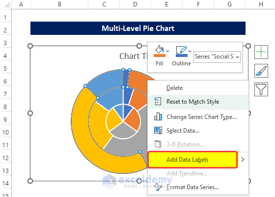
- Right-click on the middle level on the chart.
- Click on Add Data Labels.
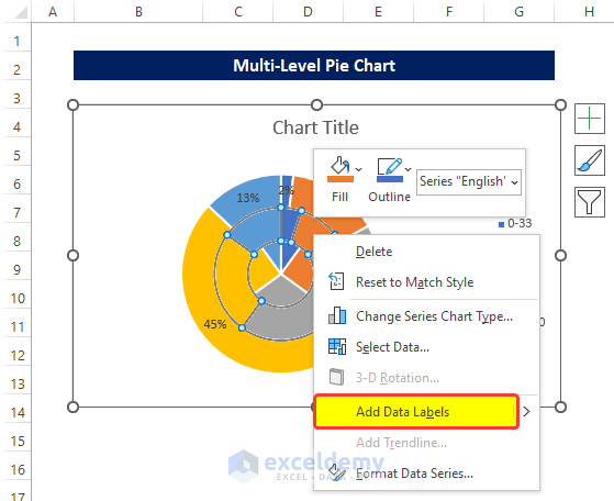
- Repeat for the center layer.
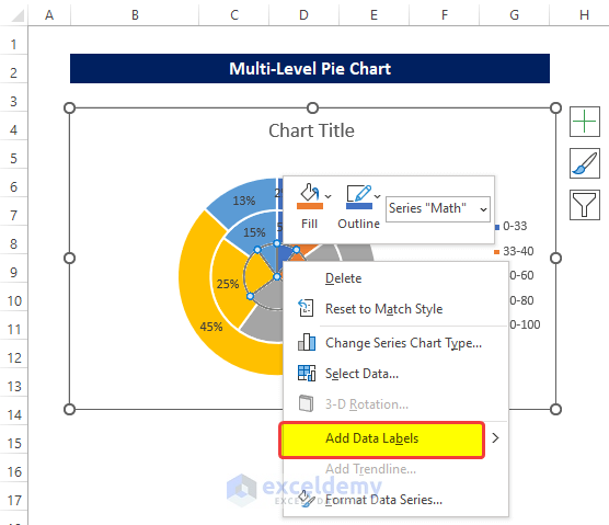
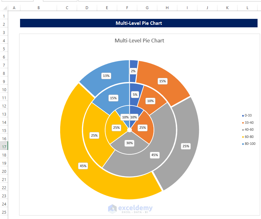
- After adding all the data labels and setting the chart title, the chart will look like this.
- Select the data labels of the first layer and right-click on them.
- In the context menu, click on Font.
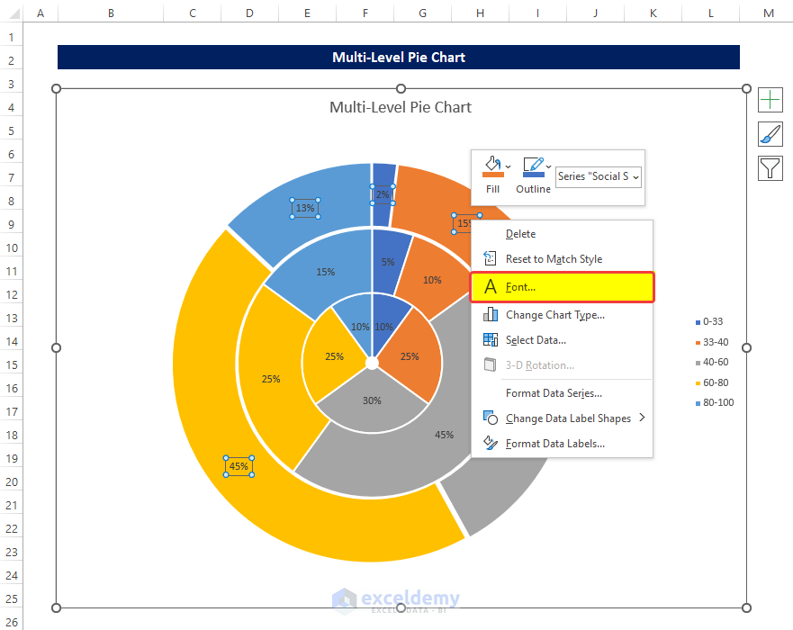
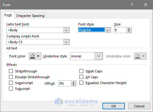
- In the Font dialog box, click on the Font style box and set the Font style to Bold.
- Set the Font Size to 11.
- Click on OK.
- Right-click on the labels for the outer layer again.
- From the context menu, click on Change Data Label Shapes.
- Select the Rectangular shape with a Rounded Corner.
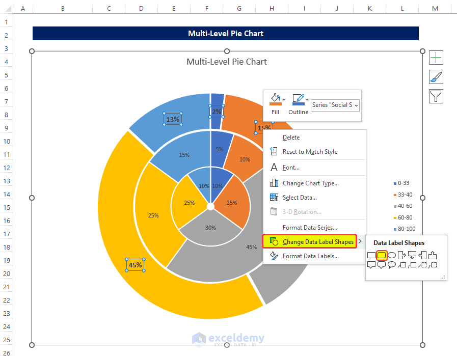
- After selecting the shape, you will notice that there is a shape with white filler.
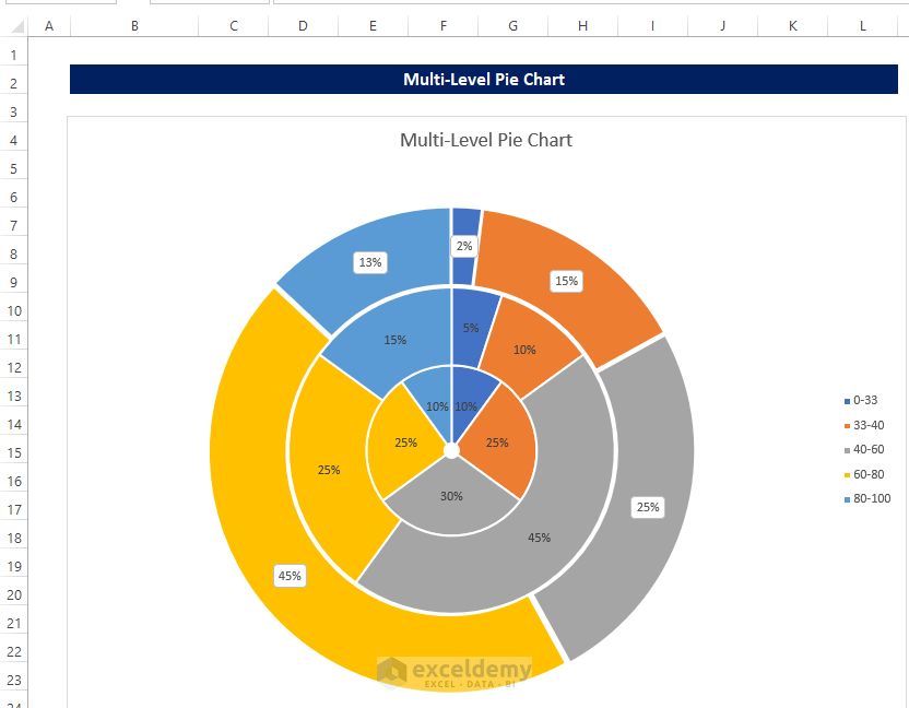
- Repeat the process for the rest of the data labels.
- The chart will look like this.
Read More: How to Make a Gender Pie Chart in Excel
Step 6 – Finalize Multi-Level Pie Chart
To easily identify which data level belongs to which subject, we can add text boxes.
- From the Insert tab, click on Shapes, then select the textbox option from the dropdown menu (first option in Basic Shapes).
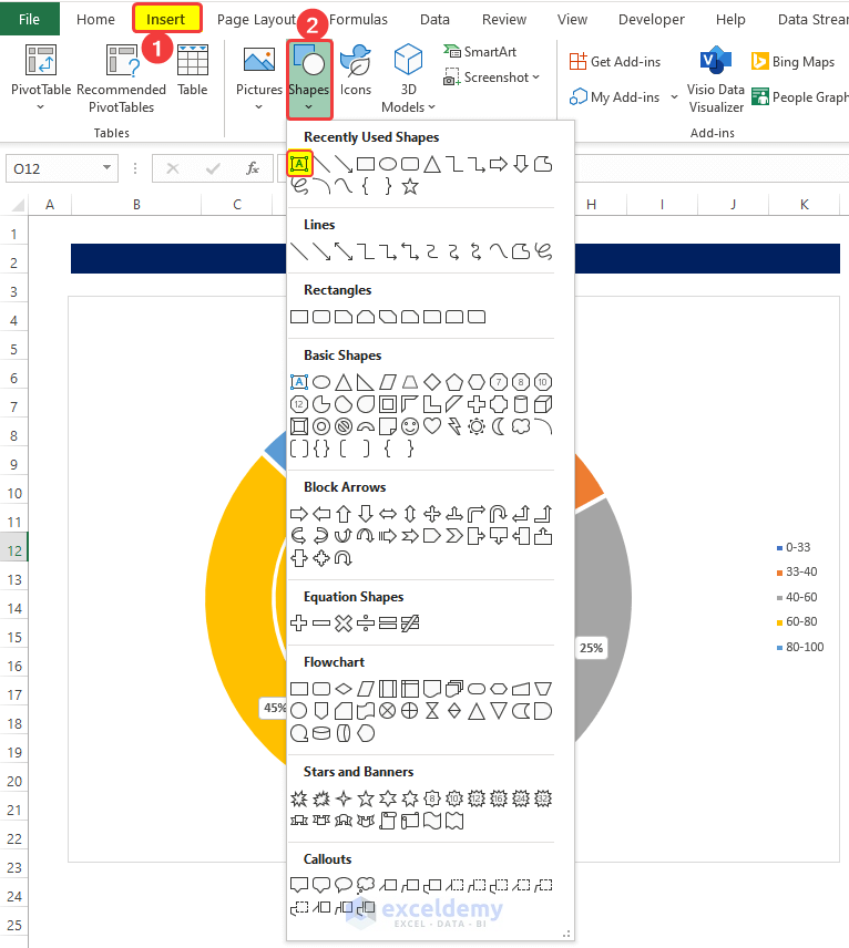
- Draw the text boxes on the chart area.
- In the text box, enter the name of the lowest level of the chart (first row in the dataset), which is Math.
- Add an arrow line and connect the text box and the Math layer.
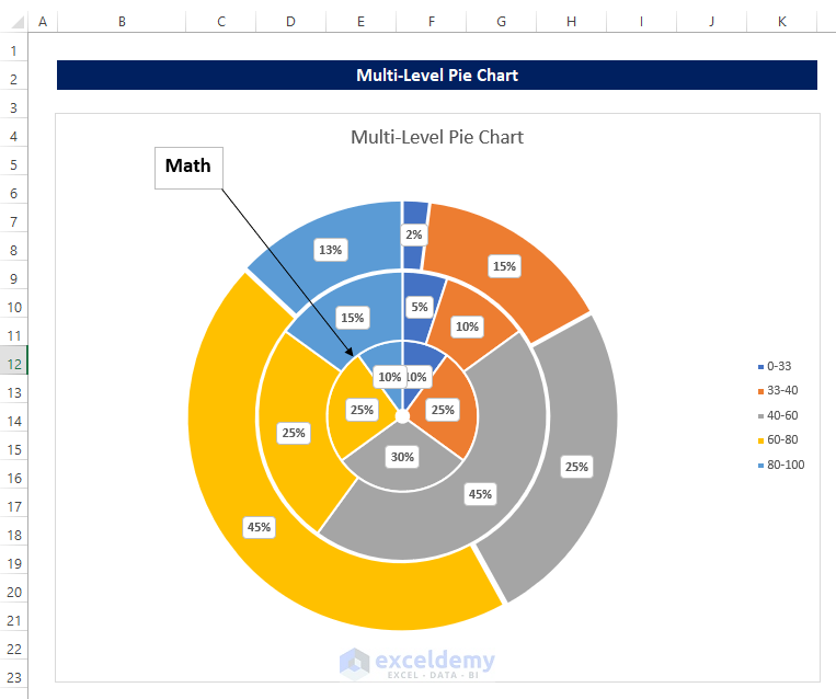
- Repeat the process for the rest of the layers and name them accordingly.
- The final output will look something like the image below.

Read More: How to Create & Customize Bar of Pie Chart in Excel
Things to Remember
✐ The order of the chart levels depends on the table header serial. Place them accordingly.
✐ Resizing or moving the charts can make the text boxes move. Add text boxes as the final steps.
Download Practice Workbook
Related Article
<< Go Back To Make a Pie Chart in Excel | Excel Pie Chart | Excel Charts | Learn Excel
Get FREE Advanced Excel Exercises with Solutions!
