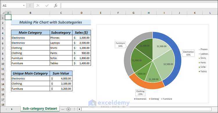
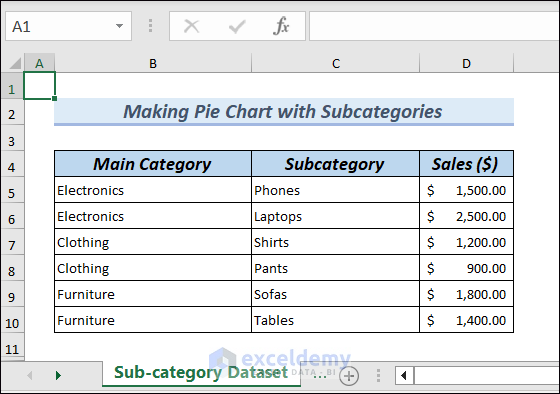
Suppose you have sales data categorized by different product types. However, you want to see how individual subcategories contribute to the total sales within each category. Let’s make a Pie Chart with subcategories to showcase this.
How to Make a Pie Chart with Subcategories in Excel: with Easy Steps
Step 1 – Build the Dataset to Draw a Pie Chart with Subcategories
To demonstrate, we will consider sales data.
- Create three columns named Main Category, Subcategory and Sales.
- Input desired values manually into several rows.
Step 2 – Calculate Unique Main Categories and Sum Values
- Choose cell B13 and insert the following formula, then hit Enter.
=UNIQUE($B$5:$B$10)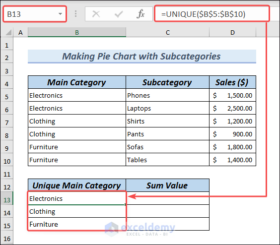
- Select cell C13 and apply the formula below, then drag the Fill Handle icon to C15.
=SUMIF($B$5:$B$10, B13, $D$5:$D$10)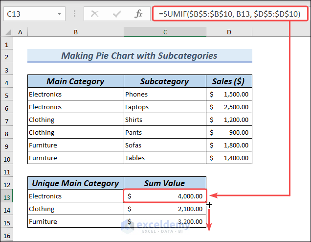
Step 3 – Draw a Typical Pie Chart Using the Main Categories and Sum Values
- Select the new range B13:C15.
- Go to Insert, expand Insert Pie,and click on Pie.
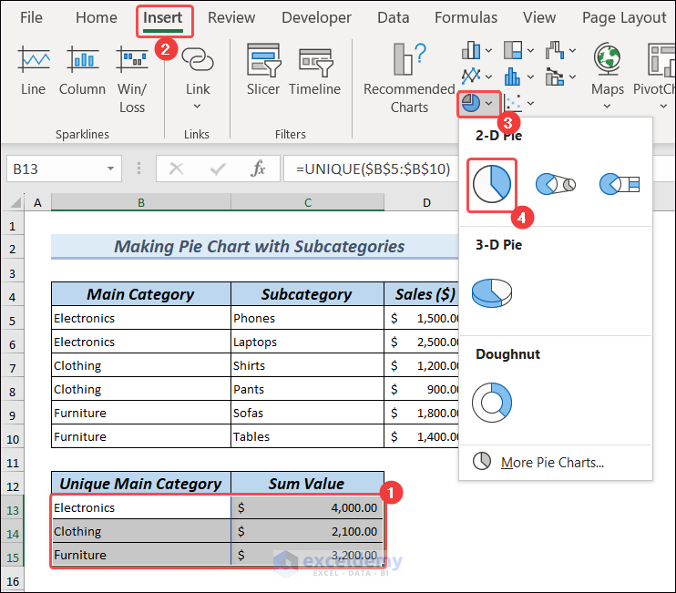
- You will get a Pie Chart like in the image.
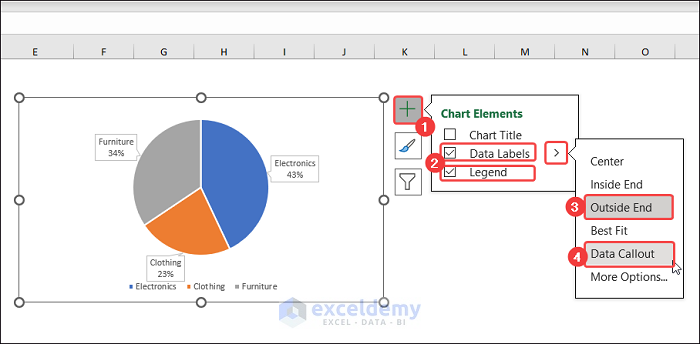
- Click on the Chart Area, then click on Chart Elements (Plus Icon.
- Check Data Labels and Legend.
- Click on Outside End and Data Callout.
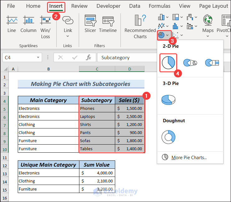
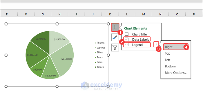
Step 4 – Insert Another Pie Chart Using Subcategories and Sales
- Choose range B4:D10.
- Go to Insert and insert another 2-D pie chart.
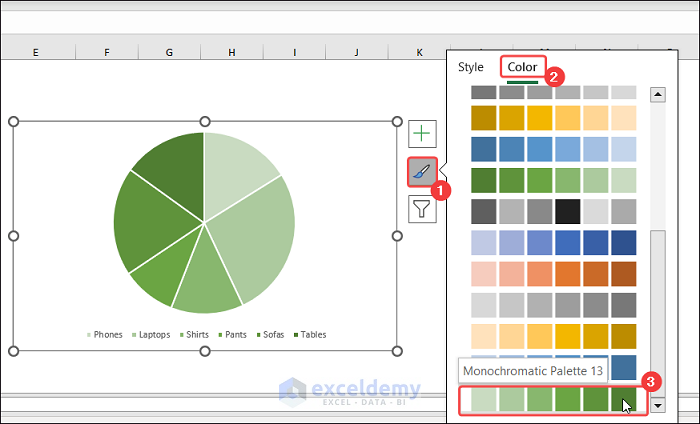
- Click on Chart Styles, go to Color, and choose an option like Monochromatic Palette 13.
- Click on Chart Elements.
- Check Data Labels and Legend.
- Expand Legend and choose Right.
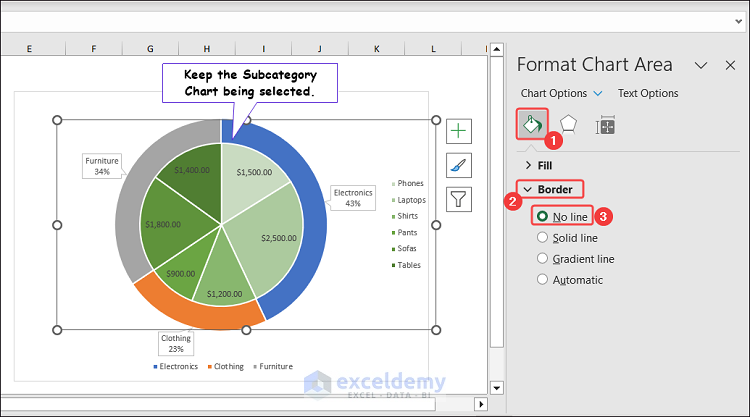
- Right-click on the Chart Area to show the context menu, and click on Format Chart Area.
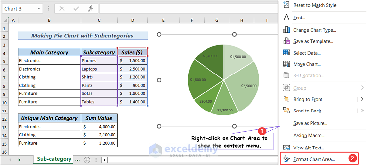
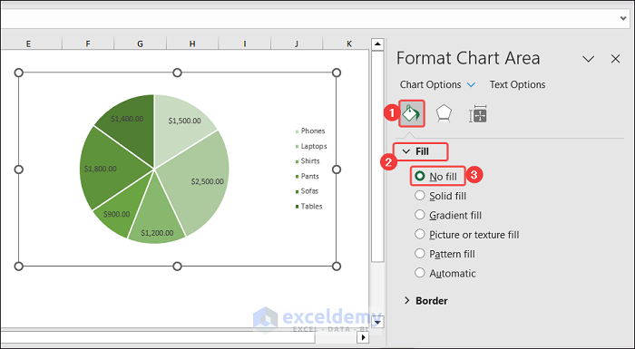
- The Format Chart Area pane will open.
- Click on Fill & Line, expand Fill, then check No Fill.
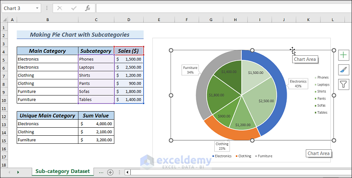
Step 5 – Create a Pie Chart with Subcategories by Combining the Two Charts
- Drag the Subcategory chart and place it over the Main Category chart.
With the Subcategory chart selected, click on Fill & Line, expand Border, and check No Line.
- Select both charts.
- Right-click on any Chart Area, expand Group, and click on Group.
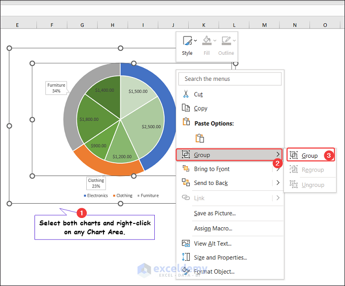
- This creates a Pie Chart with Subcategories.

2 Suitable Examples of Making an Advanced Excel Pie Chart from Subcategories from Columns
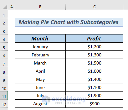
The following table has the Month and Profit columns. We will use these columns as subcategories.
Method 1 – Using Pie of Pie Chart Feature to Make Pie Chart from Subcategories Columns
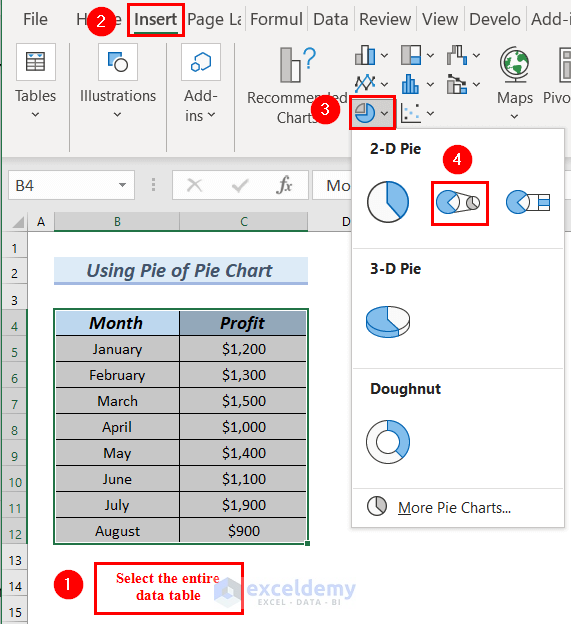
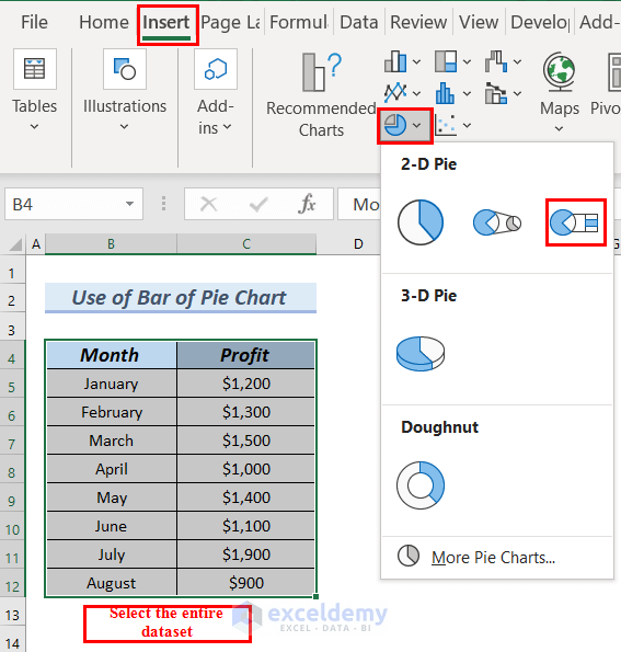
Step 1 – Inserting a Pie of Pie Chart
- Select the entire data table.
- Go to the Insert tab.
- From the Insert Pie or Doughnut Chart options, select the Pie of Pie chart.
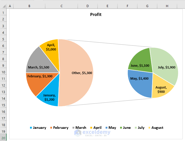
- You’ll see a Pie of Pie chart.

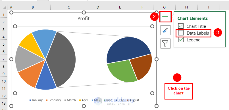
Step 2 – Adding Data Labels to the Pie of Pie Chart
- Click on the chart.
- Click on Chart Elements, which is a Plus sign situated at the top-right corner of the chart.
- From the Chart Elements, click on Data Labels.
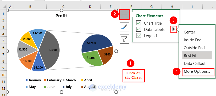
- Select the chart again.
- From Chart Elements, expand Data Labels.
- Select More Options.
- A Format Data Labels dialog box will appear on the left side of the Excel sheet.
- Click on Category Name under the Label Options.
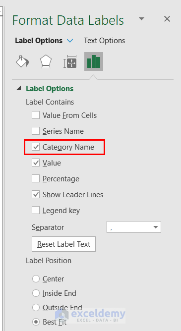
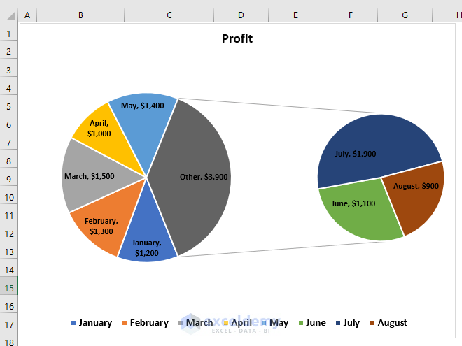
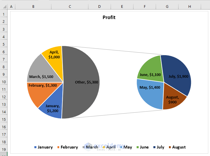
- You can see a Pie of Pie chart with both the Values and Category Name.
Step 3 – Adding More Values to the Second Plot
- Right-click on the first plot of the Pie chart.
- Select the Format Data Series option from the Context Menu.
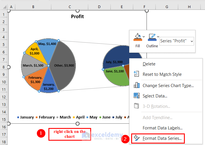
- A Format Data Series dialog box will appear.
- From the Series Options, set Values in second plot to 4. You can set the Values in second plot according to your choices.
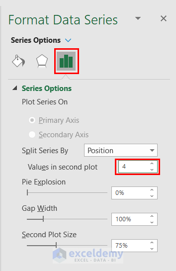
- There are 4 slices in the second plot of the Pie chart.
Read More: How to Create a Pie Chart in Excel from Pivot Table
Step 4 – Formatting the Pie of Pie Chart
- Click on the first plot of the Pie chart, and then click on the slice you want to format.
- Go to the Format tab.
- From the Shape Style group, select the Shape Fill option.
- We will select a color for our selected slice.
- Repeat for the other slices of the first and second plots of the Pie of Pie chart.
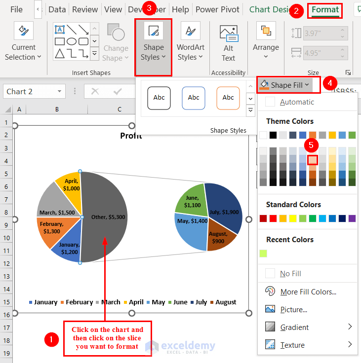
- Here’s the final Pie chart in Excel with subcategories.
Method 2 – Use the Bar of Pie Chart to Make a Pie Chart from Subcategories by Columns
Steps:
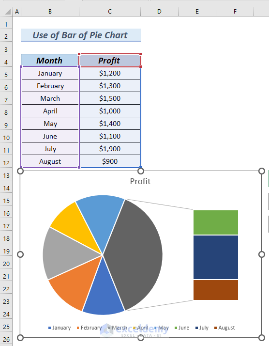
- Select the entire data table.
- Go to the Insert tab.
- From Insert Pie or Doughnut Chart, select Bar of Pie chart.
- You can see the Bar of Pie chart.
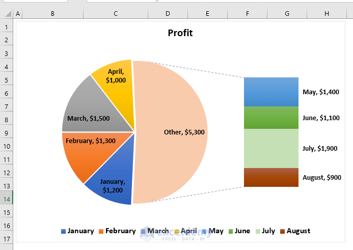
- Add Data Labels to the Bar of Pie chart by following Step 2 of Method 1.
- Add More Values to the Second plot of the Pie chart by following Step 3 of Method 1.
- Format the Bar of Pie chart by following Step 4 of Method 1.
Read More: How to Make a Pie Chart with Multiple Data in Excel
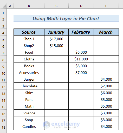
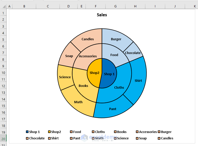
Multi-Layering in a Pie Chart
We will use the following dataset for multi-layering in a Pie chart. Notice that each column has effectively been distributed into narrower categories (shop > product category > product name), which will be used for layering.
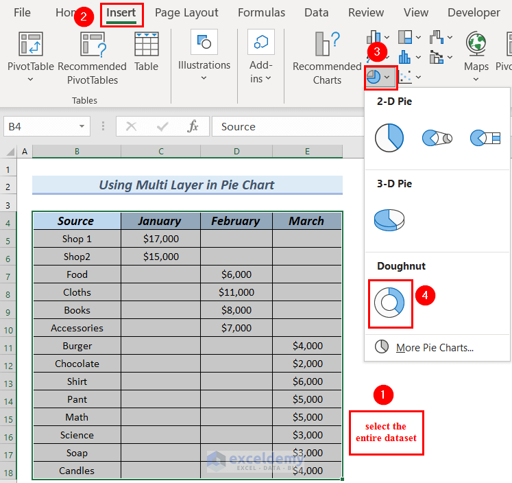
Step 1 – Inserting a Pie Chart
- Select the entire data table.
- Go to the Insert tab.
- From Insert Pie or Doughnut Chart, select Doughnut chart.
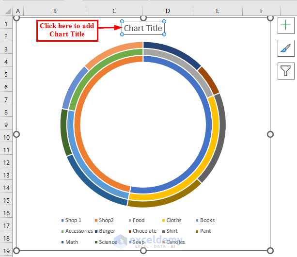
- Click on the Chart Title and edit the Chart Title.
Step 2 – Setting Doughnut Hole Size to 0%
- Right-click on the first circle of the Doughnut chart.
- Select Format Data Series from the Context Menu.
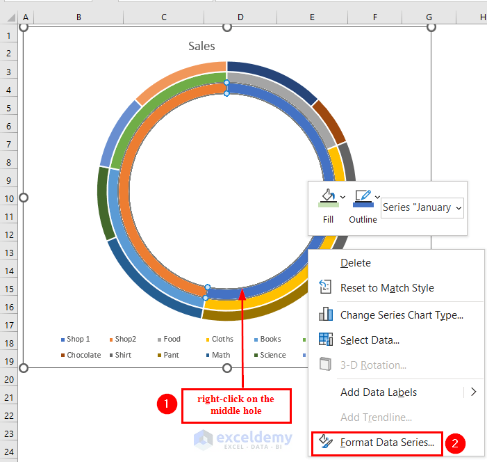
- A Format Data Series dialog box will appear.
- From the Series Options, set Doughnut Hole Size to 0%.

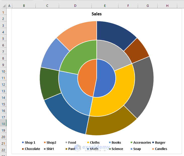
- You’ll get a Multilayer Pie Chart.
Step 3 – Highlighting the Borders
- Click on the slices in the first (middle) circle of the Pie chart.
- Select Format Data Series from the Context Menu.
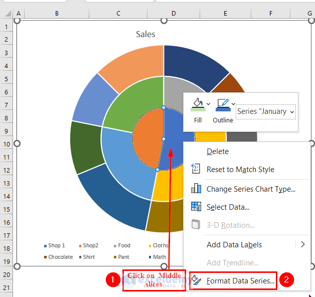
- A Format Data Series dialog box will appear.
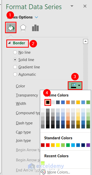
- From the Fill & Line group, select Border.
- Click on the drop-down arrow of the color box and select a color for the border. We selected Black as the Border color.
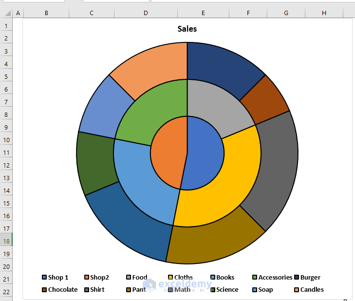
- Repeat for the second and third circles and set a Black Border.
- You can see the multilayer Pie chart with a Black border.
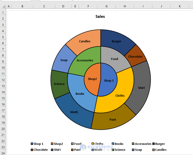
Step 4 – Adding Category Names in a Multilayer Pie Chart
- Click on the chart.
- From Chart Elements, expand Data Labels.
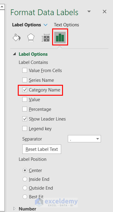
- Select More Options.
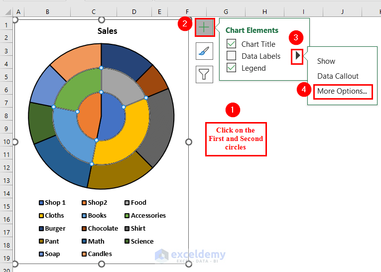
- A Format Data Labels dialog box will appear on the left side of the Excel sheet.
- Click on the Category Name under Label Options.
- We unselected the Values, since we only want to see the Category Name.
- You’ll see only the Category Names listed for each slice.
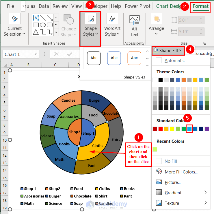
Step 5 – Formatting the Pie Chart
- Click on the chart and then click on the slice you want to format.
- Go to the Format tab.
- From the Shape Styles group, select the Shape Fill option.
- Select a color for the selected slice.
- Repeat for all slices. Add a similar color to a subcategory and the product so that the chart looks more understandable.
- Here’s the finalized Multilayer Pie Chart.
Read More: How to Make a Pie Chart in Excel without Numbers
Practice Section
You can download the above Excel file to practice the explained methods.
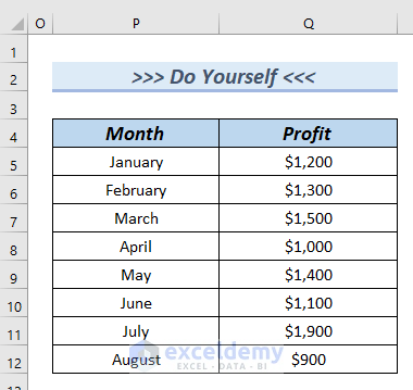
Download the Practice Workbook
Related Articles
- How to Make a Pie Chart in Excel with One Column of Data
- How to Make a Pie Chart in Excel with Words
<< Go Back To Make a Pie Chart in Excel | Excel Pie Chart | Excel Charts | Learn Excel
Get FREE Advanced Excel Exercises with Solutions!

These aren’t subcategories. They’re the same category.
Hello Hate
Thank you for reaching out and posting your comment. The issue you are mentioning is correct. Thanks once again for noticing the problem.
I am delighted to inform you that our team successfully developed a procedure to make a Pie Chart with subcategories. According to the idea, we have modified the article. I recommend you go through the article again and enjoy it.
Regards
Lutfor Rahman Shimanto
Team ExcelDemy
Great tips! I’ve always struggled with creating pie charts in Excel, especially with subcategories. The step-by-step instructions were super helpful. I can’t wait to try it out for my next presentation. Thanks for sharing!
Hello,
You are most welcome. Thanks for your feedback and appreciation. Glad to hear that you found our article’s step-by-step explanation helpful. Try this in your project and let us know.
Regards
ExcelDemy