Square Pie Chart is a kind of synchronized grid with an equal number of rows and columns. Usually, it shows the dataset value in percentage. Suppose the total work of a project is 100% which requires 100 cells (10 rows & 10 columns). Here, one cell represents 1% of the total amount of work to be done in that project. It is also known as a Waffle Chart. The focus of this article is to explain how to create a Square Pie Chart in Excel.
How to Create Square Pie Chart in Excel: 2 Easy Ways
In this article, we will cover 2 easy ways of creating a Square Pie Chart in Excel. To create a Square Pie Chart, we applied Conditional Formatting and the Developer tab. Let’s explore the methods.
1. Use Conditional Formatting to Create Square Pie Chart in Excel
The first one is a basic Square Pie chart that shows only one value. Here, we applied a new rule to the cells with the help of Conditional Formatting. So, let’s imitate the steps to create a square pie chart in Excel.
Step-01: Make Square Chart Within Grids
In this step, we will create the Square Grid Chart by applying a formula instead of writing the values manually.
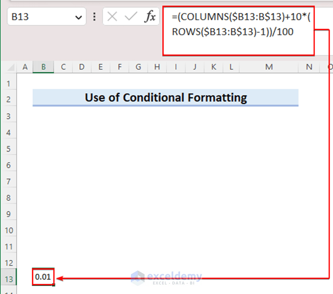
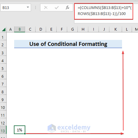
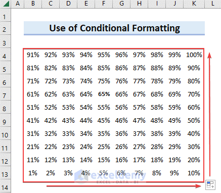
- Initially, it requires a grid of 100 So, take 10 rows and 10 columns and write the formula in the first cell of the last row which is Cell B13 here.
=(COLUMNS($E13:E$13)+10*(ROWS($E13:E$13)-1))/100
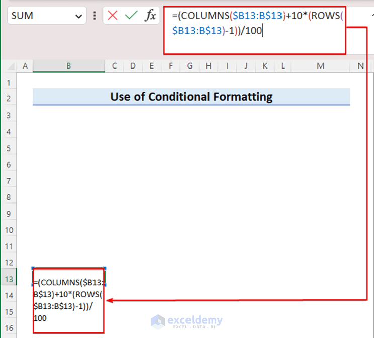
- Secondly, press Enter, and you will get the value which is 01 as it will start from 1%.
🔎 How Does the Formula Work?
- ROWS($E13:E$13): In this portion, the ROWS function returns the number of rows of the array.
- 10*(ROWS($E13:E$13)-1))/100: Now, we subtracted 1 from the previous result and then multiplied it by 10. Finally, the result is divided by 100.
- COLUMNS($E13:E$13): Here, the COLUMN function returns the number of columns in array $E13:E$13.
- (COLUMNS($E13:E$13)+10*(ROWS($E13:E$13)-1))/100: Finally, this formula returns the sum of the previous two portions.
- Afterwards, drag the Fill Handle to copy the formula through the width and height of the grid. Follow the image below.
- As a result, we got the results for the entire grid.
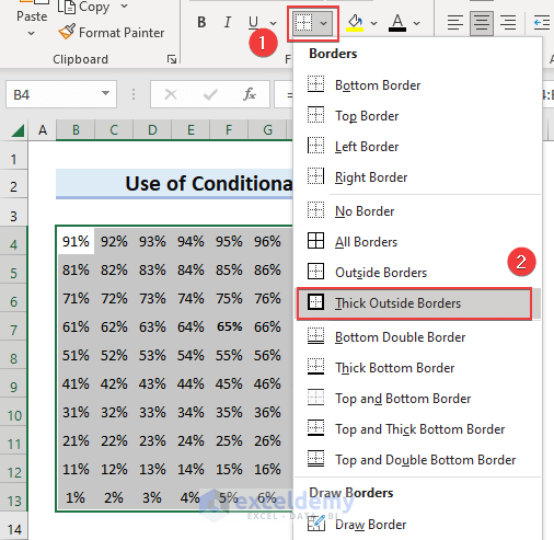
- To make your grid look more prominent, add a thick border outside.
- To do this, hit on the Border icon pointed below.
- Then, select Thick Outside Borders from the options.
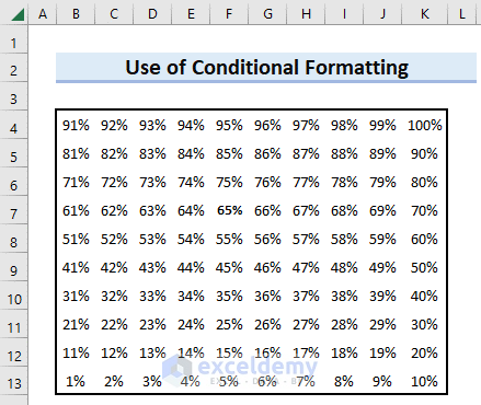
- Consequently, you can see a thick border outside the grid.
Read More: How to Make a Multi-Level Pie Chart in Excel
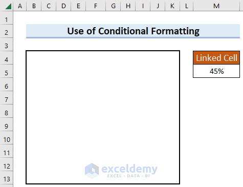
Step-02: Link Cell with Square Pie Chart
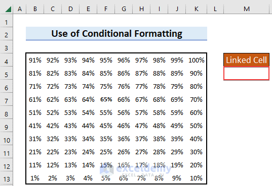
As we will be using Conditional Formatting, create a linked cell on your sheet.
- First, select any cell beside your chart. And this cell will be further used in Conditional Formatting.
- Then, add a header above the linked cell for better understanding.
Read More: How to Create a 3D Pie Chart in Excel
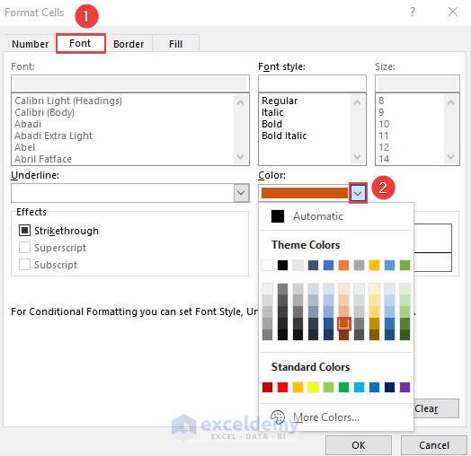
Step-03: Change of Font Color
To make the chart more professional we will hide the percentage values.
- In the beginning, click on the font color icon.
- Next, change the font to white.
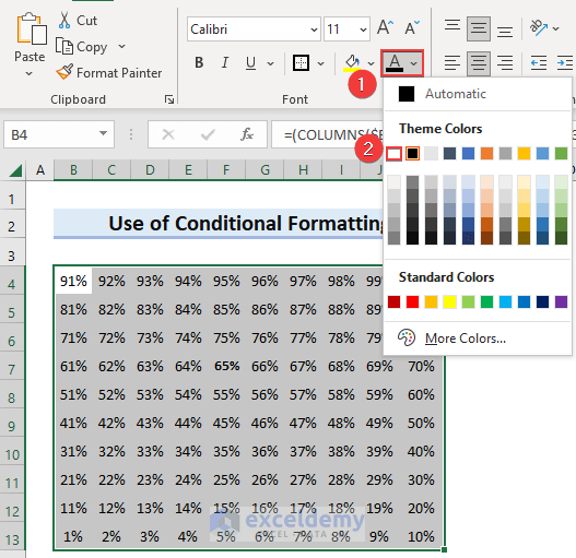
- Accordingly, all the values of the grid are hidden.
Read More: How to Create & Customize Bar of Pie Chart in Excel
Step-04: Employ Conditional Formatting
This is the most important step of the entire process. You have to apply a new rule to the grid by conditional formatting to make it look like a square pie chart.
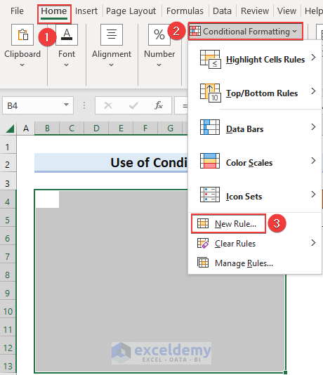
- Select the entire grid.
- Then, Select the Home From this tab, click on conditional formatting.
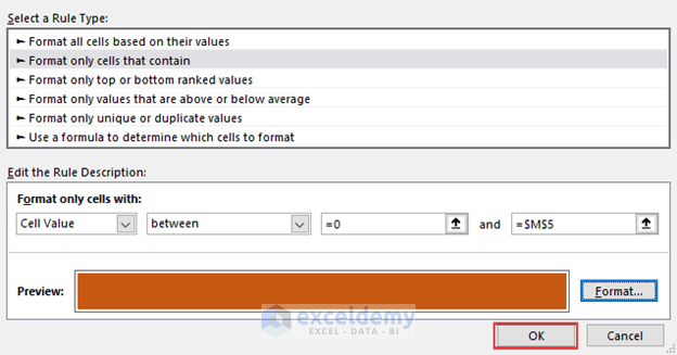
- Among the options, choose New Rule.
- Consequently, a dialog box will open like the snapshot below.
- Next, select Format only cells that contain from the options.
- Then, insert cell value 0 and $M$5. Here, M5 is the linked cell we inserted previously. The value you will put down in this cell will be shown in the chart.
- Lastly, click on the Format option so that we can format the font and fill color.
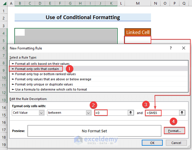
- Now, the Font color and Fill color need to be the same.
- Select the Font color of your preference.
- Then, select the Fill Color same as the Font Color.
- In conclusion, hit on the OK button after checking the preview.
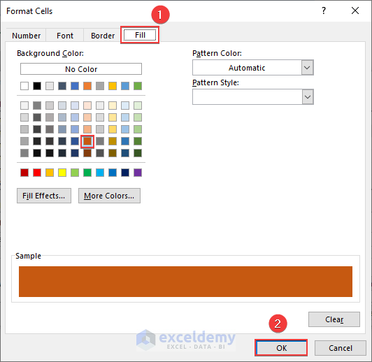
- We are done with formatting.
- Lastly, select OK to see the result.
- After that, write down a value in the linked cell.
- As a result, you will get the desired square pie chart.

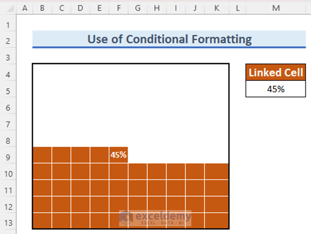
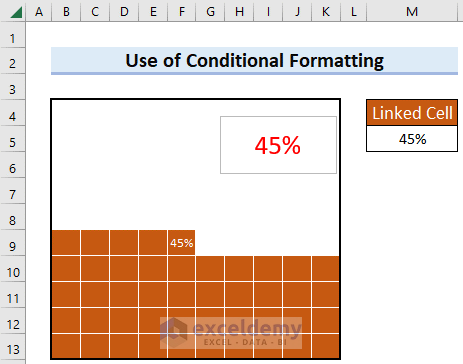
To increase the readability of the chart, follow the next steps. This results in showing up the value of the percentage in the last cell. It will be easy to detect the value just by looking at the chart.
- First, select the 100 cells.
- Then, click on the Home tab.
- Next, choose Conditional Formatting from the options.
- After that, select Highlight Cells Rules from the options.
- Lastly, pick the Equal To option.
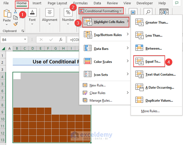
- Set the linked cell M5 as Format cells that are equal to.
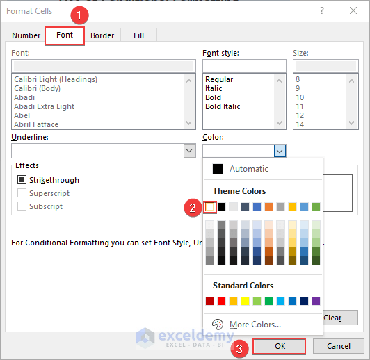
- After this, pick out the Custom Format option.
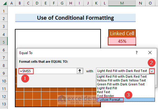
- Next, change the Font color to white.
- Then, hit on the OK.
- Finally, you can see the percentage value on the last cell.
Read More: How to Make Pie of Pie Chart in Excel
Step-05: Add Label
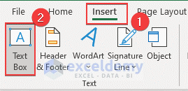
You can insert a Text Box to show the percentage at the top of the chart.
- First, Select the Insert option.
- Then, Insert a Text Box.
- In the text box, insert the linked cell M5. It means the text value will take the value of the linked cell.
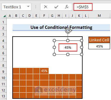
- Accordingly, the text box shows the value of M5.
Read More: How to Make a Gender Pie Chart in Excel
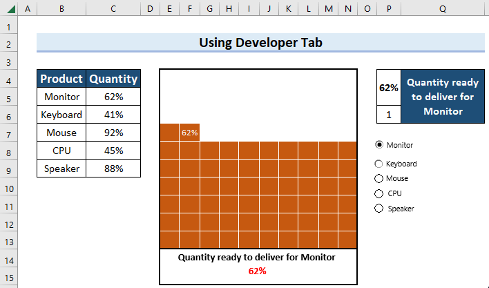
2. Create Interactive Square Pie Chart Using Developer Tab in Excel
Let’s move forward to the second method. It is the interactive one that expresses multiple values in a single sheet. For this, we will introduce the Developer tab to add options. Follow the steps carefully to create an interactive square pie chart in excel.
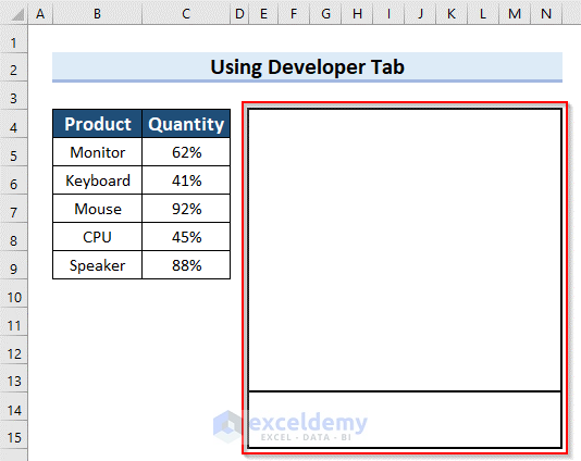
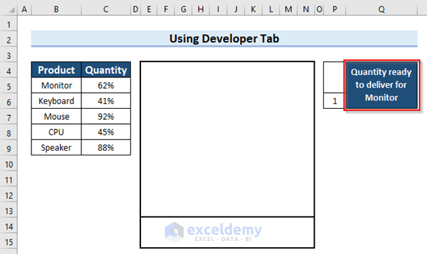
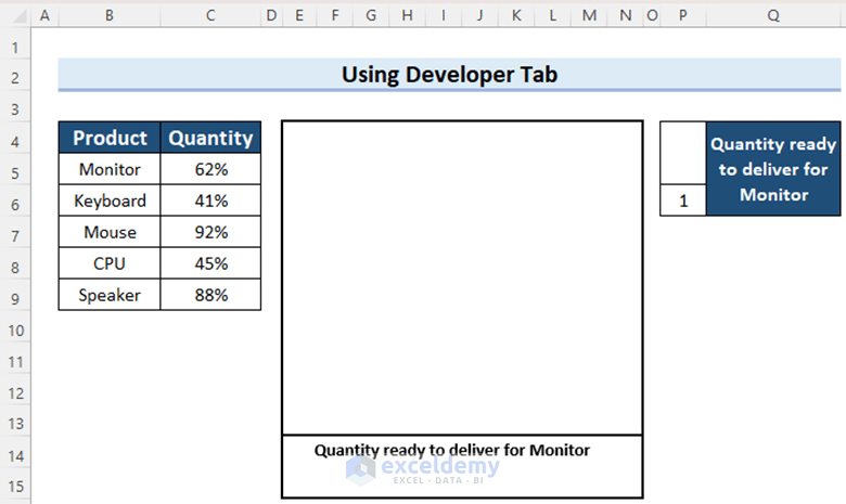
Suppose we have a dataset containing some products and the percentage of the quantity which is ready to deliver. If we want to express these values into a single dataset, then we can utilize the Developer tab.

Steps:
- First and foremost, you must create a square pie chart within Grids.
- To do this, follow Step-01 of Method 1.
- Secondly, Change the Font colour of the cells of the grid. For this, go after Step-03 of Method 1.
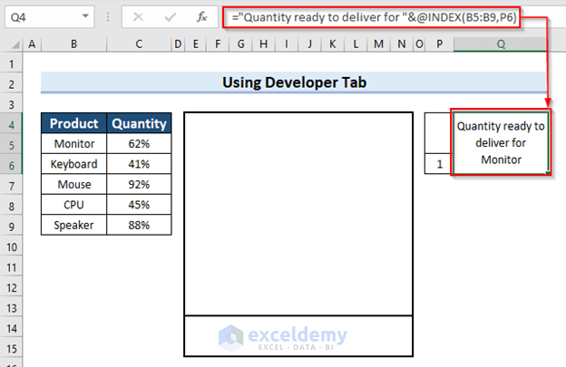
- In order to represent the square pie chart for multiple values you should apply some formulas according to your need.
- To do so, put down the formula in the marked cell. The INDEX function is used here.
="Quantity ready to deliver for "&@INDEX(B5:B9,P6)
🔎 How Does the Formula Work?
- INDEX(B5:B9,P6): This part returns the value of array B5:B9 to the reference cell P6.
- “Quantity ready to deliver for “&@INDEX(B5:B9,P6): This formula will bring the values from column B. If the P6 cell remains empty, it will show an error message. That’s why we have put the value 1 here to avoid the error.
- We added some formatting by changing the Fill color to make the sheet look good. You can also do this.
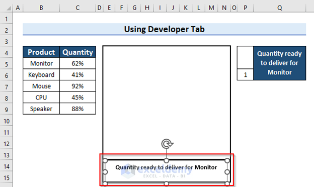
- Now, insert a Text Box at the bottom of the grid to express the value in a detailed way. Follow Step-05 of Method 1 to insert text.
- Then, edit the text according to your information on the percentage value.
- Finally, apply Conditional Formatting to create the square pie chart. Perform Step-04 of Method 1 to do this. Here, we selected Cell P4 as a linked cell.
- Now, the interface is ready now to use the Developer tab.
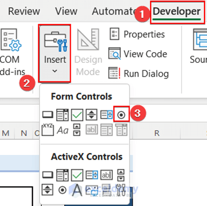
- In the first place, click on the Developer tab.
- Afterwards, Select the Insert option.
- Here, select the Option Button from From Control.
- Edit the option. The name of our first product is Monitor.
- Next, right-click on the text, and a box will appear like the image.
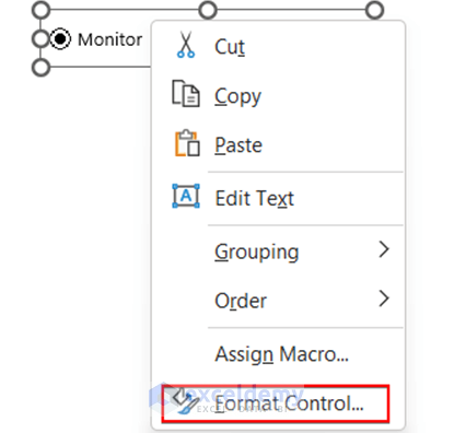
- In the control option insert the cell link as Cell P6. This cell will show the number of options.
- Put a tick on 3-D shading.
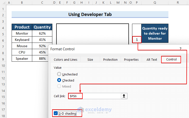
- Consecutively, add the 5 options buttons just repeating the same actions.

- At this point, apply this formula to the marked cell which is the linked cell of the conditional formatting. This formula will bring the quantity from column B.
=INDEX(C5:C9,P6)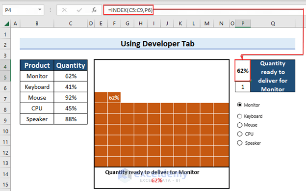
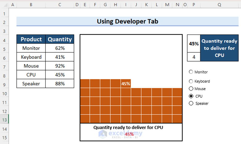
- So, we have successfully created an interactive square pie chart in excel.
- Then, click on different options and see the result in the grid.
Read More: How to Make Multiple Pie Charts from One Table
Things to Remember
- You have to remember that you can only present data in percentages.
- Making a Square Pie Chart is a bit time-consuming compared to other charts in Excel.
Practice Section
Here, we have provided a practice sheet for you to practice.

Download Practice Workbook
Conclusion
We have tried to show creating a square pie chart in excel step by step. Small details have been shown so that you can create a square pie chart at least possible time by following the article. If you face any problem regarding the article, please comment so that we can help.
Related Articles
<< Go Back To Make a Pie Chart in Excel | Excel Pie Chart | Excel Charts | Learn Excel
Get FREE Advanced Excel Exercises with Solutions!
