Basics of a Stacked Bar Chart
Bar Chart
A bar chart is a diagram where numerical values of variables are shown by the height or the length of the line or the rectangles of the same width.
Stacked Bar Chart
The stacked bar chart extends the standard bar chart from looking at numerical values from one categorized variable to two. This type of chart is used to picture the overall variation of the different variables. This is best suitable for the graphical representation of part-to-whole comparison over time.
A stacked bar chart can be formatted in 2-D or 3-D. Both have two different categories: stacked bar and 100% stacked bar. The stacked bar chart represents the user data directly, and the 100% stacked bar chart represents the given data as a percentage of the data, which contributes to a complete volume in a separate category.
How to Make a Stacked Bar Chart in Excel: 2 Quick Methods
Method 1 – Use the Quick Analysis Tool to Create Stacked Bar Chart
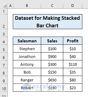
We have a dataset of sales and profit of a shop for a certain period.
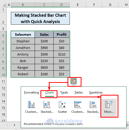
- Select the data and click the Quick Analysis tool at the corner of the selected area.
- Select the Charts menu and click More.
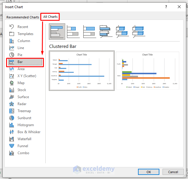
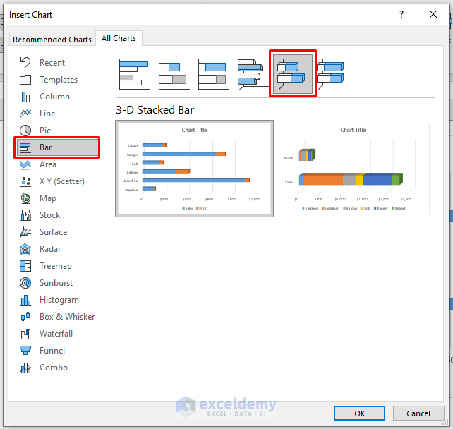
- The Insert Chart dialog box will show up.
- Select All Charts and click on Bar.
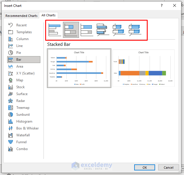
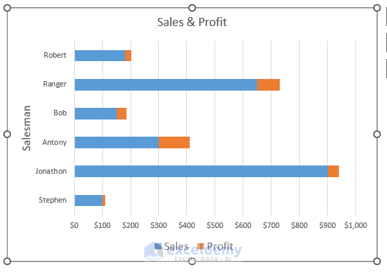
- You’ll get options to create a Stacked Bar, a 100% Stacked Bar, a 3D Stacked Bar, and a 100% 3D Stacked Bar. Choose the one you want. We have selected the Stacked Bar chart.
- Here’s the chart.
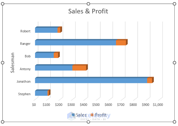
- You can also create a 3-D Stacked Bar Chart for the same data by repeating the same steps.
- Here’s the output.
Read More: Excel Stacked Bar Chart with Subcategories
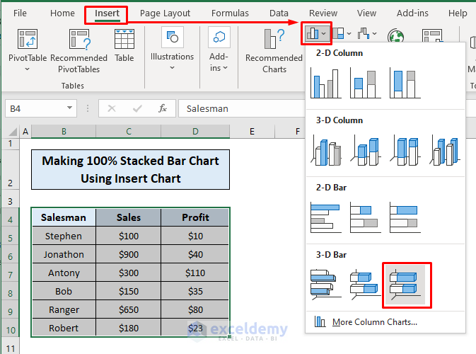
Method 2 – Make a Stacked Bar Chart with the Insert Chart Menu
- Select the data area and go to the Insert tab.
- Click the Insert Chart option. You will find different charts.
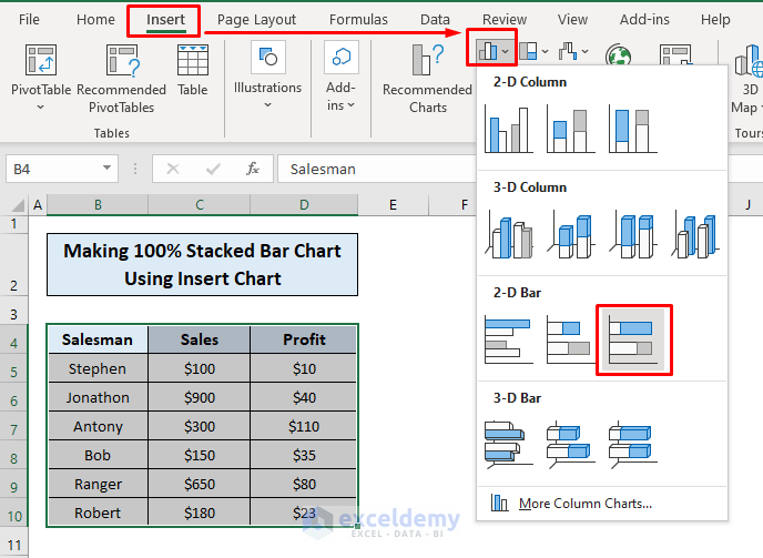
- Both 2-D and 3-D Bar have a Stacked Bar and 100% Stacked Bar chart options. Choose the one you want to create and click on it. We have selected the 100% 2-D Bar Chart.
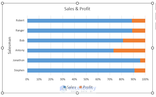
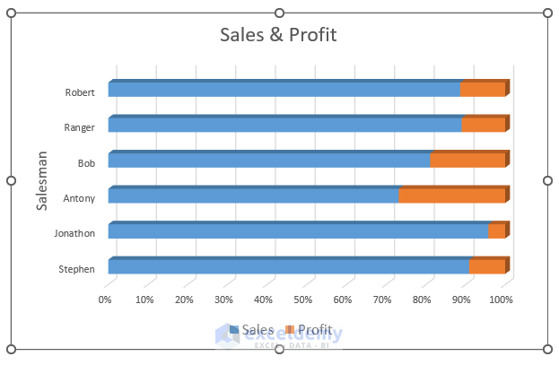
- You can also create a 100% 3-D Stacked Bar Chart.
- Here’s the 3D chart.
Read More: How to Create Stacked Bar Chart with Negative Values in Excel
Download the Practice Workbook
Related Articles
- How to Create Stacked Bar Chart for Multiple Series in Excel
- How to Create Stacked Bar Chart with Line in Excel
- How to Plot Stacked Bar Chart from Excel Pivot Table
- How to Create Stacked Bar Chart with Dates in Excel
- How to Create Bar Chart with Multiple Categories in Excel
- How to Ignore Blank Cells in Excel Bar Chart
<< Go Back to Stacked Bar Chart in Excel | Excel Bar Chart | Excel Charts | Learn Excel
Get FREE Advanced Excel Exercises with Solutions!
