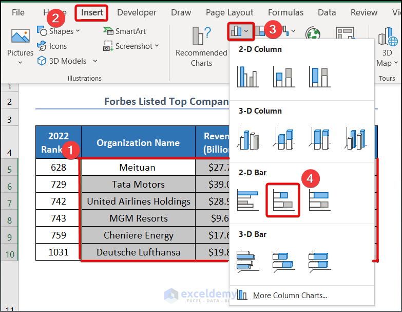
Method 1 – Create a 2-D Stacked Bar Chart with Negative Values
Step 1: Insert Stacked Bar Chart
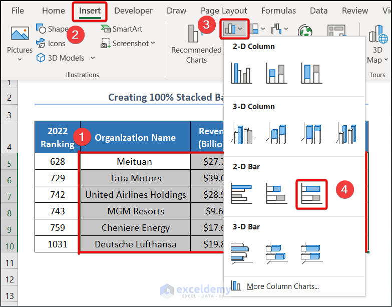
- Select range C5:F10, go to the Insert tab >> Charts group >> Insert Column or Bar Chart group >> 2-D Stacked Bar.
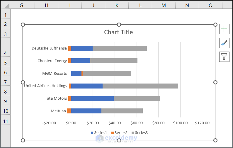
- You will get the following chart where the positive numbers are stacked on the right side of $0.00 and the negative values are on the left side.
Step 2: Format the Stacked Bar Chart
- Click on the Legend of your Bar Chart, go to the Chart Filters option.
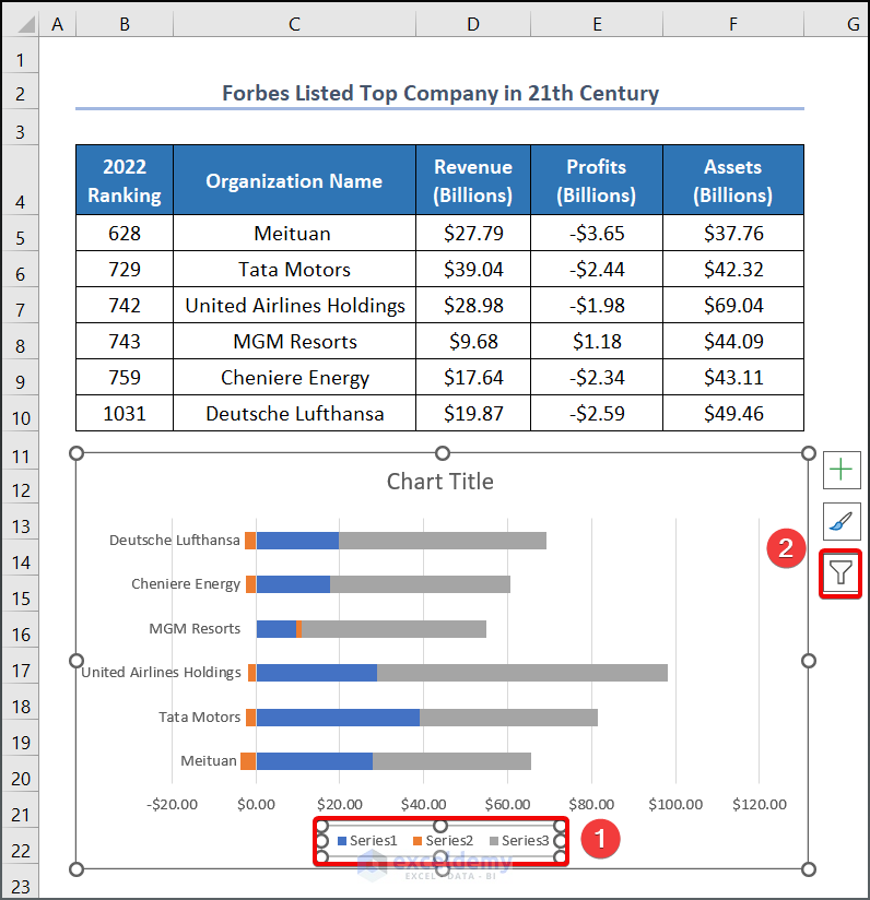
- Click on the Select Data option.
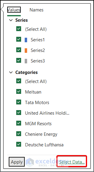
- You will get a Data Source Wizard.
- Click on Series1 and click on the Edit button to change your Legend name.
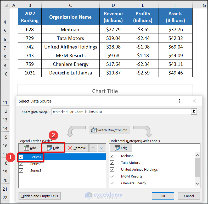
- In the dialog box, select D4 as your Series name and press OK.
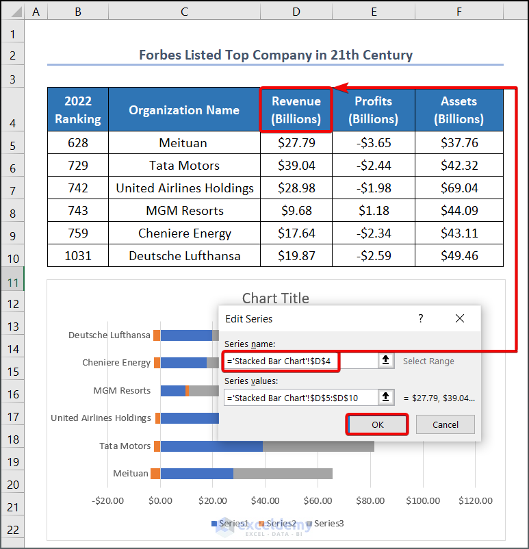
- Your first Legend will be changed to Revenue (Billions).
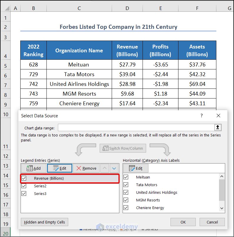
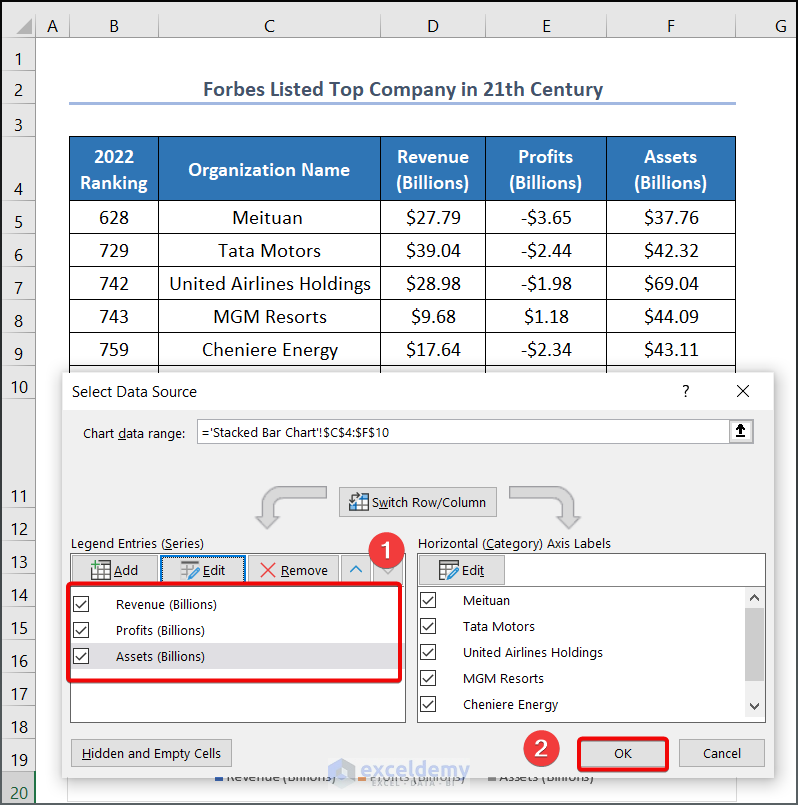
- Follow the same process to change the other two legends. You will have three Legend names as shown below.
- Press OK.
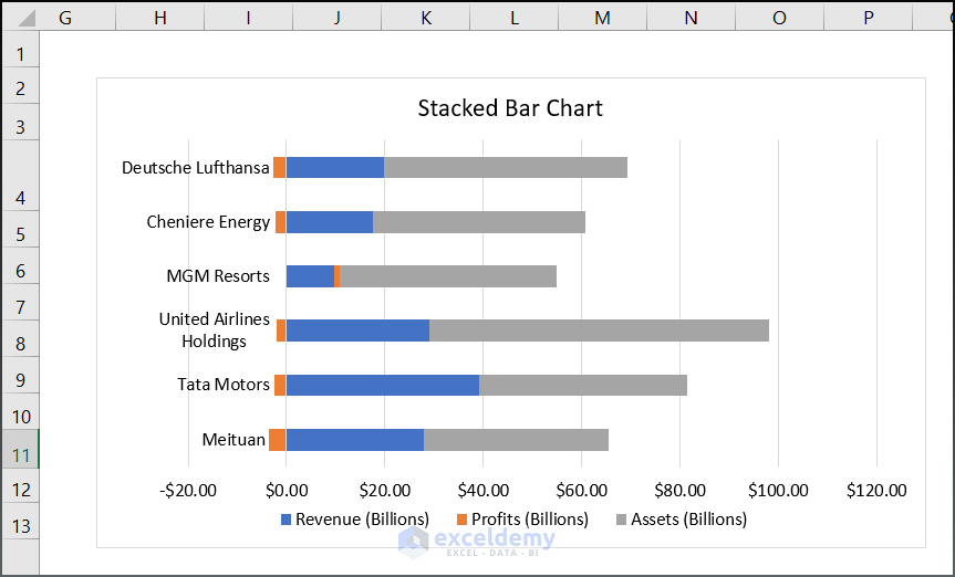
- After changing your Chart Title to “Stacked Bar Chart”, you will get a chart as shown in the following image below. You can rename the chart title based on your requirements.
Read More: How to Make a Stacked Bar Chart in Excel
Method 2 – Construct a 100% Stacked Bar Chart with Negative Values
Step 1: Generate a 100% Stacked Bar Chart
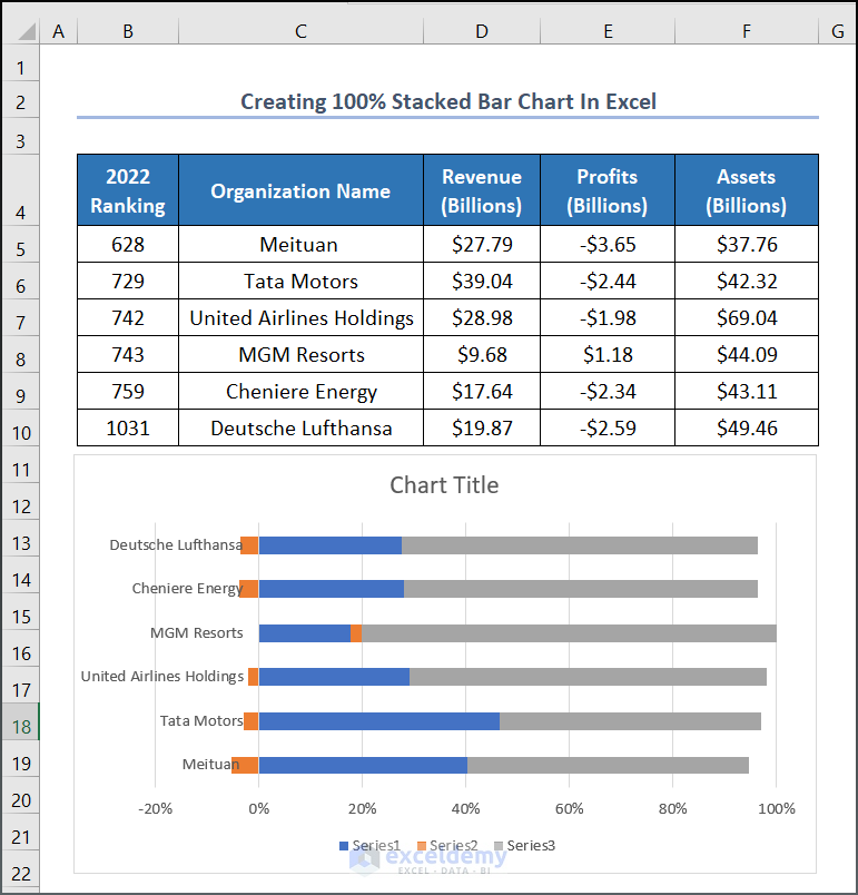
- Select range C5:F10, go to the Insert tab >> Charts group >> Insert Column or Bar Chart group >> 2-D 100% Stacked Bar.
- You will get a raw chart as shown below. We can see that the values in the X-axis are given in percentage scale.
Step 2: Format the 100% Stacked Bar Chart
Follow the steps from Method 1 to format the chart.
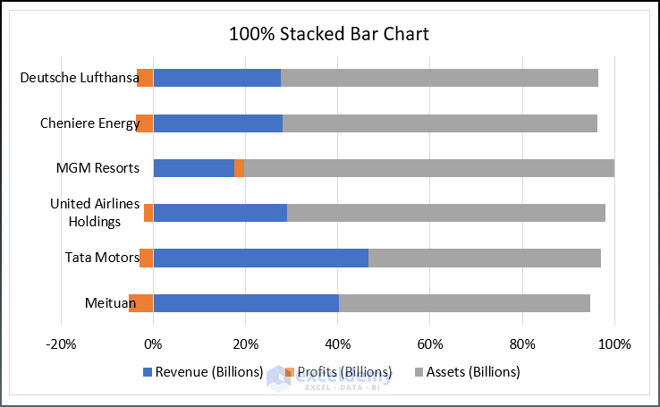
The final output will be as shown in the following image.
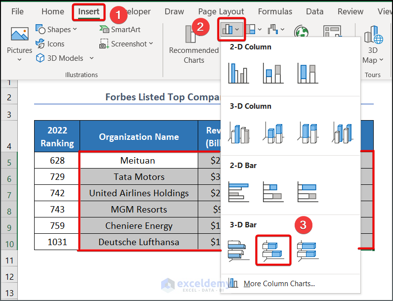
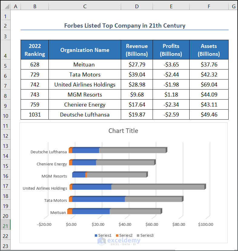
Method 3 – Build a 3-D Stacked Bar Chart with Negative Values
Step 1: Generate 3D Stacked Bar Chart
- Select range C5:F10, go to the Insert tab >> Charts group >> Insert Column or Bar Chart group >> 3-D Stacked Bar.
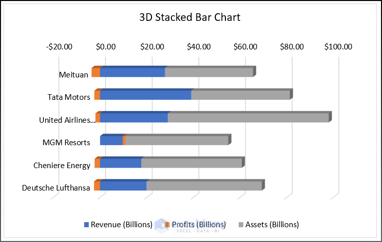
- You will have a 3D Stacked Bar Chart as shown in the following image.
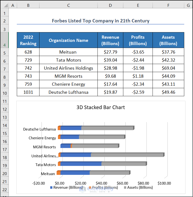
Step 2: Format the 100% Stacked Bar Chart
Follow the formatting steps of Method 1 and you will get an output as shown below.
You can also use categories in reverse order to move your X-axis data to the top.
- Click on the Y-axis data of your chart, Right-click on your mouse.
- Select the Format Axis option.
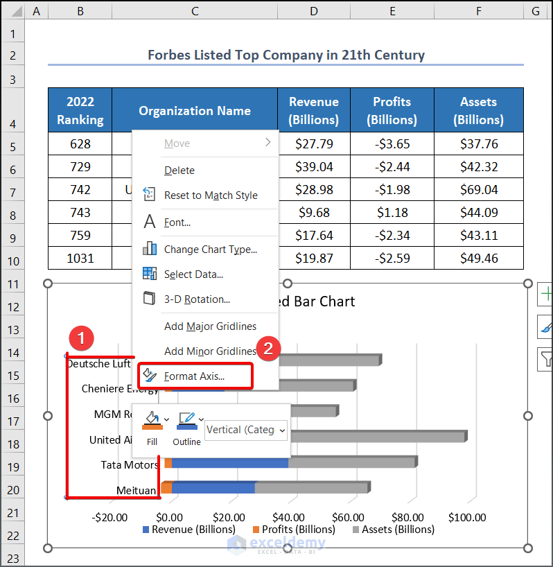
- On the right side of your Excel interface, a wizard will show up.
- Select Categories in reverse order as your Axis position.
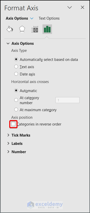
- The x-axis data will be moved to the top of the chart.
Read More: Excel Stacked Bar Chart with Subcategories
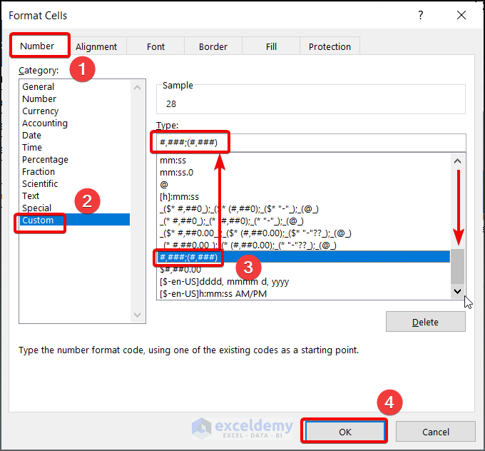
How to Create Excel Chart Showing Negative Values as Positive
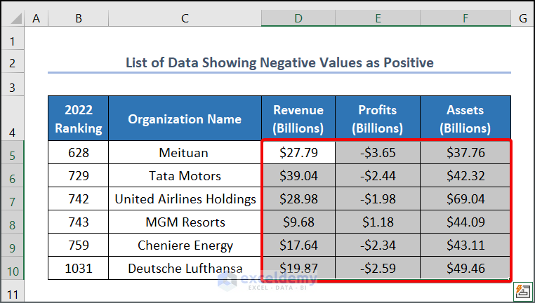
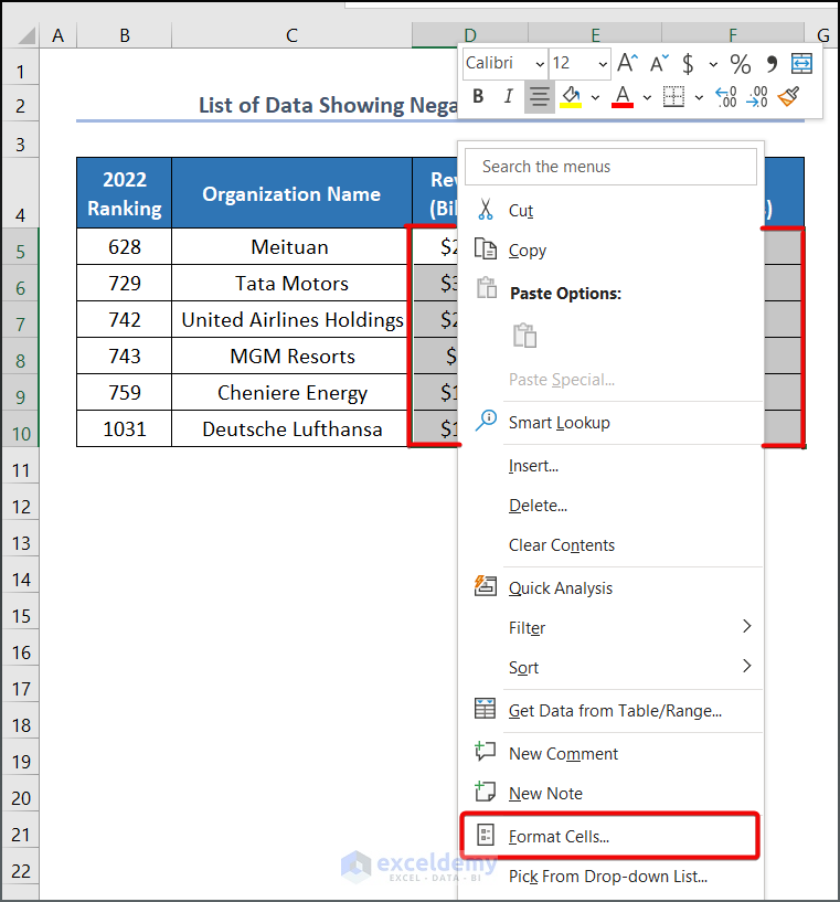
- Select your range of data, D5:F10 for instance.
- Right-click and choose the Format Cells option.
- In the Format Cells window, select Custom from the Number. Enter the following format code to the Type:
#,###;(#,###)- Click OK.
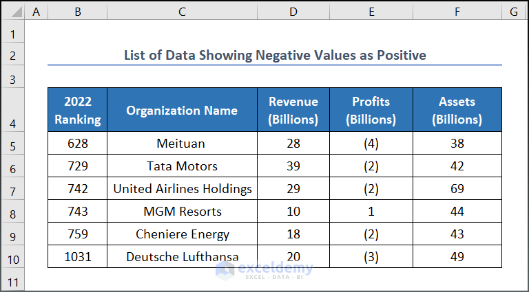
- You will get a list of data where negative values are enclosed by the first bracket.
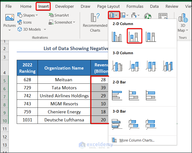
- To create your chart, select range D5:F10, go to the Insert tab >> Charts group >> Insert Column or Bar Chart group >> Stacked Column.
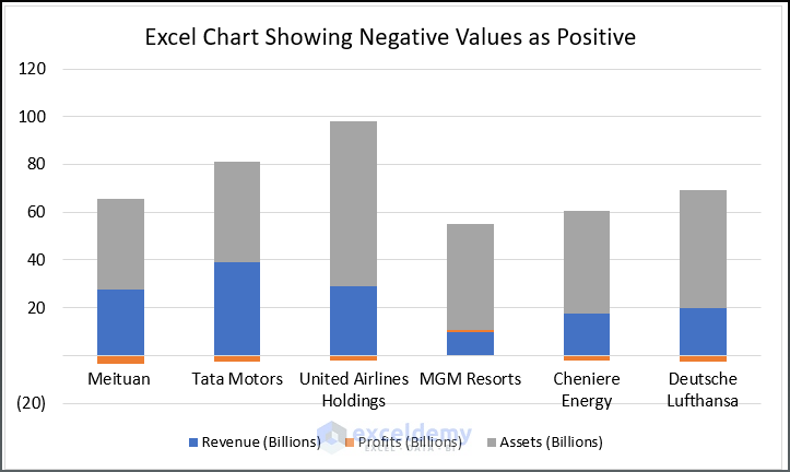
- After formatting the chart, you will get an output as shown in the image below.
Read More: How to Create Stacked Bar Chart for Multiple Series in Excel
Download Practice Workbook
Related Articles
- How to Create Stacked Bar Chart with Line in Excel
- How to Plot Stacked Bar Chart from Excel Pivot Table
- How to Create Stacked Bar Chart with Dates in Excel
- How to Create Bar Chart with Multiple Categories in Excel
- How to Ignore Blank Cells in Excel Bar Chart
<< Go Back to Stacked Bar Chart in Excel | Excel Bar Chart | Excel Charts | Learn Excel
Get FREE Advanced Excel Exercises with Solutions!
