What is a Stacked Bar Chart?
A stacked bar chart is a type of bar chart that displays multiple data points on top of each other within the same bar. This allows you to compare the total values across different categories as well as the individual components that make up those totals.
Here’s a breakdown of its key features:
- Primary Categorical Variable: Each bar represents a category of the primary variable.
- Secondary Categorical Variable: Each bar is divided into segments that represent different subcategories of the secondary variable.
- Comparison: You can compare both the total length of the bars (overall totals) and the individual segments within each bar (subcomponent contributions).
Method 1 – Create a Stacked Bar Chart with a Line Chart

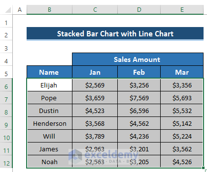
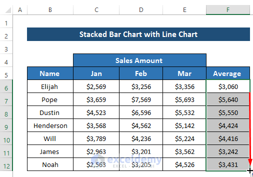
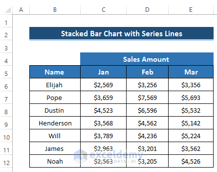
- Select the range of cells B6 to E12.
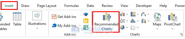
- Go to the Insert tab in the ribbon.
- From the Charts group, select the Recommended Charts option.
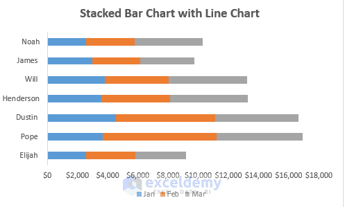
- In the Insert Chart dialog box, choose the Stacked Bar chart.
- Click OK to generate the chart.

- It will give us the following result.
- If you want to change the Chart Style, click on the Brush sign on the right side of the chart and select your preferred chart style.
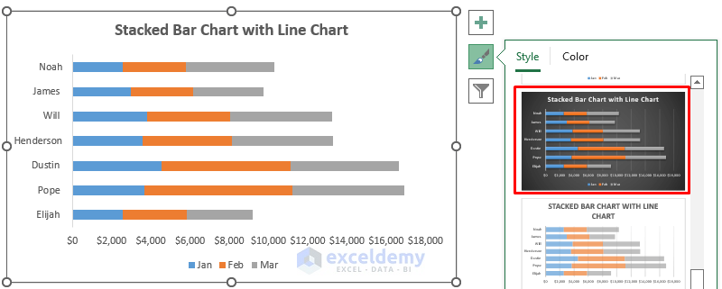
- You will get the following stacked bar chart.
Create the Line Chart:
- Add a new column to your dataset (cell F6).
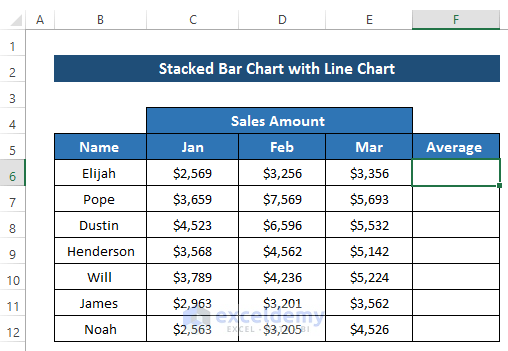
- In cell F6, calculate the average sales amount for the three months using the AVERAGE function:
=AVERAGE(C6:E6)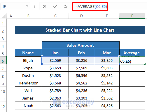
- Press Enter.
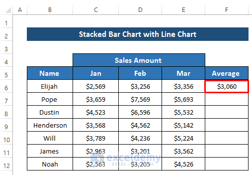
- Drag the Fill Handle down the column to apply the formula.
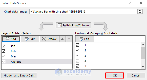
- Right-click on the stacked bar chart and choose Select Data.
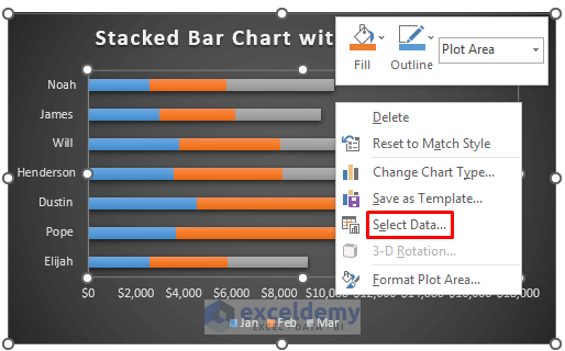
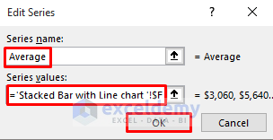
- In the Select Data Source dialog box, click Add from the Legend Entries (Series) section.
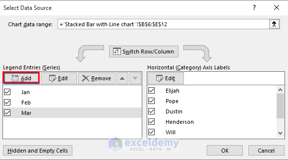
- Set the Series name and select the newly created column reference for the Series values.
- Click OK.
- The Select Data Source box will appear again, click OK.
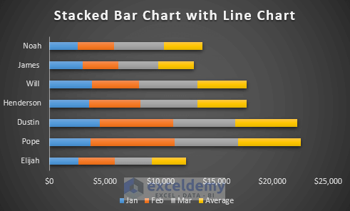
- The stacked bar chart will be regarded as a standard bar chart, creating an additional bar for this column.
- You will get the following result after adding a new series.
- Right-click on any of the bars and choose Change Series Chart Type.
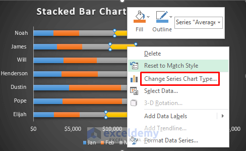
- Set all series as stacked bars, except for the Average series, which should be changed to a line chart.
- Click OK.
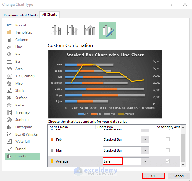
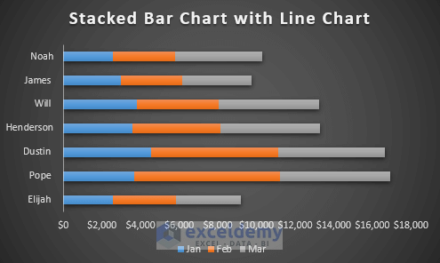
- The stacked bar chart with a line chart will be created.
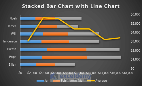
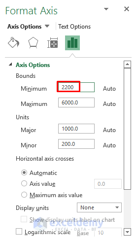
- Format the axis for a better view.
- Double-click on the right of the chart axis.
- It will open up the Format Axis dialog box.
- Set the Minimum value for your axis.
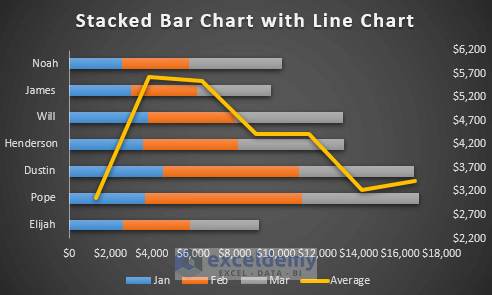
- This will give you the required stacked bar chart with a line.
Read More: How to Create Stacked Bar Chart for Multiple Series in Excel
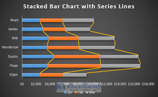
Method 2 – Create a Stacked Bar Chart with Series Lines
In this method, we’ll join the series points to create lines within the stacked bar chart.
Steps
- Create the Stacked Bar Chart with Series Lines:
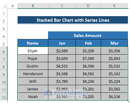
- Select the range of cells B6 to E12.
-
- Go to the Insert tab in the ribbon.
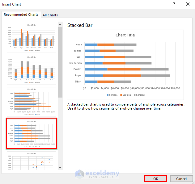
- From the Charts group, choose the Recommended Charts option.

-
- In the Insert Chart dialog box, select the Stacked Bar chart.
- Click OK to generate the chart.
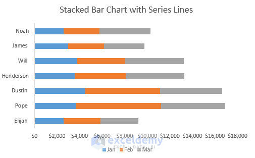
It will give us the following result.
-
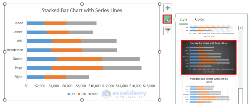
- If you want to change the Chart Style, click the Brush sign on the right side of the chart and select your preferred style.
- We get the following result.
- Add Series Lines:
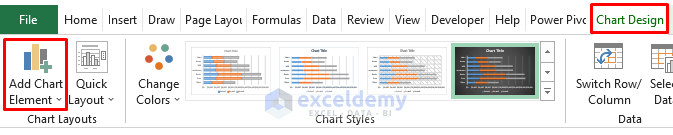
- Click anywhere on the chart to open the Chart Design option on the ribbon.
- Select the Chart Design option.
- From the Chart Layouts group, choose the Add Chart Element drop-down.
-
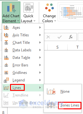
- Select Lines.
- From the Lines section, choose Series Lines.
-
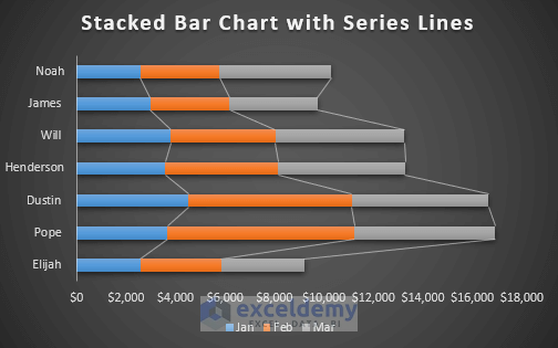
- This will automatically create a series of lines on your chart.
-
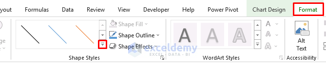
- To change the series lines’ color, click on the lines and use the Format option on the ribbon.
- To change the series lines color, click on the lines.
-
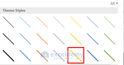
- You can select your preferred theme from the Theme Styles options.
-
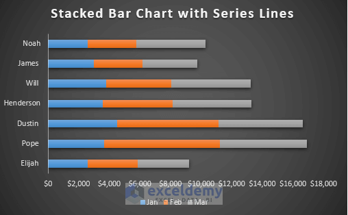
- You will get your required stacked bar chart with series lines.
Read More: How to Create Stacked Bar Chart with Dates in Excel
Things to Remember
- To create a stacked bar chart with a line chart, add an extra column for the line chart.
- Utilize a combo chart where one column represents the line chart and the others represent the stacked bar chart.
Download Practice Workbook
You can download the practice workbook from here:
Related Articles
- How to Make a Stacked Bar Chart in Excel
- Excel Stacked Bar Chart with Subcategories
- How to Create Stacked Bar Chart with Negative Values in Excel
- How to Plot Stacked Bar Chart from Excel Pivot Table
- How to Create Bar Chart with Multiple Categories in Excel
- How to Ignore Blank Cells in Excel Bar Chart
<< Go Back to Stacked Bar Chart in Excel | Excel Bar Chart | Excel Charts | Learn Excel
Get FREE Advanced Excel Exercises with Solutions!
