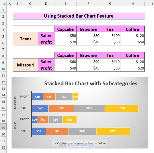
Method 1 – Using Stacked Bar Chart Feature to Create Excel Stacked Bar Chart with Subcategories
Steps:
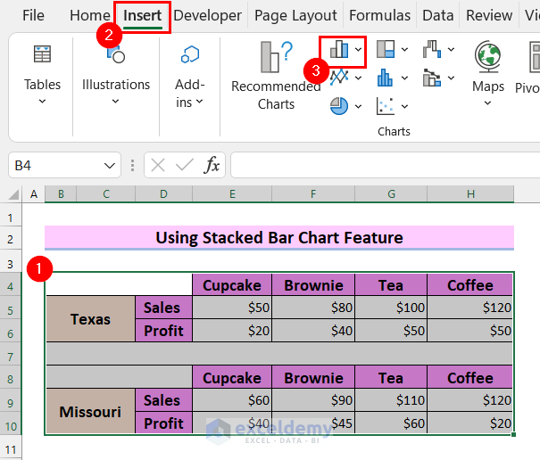
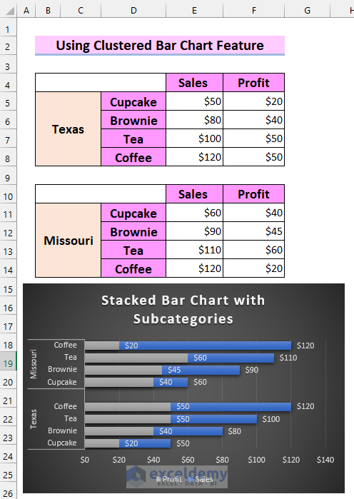
- Select the dataset.
- Go to the Insert tab from the Ribbon.
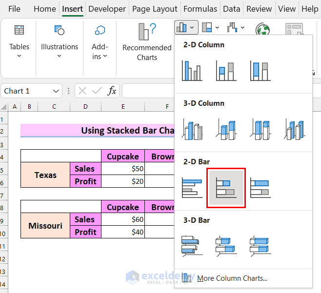
- Select the Insert Column or Bar Chart from the Charts option.
This will lead you to a drop-down menu.
- From the drop-down, select the Stacked Bar.
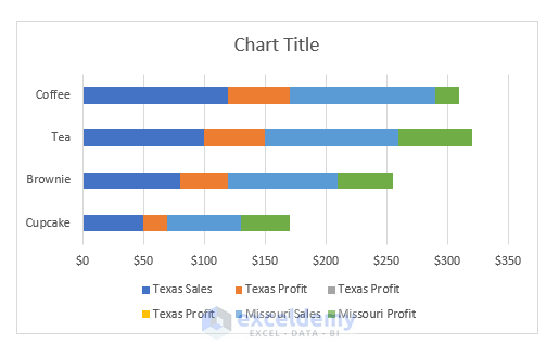
You will see a chart has been inserted into the worksheet. I got the chart you can see in the following picture. This is not the chart I want.
We will change the chart as I want it to be. I want to change the rows and columns.
- Select the stacked chart.
- Go to the Chart Design tab.
- Select Switch Row/column.
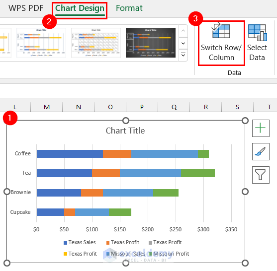
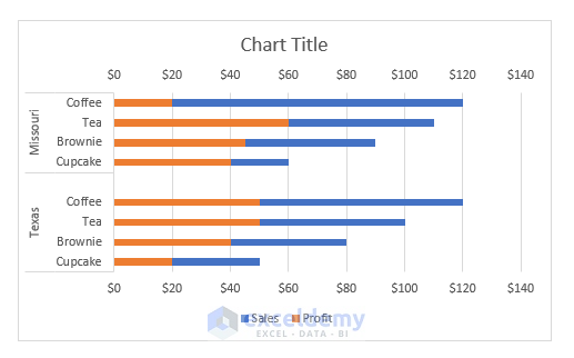
You will see that I have got my desired chart. At this point, you can format the data series of the chart.
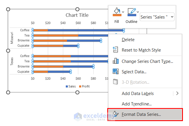
- Right-Click on any bar of the stacked bar chart.
- Select Format Data Series.
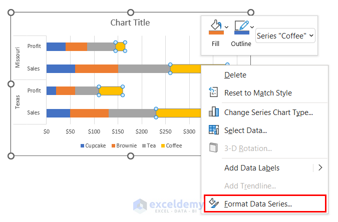
Format Data Series dialog box will appear on the right side of the screen.
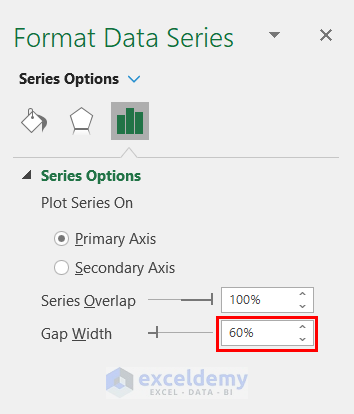
- You can change the gap width. We changed it to 60%. You can change it to your liking.
- Right-Click on any bar.
- Select Add Data Labels.
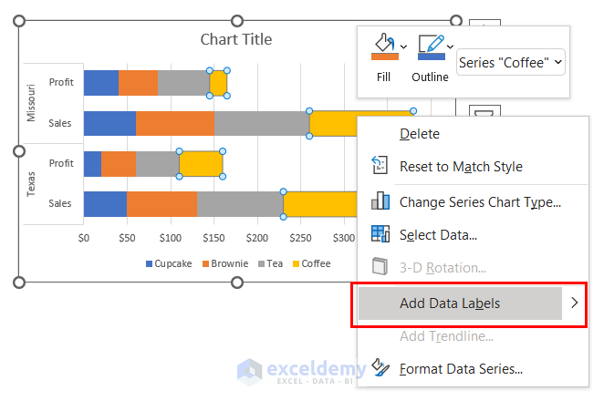
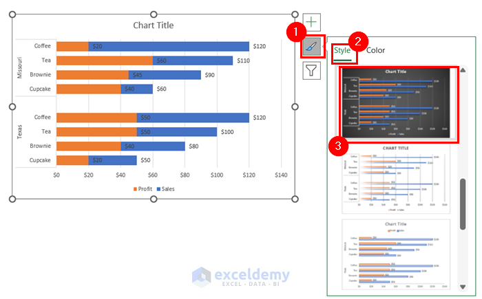
This will add Data Labels to your stacked bar chart. In the following picture, you can see that I have added Data Labels to my chart, and this is how it looks at this point.
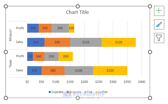
You can format the chart.
- Go to Chart Styles.
- Select Styles.
- You can select any chart format from there. We selected the marked format in the image below, but you can select any other design you like.
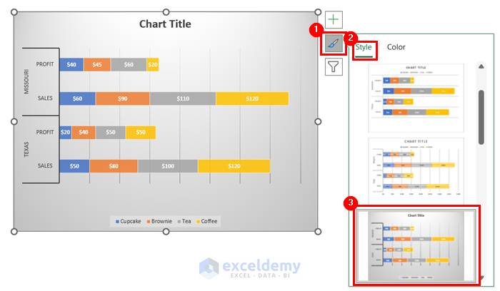
- You can add a chart title to your stacked bar chart.
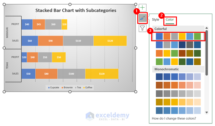
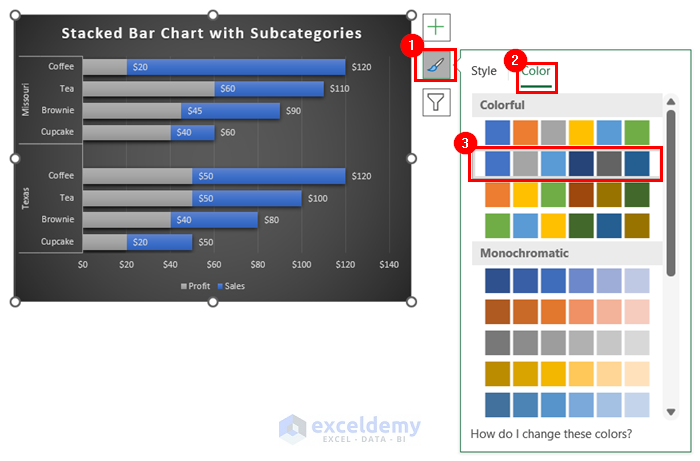
You can also change the colors of the stacked bar chart.
- Go to the Color from the Chart Styles option.
- Select the color you like. We selected the marked color in the image, which was the chart’s default color, so you do not see any change.
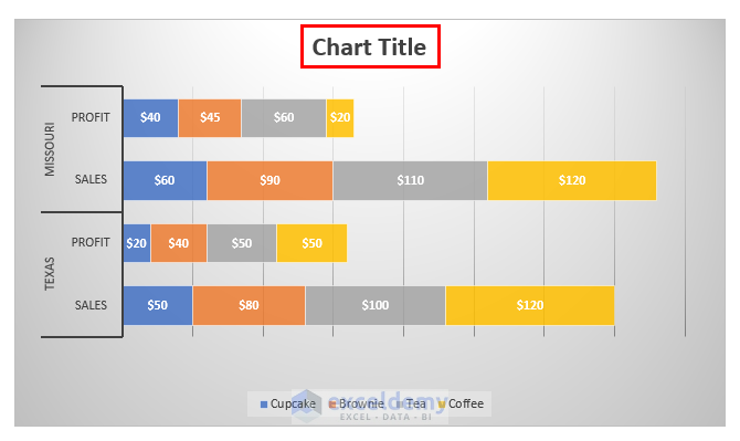
This is what the chart looks like after formatting.
You got my desired stacked bar chart with subcategories.
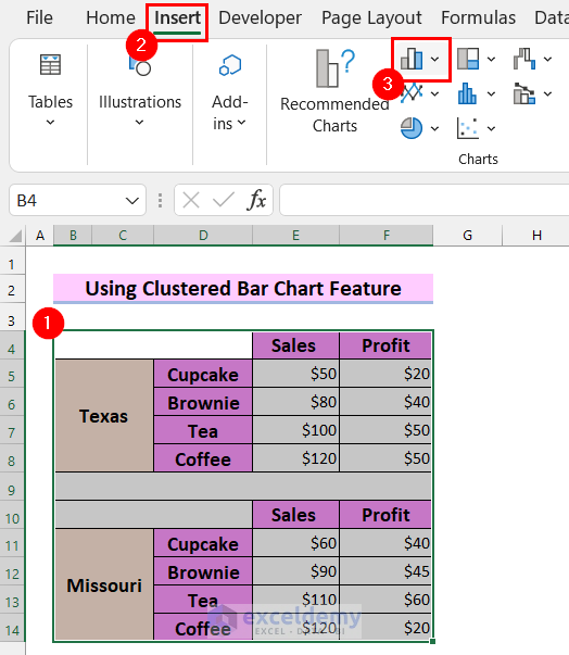
Method 2 – Use of Clustered Bar Chart Feature to Create Excel Stacked Bar Chart with Subcategories
Steps:
- Select the dataset.
- Go to the Insert tab from the Ribbon.
- Select the Insert Column or Bar Chart from the Charts option.
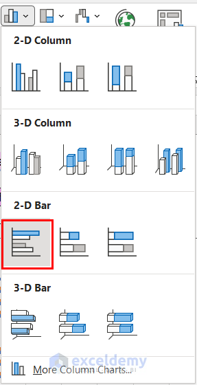
You will see a drop-down menu.
- Select Clustered Bar.
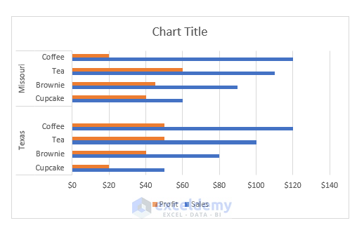
You will see that a clustered bar chart has been inserted into your worksheet. We want a stacked bar chart.
To get our stacked bar chart,
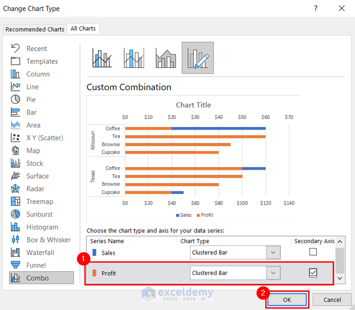
- Right-Click on any bar.
- Select Change Series Chart Type.
- Add Profit to the secondary axis.
- Select OK.
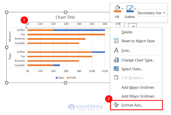
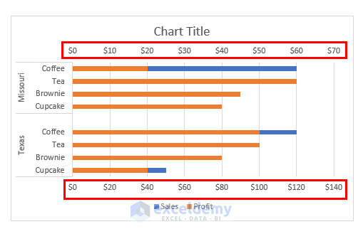
You will see that the bars are stacked. The two axes do not match each other.
I will show you how to solve this problem.
- Select the secondary axis and then Right-Click on it.
- Select Format Axis.
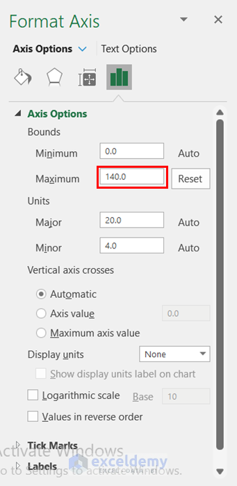
The Format Axis dialog box will appear on the right side of the screen.
- Select the Bounds as the primary axis. We selected 140 because our primary axis’ Maximum Bound is 140.
You can see that the bar chart is now stacked properly.
You can add data labels.
- Right-Click on any bar.
- Select Add Data Labels.
After adding the data labels. You can format your stacked bar chart.
- Go to the Chart Styles.
- Select Styles.
- You can select any chart format from there. We selected the marked format in the image below, but you can select any other design you like.
You can change the colors of the stacked bar chart.
- Go to the Color from the Chart Styles option.
- Select the color you like. We selected the marked color in the image.
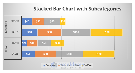
This is my final stacked bar chart in the picture below.
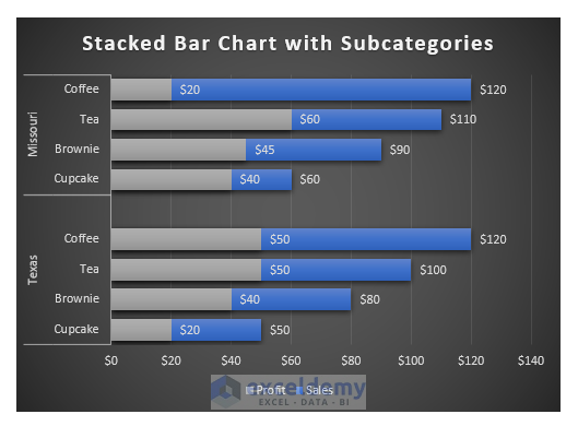
We got an Excel stacked bar chat with subcategories.
Download Practice Workbook
Related Articles
- How to Create Stacked Bar Chart with Negative Values in Excel
- How to Create Stacked Bar Chart with Line in Excel
- How to Plot Stacked Bar Chart from Excel Pivot Table
- How to Create Stacked Bar Chart with Dates in Excel
- How to Create Bar Chart with Multiple Categories in Excel
- How to Ignore Blank Cells in Excel Bar Chart
<< Go Back to Stacked Bar Chart in Excel | Excel Bar Chart | Excel Charts | Learn Excel
Get FREE Advanced Excel Exercises with Solutions!
