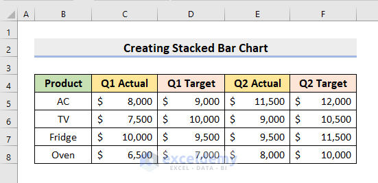
Step 1 – Input Data
In this example, we’ll input a dataset about 4 products and their sales in 2 quarters, as well as projected and actual sales.
- Create the headers for the products and the sales amounts in different quarters.
- Insert the Product names.
- Insert the precise Sales amounts in the respective cells.
Read More: How to Make a 100 Percent Stacked Bar Chart in Excel
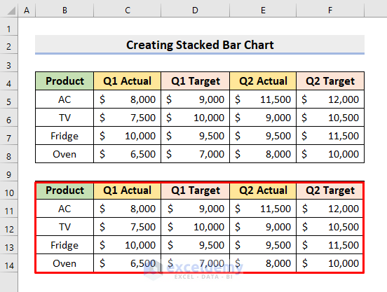
Step 2 – Rearrange Data
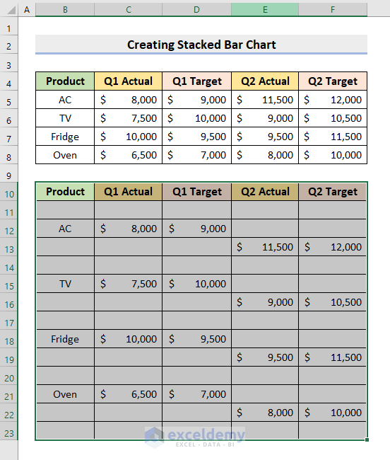
- Select the range B4:F8.
- Press Ctrl + C to copy it.
- Click on cell B10.
- Right-click and choose the Paste Link feature from the Paste Options.
- Whenever you update the original dataset, these data values will get updated automatically.
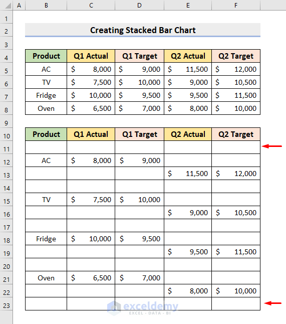
- Insert 2 blank rows between each value row by right-clicking on the row headers and pressing Insert.
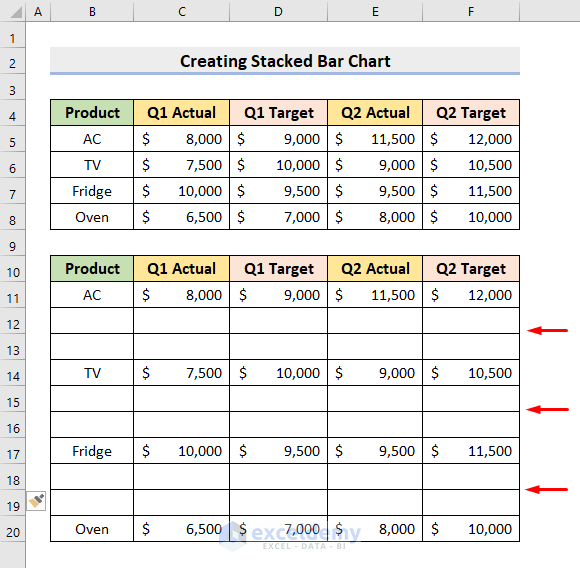
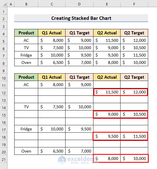
- Move the Q2 Actual and Q2 Target values to the blank cells below the row for the name (see the image for the example).
- Insert a blank row under the dataset header.
- Enter another blank row at the end of the dataset if you haven’t already.
Read More: Excel Stacked Bar Chart with Subcategories
Step 3 – Create a Stacked Bar Chart for Multiple Series
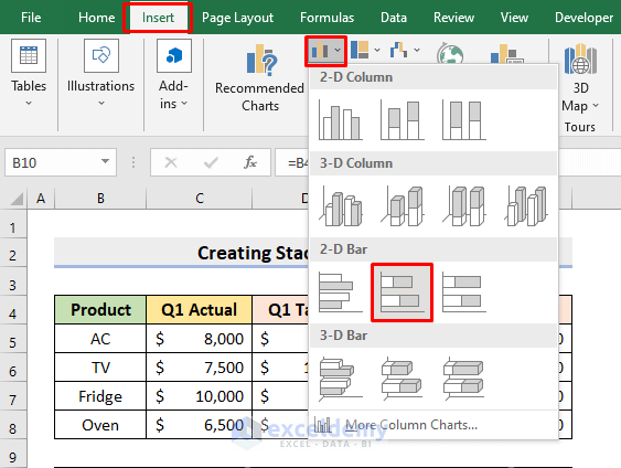
- Select the range B10:F23.
- Go to the Insert tab.
- Click the first drop-down icon from the Chart section.
- Choose the Stacked Bar option.
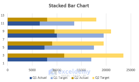
- You’ll get a Stacked Bar chart.
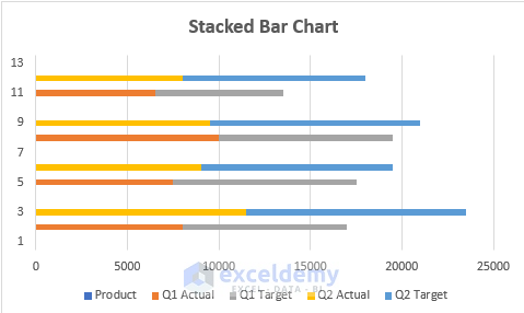
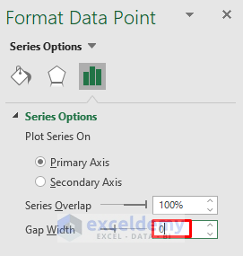
- Click any series in the chart and press Ctrl + 1.
- You’ll get the Format Data Point pane. Type 0 in the Gap Width box.
- The Product legend is unnecessary here, so click on the Product legend and press Delete.
- To make the chart more vibrant, click the legends present in the chart under the X-axis and choose some other colors.
- Here’s a result for our sample.
Read More: How to Create Stacked Bar Chart with Line in Excel
Final Output
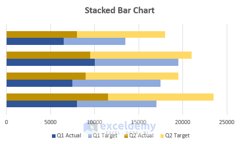
- Delete the Y-axis labels as they are not required in the bar charts.
- The topmost bar is for the Oven, followed by the Fridge, TV, and AC.
Download the Practice Workbook
Related Articles
- How to Create Stacked Bar Chart with Negative Values in Excel
- How to Plot Stacked Bar Chart from Excel Pivot Table
- How to Create Stacked Bar Chart with Dates in Excel
- How to Create Bar Chart with Multiple Categories in Excel
- How to Ignore Blank Cells in Excel Bar Chart
<< Go Back to Stacked Bar Chart in Excel | Excel Bar Chart | Excel Charts | Learn Excel
Get FREE Advanced Excel Exercises with Solutions!
