What Is a Stacked Bar Chart?
A stacked bar chart is a graph to represent and compare the segments of a whole. It can show the parts of a whole data series. A stacked bar chart usually has several bars and each of them is divided into multiple segments. Each bar represents a different data series and each part or segment of a bar represents a particular category within that data series. A stacked bar chart is used to show a larger variable divided into smaller categories and then compare the categories across different variables. In the case of a 100 % stacked bar chart, each bar makes up a total of 100%.
Step 1 – Organizing the Data in Excel
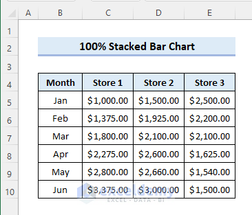
- We have the following dataset. It contains the monthly sales of 3 different stores. You can make a 100% stacked bar chart to show and compare the contributions of the stores to the total sales.
Read More: How to Sort Bar Chart Without Sorting Data in Excel
Step 2 – Inserting a 100% Stacked Bar Chart in Excel
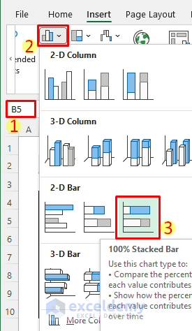
- Select Insert.
- Go to Insert Column or Bar Chart.
- Select 2-D Bar and pick a 100% Stacked Bar. Alternatively, you can select the 3-D 100% Stacked Bar from 3-D Bar.
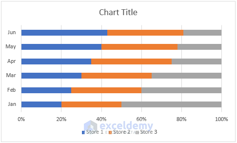
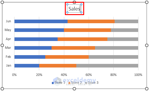
- The following 100% stacked bar chart will be inserted.
Read More: How to Make a Simple Bar Graph in Excel
Step 3 – Editing the Chart Title
- Click on the chart title and enter a title as required.
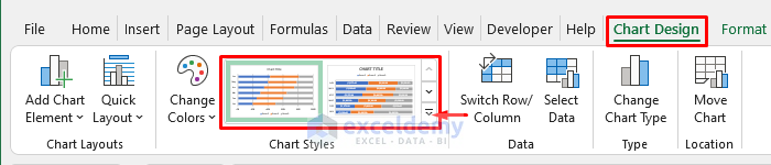
Step 4 – Picking a Suitable Chart Style
- Choose a style for the bar chart from the Chart Design tab. The tab shows when you have the chart selected.
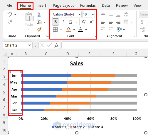
Step 5 – Formatting the Chart Axes
- Click on the chart axes to apply text formatting to make the chart more presentable.
Read More: Excel Chart Bar Width Too Thin
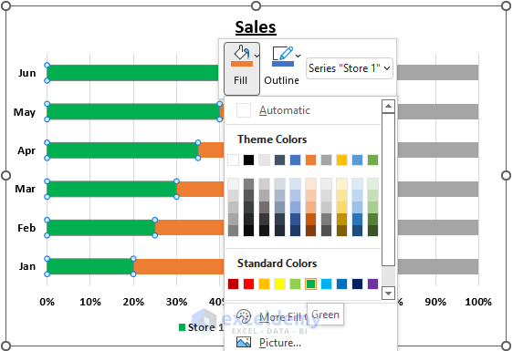
Step 6 – Changing the Bar Colors
- Click on any particular data series on the bar chart.
- Right-click and choose the desired fill color.
Read More: How to Change Bar Chart Color Based on Category in Excel
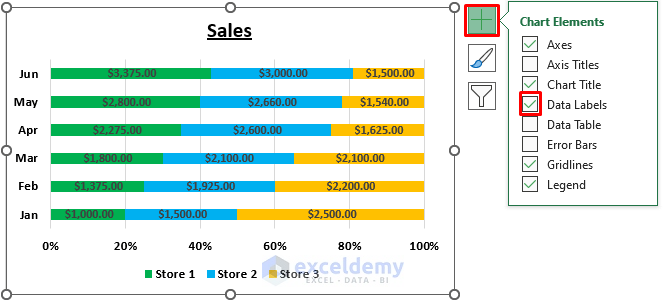
Step 7 – Adding Data Labels
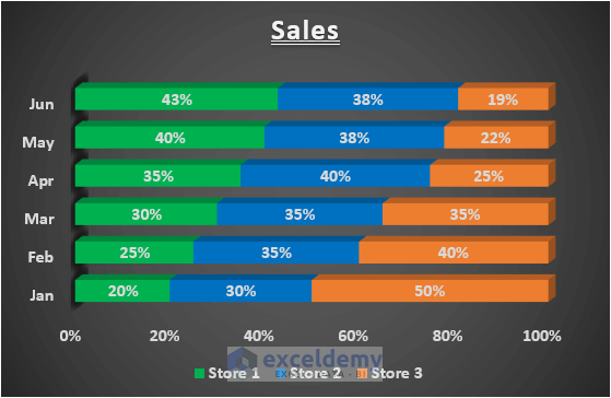
- Note that the 100% stacked bar chart doesn’t show the actual value but represents their percentages.
- To show the actual value on the bar chart, check the Data Labels checkbox from the Chart Elements.
Read More: How to Make a Diverging Stacked Bar Chart in Excel
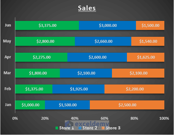
Step 8 – Finalizing the 100% Stacked Bar Chart in Excel
- You can customize the bar chart further if needed by repeating the steps above.
Read More: How to Create Clustered Stacked Bar Chart in Excel
Things to Remember
- You must select the chart to be able to customize it.
Download the Practice Workbook
Related Articles
- How to Make a Bar Graph in Excel without Numbers
- How to Create a Bar Chart in Excel with Multiple Bars
- How to Make a Grouped Bar Chart in Excel
- How to Make a Double Bar Graph in Excel
<< Go Back to Stacked Bar Chart in Excel | Excel Bar Chart | Excel Charts | Learn Excel
Get FREE Advanced Excel Exercises with Solutions!

Thank you for this thorough explanation. I do however have a question. Suppose in your step 6 I want to change the individual segment colors of only one month, say Jan. How could I do that?
Thanks,
Hello Jay,
You are most welcome and thank you for your kind words! To change the individual segment colors for just one month, follow these steps:
1. Select the chart.
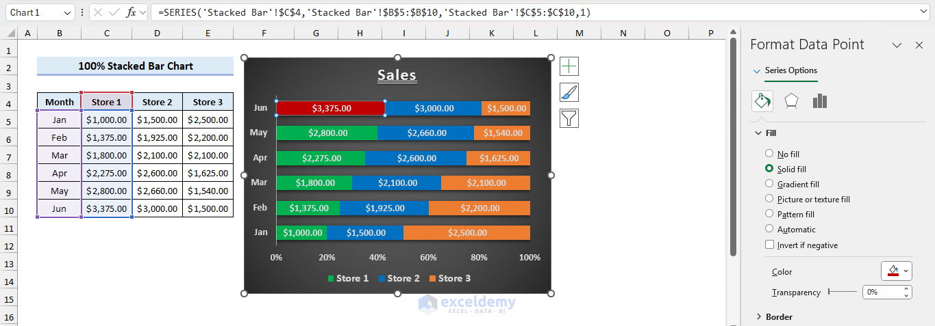
2. Select the bar segment for January that you want to modify.
3. Right-click the segment and choose Format Data Point.
4. In the Format Pane, change the Fill color to your desired choice.
Regards
ExcelDemy