Excel datasets contain sectionized data that can be referred to as breakout. The typical way to make a pie chart with breakout in Excel involves inserting pie charts for each of the different sections or periods.
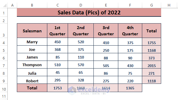
Let’s say we have dummy Sales Data (Pics) for an entire year divided into quarters. Each quarter represents a separate section or period.
In this article, we discuss data breakout and demonstrate step by step process to make a pie chart with breakout in Excel.
Explaining Data Breakouts
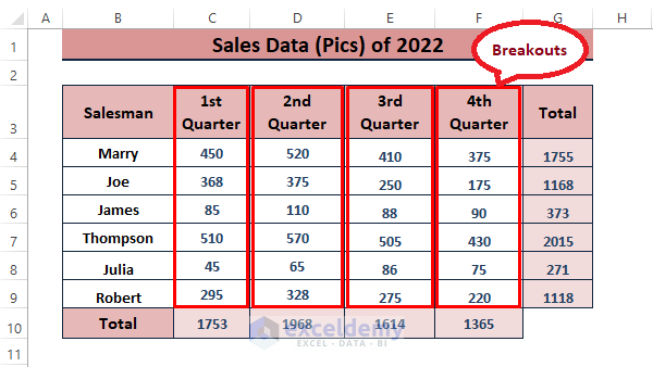
Data representing multiple sections, ranges, groups, or periods is common in Excel datasets. Each of those sections, ranges, groups, or periods is referred to as breakouts. So, in our dataset, each quarter is a breakout. Therefore, we have 4 breakouts in our dataset.
Step by Step Process to Make Pie Chart with Breakout in Excel
As breakouts are the different specific sections or periods of a dataset, users need to select any of the sections or periods to insert a pie chart. Follow the below steps to make a pie chart with breakouts in Excel.
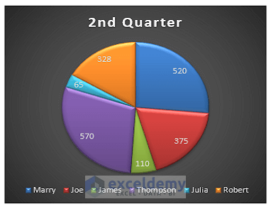
Step 1: Insert a Pie Chart Using the First Breakout Data
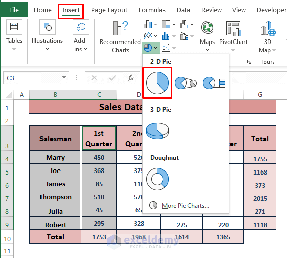
🔄 Highlight the breakout along with the legends. After that, go to Insert > Click Insert Pie or Doughnut Chart > Choose any Pie Chart (i.e., 2D Pie).
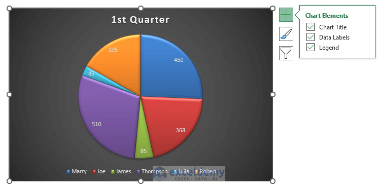
🔄 In a moment, Excel inserts the 1st breakout pie chart as depicted in the below image. Tick Chat Title, Data Labels, and Legend under Chart Elements from the side menu Plus Icon options.
⧭ You can choose any Pie Chart design from the options to organize your breakouts.
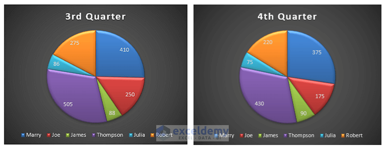
Step 2: Repeat the Chart Insertion for Other Breakouts
🔄 As mentioned earlier, the dataset has 4 separate quarters and if users want to make pie charts for all the breakouts, just repeat Step 1. Finally, you’ll have a depiction similar to the image below representing all the breakouts into pie charts.
Read More: How to Make Pie Chart in Excel with Subcategories
Conclusion
This article discusses data breakouts and step by step process to make a pie chart with a breakout in Excel. We hope the above discussion clarifies the concept of breakouts and helps you make pie charts with them. Comment if you have further inquiries or have anything to add.
Related Articles
- How to Create a Pie Chart in Excel from Pivot Table
- How to Make Two Pie Charts with One Legend in Excel
- How to Make a Pie Chart in Excel with One Column of Data
- How to Make a Pie Chart with Multiple Data in Excel
- How to Make a Pie Chart in Excel with Words
- How to Make a Pie Chart in Excel without Numbers
<< Go Back To Make a Pie Chart in Excel | Excel Pie Chart | Excel Charts | Learn Excel
Get FREE Advanced Excel Exercises with Solutions!
