If you are looking for how to make two pie charts with one legend in Excel, then you are in the right place. In our practical life, we often need to make pie charts for statistical analysis or research. Legends are very important to indicate different portions of the chart. Usage of diversified legends makes our charts more complex to understand. In this article, we’ll try to discuss how to make two pie charts with one legend in Excel.
How to Make Two Pie Charts with One Legend in Excel: 2 Ways
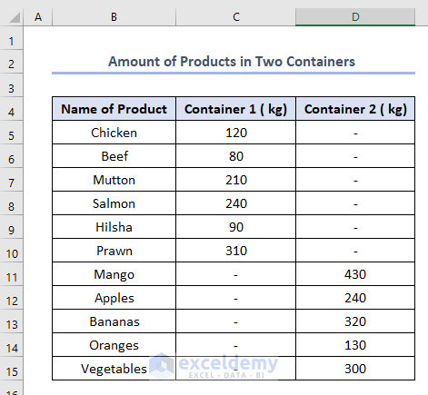
We have limited methods to make two pie charts with one legend. To understand the methods, we have made a dataset named Amount of Products in Two Containers which has column headers as Name of product, Container 1 (kg), and Container 2 (kg) in Columns B, C, and D respectively. The dataset is like this.
Let’s discuss the two methods to make pie charts with one legend.
1. Merge Two Pie Charts with One Legend
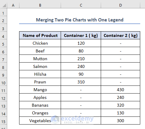
When we need to merge two pie charts into one with one or the same legend we need to follow this method. We’ll try to include the amounts of products of Container 1 and Container 2 into one single pie chart with one legend. To do this, we need to work on the following dataset of Merging Two Pie Charts with One Legend.
The steps are like this.
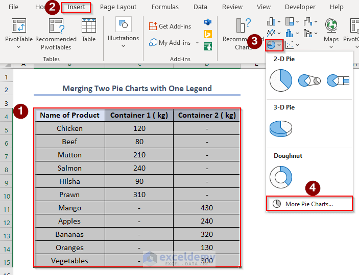
Firstly, select the whole dataset > go to Insert tab> select symbol of pie charts > select More Pie Charts.
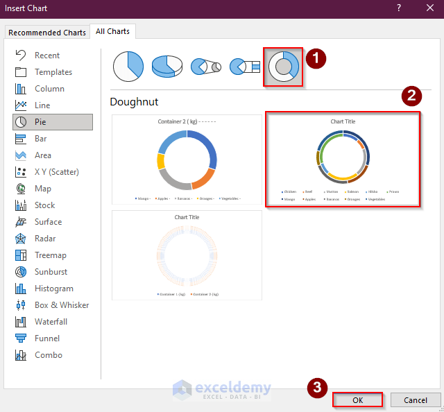
Eventually, this Insert Chart window will appear.
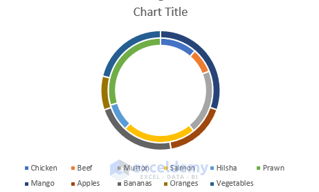
Secondly, select as stated icons in the picture below and click OK.
As a result, a chart like this will appear.
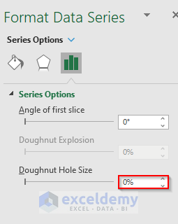
Thirdly, right-click the inner circle of the chart > select Format Data Series.
 A Format Data Series window will appear.
Fourthly, change the Doughnut Hole Size to 0%.
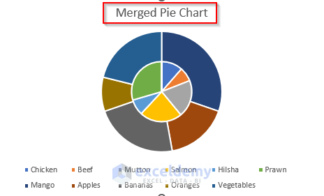
Consequently, the shape of the chart will be like this. Change the Chart Title to Merged Pie Chart.
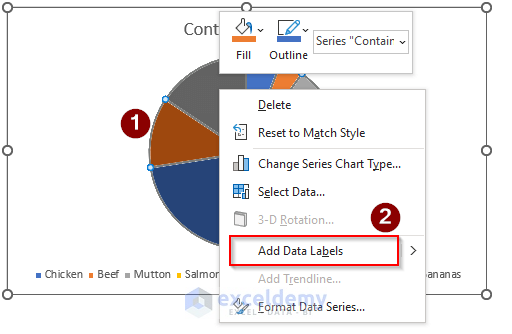
Fifthly, right-click on the upper outer circle of the chart > select Add Data Labels.
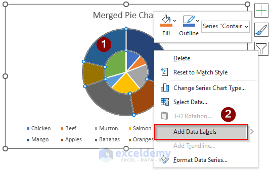
The data in the dataset to different regions will be added according to their category.
Sixthly, right-click on any of the data in the circle > select Format Data Labels.
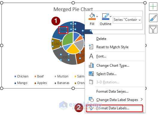
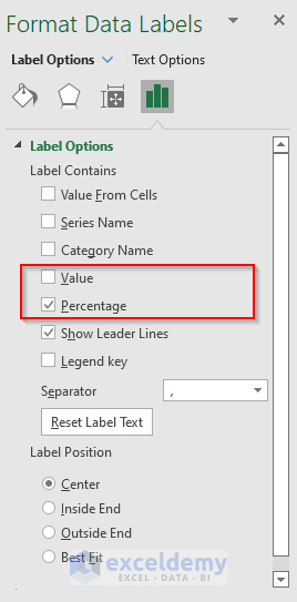
A Format Data Labels window will appear.
Seventhly, select Percentage and deselect Value. We can select any options here according to our requirements.
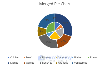
Eventually, the amounts in different portions in the chart with percentages will be shown.
Eighthly, repeat the same procedure for the inner circle of the chart too.
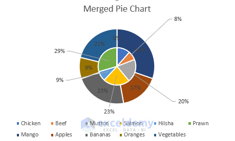
Ninthly, after getting the values in percentage in the inner portion, just click them and slide them out of the circle. Automatic lines joining the values with the circle will appear. We can do this for the lack of space in the inner chart.
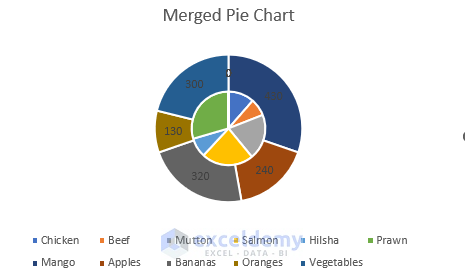
Finally, we will get our chart like this.
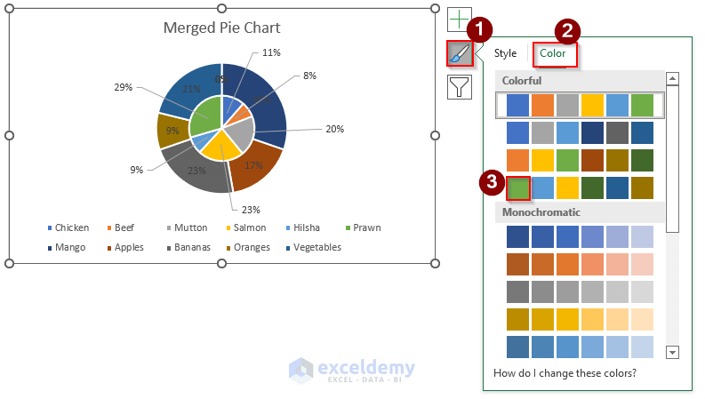
Eventually, we can change the color of the chart for better visual representation.
To do this, select the draw icon > select Color > choose any color options. We have selected the Green colored icon option.
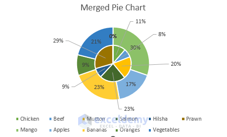
Lastly, we’ll get our chart like this.
Read More: How to Make Pie Chart in Excel with Subcategories
2. Usage of PowerPoint to Make Two Pie Charts with One Legend in Excel
When we want to make two different pie charts with one legend we need to follow this procedure. In this procedure, we need the help of Microsoft PowerPoint. We can apply this method in the following dataset Using PowerPoint.

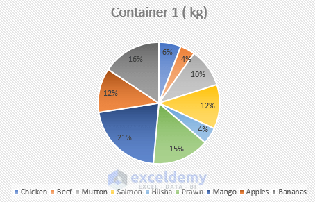
Firstly, select columns B and C like the picture below > go to Insert > select pie chart symbol > go to 2-D Pie.

Eventually, a pie chart of Container 1 (kg) will appear.

Secondly, right-click on the chart > select Add Data Labels.
Thirdly, following the steps of the previous method we need to select the Percentage and deselect the Value as we have done in the first method and after that our output is like this.
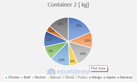
Similarly, we need to follow the same steps for Container 2 and we get the pie chart like this.
Fourthly, open Microsoft PowerPoint.

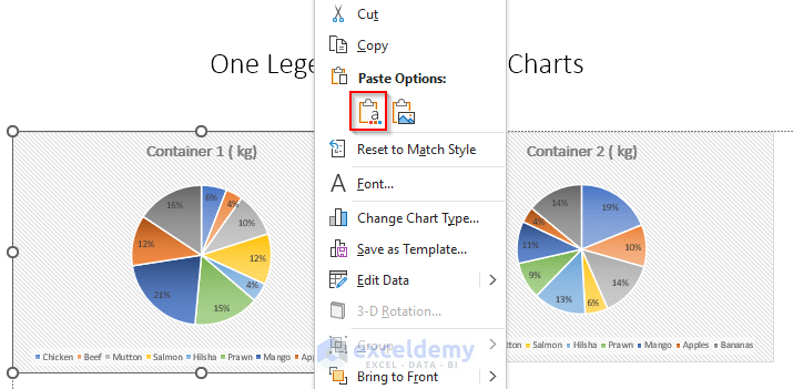
Fifthly, copy the pie chart of Container 1 (kg) from the Excel sheet by pressing CTRL+C.
Sixthly, click Paste on the PowerPoint > select the marked icon in the Paste Option.

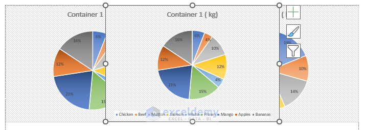
Consequently, the two pie charts will be pasted into the PowerPoint. Level them like the picture below.

Seventhly, copy the chart of Container 1 by pressing CTRL+C.
Eighthly, right-click the mouse > select the marked icon in the Paste Options.
A similar chart of Container 1 will appear.
Ninthly, select the legend on chart 1 and press DELETE. Also, delete the legend of chart 2.
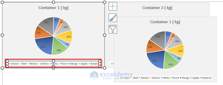
Tenthly, level the three charts like the picture.
Eleventhly, right-click on any portion of the copied chart of Container 1 (it will select all the data) > select Edit Data.
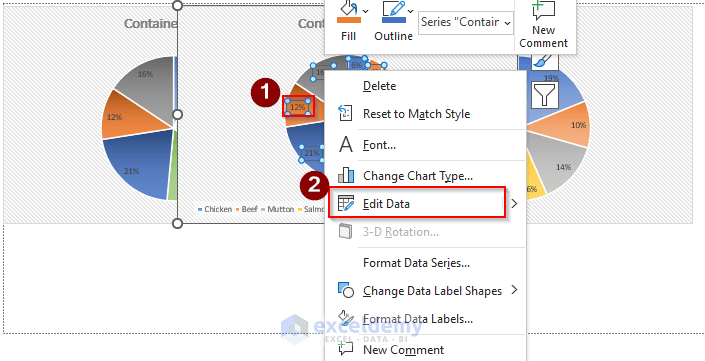
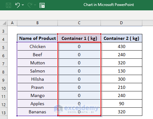
Eventually, a Chart in Microsoft PowerPoint Excel sheet will open.
Twelfth, change all the values in Column C to 0.
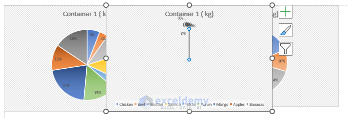
As a result, the charts in the PowerPoint will look like this. The copied chart will disappear.
Now, stretch the copied chart on both the left and the right side by dragging the cursor like the picture below.
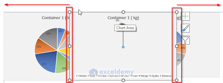
Consequently, it will look like this.

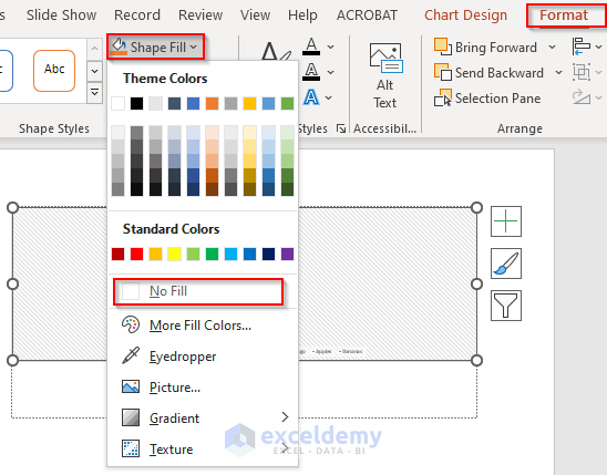
Later, select Format > click Shape Fill > select No Fill.
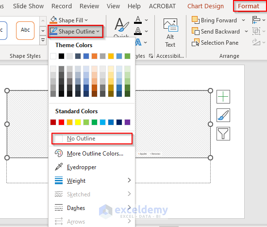
Similarly, go to Format > select Shape Outline > select No Outline.
As a result, two legends will change to one legend like this. We need to delete the unused title of Container 1 (kg) and other unused values located in the middle of the picture.

Finally, we’ll get our desired two pie charts with one legend like this.

Read More: How to Make a Pie Chart with Multiple Data in Excel
Things to Remember
- One very important thing is, when we need to copy & paste charts from Excel sheet to PowerPoint in the second method, we have to select the marked paste option which we have described above. It will link the chart PowerPoint with the Excel Otherwise, no interlink will be created, and changing anything in Excel will not make a change in the PowerPoint.
- We need to use the selected paste option when we just copy & paste the chart of Container 1 (kg) in the PowerPoint. If we just paste it by pressing CTRL+V, any change made in the Container 1 values in the Excel sheet will change both the main chart and copied chart of Container 1 in the PowerPoint.
Download Practice Workbook
Conclusion
We can make two pie charts with one legend in Excel easily if we study this article properly. Please feel free to visit our official Excel learning platform ExcelDemy if you have further queries.
Related Articles
- How to Make Pie Chart with Breakout in Excel
- How to Create a Pie Chart in Excel from Pivot Table
- How to Make a Pie Chart in Excel with One Column of Data
- How to Make a Pie Chart in Excel with Words
- How to Make a Pie Chart in Excel without Numbers
<< Go Back To Make a Pie Chart in Excel | Excel Pie Chart | Excel Charts | Learn Excel
Get FREE Advanced Excel Exercises with Solutions!
